Design — Kalme Next.js
The look comes from a small set of tokens. Change a token and every page, component and state follows — you rarely need to touch a component.
See everything first
Section titled “See everything first”Run npm run dev and open http://localhost:3000/style-guide. It shows the colours, text styles, buttons, form
fields, cards and every other component with its name. When you want to know what a change will affect, look there.
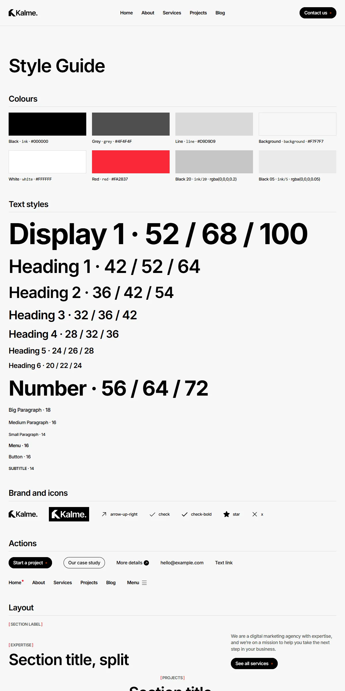
Colours
Section titled “Colours”src/design-system/theme.css:
@theme { --color-ink: #000; /* headings, text, buttons, dark cards */ --color-grey: #4f4f4f; /* paragraphs, secondary text */ --color-line: #d9d9d9; /* dividers, borders, category chips */ --color-background: #f7f7f7; /* page, header, footer */ --color-red: #fa2837; /* the accent: the dot in buttons, the brackets of section labels */ --color-danger: #fa2837; /* form errors */}Each name becomes a Tailwind class: bg-ink, text-grey, border-line, bg-red. Swap the hex values for your own
palette and the whole site changes. Keep enough contrast between text and its background — at least 4.5:1, or the site
becomes hard to read. Cards and panels are white (bg-white) on the light grey page.
Red is Kalme’s only accent: a small dot in every button, the active menu item and the brackets around section labels
([ EXPERTISE ]). Change --color-red to your brand colour and all of them follow. Keep --color-danger a colour
people read as an error.
Faded blacks are opacity modifiers on the same colour: bg-ink/5 (form fields), bg-ink/20. They follow the palette
when you change --color-ink.
public/images/logo.svg is the logo in the header and the footer, logo-white.svg the white one on the About hero, and
src/app/icon.svg and src/app/apple-icon.png are the icons in the browser tab and on a phone’s home screen. Replace the
files, keeping the names. The logo is drawn in a 4:1 box — 100 × 25 px in the header (80 × 20 px on phones), up to
300 × 75 px in the footer — so draw yours in about that proportion. Its description for screen readers is site.name.
The template loads Inter through next/font in src/app/layout.tsx:
const inter = Inter({ variable: "--font-inter", subsets: ["latin"] });To use another Google font, import it by name from next/font/google and keep the variable name:
import { Manrope } from "next/font/google";const inter = Manrope({ variable: "--font-inter", subsets: ["latin"] });For a font you have licensed yourself, use next/font/local and point it at the files in src/app/fonts/. Next.js
serves the font from your own domain either way, so there is no request to Google at runtime.
Every text style uses a slightly tight letter spacing (−0.03em, −0.02em on buttons), which suits Inter. With another
font, check the headings and adjust tracking-[…] in the text styles if they look cramped.
Text styles
Section titled “Text styles”src/design-system/tokens/text.ts holds the sizes, weights and line heights, named after the design:
display, h1, h2, h3, h4, h5, h6, numberbigParagraph, paragraph, smallParagraphmenu, button, subtitleEach is a set of Tailwind classes. The headings have the phone size first and the tablet (md:) and desktop (lg:)
sizes after: h2: "text-[36px] md:text-[42px] lg:text-[54px] leading-[1.2] font-semibold tracking-[-0.03em]".
Paragraphs, menu, button and subtitle are the same at every size. Change the numbers here rather than in the components,
and headings stay consistent across the site.
Use them as className={text.h2} or combine: className={cn(text.h6, "text-grey")}.
Breakpoints
Section titled “Breakpoints”Three sizes, set in theme.css:
| Width | Tailwind prefix | |
|---|---|---|
| Phone | below 810 px | (none) |
| Tablet | 810–1199 px | md: |
| Desktop | 1200 px and up | lg: |
Content is at most 1440 px wide; the page padding is 15 px on phones, 20 px on tablets and 30 px on desktops
(src/design-system/components/layout/Section.tsx).
Motion
Section titled “Motion”src/design-system/tokens/motion.ts holds the two springs: springSoft (no bounce) for buttons, card hovers, the
accordion, the pricing switch and the header menu, and springButton (a small bounce) for the menu icon. Lower
duration for a snappier feel, or raise bounce for a livelier one.
Three effects have their own settings:
| Effect | Where to change it |
|---|---|
| The showreel in the Home hero changes picture every 2 seconds | add interval={3000} (milliseconds) to <Showreel> in src/components/sections/HomeHeroSection.tsx |
| The page video rises 150 px as you scroll down the page | add from={-80} (pixels) to <ScrollVideo> in src/components/sections/PageVideoSection.tsx |
| The images above the footer move at 30 px per second | speed on <Ticker>, src/components/sections/CtaSection.tsx |
Every animation respects the visitor’s “reduce motion” setting.
Rounded corners, spacing, shadows
Section titled “Rounded corners, spacing, shadows”Kalme is square: no rounded corners except the buttons and the small round icons, no shadows. Spacing is Tailwind
classes on the components (px-5, gap-10). Tailwind’s scale is 4 px per step, so p-5 is 20 px. Change them where
you see them; the style guide shows the result immediately.
Components
Section titled “Components”src/design-system/components/ — buttons, cards, form fields, the accordion, the pricing card, the ticker, the
videos, the icons. Its README lists every component next to the design it comes from.
The sections that make up a page are one level up, in src/components/sections/, and are listed in Pages and sections.
The icons are Phosphor shapes stored as path data in
src/design-system/components/icons/paths.ts, and <Icon name="check" /> draws one in the current text colour. To add
one, open the icon on phosphoricons.com, copy the SVG, take the d="…" of its <path>, and add a line:
"my-icon": "M128,24A104,104,0,1,0,…",Then use <Icon name="my-icon" className="size-5" />. Paths use a 256 × 256 grid, which is what Phosphor exports.