Components — Kalme Figma
The pages are built from components, so a change to a component reaches every page that uses it. The main components live on the Components page, on three boards; every page frame holds instances of them. Each component has a short description, shown when you hover it in the Assets panel.
Using components
Section titled “Using components”- Add one: drag it from the Assets panel (
Alt/Option + I) onto a frame. - Change a variant: select an instance and pick the variant in the right sidebar (for example Header → Breakpoint: Phone Open).
- Override content: double-click into an instance and change its text or image. Overrides stay when the main component changes. Many components also have text properties (Title, Label, Category, Date…) you can edit straight from the right sidebar.
- Edit for everyone: right-click an instance → Go to main component, and edit it there.
- Break the link: Detach instance (
Ctrl/Cmd + Alt/Option + B) when one place needs something the component can’t do. The copy stops following the main component.
The hover, open, loading, success and error variants document how the interface reacts. Use them to show states in a presentation, or connect them with Prototype → While hovering / On click to click through the design. The pages show every component at rest.
Buttons & Elements
Section titled “Buttons & Elements”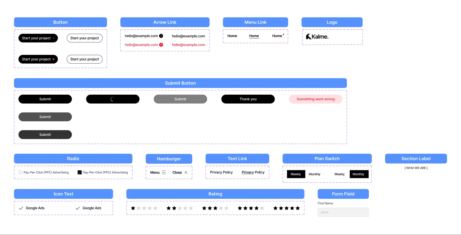
| Component | Variants |
|---|---|
| Logo | Color: Black, White — the Kalme logo, as vectors |
| Button | Style: Primary, Secondary × State: Default, Hover — the pill button; Primary carries the red dot |
| Arrow Link | Icon: Yes, No × State: Default, Hover — a link with an arrow in a circle (contact details, team e-mails) |
| Menu Link | State: Default, Hover, Active — one item of the header menu; Active marks the current page |
| Text Link | State: Default, Hover — a plain link with a growing underline |
| Hamburger | State: Default, Open — the phone menu button |
| Submit Button | State: Default, Hover, Pressed, Loading, Disabled, Success, Error |
| Radio | State: Default, Checked — one option of the contact form’s service choice |
| Form Field | — a field label with its input |
| Plan Switch | Plan: Weekly, Monthly — the switch on the pricing card |
| Icon Text | Width: Fill, Hug — a list item with a check, used for a service’s tools |
| Rating | Rating: 1 to 5 stars |
| Section Label | — the label above a section title, between red brackets |
To put your logo everywhere, edit the Logo component once (both variants).
Sections
Section titled “Sections”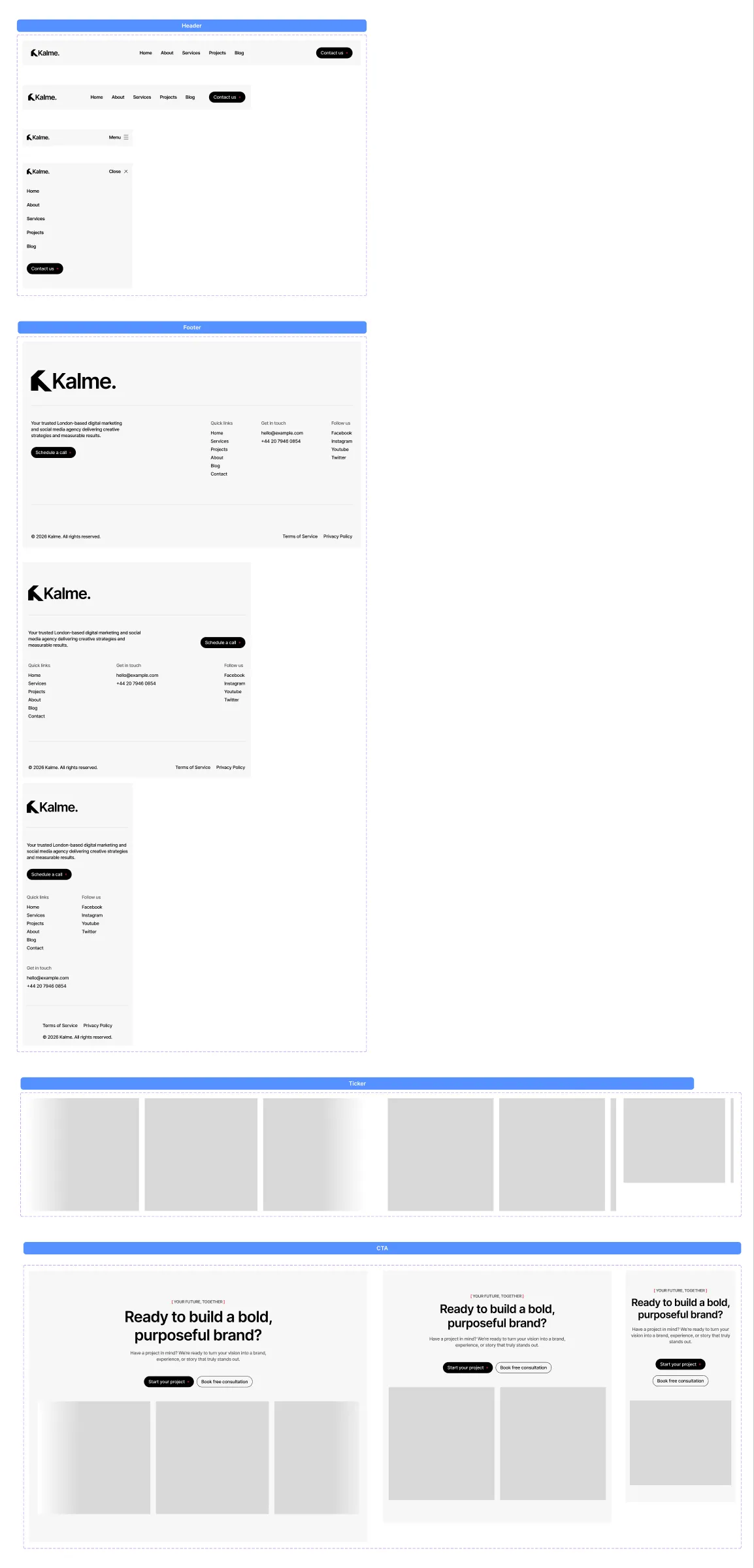
| Component | Variants |
|---|---|
| Header | Breakpoint: Desktop, Tablet, Phone, Phone Open — Phone Open shows the menu |
| Footer | Breakpoint: Desktop, Tablet, Phone — logo, statement, quick links, contact details, social links, copyright |
| CTA | Breakpoint: Desktop, Tablet, Phone — the call to action above the footer |
| Ticker | Breakpoint: Desktop, Tablet, Phone — the moving strip of images in the call to action |
| Component | Variants |
|---|---|
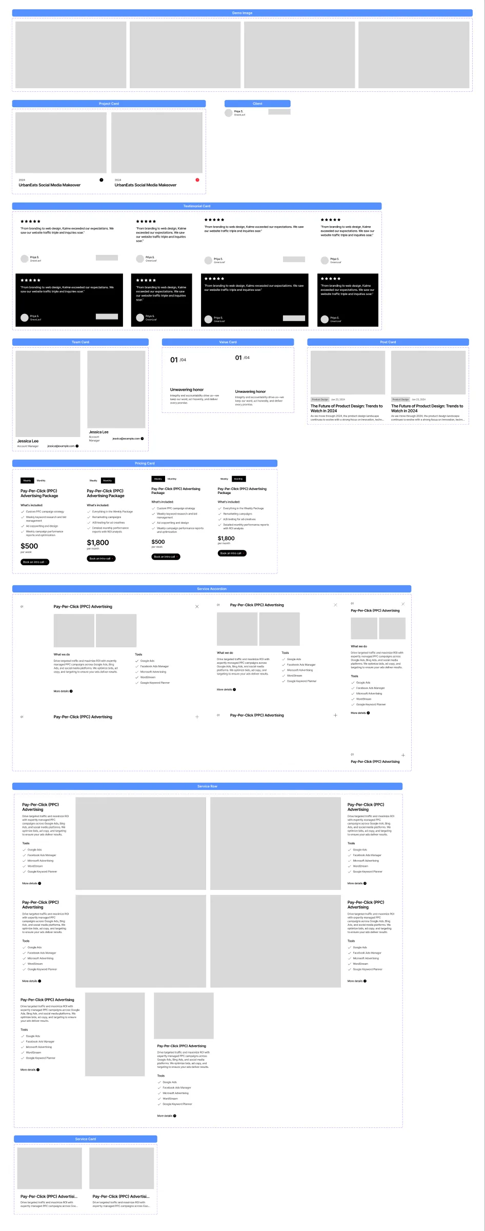
| Service Accordion | Breakpoint: Desktop, Tablet, Phone × State: Open, Closed — one row of the services on Home |
| Service Row | Breakpoint × Side: Left, Right (desktop), Left (tablet, image beside the panel), Stacked (phone) × State: Default, Hover — a service on the Services page |
| Service Card | State: Default, Hover — a service under “More services” |
| Pricing Card | Breakpoint: Desktop, Mobile × Plan: Weekly, Monthly — the package of a service page |
| Project Card | State: Default, Hover |
| Post Card | State: Default, Hover — title and excerpt are cut after two lines |
| Value Card | Breakpoint: Desktop, Mobile — one of the four values on About |
| Team Card | Breakpoint: Desktop, Mobile |
| Testimonial Card | Breakpoint: Desktop, Mobile × Color: Light, Dark × Size: Full, Simple — Full adds the company logo |
| Client | — the name and company under a testimonial |
| Demo Image | Image: 01 to 04 — an image slot with four demo photos |
Mobile variants are for the tablet and phone frames: their cards have 20 px of padding instead of 30.
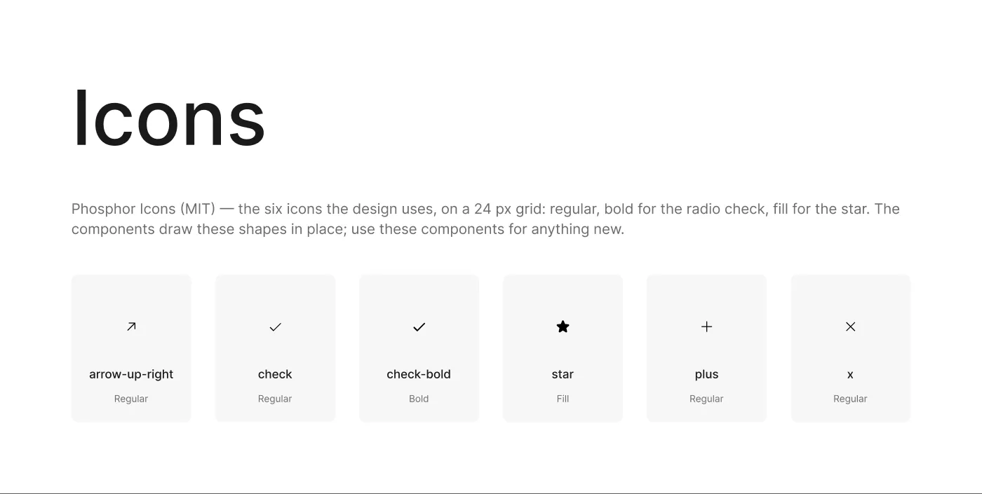
The Icons page holds the six icons used in the design as components (Icon/arrow-up-right, Icon/check,
Icon/check-bold, Icon/star, Icon/plus, Icon/x), from Phosphor Icons (MIT licence),
coloured with the Black variable. The components draw these shapes in place, so editing an icon component doesn’t change them; use the icon components for anything new. Drag one from the Assets panel, or install the free Phosphor plugin from the Figma
Community for the full set in every weight.
Adding your own
Section titled “Adding your own”Build new components next to the existing ones, on the matching board of the Components page, and use the colour variables and text styles (Colours and text styles) instead of raw values — that keeps your additions rebrandable with the rest.