Design — Kalme HTML
The pages are styled with Tailwind CSS classes and a handful of colour, font and breakpoint tokens. Most changes are edits in the HTML; a new colour or font means one rebuild of the stylesheet.
How the styling works
Section titled “How the styling works”The pages are styled with Tailwind CSS classes written in the HTML
(class="rounded-full px-5 py-3 bg-ink text-white"). assets/css/style.css contains exactly the classes the pages
use, generated from src/css/style.css.
That means two kinds of change:
| Change | Rebuild the stylesheet? |
|---|---|
| Move, copy or delete elements; use classes that already appear somewhere in the site | No |
Change a colour, a font, a breakpoint; use a class that appears nowhere yet (say mt-7) |
Yes |
Rebuilding the stylesheet
Section titled “Rebuilding the stylesheet”Once, install the tools (needs Node.js 20 or newer):
npm installThen, after a change:
npm run build:css # one buildnpm run watch:css # rebuilds on every save while you workBoth write assets/css/style.css. The build scans every .html file and assets/js/main.js for classes, so a class
you add anywhere is picked up. Upload the new style.css with your pages.
Colours
Section titled “Colours”In src/css/style.css:
@theme { --color-ink: #000; /* headings, text, buttons, dark cards */ --color-grey: #4f4f4f; /* paragraphs, secondary text */ --color-line: #d9d9d9; /* dividers, borders, category chips */ --color-background: #f7f7f7; /* page, header, footer */ --color-red: #fa2837; /* the accent: the dot in buttons, the brackets of section labels */ --color-danger: #fa2837; /* form errors */}Each becomes a class (bg-ink, text-grey, border-line, bg-red). Change the values, rebuild, and the whole site
follows. Keep text on its background at a contrast of at least 4.5:1 so it stays readable. Cards and panels are white
(bg-white) on the light grey page.
Red is Kalme’s only accent: a small dot in every button, the active menu item and the brackets around section labels.
The round arrow on project cards turns from black to red on hover, and the script animates that, so the two colours are
also written in the HTML (data-motion='{"rest":{"backgroundColor":"#000000"},"hover":{"backgroundColor":"#fa2837"}}'). If
you change --color-ink or --color-red, replace #000000 and #fa2837 in those attributes across the files too.
Logo and icons
Section titled “Logo and icons”assets/images/logo.svg is the logo in the header and the footer, logo-white.svg the white one on the About page;
icon.svg and apple-icon.png in the root folder are the icons in the browser tab and on a phone’s home screen. Replace
the files, keeping the names. The logo is drawn in a 4:1 box — 100 × 25 px in the header (80 × 20 px on phones), up to
300 × 75 px in the footer — so draw yours in about that proportion.
The interface icons in the pages are inline SVG (Phosphor). To use another one, open it on phosphoricons.com, copy its SVG and paste it where the old one is; icons take their colour from the text around them.
Inter ships in assets/fonts/inter-variable.woff2 and is declared at the top of src/css/style.css:
@font-face { font-family: "Inter"; src: url("../fonts/inter-variable.woff2") format("woff2"); font-weight: 100 900; … }:root { --font-inter: Inter, "Inter fallback: Arial", sans-serif; }To use another font: put its .woff2 file in assets/fonts/, change the @font-face (font-family and src) and the
first name in --font-inter, then rebuild. Fonts from Google Fonts can be downloaded as
files with https://gwfh.mranftl.com so they are served from your own domain, which is faster and needs no consent
banner. Every text style uses a slightly tight letter spacing (tracking-[-0.03em]), which suits Inter; with another
font, check the headings.
Sizes and spacing
Section titled “Sizes and spacing”Text sizes are classes with a phone value first and the tablet (md:) and desktop (lg:) values after:
text-[36px] md:text-[42px] lg:text-[54px]. Spacing uses Tailwind’s scale — 4 px per step, so p-5 is 20 px, gap-10
is 40 px — or exact values in brackets (py-[50px]). Kalme is square: no rounded corners except the buttons and the
small round icons, no shadows.
| Width | Prefix | |
|---|---|---|
| Phone | below 810 px | (none) |
| Tablet | 810–1199 px | md: |
| Desktop | 1200 px and up | lg: |
Components
Section titled “Components”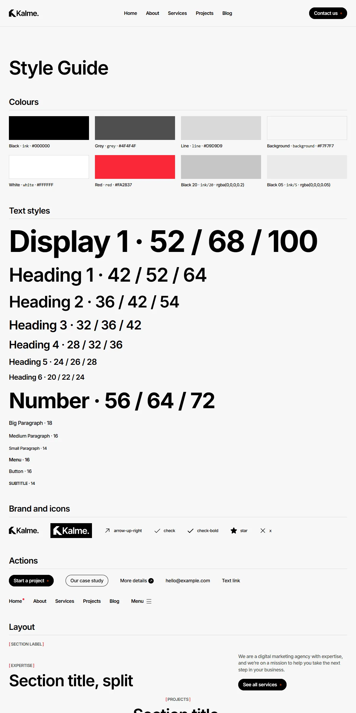
style-guide.html shows every button, form field, card and section with its name. To reuse one, copy its markup from
there or from the page that shows it. Elements with data-… attributes (data-hover, data-motion,
data-service-accordion, data-pricing, data-showreel, data-scroll-video, data-loop-video, data-form, …) are
wired to the site script — keep those attributes when you copy them.
Motion
Section titled “Motion”Hover effects, the accordion, the pricing switch, the showreel, the videos and the image ticker are all in
assets/js/main.js and respect the visitor’s “reduce motion” setting. A few speeds are written in the HTML:
| Effect | Where |
|---|---|
| The showreel in the Home hero changes picture every 2 seconds | data-showreel="2000" in index.html (milliseconds) |
| The page video rises 150 px as you scroll | data-scroll-video="-150" in index.html and about.html |
| The images above the footer scroll by | the animation-duration in the ticker’s style attribute (a smaller number is faster) |