Colours and text styles — Kalme Figma
Every colour in the file is a colour variable and every piece of text uses a text style. Change one and every frame, component and state that uses it updates — this is how you rebrand Kalme in minutes instead of recolouring layers one by one.
Open them from the right sidebar with nothing selected (Local variables, Text styles), or see them laid out on the Style Guide page.
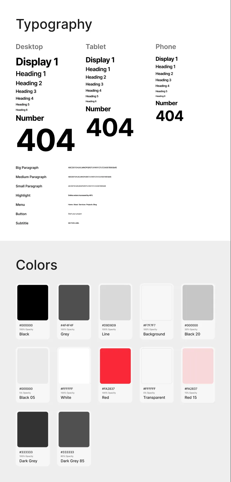
Colour variables
Section titled “Colour variables”All colours live in one collection, Colors:
| Variable | Value | Used for |
|---|---|---|
| Black | #000000 | Headings, text, buttons, dark cards |
| Grey | #4F4F4F | Paragraphs and secondary text |
| Line | #D9D9D9 | Dividers, borders, category chips |
| Background | #F7F7F7 | The page, header and footer |
| White | #FFFFFF | Cards, text on dark |
| Red | #FA2837 | The accent: the dot on buttons, the active menu item, the brackets of section labels |
| Black 20 | #000000 at 20 % | Overlays on photos |
| Black 05 | #000000 at 5 % | Light fills |
| Transparent | #FFFFFF at 0 % | Invisible fills that keep a layer clickable |
| Red 15 | #FA2837 at 15 % | The error state of the submit button |
| Dark Grey, Dark Grey 85 | #333333, and at 85 % | The pressed and hover states of the submit button |
| Placeholder | #D9D9D9 (a colour style) | Every photo slot — replace it with your image |
The variables in the Docs group (Board, Panel, Card, Line, Text, Muted, Tag) colour the Style Guide, Components and Read Me boards only; the design doesn’t use them.
Kalme is black and white with one accent, Red. Changing it is the quickest way to make the design yours.
Rebranding the palette
Section titled “Rebranding the palette”- Deselect everything, open Local variables, and click a value to change it.
- Keep the variable’s name, so everything that uses it follows.
- Change Red and Red 15 together, and the two Dark Grey values: they are the same colour at different opacities.
Keep the contrast between text and background readable: 4.5:1 or more. (The design’s Grey on Background is 7.6:1. The submit button’s error message — Red on Red 15 — is about 2.9:1, as on the live site; darken the text if your project needs to meet WCAG AA.)
Text styles
Section titled “Text styles”Inter throughout, with −3 % letter spacing (the button label −2 %). Headings are Semi Bold (600), the Display, Number, 404 and Highlight styles Bold (700), paragraphs, buttons and the rest Medium (500). Highlight is the bold lead of a list item (the results of a case study, the legal lists).
Headings — one style per breakpoint
Section titled “Headings — one style per breakpoint”| Style | Desktop | Tablet | Phone | Line height |
|---|---|---|---|---|
| Display 1 | 100 | 68 | 52 | 110 % |
| Heading 1 | 64 | 52 | 42 | 120 % |
| Heading 2 | 54 | 42 | 36 | 120 % |
| Heading 3 | 42 | 36 | 32 | 120 % |
| Heading 4 | 36 | 32 | 28 | 120 % |
| Heading 5 | 28 | 26 | 24 | 120 % |
| Heading 6 | 24 | 22 | 20 | 120 % |
| Number (the figures on Home and About) | 72 | 64 | 56 | 120 % |
| Display 404 (the 404 number) | 289 | 234 | 136 | 100 % |
Styles are grouped by breakpoint: Desktop/Heading 1, Tablet/Heading 1, Phone/Heading 1 and so on. Pick the group of the frame you are working in, and check the style already on a layer before replacing it.
Paragraphs and interface text
Section titled “Paragraphs and interface text”| Style | Size | Weight | Line height |
|---|---|---|---|
| Paragraph / Big Paragraph | 18 | Medium | 140 % |
| Paragraph / Medium Paragraph | 16 | Medium | 140 % |
| Paragraph / Small Paragraph | 14 | Medium | 140 % |
| Paragraph / Menu | 16 | Semi Bold | 120 % |
| Paragraph / Button | 16 | Medium | 120 % |
| Paragraph / Subtitle | 14 | Semi Bold, uppercase | 140 % |
| Paragraph / Highlight | 16 | Bold | 140 % |
The Docs/ text styles set the labels on the Style Guide, Components, Icons, Read Me and Cover pages. The page designs don’t use them.
Changing the font
Section titled “Changing the font”- Open Text styles and edit a style: change the font family.
- Repeat for every text style — Figma has no single “font” setting.
The quickest route is a plugin that swaps fonts across styles (search the Figma Community for “font replacer”). Check long headings afterwards: another font may run wider and wrap differently.
Breakpoints
Section titled “Breakpoints”| Size | Frame width | Side margins |
|---|---|---|
| Desktop | 1200 px | 30 px |
| Tablet | 810 px | 20 px |
| Phone | 390 px | 15 px |
Layout grids
Section titled “Layout grids”Every page frame has a grid style that matches its breakpoint:
| Grid style | Columns | Gutter | Margins |
|---|---|---|---|
| Grid/Desktop | 12 | 20 px | 30 px |
| Grid/Tablet | 8 | 20 px | 20 px |
| Grid/Phone | 4 | 15 px | 15 px |
They are hidden by default so they don’t cover the design. Show them with Ctrl + G (Mac) or Ctrl + Shift + 4 (Windows), or with the eye icon in the frame’s Layout grid panel. New frames get the same grid by picking the style in that panel.
These are the widths the Framer, Next.js, Astro and HTML editions switch layouts at, so a design you adjust here translates directly.