Kalme documentation — Figma
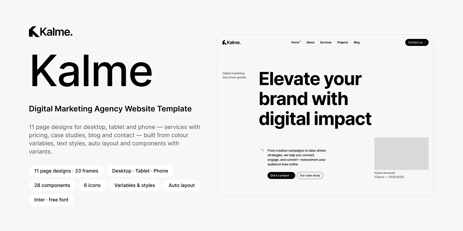
The Kalme design as an editable Figma file: every page at desktop, tablet and phone size, the colour variables and text styles, and the components the pages are built from. Read in this order, or jump to what you need.
| Guide | What it covers |
|---|---|
| Getting started | Opening the file, the font, and a tour of what is on the canvas |
| Colours and text styles | Colour variables and text styles, and how to rebrand the whole file from them |
| Components | Every component and its variants, and how to use them |
| Editing the design | Changing text and images, building new pages and sections, working across breakpoints |
| From design to website | Turning the design into a website: developers, Dev Mode, exports, the Kalme code and Framer editions |
| Troubleshooting and questions | Missing fonts, grey photos, questions and answers |
In a hurry
Section titled “In a hurry”- Import the file into your Figma account (Getting started).
- Install Inter if Figma asks for it — it is the only font.
- Change the colour variables to your brand’s (Colours and text styles); every page follows.
- Replace the logo in the Logo component and the photos on the pages (Editing the design).
- Rewrite the text, page by page, starting with Home.
What is in the file
Section titled “What is in the file”- Organised in pages: Cover, Read Me, Style Guide, Components, Icons, and one page per breakpoint.
- 11 pages, 3 sizes each: Home, About, Services, Service detail, Projects, Project detail, Blog, Blog post, Contact, Terms of Service and 404 — at 1200 px (desktop), 810 px (tablet) and 390 px (phone), 33 frames in all.
- Variables and styles: colour variables for the whole palette, text styles for headings at each breakpoint, paragraphs, buttons, the menu and section labels, and a layout grid style per breakpoint. Every text and colour in the design uses one.
- 28 components, 86 variants, each with a description: header, menu, footer, buttons and links with their hover states, the form parts and the submit button’s loading, success and error states, the services accordion, service rows and cards, the pricing card with its weekly / monthly switch, project, post, value, team and testimonial cards, and the call to action with its moving image strip.
- Six Phosphor icons, one component each.
- Photos are placeholders, each at the size and crop the layout expects — drop in your own. The previews use photos from Unsplash and video stills from Pexels, good free sources; they are not included because their licences don’t allow selling them unmodified.
Getting help
Section titled “Getting help”- Your licence terms: License.
- Support and updates: https://framebrick.co/support.
- Want it done for you? Marcframe, the studio behind this template, updates templates to your needs, builds custom templates and designs new sites — also on Contra.