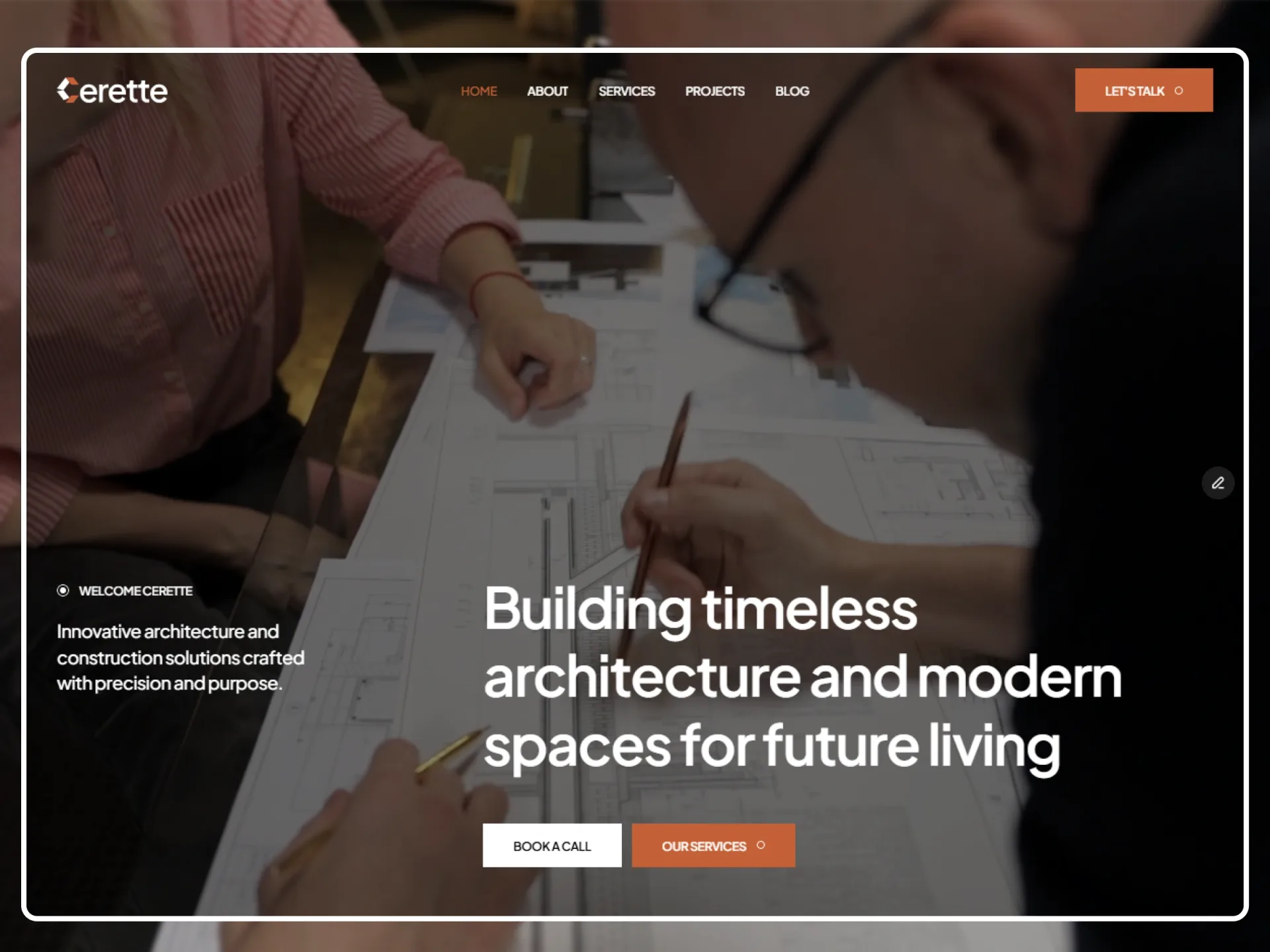
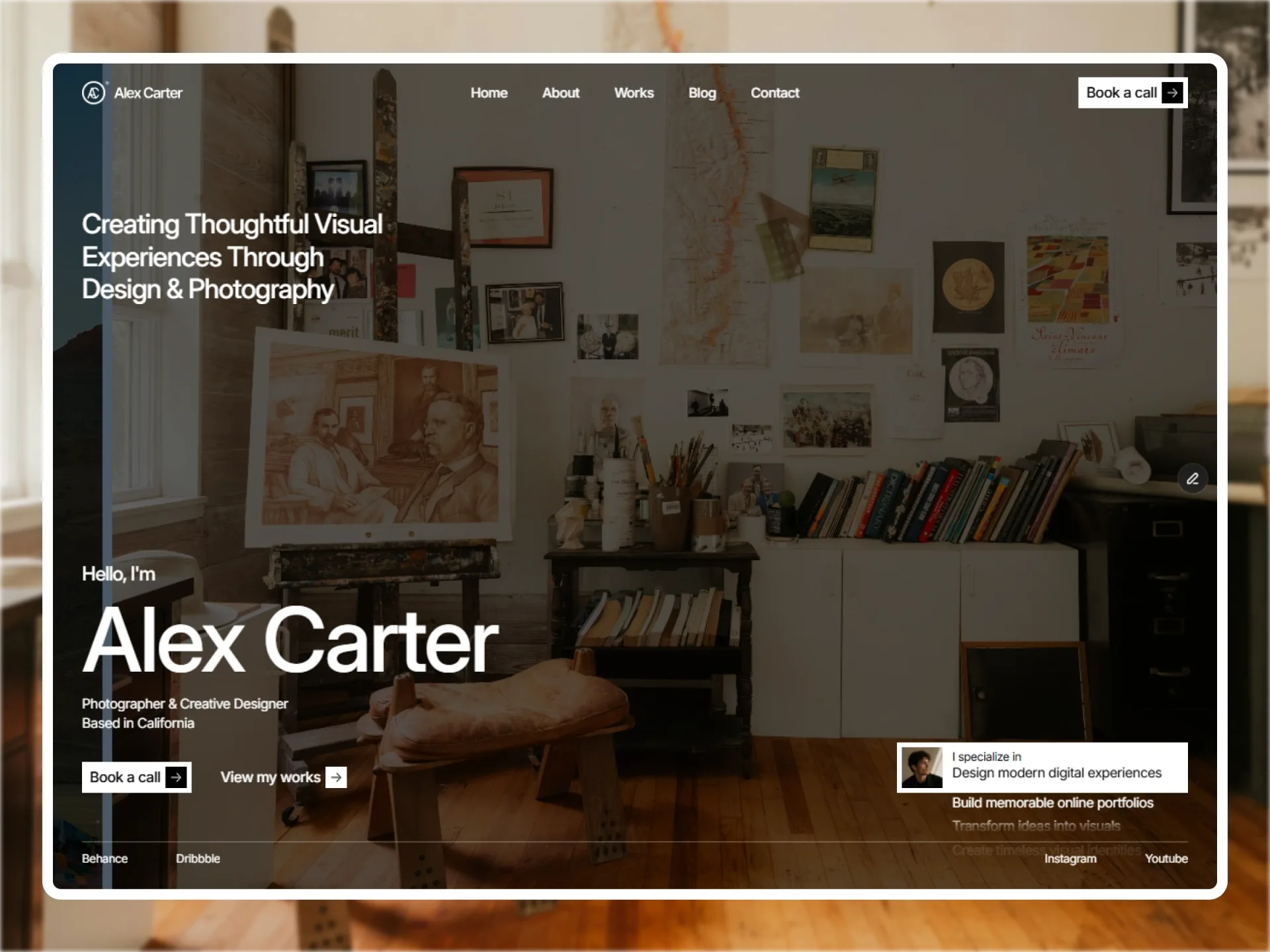
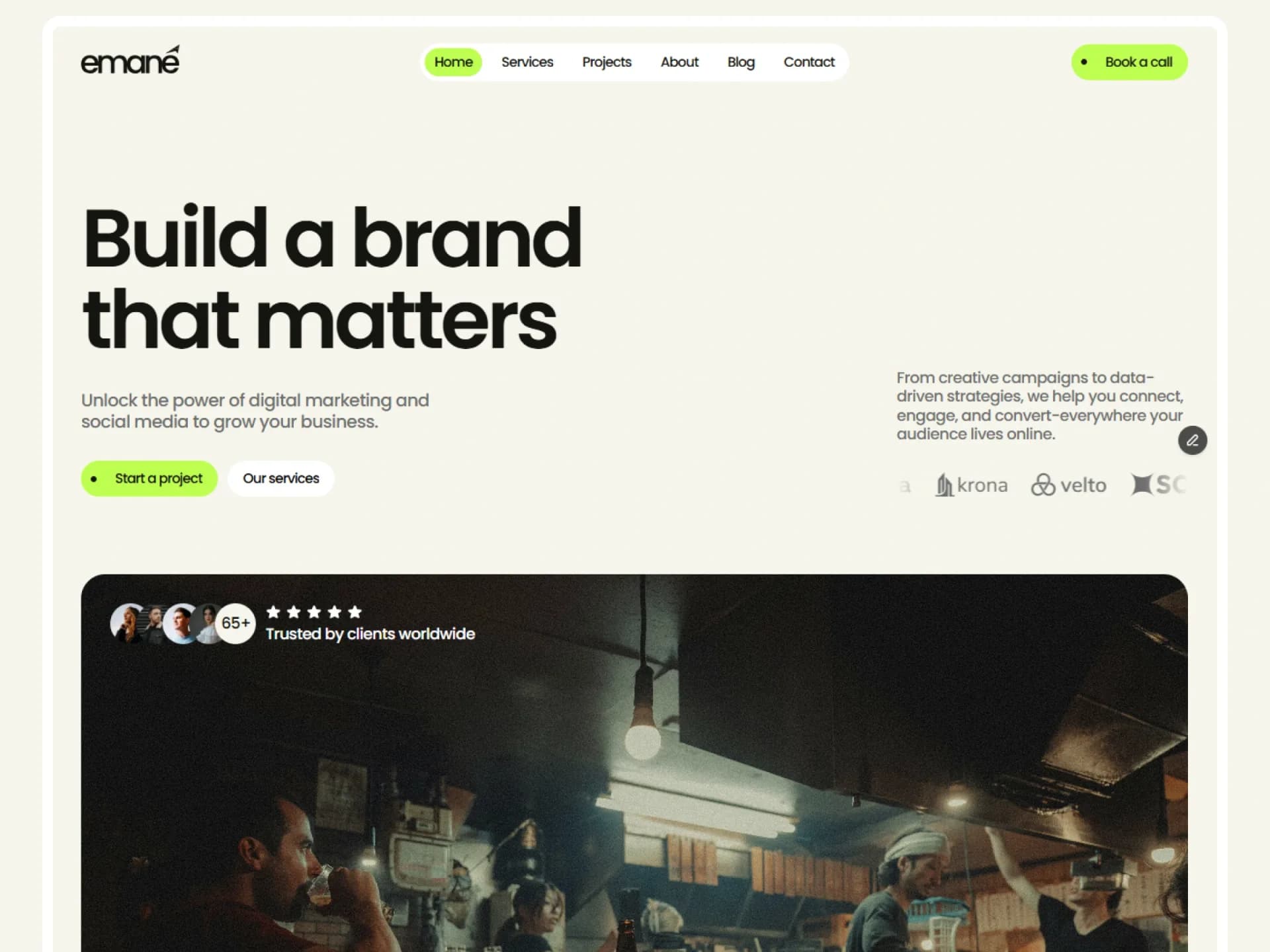
Header Centered
Sticky header with the brand on the left, navigation centered and a call to action on the right. It clears and fades on scroll down; link labels roll on hover.
New · page sections
Full-width sections taken from Framebrick templates — their layout, interactions and motion, in one default look. Stack them like a wireframe, then change a few CSS variables and every block follows.
$ npx shadcn@latest add https://framebrick.co/r/blocks/hero-title.jsonHeadline with rating, avatars and two actions, then a row of recent projects that open on hover.
Page heading and summary over a wide image that settles into place as it scrolls into view; optional breadcrumbs and facts.
Inner page opening above a grid of a large cover photo and two photo + fact rows.
Inner page opening: breadcrumbs, page heading, divider and a short description.
Section header and a two-column grid of project cards whose photos zoom on hover.
Every project as a grid of cards or a compact list, with a Grid / List switch.
End of a project page: the heading beside the next project's card.
A project's overview, process and results, with parallax photos and photos that move into place as you scroll.
Wireframe first, theme second
Every block sets its own spacing and width, so any order stacks cleanly, and reads only the shadcn colors plus a few block tokens — heading font, type scale, section padding, container and gutter. Change them in app/globals.css and the whole page follows.
Be the first to know
One short email when we release a template or a free component. No spam — unsubscribe anytime.
We use your email only for Framebrick updates. Privacy policy