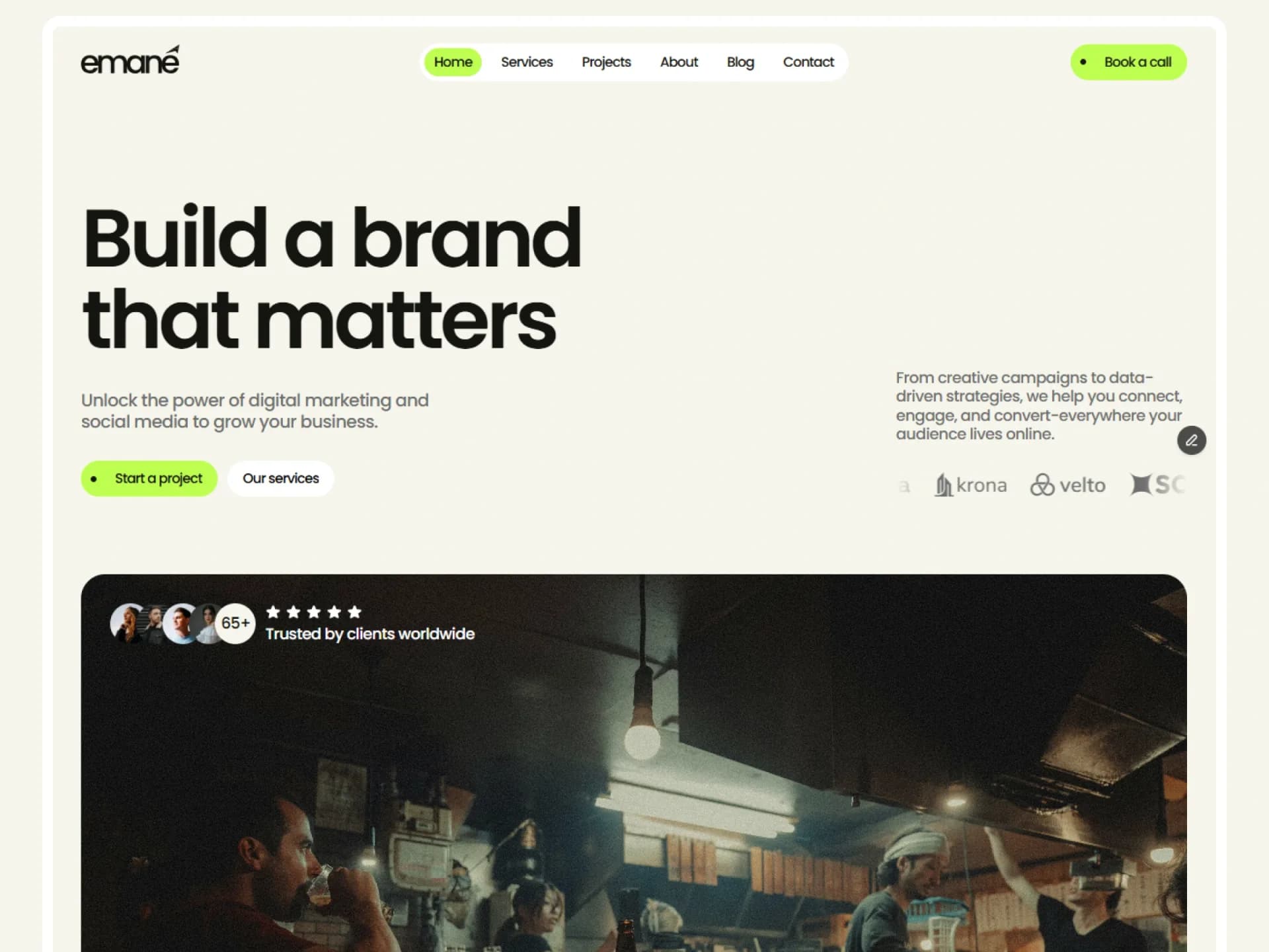
Hero
Hero Title
Inner page opening: breadcrumbs, page heading, divider and a short description.
Layout and motion from the Nitip template — see it in contextimport Link from "next/link";
import { cn } from "@/lib/utils";
/*
* Hero Title — the opening of an inner page: breadcrumbs, the page heading, a divider and a short description.
* Source: marcframe/nitip → design-system/components/layout/PageTitle.tsx, as used by the Services, Projects, Blog,
* Careers and Contact pages.
*
* Layout kept from Framer: breadcrumbs 12px above the heading, a full-width divider, then the description up to
* 36rem wide (wide: 52rem, as on Careers). No motion.
*/
export type HeroTitleProps = {
/** Heading level: h1 when the hero opens the page. */
as?: "h1" | "h2";
/** Trail above the heading; the last item is the current page. Pass [] to leave it out. */
breadcrumbs?: { label: string; href?: string }[];
title?: string;
description?: string;
/** A longer description gets the wider measure. */
wide?: boolean;
className?: string;
};
const defaults = {
breadcrumbs: [{ label: "Home", href: "/" }, { label: "Services" }],
title: "Services",
description:
"Strategy, content and campaigns under one roof — everything a growing brand needs to be seen, remembered and chosen.",
};
export function HeroTitle({
as: Heading = "h1",
breadcrumbs = defaults.breadcrumbs,
title = defaults.title,
description = defaults.description,
wide = false,
className,
}: HeroTitleProps) {
return (
<section className={cn("py-(--section-y)", className)}>
<div className="mx-auto flex max-w-(--container) flex-col gap-8 px-(--gutter)">
<div className="flex flex-col gap-3">
{breadcrumbs.length > 0 && (
<nav aria-label="Breadcrumb">
<ol className="flex flex-wrap items-center gap-1.5 text-sm text-muted-foreground">
{breadcrumbs.map((crumb, i) => {
const last = i === breadcrumbs.length - 1;
return (
<li key={`${crumb.label}-${i}`} className="inline-flex items-center gap-1.5">
{crumb.href && !last ? (
<Link href={crumb.href} className="transition-colors hover:text-foreground">
{crumb.label}
</Link>
) : (
<span aria-current={last ? "page" : undefined} className={cn(last && "text-foreground")}>
{crumb.label}
</span>
)}
{!last && <span aria-hidden>/</span>}
</li>
);
})}
</ol>
</nav>
)}
<Heading className="font-heading text-h1 font-semibold tracking-tight text-balance">{title}</Heading>
</div>
<hr className="border-border" />
{description && (
<p className={`text-lead text-pretty text-muted-foreground ${wide ? "max-w-[52rem]" : "max-w-xl"}`}>
{description}
</p>
)}
</div>
</section>
);
}Installation
$ npx shadcn@latest add https://framebrick.co/r/blocks/hero-title.json1. Add the block tokens to
app/globals.cssonce (theming).npx shadcn@latest add https://framebrick.co/r/blocks/tokens.json2. Copy the block into
components/hero-title.tsx.import Link from "next/link"; import { cn } from "@/lib/utils"; /* * Hero Title — the opening of an inner page: breadcrumbs, the page heading, a divider and a short description. * Source: marcframe/nitip → design-system/components/layout/PageTitle.tsx, as used by the Services, Projects, Blog, * Careers and Contact pages. * * Layout kept from Framer: breadcrumbs 12px above the heading, a full-width divider, then the description up to * 36rem wide (wide: 52rem, as on Careers). No motion. */ export type HeroTitleProps = { /** Heading level: h1 when the hero opens the page. */ as?: "h1" | "h2"; /** Trail above the heading; the last item is the current page. Pass [] to leave it out. */ breadcrumbs?: { label: string; href?: string }[]; title?: string; description?: string; /** A longer description gets the wider measure. */ wide?: boolean; className?: string; }; const defaults = { breadcrumbs: [{ label: "Home", href: "/" }, { label: "Services" }], title: "Services", description: "Strategy, content and campaigns under one roof — everything a growing brand needs to be seen, remembered and chosen.", }; export function HeroTitle({ as: Heading = "h1", breadcrumbs = defaults.breadcrumbs, title = defaults.title, description = defaults.description, wide = false, className, }: HeroTitleProps) { return ( <section className={cn("py-(--section-y)", className)}> <div className="mx-auto flex max-w-(--container) flex-col gap-8 px-(--gutter)"> <div className="flex flex-col gap-3"> {breadcrumbs.length > 0 && ( <nav aria-label="Breadcrumb"> <ol className="flex flex-wrap items-center gap-1.5 text-sm text-muted-foreground"> {breadcrumbs.map((crumb, i) => { const last = i === breadcrumbs.length - 1; return ( <li key={`${crumb.label}-${i}`} className="inline-flex items-center gap-1.5"> {crumb.href && !last ? ( <Link href={crumb.href} className="transition-colors hover:text-foreground"> {crumb.label} </Link> ) : ( <span aria-current={last ? "page" : undefined} className={cn(last && "text-foreground")}> {crumb.label} </span> )} {!last && <span aria-hidden>/</span>} </li> ); })} </ol> </nav> )} <Heading className="font-heading text-h1 font-semibold tracking-tight text-balance">{title}</Heading> </div> <hr className="border-border" /> {description && ( <p className={`text-lead text-pretty text-muted-foreground ${wide ? "max-w-[52rem]" : "max-w-xl"}`}> {description} </p> )} </div> </section> ); }
Usage
import { HeroTitle } from "@/components/hero-title";

<HeroTitle
  breadcrumbs={[{ label: "Home", href: "/" }, { label: "Services" }]}
  title="Services"
  description="Strategy, content and campaigns under one roof."
/>
Props
| Prop | Type | Default | Description |
|---|---|---|---|
| as | "h1" | "h2" | "h1" | Heading level of the title. |
| breadcrumbs | { label, href? }[] | Home / Services | Trail above the heading; [] hides it. |
| title / description | string | — | Page heading and the text under the divider. |
| wide | boolean | false | Wider measure (52rem instead of 36rem) for a longer description. |
| className | string | — | Classes for the <section>. |
- No motion: the layout is the point — follow it with a list block such as services or projects.
AI prompt
Paste into v0, Lovable, Bolt or Claude to rebuild this block in your own project.
Create a React + Tailwind CSS block called HeroTitle (Next.js).
- <section className="py-(--section-y)">, container mx-auto max-w-(--container) px-(--gutter), column gap-8.
- Breadcrumbs (nav aria-label="Breadcrumb", text-sm text-muted-foreground, "/" separators aria-hidden, links hover:text-foreground,
  last item text-foreground aria-current="page") 12px above an h1 font-heading text-h1 font-semibold tracking-tight.
- A full-width <hr className="border-border">, then a text-lead muted description, max-w-xl (or 52rem when wide).
- Only shadcn variables and block tokens.