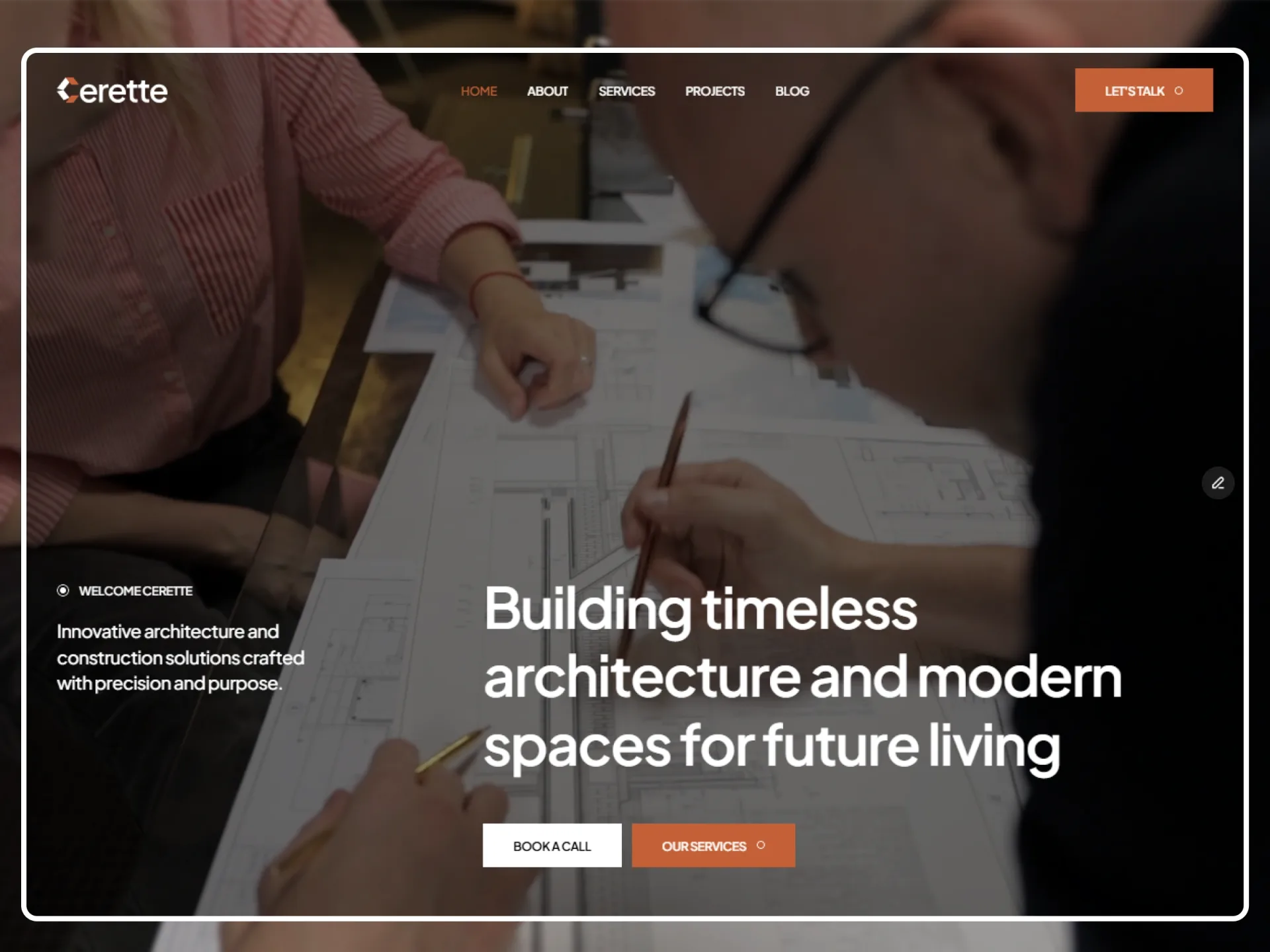
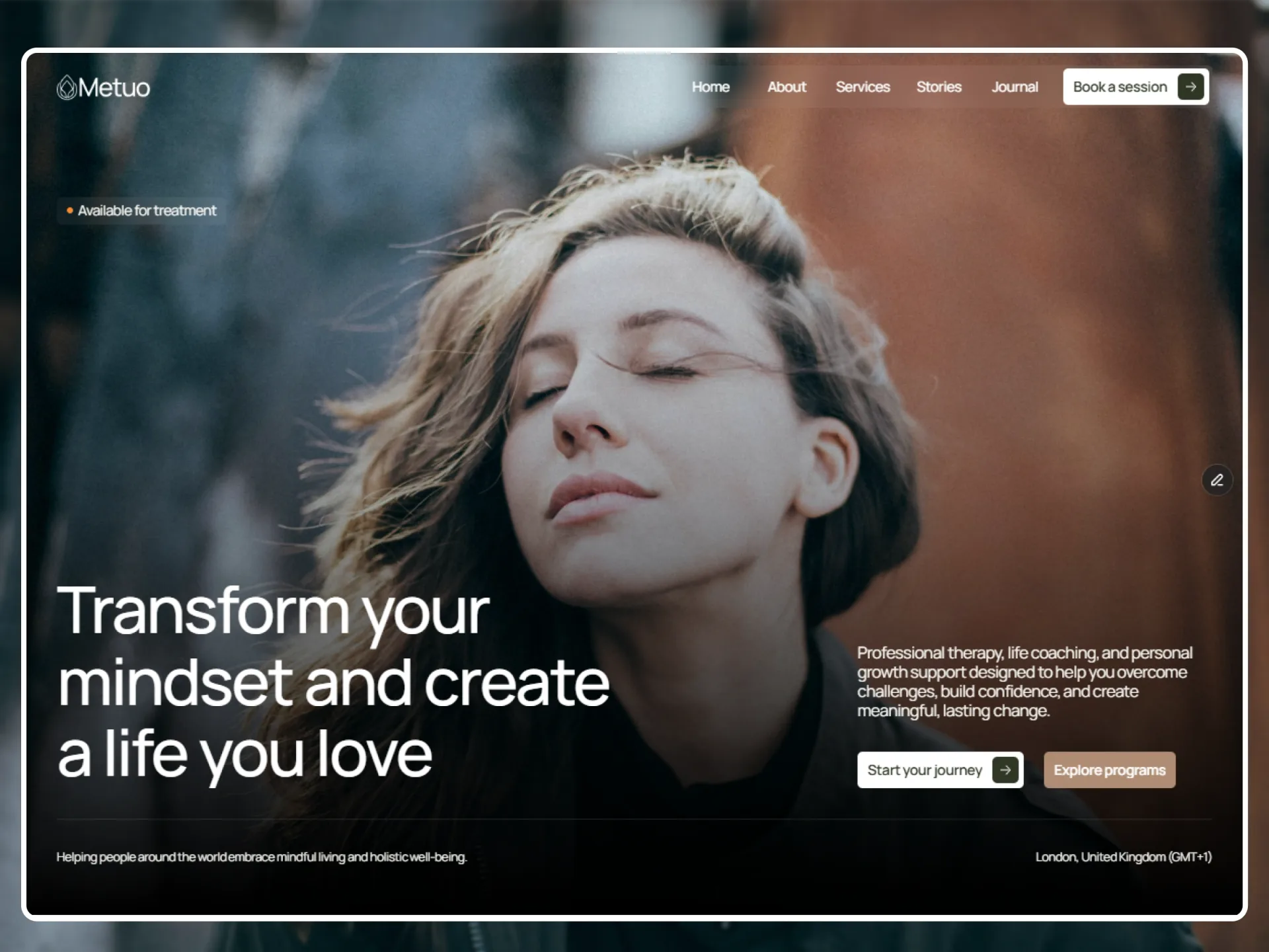
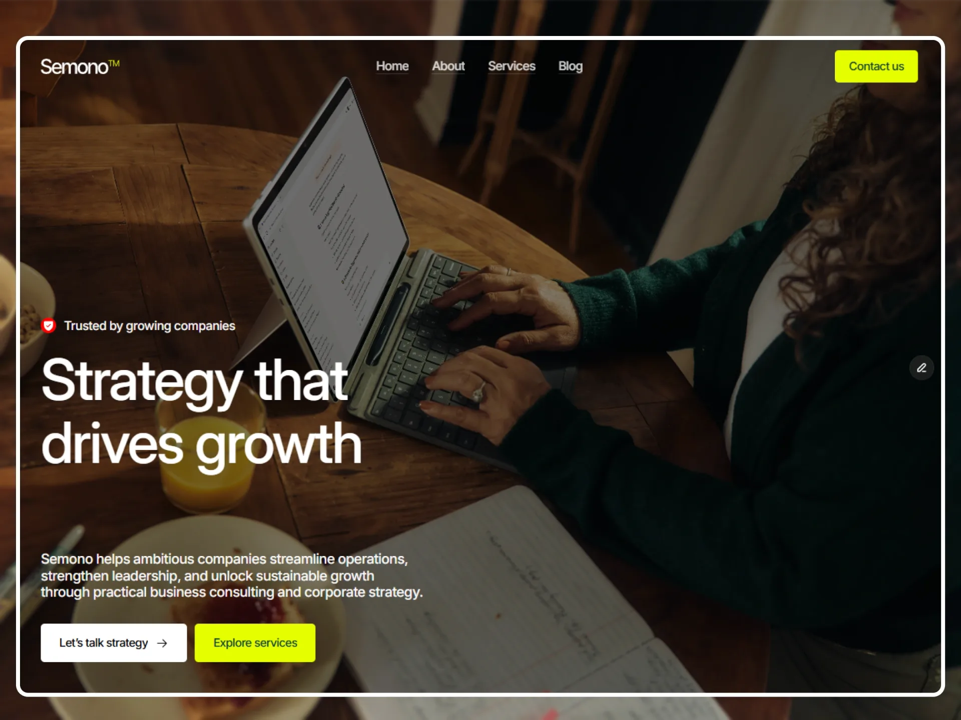
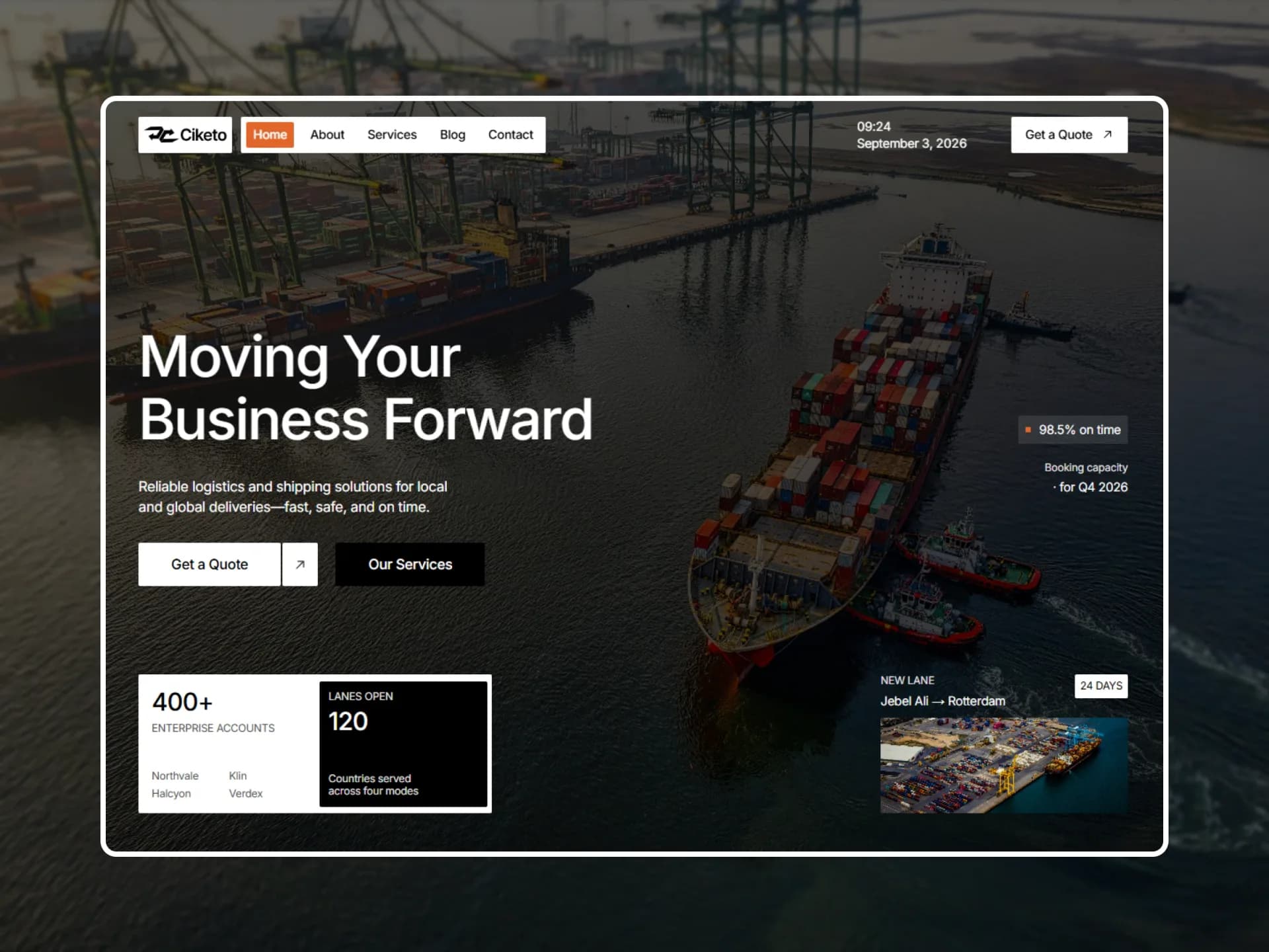
CTA
CTA Card
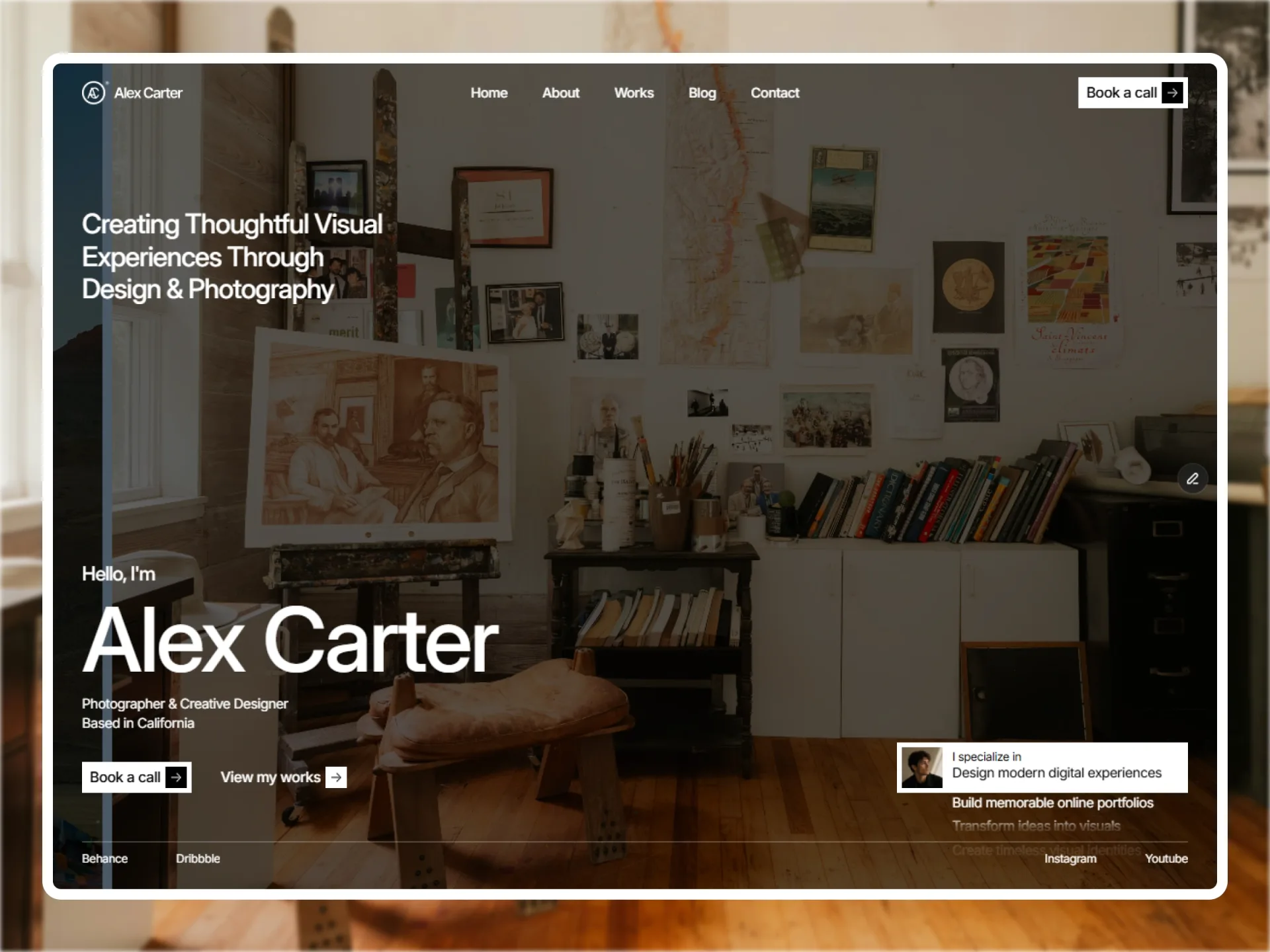
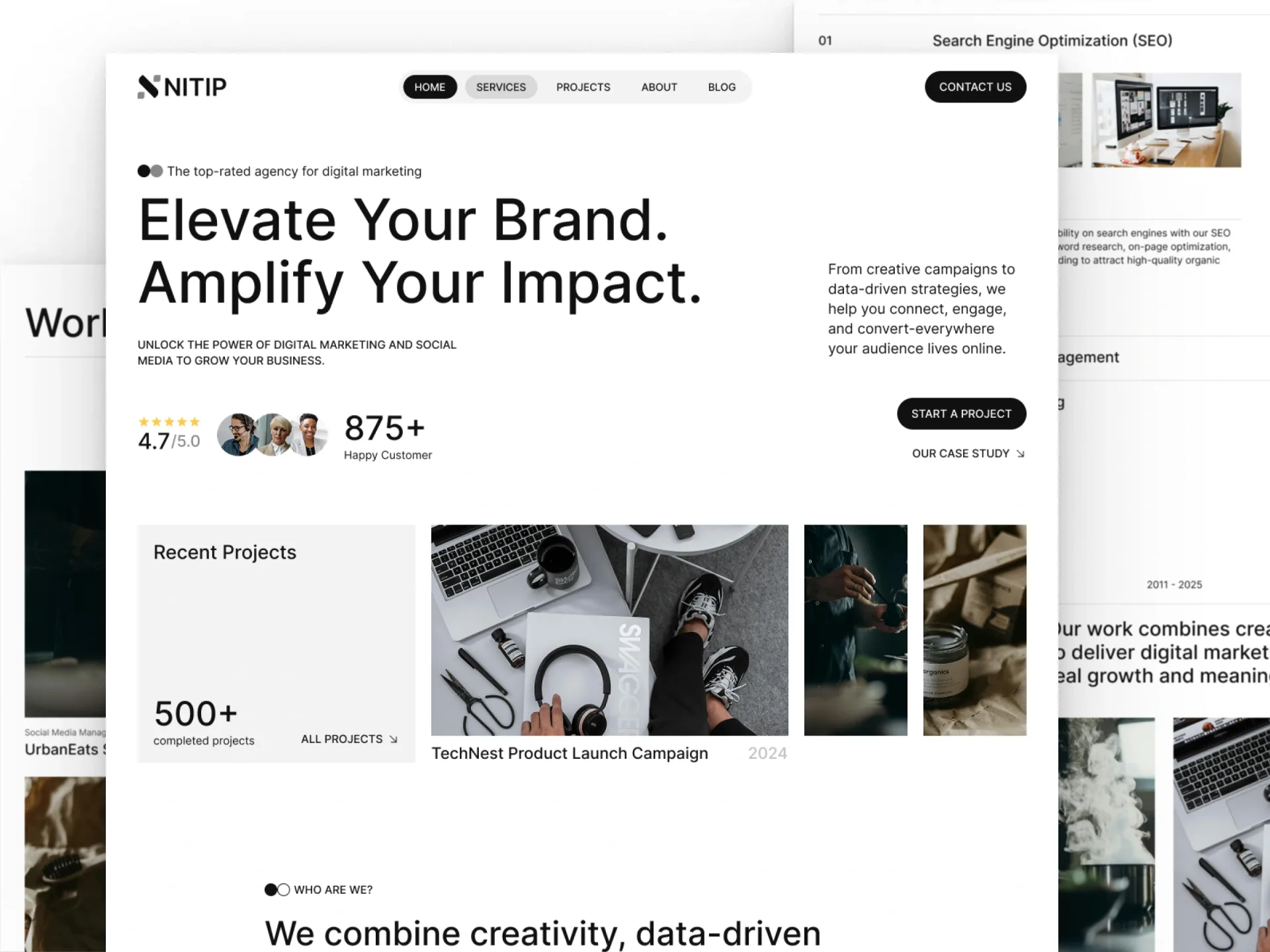
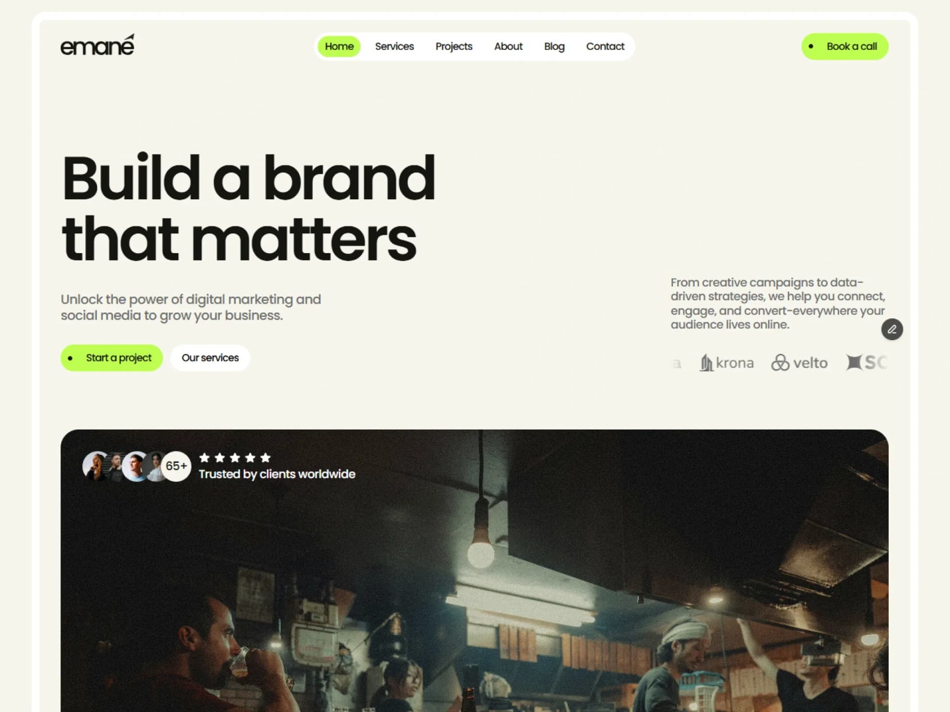
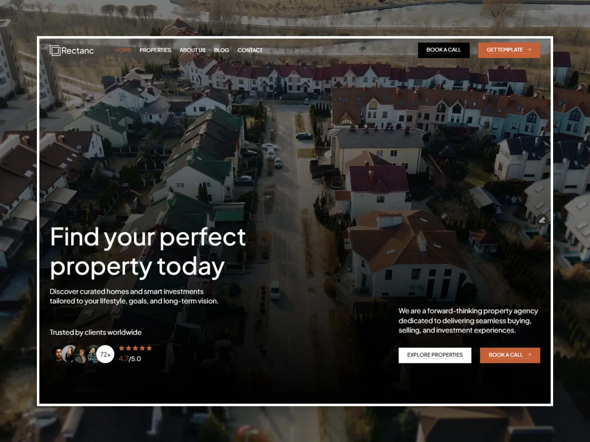
An invitation as one rounded card: the brand, a heading with an accent line, a lead and two buttons beside a photo, dark or light.
Layout and motion from the Semono template — see it in contextTry it in the page builderBlocks come with Pro
Preview every block now, in any theme and at any width. The source, the install command and the AI prompt unlock when Pro opens, once the catalog reaches 20 templates.
Props
| Prop | Type | Default | Description |
|---|---|---|---|
| brand | string | "Northstar" | The brand at the top of the panel; empty for none. |
| title | string | — | The h2, up to 565px. |
| accent | string | — | The heading's last sentence, on a line of its own in the panel's softer colour; empty for none. |
| lead | string | — | Up to 469px. |
| actions | { label, href }[] | 2 buttons | One or two buttons: the first filled, the second outlined. |
| image | { src, alt } | — | The photo beside the panel (350px tall under it on phones). |
| tone | "dark" | "light" | "dark" | dark: the card in the foreground colour; light: on the muted surface. |
| buttonStyle | "spring" | "flip" | "sweep" | "spring" | The look of both buttons: SpringButton, FlipButton or SweepButton (they take the same props). |
| reveal | boolean | true | false: the card does not rise in. |
| className | string | — | Classes for the <section>. |
- The panel and the photo share the card 7:3 from 768px and 52:48 from 1024px; the panel's padding is 60 / 80 / 100px on top and bottom. The buttons are a slot: buttonStyle picks from buttonSlot, whose three components share one interface.
- The whole card rises 40px into place from transparent once as its first pixel comes into view (scroll-reveal); still with reveal={false} or reduced motion.