Media
Media Gallery
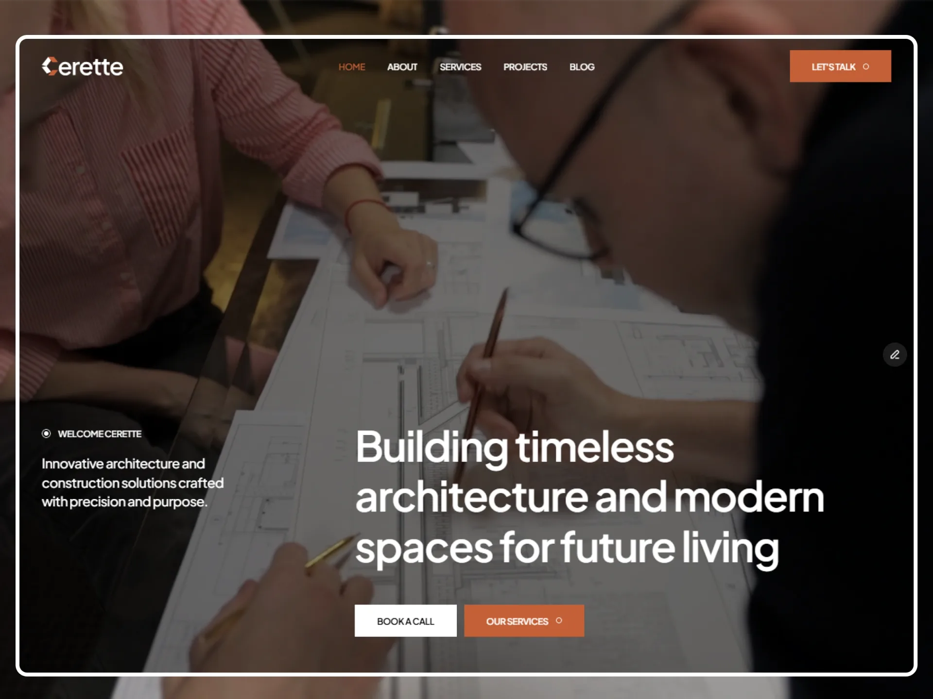
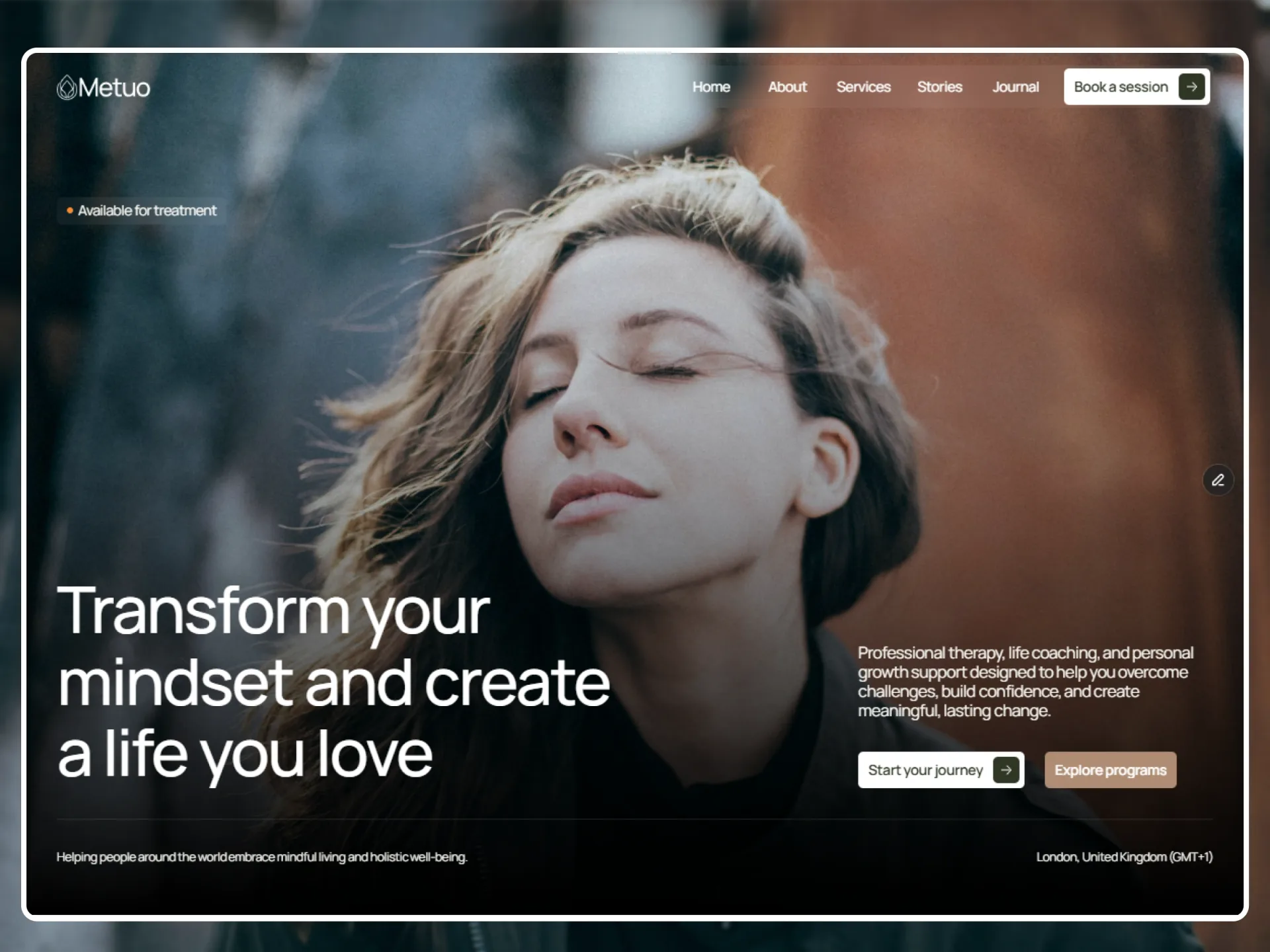
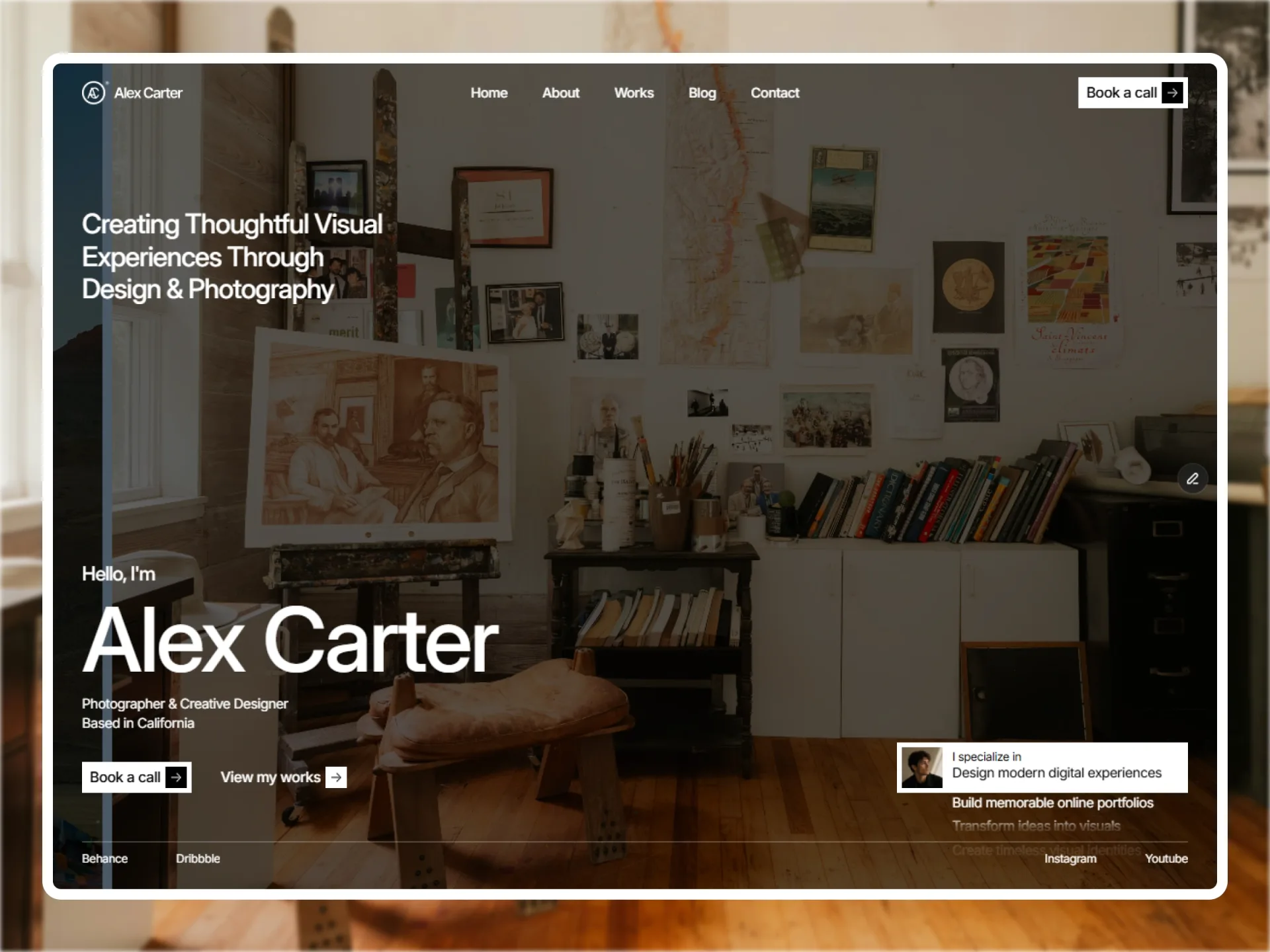
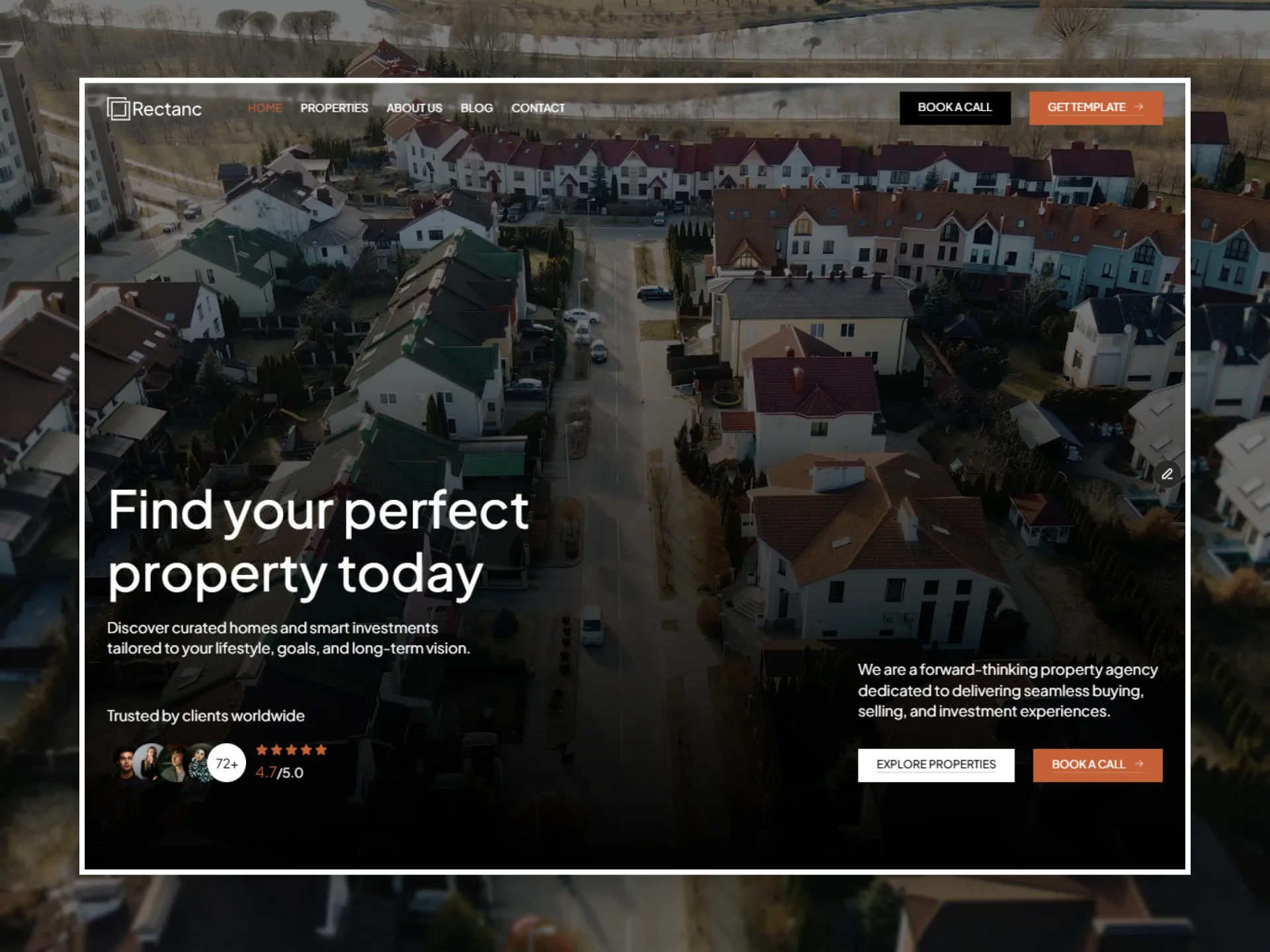
Photos in two columns at their own proportions, the first half on the left and the rest on the right, each rising into view.
Layout and motion from the Tustel template — see it in contextTry it in the page builderBlocks come with Pro
Preview every block now, in any theme and at any width. The source, the install command and the AI prompt unlock when Pro opens, once the catalog reaches 20 templates.
Props
| Prop | Type | Default | Description |
|---|---|---|---|
| title | string | "" | A heading above the photos; empty for a visually hidden "Gallery". |
| label | string | "" | A small line above the heading; empty for none. |
| images | { src, alt, ratio? }[] | 6 photos | In order: the first half (rounded up) down the left column, the rest down the right. ratio ("4 / 5") sizes a photo's box before it loads. |
| className | string | — | Classes for the <section>. |
- Two equal columns 20px apart at every width, each photo the column's width at its own proportions, rounded to the theme's radius. No hover and no lightbox.
- Each photo rises into place from transparent once half of it is in view (scroll-reveal); in place at once with reduced motion.