Features & services
Services Accordion
Section header and every service as a numbered row that opens to photos, a description, a link and the tools used.
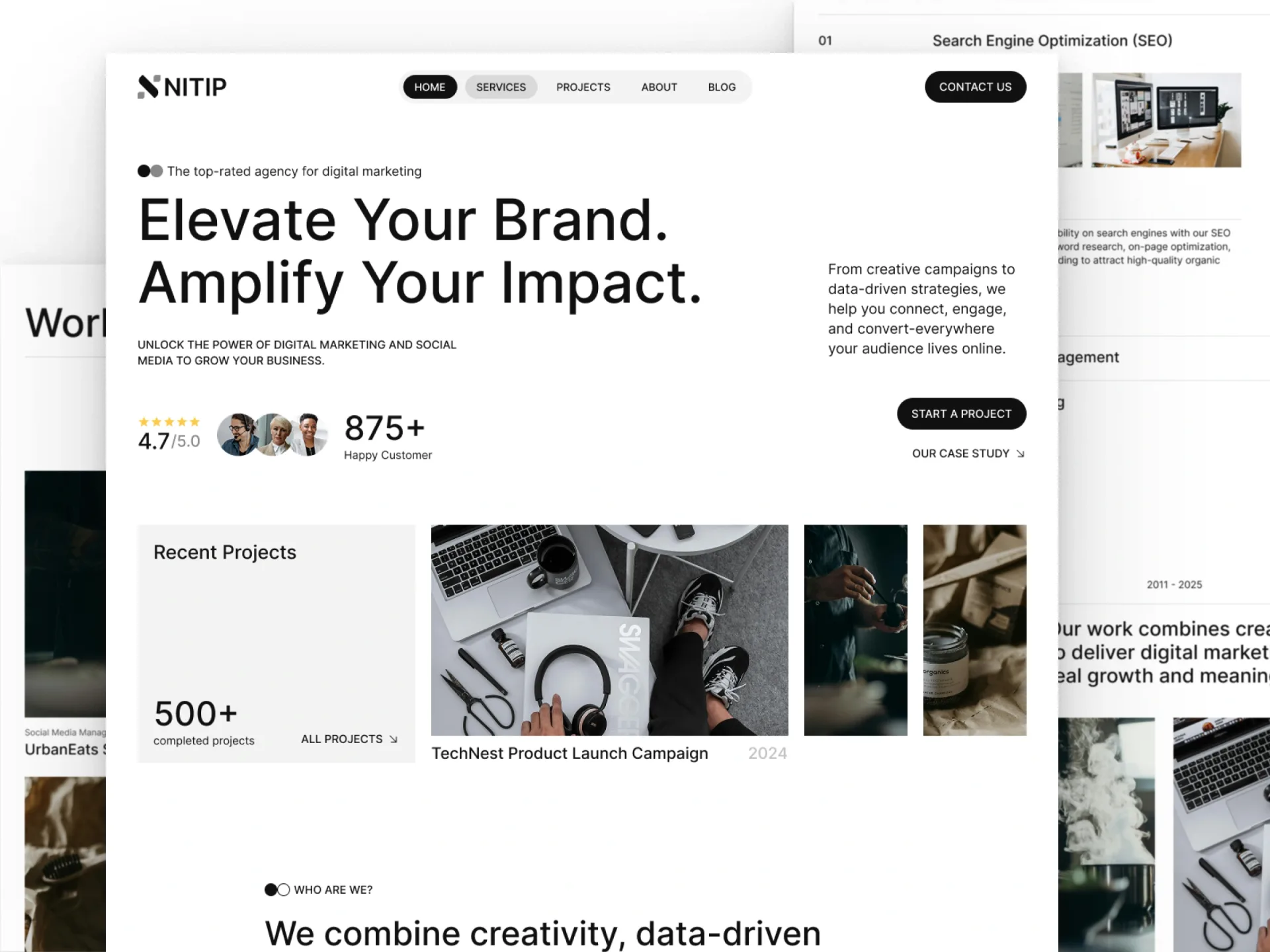
Layout and motion from the Nitip template — see it in contextimport { AccordionList } from "@/components/ui/accordion-list";
import { SpringButton } from "@/components/ui/spring-button";
import { UnderlineLink } from "@/components/ui/underline-link";
import { cn } from "@/lib/utils";
/*
* Services Accordion — a section header (title, action, divider, lead) and every service as a numbered row that
* opens to two photos, a description, a link and the tools used.
* Source: marcframe/nitip → components/sections/ServicesSection.tsx, ServiceCatalogSection.tsx and
* MoreServicesSection.tsx (+ design-system SectionHeader, ServiceList, TextPoint).
*
* Layout kept from Framer: the header's title and button share a row from 768px (button under the title on phones),
* the lead sits at the right edge up to 48rem wide. An open row shows the tools first on phones; from 768px the
* photos, description and link fill the row and the tools take a 256px (1024px: 300px) column on the right.
* Motion kept (accordion-list): rows open on their own, the first starts open, closed rows sit at 50% until hovered,
* height opens with a spring (bounce 0, 0.4s) while the content fades in. Changed: Nitip's divider segment in front
* of the title isn't part of accordion-list — rows use full-width dividers.
*/
export type ServiceTool = { label: string; href?: string };
export type ServiceItem = {
title: string;
href: string;
description: string;
images: [{ src: string; alt: string }, { src: string; alt: string }];
tools?: ServiceTool[];
};
export type ServicesAccordionProps = {
title?: string;
/** Short line next to the title from 768px (a year range, a count). */
meta?: string;
lead?: string;
action?: { label: string; href: string };
services?: ServiceItem[];
/** How many rows start open. */
initiallyOpen?: number;
labels?: { details: string; tools: string; more: string };
className?: string;
};
const photo = (id: string) => `https://images.unsplash.com/${id}?auto=format&fit=crop&w=900&q=80`;
const defaults = {
title: "Expertise",
lead: "We plan, make and measure the work that grows brands — one team from the first idea to the last report.",
action: { label: "All services", href: "/services" },
labels: { details: "What we do", tools: "Tools", more: "Learn more" },
services: [
{
title: "Social media management",
href: "/services/social-media",
description:
"Channel strategy, a steady content calendar and community care, so your audience hears from you often and in your own voice.",
images: [
{ src: photo("photo-1515378791036-0648a3ef77b2"), alt: "Person in a yellow sweater typing on a laptop" },
{ src: photo("photo-1432888498266-38ffec3eaf0a"), alt: "Hands sketching app wireframes next to a phone" },
],
tools: [
{ label: "Meta Business Suite", href: "https://business.facebook.com" },
{ label: "Later", href: "https://later.com" },
{ label: "Canva", href: "https://www.canva.com" },
],
},
{
title: "Search engine optimization",
href: "/services/seo",
description:
"Technical fixes, content that answers real searches and links earned the honest way — traffic that keeps coming.",
images: [
{ src: photo("photo-1460925895917-afdab827c52f"), alt: "Laptop on a desk showing an analytics dashboard" },
{ src: photo("photo-1551288049-bebda4e38f71"), alt: "Charts of traffic data on a dark screen" },
],
tools: [
{ label: "Google Search Console", href: "https://search.google.com/search-console" },
{ label: "Ahrefs", href: "https://ahrefs.com" },
{ label: "Screaming Frog", href: "https://www.screamingfrog.co.uk" },
],
},
{
title: "Paid advertising",
href: "/services/paid-advertising",
description:
"Search and social campaigns built around your margins, tested weekly and reported in plain numbers.",
images: [
{ src: photo("photo-1486312338219-ce68d2c6f44d"), alt: "Hands typing on a laptop keyboard" },
{ src: photo("photo-1497215728101-856f4ea42174"), alt: "Desk with a laptop beside tall windows and potted plants" },
],
tools: [
{ label: "Google Ads", href: "https://ads.google.com" },
{ label: "Meta Ads Manager", href: "https://www.facebook.com/business/tools/ads-manager" },
{ label: "LinkedIn Campaign Manager", href: "https://business.linkedin.com/marketing-solutions" },
],
},
{
title: "Content & copywriting",
href: "/services/content",
description: "Articles, scripts and campaign lines that sound like you and give people a reason to act.",
images: [
{ src: photo("photo-1455390582262-044cdead277a"), alt: "Fountain pen writing on paper" },
{ src: photo("photo-1519389950473-47ba0277781c"), alt: "Team working on laptops around a table, seen from above" },
],
tools: [
{ label: "Notion", href: "https://www.notion.so" },
{ label: "Grammarly", href: "https://www.grammarly.com" },
],
},
{
title: "Brand strategy",
href: "/services/brand-strategy",
description: "Positioning, messaging and a visual direction everyone on your team can use with confidence.",
images: [
{ src: photo("photo-1531403009284-440f080d1e12"), alt: "Hands pointing at wireframe sketches pinned to a wall" },
{ src: photo("photo-1552664730-d307ca884978"), alt: "Team at a table in front of a wall of sticky notes" },
],
tools: [
{ label: "Miro", href: "https://miro.com" },
{ label: "Figma", href: "https://www.figma.com" },
],
},
] as ServiceItem[],
};
export function ServicesAccordion({
title = defaults.title,
meta,
lead = defaults.lead,
action = defaults.action,
services = defaults.services,
initiallyOpen = 1,
labels = defaults.labels,
className,
}: ServicesAccordionProps) {
return (
<section className={cn("py-(--section-y)", className)}>
<div className="mx-auto flex max-w-(--container) flex-col gap-12 px-(--gutter) md:gap-16 lg:gap-20">
<div className="flex flex-col gap-5">
<div className="flex flex-col items-start justify-between gap-5 md:flex-row md:items-end">
<h2 className="min-w-0 font-heading text-h2 font-semibold tracking-tight text-balance">{title}</h2>
{meta && <p className="hidden text-muted-foreground md:block">{meta}</p>}
{action && (
<SpringButton href={action.href} arrow={false}>
{action.label}
</SpringButton>
)}
</div>
<hr className="border-border" />
{lead && <p className="max-w-3xl self-end text-h3 font-medium text-pretty">{lead}</p>}
</div>
<AccordionList
type="multiple"
defaultValue={services.slice(0, initiallyOpen).map((service) => service.href)}
items={services.map((service, i) => ({
value: service.href,
marker: String(i + 1).padStart(2, "0"),
title: <span className="font-heading text-h3 font-semibold tracking-tight">{service.title}</span>,
content: <ServiceDetails service={service} labels={labels} />,
}))}
/>
</div>
</section>
);
}
function ServiceDetails({ service, labels }: { service: ServiceItem; labels: typeof defaults.labels }) {
return (
<div className="flex flex-col gap-8 pt-4 pb-4 text-base text-foreground md:flex-row md:items-end md:gap-12 lg:gap-24">
<div className="flex min-w-0 flex-1 flex-col items-start gap-8 md:gap-10">
<div className="grid w-full max-w-3xl gap-4 md:grid-cols-2">
{service.images.map((image) => (
<img
key={image.src}
src={image.src}
alt={image.alt}
className="aspect-[8/5] w-full rounded-lg bg-muted object-cover"
/>
))}
</div>
<div className="flex w-full max-w-3xl flex-col gap-2.5">
<p className="font-medium">{labels.details}</p>
<hr className="border-border" />
<p className="text-muted-foreground">{service.description}</p>
</div>
<UnderlineLink href={service.href}>
{labels.more}
<span className="sr-only">: {service.title}</span>
</UnderlineLink>
</div>
{service.tools && service.tools.length > 0 && (
<div className="flex shrink-0 flex-col gap-2.5 max-md:order-first md:w-64 lg:w-75">
<p className="font-medium">{labels.tools}</p>
<hr className="border-border" />
<ul>
{service.tools.map((tool) => (
<li key={tool.label}>
{tool.href ? (
<a
href={tool.href}
target="_blank"
rel="noopener noreferrer"
className="flex items-center gap-5 border-b border-border py-2.5 transition-colors hover:text-foreground/80 hover:underline hover:underline-offset-4"
>
<span className="flex-1">{tool.label}</span>
<span aria-hidden className="size-2 rounded-full bg-foreground" />
</a>
) : (
<span className="flex items-center gap-5 border-b border-border py-2.5">
<span className="flex-1">{tool.label}</span>
<span aria-hidden className="size-2 rounded-full bg-foreground" />
</span>
)}
</li>
))}
</ul>
</div>
)}
</div>
);
}Installation
$ npx shadcn@latest add https://framebrick.co/r/blocks/services-accordion.json1. Add the Framebrick UI components it uses (they bring Motion).
npx shadcn@latest add https://framebrick.co/r/accordion-list.json https://framebrick.co/r/spring-button.json https://framebrick.co/r/underline-link.json2. Add the block tokens to
app/globals.cssonce (theming).npx shadcn@latest add https://framebrick.co/r/blocks/tokens.json3. Copy the block into
components/services-accordion.tsx.import { AccordionList } from "@/components/ui/accordion-list"; import { SpringButton } from "@/components/ui/spring-button"; import { UnderlineLink } from "@/components/ui/underline-link"; import { cn } from "@/lib/utils"; /* * Services Accordion — a section header (title, action, divider, lead) and every service as a numbered row that * opens to two photos, a description, a link and the tools used. * Source: marcframe/nitip → components/sections/ServicesSection.tsx, ServiceCatalogSection.tsx and * MoreServicesSection.tsx (+ design-system SectionHeader, ServiceList, TextPoint). * * Layout kept from Framer: the header's title and button share a row from 768px (button under the title on phones), * the lead sits at the right edge up to 48rem wide. An open row shows the tools first on phones; from 768px the * photos, description and link fill the row and the tools take a 256px (1024px: 300px) column on the right. * Motion kept (accordion-list): rows open on their own, the first starts open, closed rows sit at 50% until hovered, * height opens with a spring (bounce 0, 0.4s) while the content fades in. Changed: Nitip's divider segment in front * of the title isn't part of accordion-list — rows use full-width dividers. */ export type ServiceTool = { label: string; href?: string }; export type ServiceItem = { title: string; href: string; description: string; images: [{ src: string; alt: string }, { src: string; alt: string }]; tools?: ServiceTool[]; }; export type ServicesAccordionProps = { title?: string; /** Short line next to the title from 768px (a year range, a count). */ meta?: string; lead?: string; action?: { label: string; href: string }; services?: ServiceItem[]; /** How many rows start open. */ initiallyOpen?: number; labels?: { details: string; tools: string; more: string }; className?: string; }; const photo = (id: string) => `https://images.unsplash.com/${id}?auto=format&fit=crop&w=900&q=80`; const defaults = { title: "Expertise", lead: "We plan, make and measure the work that grows brands — one team from the first idea to the last report.", action: { label: "All services", href: "/services" }, labels: { details: "What we do", tools: "Tools", more: "Learn more" }, services: [ { title: "Social media management", href: "/services/social-media", description: "Channel strategy, a steady content calendar and community care, so your audience hears from you often and in your own voice.", images: [ { src: photo("photo-1515378791036-0648a3ef77b2"), alt: "Person in a yellow sweater typing on a laptop" }, { src: photo("photo-1432888498266-38ffec3eaf0a"), alt: "Hands sketching app wireframes next to a phone" }, ], tools: [ { label: "Meta Business Suite", href: "https://business.facebook.com" }, { label: "Later", href: "https://later.com" }, { label: "Canva", href: "https://www.canva.com" }, ], }, { title: "Search engine optimization", href: "/services/seo", description: "Technical fixes, content that answers real searches and links earned the honest way — traffic that keeps coming.", images: [ { src: photo("photo-1460925895917-afdab827c52f"), alt: "Laptop on a desk showing an analytics dashboard" }, { src: photo("photo-1551288049-bebda4e38f71"), alt: "Charts of traffic data on a dark screen" }, ], tools: [ { label: "Google Search Console", href: "https://search.google.com/search-console" }, { label: "Ahrefs", href: "https://ahrefs.com" }, { label: "Screaming Frog", href: "https://www.screamingfrog.co.uk" }, ], }, { title: "Paid advertising", href: "/services/paid-advertising", description: "Search and social campaigns built around your margins, tested weekly and reported in plain numbers.", images: [ { src: photo("photo-1486312338219-ce68d2c6f44d"), alt: "Hands typing on a laptop keyboard" }, { src: photo("photo-1497215728101-856f4ea42174"), alt: "Desk with a laptop beside tall windows and potted plants" }, ], tools: [ { label: "Google Ads", href: "https://ads.google.com" }, { label: "Meta Ads Manager", href: "https://www.facebook.com/business/tools/ads-manager" }, { label: "LinkedIn Campaign Manager", href: "https://business.linkedin.com/marketing-solutions" }, ], }, { title: "Content & copywriting", href: "/services/content", description: "Articles, scripts and campaign lines that sound like you and give people a reason to act.", images: [ { src: photo("photo-1455390582262-044cdead277a"), alt: "Fountain pen writing on paper" }, { src: photo("photo-1519389950473-47ba0277781c"), alt: "Team working on laptops around a table, seen from above" }, ], tools: [ { label: "Notion", href: "https://www.notion.so" }, { label: "Grammarly", href: "https://www.grammarly.com" }, ], }, { title: "Brand strategy", href: "/services/brand-strategy", description: "Positioning, messaging and a visual direction everyone on your team can use with confidence.", images: [ { src: photo("photo-1531403009284-440f080d1e12"), alt: "Hands pointing at wireframe sketches pinned to a wall" }, { src: photo("photo-1552664730-d307ca884978"), alt: "Team at a table in front of a wall of sticky notes" }, ], tools: [ { label: "Miro", href: "https://miro.com" }, { label: "Figma", href: "https://www.figma.com" }, ], }, ] as ServiceItem[], }; export function ServicesAccordion({ title = defaults.title, meta, lead = defaults.lead, action = defaults.action, services = defaults.services, initiallyOpen = 1, labels = defaults.labels, className, }: ServicesAccordionProps) { return ( <section className={cn("py-(--section-y)", className)}> <div className="mx-auto flex max-w-(--container) flex-col gap-12 px-(--gutter) md:gap-16 lg:gap-20"> <div className="flex flex-col gap-5"> <div className="flex flex-col items-start justify-between gap-5 md:flex-row md:items-end"> <h2 className="min-w-0 font-heading text-h2 font-semibold tracking-tight text-balance">{title}</h2> {meta && <p className="hidden text-muted-foreground md:block">{meta}</p>} {action && ( <SpringButton href={action.href} arrow={false}> {action.label} </SpringButton> )} </div> <hr className="border-border" /> {lead && <p className="max-w-3xl self-end text-h3 font-medium text-pretty">{lead}</p>} </div> <AccordionList type="multiple" defaultValue={services.slice(0, initiallyOpen).map((service) => service.href)} items={services.map((service, i) => ({ value: service.href, marker: String(i + 1).padStart(2, "0"), title: <span className="font-heading text-h3 font-semibold tracking-tight">{service.title}</span>, content: <ServiceDetails service={service} labels={labels} />, }))} /> </div> </section> ); } function ServiceDetails({ service, labels }: { service: ServiceItem; labels: typeof defaults.labels }) { return ( <div className="flex flex-col gap-8 pt-4 pb-4 text-base text-foreground md:flex-row md:items-end md:gap-12 lg:gap-24"> <div className="flex min-w-0 flex-1 flex-col items-start gap-8 md:gap-10"> <div className="grid w-full max-w-3xl gap-4 md:grid-cols-2"> {service.images.map((image) => ( <img key={image.src} src={image.src} alt={image.alt} className="aspect-[8/5] w-full rounded-lg bg-muted object-cover" /> ))} </div> <div className="flex w-full max-w-3xl flex-col gap-2.5"> <p className="font-medium">{labels.details}</p> <hr className="border-border" /> <p className="text-muted-foreground">{service.description}</p> </div> <UnderlineLink href={service.href}> {labels.more} <span className="sr-only">: {service.title}</span> </UnderlineLink> </div> {service.tools && service.tools.length > 0 && ( <div className="flex shrink-0 flex-col gap-2.5 max-md:order-first md:w-64 lg:w-75"> <p className="font-medium">{labels.tools}</p> <hr className="border-border" /> <ul> {service.tools.map((tool) => ( <li key={tool.label}> {tool.href ? ( <a href={tool.href} target="_blank" rel="noopener noreferrer" className="flex items-center gap-5 border-b border-border py-2.5 transition-colors hover:text-foreground/80 hover:underline hover:underline-offset-4" > <span className="flex-1">{tool.label}</span> <span aria-hidden className="size-2 rounded-full bg-foreground" /> </a> ) : ( <span className="flex items-center gap-5 border-b border-border py-2.5"> <span className="flex-1">{tool.label}</span> <span aria-hidden className="size-2 rounded-full bg-foreground" /> </span> )} </li> ))} </ul> </div> )} </div> ); }
Usage
import { ServicesAccordion } from "@/components/services-accordion";

<ServicesAccordion
  title="Expertise"
  action={{ label: "All services", href: "/services" }}
  services={[
    {
      title: "Paid advertising",
      href: "/services/paid-advertising",
      description: "Search and social campaigns built around your margins.",
      images: [{ src: "/services/ads-1.jpg", alt: "…" }, { src: "/services/ads-2.jpg", alt: "…" }],
      tools: [{ label: "Google Ads", href: "https://ads.google.com" }],
    },
  ]}
/>
Props
| Prop | Type | Default | Description |
|---|---|---|---|
| title / lead | string | — | Section heading (h2) and the large lead under the divider. |
| meta | string | — | Short line beside the title from 768px (a year range, a count). |
| action | { label, href } | All services | Button beside the title; under it on phones. |
| services | { title, href, description, images: [img, img], tools? }[] | 5 services | One row each, numbered 01, 02…; row titles are h3. |
| initiallyOpen | number | 1 | How many rows start open. |
| labels | { details, tools, more } | What we do, Tools, Learn more | Text inside an open row. |
| className | string | — | Classes for the <section>. |
- Rows open on their own (several can be open), the first starts open, closed rows sit at 50% until hovered or focused, and height opens with a spring (bounce 0, 0.4s) while the content fades in.
- An open row shows the tools first on phones; from 768px the tools take a 256px (1024px: 300px) column on the right.
- Tools with an href open in a new tab. Nitip's divider segment in front of the title is not part of accordion-list; rows use full dividers.
AI prompt
Paste into v0, Lovable, Bolt or Claude to rebuild this block in your own project.
Create a React + Tailwind CSS + Motion block called ServicesAccordion (Next.js).
- <section className="py-(--section-y)">, container mx-auto max-w-(--container) px-(--gutter), column gap-12 md:gap-16 lg:gap-20.
- Header: a row from 768px (items-end, justify-between; stacked on phones): h2 font-heading text-h2 font-semibold tracking-tight,
  an optional muted meta, a shadcn-style button; then an <hr>; then a lead (text-h3 font-medium) max-w-3xl aligned to the right edge.
- Rows: divided accordion (border-b), each trigger a button inside an h3 with a muted two-digit number (from 640px), the title
  (font-heading text-h3 semibold) and a plus that rotates 45° when open; aria-expanded / aria-controls; several rows can be
  open; the first starts open; closed rows at opacity 50%, 100% on hover and focus. Panel height 0 → auto with a spring
  (bounce 0, 0.4s), opacity in 0.25s after 0.1s, out in 0.15s; closed panels inert.
- Panel: from 768px a row (items-end, gap-12 / lg:gap-24): left — two 8:5 photos side by side (rounded-lg), "What we do" over an
  <hr> and a muted description, a text link "Learn more" whose underline grows on hover; right — a 256px (lg 300px) "Tools"
  column: <hr> and rows with a border-b, the label and an 8px dot, links open in a new tab. On phones the tools come first.
- Only shadcn variables and block tokens.