Features & services
Services Filter
A centred heading, then category tabs and a search field that filter a grid of service cards without photos: icon, price, two facts and a Book button.
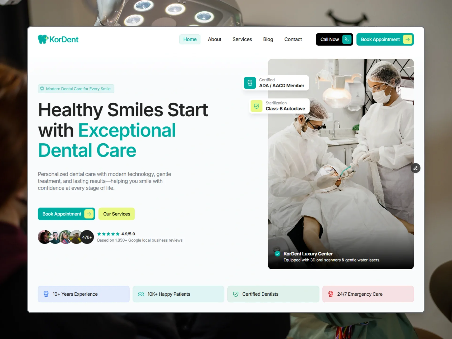
Layout and motion from the KorDent template — see it in contextTry it in the page builderBlocks come with Pro and Ultimate
Preview every block now, in any theme and at any width. The source, the install command and your registry token come with a Pro or Ultimate plan.
Props
| Prop | Type | Default | Description |
|---|---|---|---|
| label / title / lead | string | — | The centred heading block; an empty label or lead is left out. |
| as | "h1" | "h2" | "h2" | h1 when the block opens the page; the card titles then become h2. |
| filter | boolean | true | false: no tabs and no search field, the line only (a service page's list). |
| services | { title, href, category, summary, details?, price?, facts?: { label, value }[], icon?, bookHref? }[] | 7 services | The cards. category makes the tabs; icon is heart, shield, spark, clock, layers, star, smile or activity; without bookHref the Book button is left out. |
| limit | number | 6 | How many matching services are shown. |
| allLabel | string | "All" | The first tab. |
| filterLabel / searchLabel | string | — | The names of the tabs' group and of the search field, for screen readers. |
| searchPlaceholder | string | "Search services…" | The search field's placeholder. |
| emptyText | string | "No services match your search." | Shown when nothing matches. |
| countText | (count) => string | — | Announced to screen readers when the list changes ("3 services"). |
| labels | { price?, more?, book? } | — | The card's words: "From", "Learn more", "Book". |
| className | string | — | Classes for the <section>. |
- A tab and the search text (the title contains it, in any case) filter together at once; the count is announced (role=status) and a line shows when nothing matches. The chosen tab is filled with the primary colour (aria-pressed).
- Hovering or focusing inside a card gives it the theme's shadow and fills the icon box with the primary colour — a 400ms transition (KorDent: spring bounce 0, 0.4s), none with reduced motion. The Book button rolls its label (flip-button).
- Dropped from KorDent: its teal and lime, the float shadow, Phosphor icons, the red line of an urgent card and the appear on scroll.