Projects & work
Projects Grid
Section header and a two-column grid of project cards whose photos zoom on hover.
Layout and motion from the Nitip template — see it in contextimport Link from "next/link";
import { SpringButton } from "@/components/ui/spring-button";
import { ZoomCard } from "@/components/ui/zoom-card";
import { cn } from "@/lib/utils";
/*
* Projects Grid — a section header (title, meta, action, divider, lead) and a two-column grid of project cards:
* photo, services and year, title.
* Source: marcframe/nitip → components/sections/ProjectsSection.tsx (+ design-system SectionHeader, ProjectCard).
*
* Layout kept from Framer: the header's button stays beside the title on phones; the meta shows from 768px; the lead
* sits at the right edge. One column below 768px (48px apart), two from 768px. Cards: 545:400 photo, a one-line meta
* row (service links, year at the right), the title.
* Motion kept: the photo zooms to 105% while the card is hovered, with Framer's tween, cubic-bezier(0.12, 0.23, 0.5, 1) over 400ms
* (zoom-card). As on Framer, the photo link is a duplicate of the title link, so it is hidden from assistive tech and
* the keyboard. Dropped: Nitip's "View Project" cursor label (zoom-card's `cursor` prop pairs with label-cursor).
*/
export type ProjectCardItem = {
title: string;
year: string;
href: string;
image: { src: string; alt: string };
services?: { label: string; href?: string }[];
};
export type ProjectsGridProps = {
title?: string;
meta?: string;
lead?: string;
action?: { label: string; href: string };
projects?: ProjectCardItem[];
className?: string;
};
const photo = (id: string) => `https://images.unsplash.com/${id}?auto=format&fit=crop&w=1200&q=80`;
const sampleProjects: ProjectCardItem[] = [
{
title: "Harvest Kitchen",
year: "2025",
href: "/projects/harvest-kitchen",
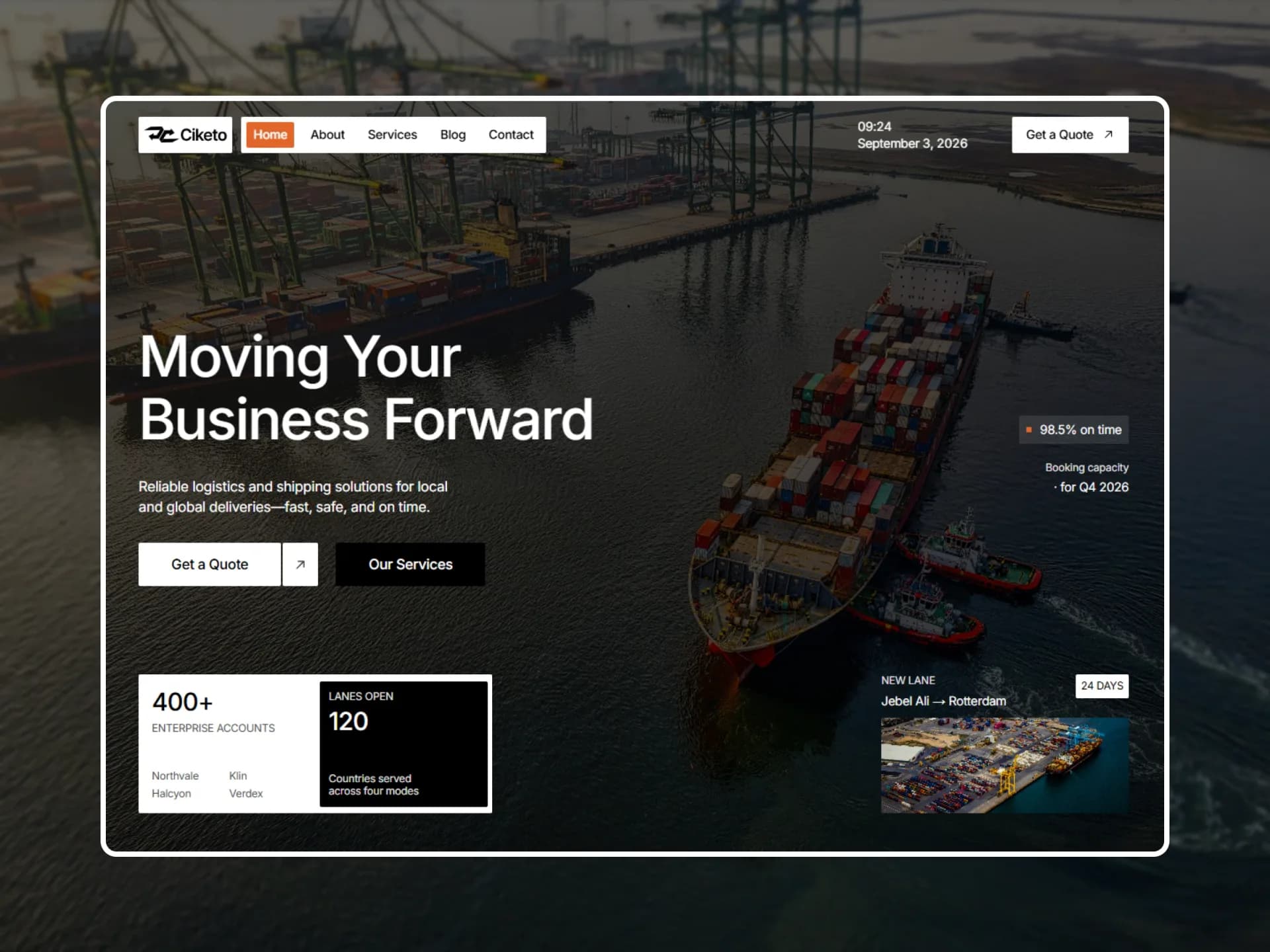
image: { src: photo("photo-1504674900247-0877df9cc836"), alt: "Plates of grilled meat and salads on a table, seen from above" },
services: [
{ label: "Social media", href: "/services/social-media" },
{ label: "Content", href: "/services/content" },
],
},
{
title: "Pulse Fitness",
year: "2025",
href: "/projects/pulse-fitness",
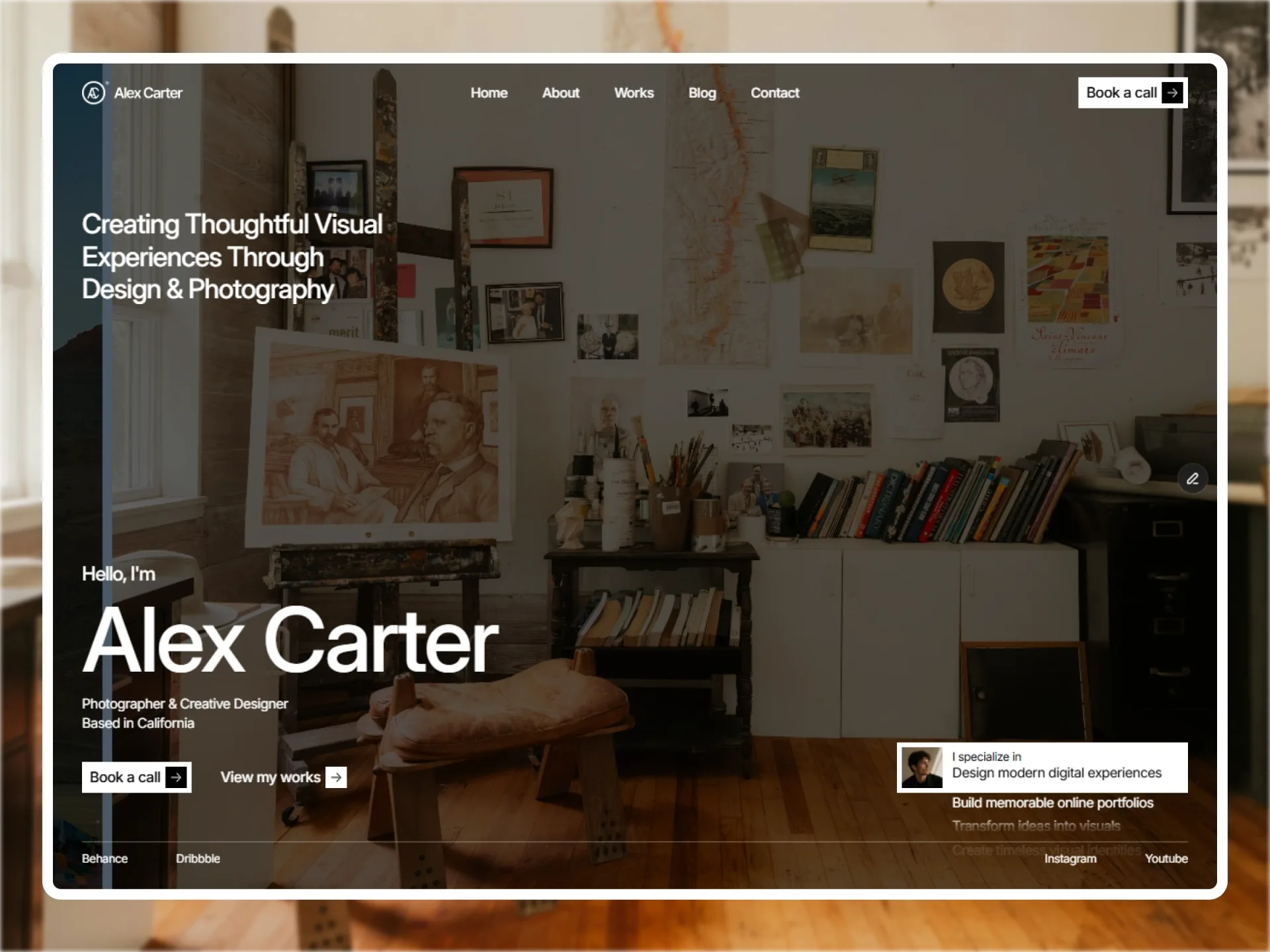
image: { src: photo("photo-1534438327276-14e5300c3a48"), alt: "Rack of dumbbells in a bright gym" },
services: [
{ label: "Paid advertising", href: "/services/paid-advertising" },
{ label: "SEO", href: "/services/seo" },
],
},
{
title: "Atlas Outfitters",
year: "2024",
href: "/projects/atlas-outfitters",
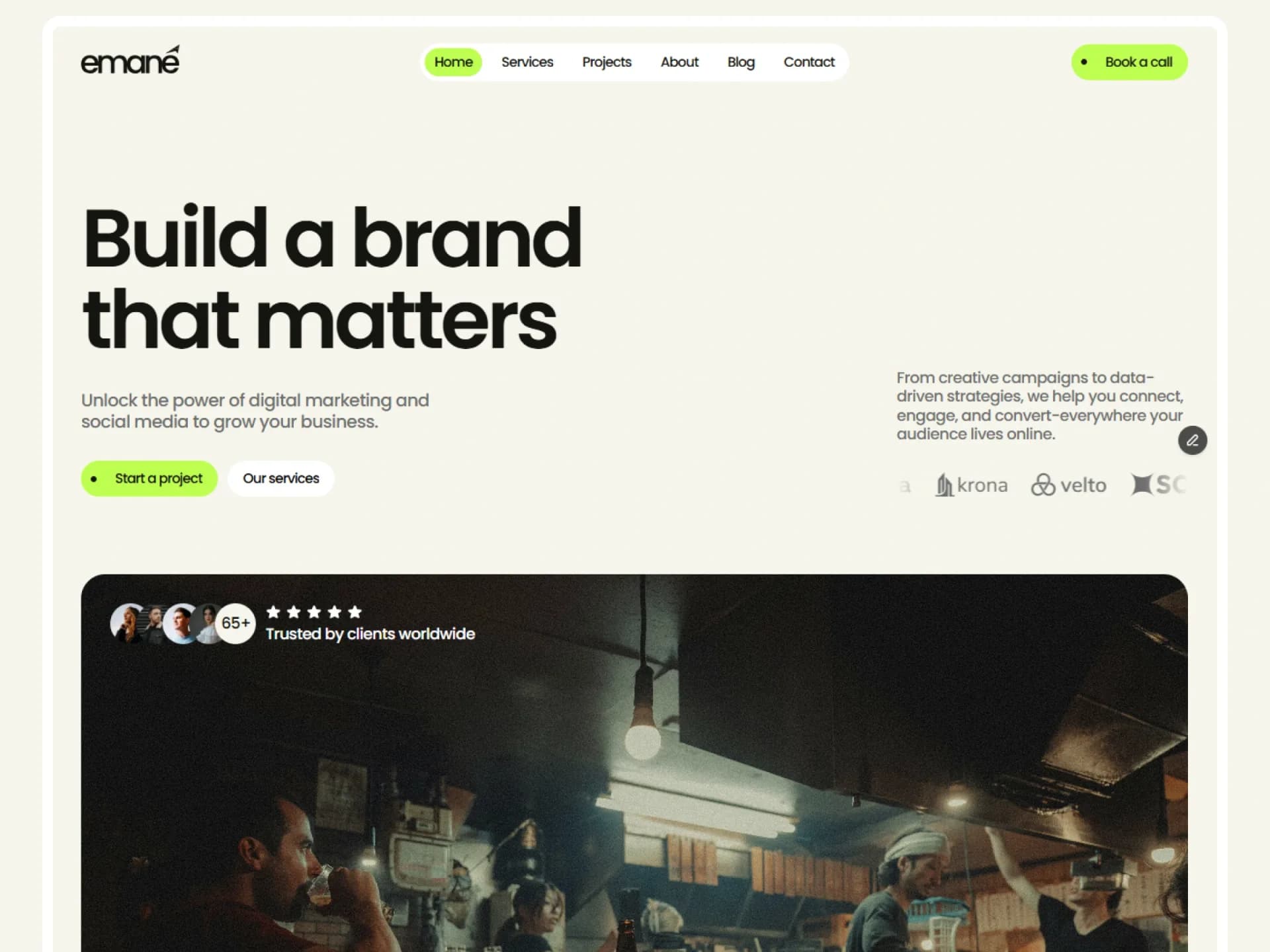
image: { src: photo("photo-1441986300917-64674bd600d8"), alt: "Clothes on rails and shelves inside a shop" },
services: [
{ label: "Brand strategy", href: "/services/brand-strategy" },
{ label: "Social media", href: "/services/social-media" },
],
},
{
title: "Tempo Wearables",
year: "2024",
href: "/projects/tempo-wearables",
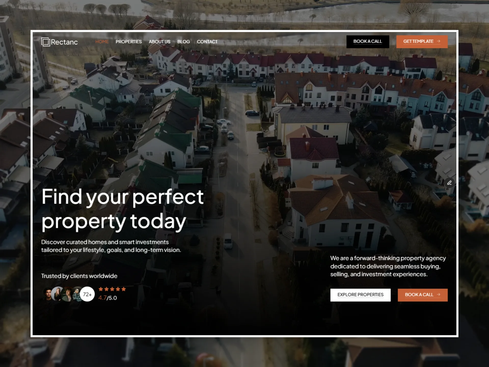
image: { src: photo("photo-1523275335684-37898b6baf30"), alt: "White smartwatch lying on a white surface" },
services: [
{ label: "Content", href: "/services/content" },
{ label: "Paid advertising", href: "/services/paid-advertising" },
],
},
];
const defaults = {
title: "Projects",
meta: "2019 – 2026",
lead: "Our work pairs creative ideas with hard numbers — campaigns and brands that grow real businesses.",
action: { label: "More projects", href: "/projects" },
};
export function ProjectsGrid({
title = defaults.title,
meta = defaults.meta,
lead = defaults.lead,
action = defaults.action,
projects = sampleProjects,
className,
}: ProjectsGridProps) {
return (
<section className={cn("py-(--section-y)", className)}>
<div className="mx-auto flex max-w-(--container) flex-col gap-12 px-(--gutter) md:gap-16 lg:gap-20">
<div className="flex flex-col gap-5">
<div className="flex items-center justify-between gap-5 md:items-end">
<h2 className="min-w-0 font-heading text-h2 font-semibold tracking-tight text-balance">{title}</h2>
{meta && <p className="hidden text-muted-foreground md:block">{meta}</p>}
{action && (
<SpringButton href={action.href} arrow={false}>
{action.label}
</SpringButton>
)}
</div>
<hr className="border-border" />
{lead && <p className="max-w-3xl self-end text-h3 font-medium text-pretty">{lead}</p>}
</div>
<div className="grid gap-12 md:grid-cols-2 md:gap-5 lg:gap-x-8 lg:gap-y-12">
{projects.map((project) => (
<ProjectCard key={project.href} project={project} />
))}
</div>
</div>
</section>
);
}
function ProjectCard({ project }: { project: ProjectCardItem }) {
return (
<article className="group flex flex-col gap-4">
<Link href={project.href} tabIndex={-1} aria-hidden className="block">
<ZoomCard className="aspect-[545/400]">
<img src={project.image.src} alt={project.image.alt} className="object-cover" />
</ZoomCard>
</Link>
<div className="flex flex-col gap-2">
<div className="flex h-5 items-start justify-between gap-5 overflow-hidden text-sm whitespace-nowrap text-muted-foreground">
<p className="flex min-w-0 flex-wrap gap-x-1">
{project.services?.map((service, i) => {
const label = `${service.label}${i < (project.services?.length ?? 0) - 1 ? "," : ""}`;
return service.href ? (
<Link key={service.label} href={service.href} className="transition-colors hover:text-foreground hover:underline hover:underline-offset-4">
{label}
</Link>
) : (
<span key={service.label}>{label}</span>
);
})}
</p>
<p>{project.year}</p>
</div>
<h3 className="font-heading text-h3 font-semibold tracking-tight">
<Link href={project.href} className="hover:underline hover:underline-offset-4">
{project.title}
</Link>
</h3>
</div>
</article>
);
}Installation
$ npx shadcn@latest add https://framebrick.co/r/blocks/projects-grid.json1. Add the Framebrick UI components it uses (they bring Motion).
npx shadcn@latest add https://framebrick.co/r/spring-button.json https://framebrick.co/r/zoom-card.json2. Add the block tokens to
app/globals.cssonce (theming).npx shadcn@latest add https://framebrick.co/r/blocks/tokens.json3. Copy the block into
components/projects-grid.tsx.import Link from "next/link"; import { SpringButton } from "@/components/ui/spring-button"; import { ZoomCard } from "@/components/ui/zoom-card"; import { cn } from "@/lib/utils"; /* * Projects Grid — a section header (title, meta, action, divider, lead) and a two-column grid of project cards: * photo, services and year, title. * Source: marcframe/nitip → components/sections/ProjectsSection.tsx (+ design-system SectionHeader, ProjectCard). * * Layout kept from Framer: the header's button stays beside the title on phones; the meta shows from 768px; the lead * sits at the right edge. One column below 768px (48px apart), two from 768px. Cards: 545:400 photo, a one-line meta * row (service links, year at the right), the title. * Motion kept: the photo zooms to 105% while the card is hovered, with Framer's tween, cubic-bezier(0.12, 0.23, 0.5, 1) over 400ms * (zoom-card). As on Framer, the photo link is a duplicate of the title link, so it is hidden from assistive tech and * the keyboard. Dropped: Nitip's "View Project" cursor label (zoom-card's `cursor` prop pairs with label-cursor). */ export type ProjectCardItem = { title: string; year: string; href: string; image: { src: string; alt: string }; services?: { label: string; href?: string }[]; }; export type ProjectsGridProps = { title?: string; meta?: string; lead?: string; action?: { label: string; href: string }; projects?: ProjectCardItem[]; className?: string; }; const photo = (id: string) => `https://images.unsplash.com/${id}?auto=format&fit=crop&w=1200&q=80`; const sampleProjects: ProjectCardItem[] = [ { title: "Harvest Kitchen", year: "2025", href: "/projects/harvest-kitchen", image: { src: photo("photo-1504674900247-0877df9cc836"), alt: "Plates of grilled meat and salads on a table, seen from above" }, services: [ { label: "Social media", href: "/services/social-media" }, { label: "Content", href: "/services/content" }, ], }, { title: "Pulse Fitness", year: "2025", href: "/projects/pulse-fitness", image: { src: photo("photo-1534438327276-14e5300c3a48"), alt: "Rack of dumbbells in a bright gym" }, services: [ { label: "Paid advertising", href: "/services/paid-advertising" }, { label: "SEO", href: "/services/seo" }, ], }, { title: "Atlas Outfitters", year: "2024", href: "/projects/atlas-outfitters", image: { src: photo("photo-1441986300917-64674bd600d8"), alt: "Clothes on rails and shelves inside a shop" }, services: [ { label: "Brand strategy", href: "/services/brand-strategy" }, { label: "Social media", href: "/services/social-media" }, ], }, { title: "Tempo Wearables", year: "2024", href: "/projects/tempo-wearables", image: { src: photo("photo-1523275335684-37898b6baf30"), alt: "White smartwatch lying on a white surface" }, services: [ { label: "Content", href: "/services/content" }, { label: "Paid advertising", href: "/services/paid-advertising" }, ], }, ]; const defaults = { title: "Projects", meta: "2019 – 2026", lead: "Our work pairs creative ideas with hard numbers — campaigns and brands that grow real businesses.", action: { label: "More projects", href: "/projects" }, }; export function ProjectsGrid({ title = defaults.title, meta = defaults.meta, lead = defaults.lead, action = defaults.action, projects = sampleProjects, className, }: ProjectsGridProps) { return ( <section className={cn("py-(--section-y)", className)}> <div className="mx-auto flex max-w-(--container) flex-col gap-12 px-(--gutter) md:gap-16 lg:gap-20"> <div className="flex flex-col gap-5"> <div className="flex items-center justify-between gap-5 md:items-end"> <h2 className="min-w-0 font-heading text-h2 font-semibold tracking-tight text-balance">{title}</h2> {meta && <p className="hidden text-muted-foreground md:block">{meta}</p>} {action && ( <SpringButton href={action.href} arrow={false}> {action.label} </SpringButton> )} </div> <hr className="border-border" /> {lead && <p className="max-w-3xl self-end text-h3 font-medium text-pretty">{lead}</p>} </div> <div className="grid gap-12 md:grid-cols-2 md:gap-5 lg:gap-x-8 lg:gap-y-12"> {projects.map((project) => ( <ProjectCard key={project.href} project={project} /> ))} </div> </div> </section> ); } function ProjectCard({ project }: { project: ProjectCardItem }) { return ( <article className="group flex flex-col gap-4"> <Link href={project.href} tabIndex={-1} aria-hidden className="block"> <ZoomCard className="aspect-[545/400]"> <img src={project.image.src} alt={project.image.alt} className="object-cover" /> </ZoomCard> </Link> <div className="flex flex-col gap-2"> <div className="flex h-5 items-start justify-between gap-5 overflow-hidden text-sm whitespace-nowrap text-muted-foreground"> <p className="flex min-w-0 flex-wrap gap-x-1"> {project.services?.map((service, i) => { const label = `${service.label}${i < (project.services?.length ?? 0) - 1 ? "," : ""}`; return service.href ? ( <Link key={service.label} href={service.href} className="transition-colors hover:text-foreground hover:underline hover:underline-offset-4"> {label} </Link> ) : ( <span key={service.label}>{label}</span> ); })} </p> <p>{project.year}</p> </div> <h3 className="font-heading text-h3 font-semibold tracking-tight"> <Link href={project.href} className="hover:underline hover:underline-offset-4"> {project.title} </Link> </h3> </div> </article> ); }
Usage
import { ProjectsGrid } from "@/components/projects-grid";

<ProjectsGrid
  title="Projects"
  action={{ label: "More projects", href: "/projects" }}
  projects={[
    {
      title: "Harvest Kitchen",
      year: "2025",
      href: "/projects/harvest-kitchen",
      image: { src: "/work/harvest.jpg", alt: "…" },
      services: [{ label: "Social media", href: "/services/social-media" }],
    },
  ]}
/>
Props
| Prop | Type | Default | Description |
|---|---|---|---|
| title / lead | string | — | Section heading (h2) and the large lead under the divider. |
| meta | string | 2019 – 2026 | Short line beside the title from 768px. |
| action | { label, href } | More projects | Button beside the title at every width. |
| projects | { title, year, href, image: { src, alt }, services? }[] | 4 projects | Cards; titles are h3 links, services are links in the meta row. |
| className | string | — | Classes for the <section>. |
- One column below 768px, two from 768px. The meta row is one line tall: services that don't fit are clipped.
- Photos zoom to 105% while their card is hovered, with Framer's tween, cubic-bezier(0.12, 0.23, 0.5, 1) over 400ms. The photo link duplicates the title link, so it is hidden from assistive tech and the keyboard.
AI prompt
Paste into v0, Lovable, Bolt or Claude to rebuild this block in your own project.
Create a React + Tailwind CSS block called ProjectsGrid (Next.js).
- <section className="py-(--section-y)">, container mx-auto max-w-(--container) px-(--gutter), column gap-12 md:gap-16 lg:gap-20.
- Header: a row (items-center, md:items-end, justify-between): h2 font-heading text-h2 semibold tracking-tight, a muted meta from
  768px, a shadcn-style button; an <hr>; a lead (text-h3 font-medium) max-w-3xl aligned right.
- Grid: 1 column (gap-12), 2 from 768px (gap-5, lg gap-x-8 gap-y-12). Card: a 545:400 photo in a rounded-lg frame that zooms
  to 1.05 on hover (transition-transform 400ms cubic-bezier(0.12,0.23,0.5,1)) inside a link with aria-hidden and tabIndex -1;
  then a one-line (h-5, overflow-hidden) text-sm muted row of comma-separated service links with the year at the right;
  then an h3 link (font-heading text-h3 semibold) that underlines on hover.
- Only shadcn variables and block tokens; plain <img> with alt text.