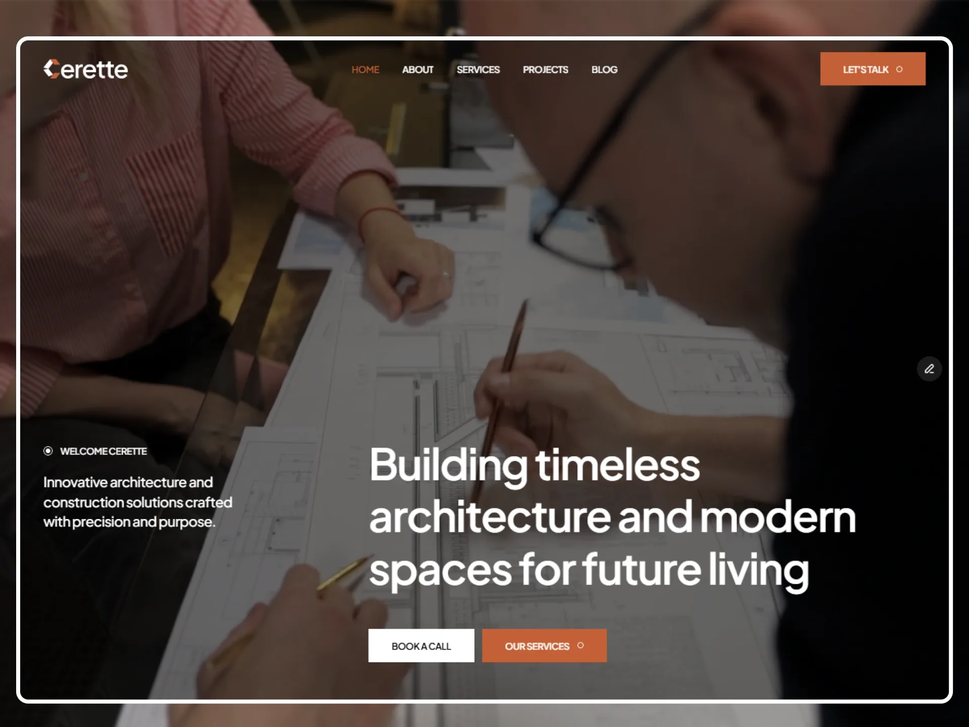
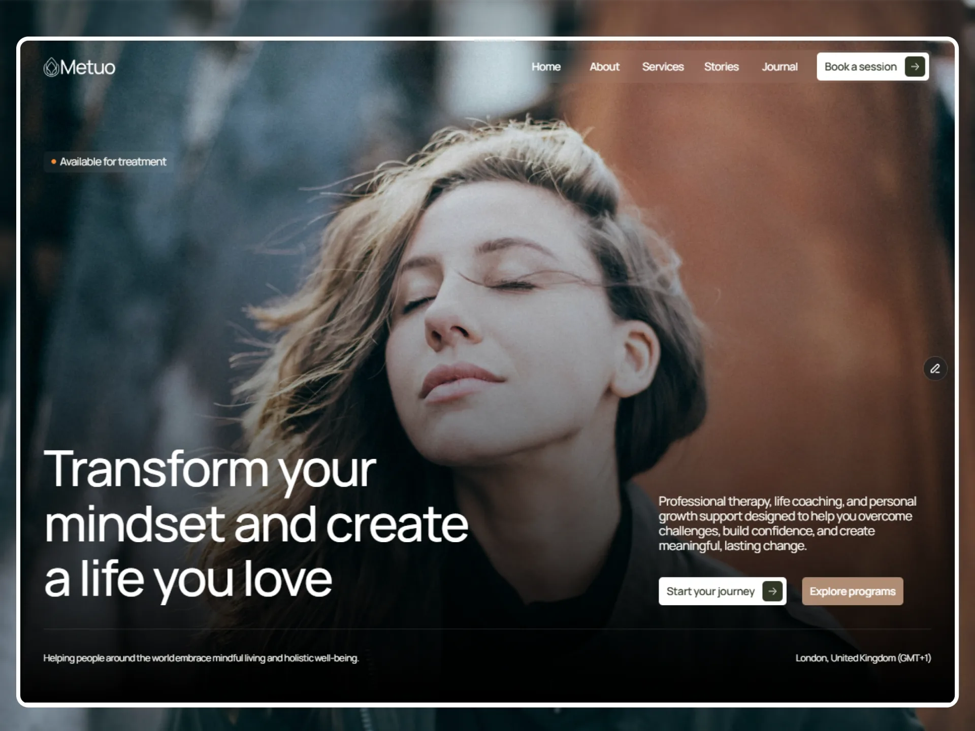
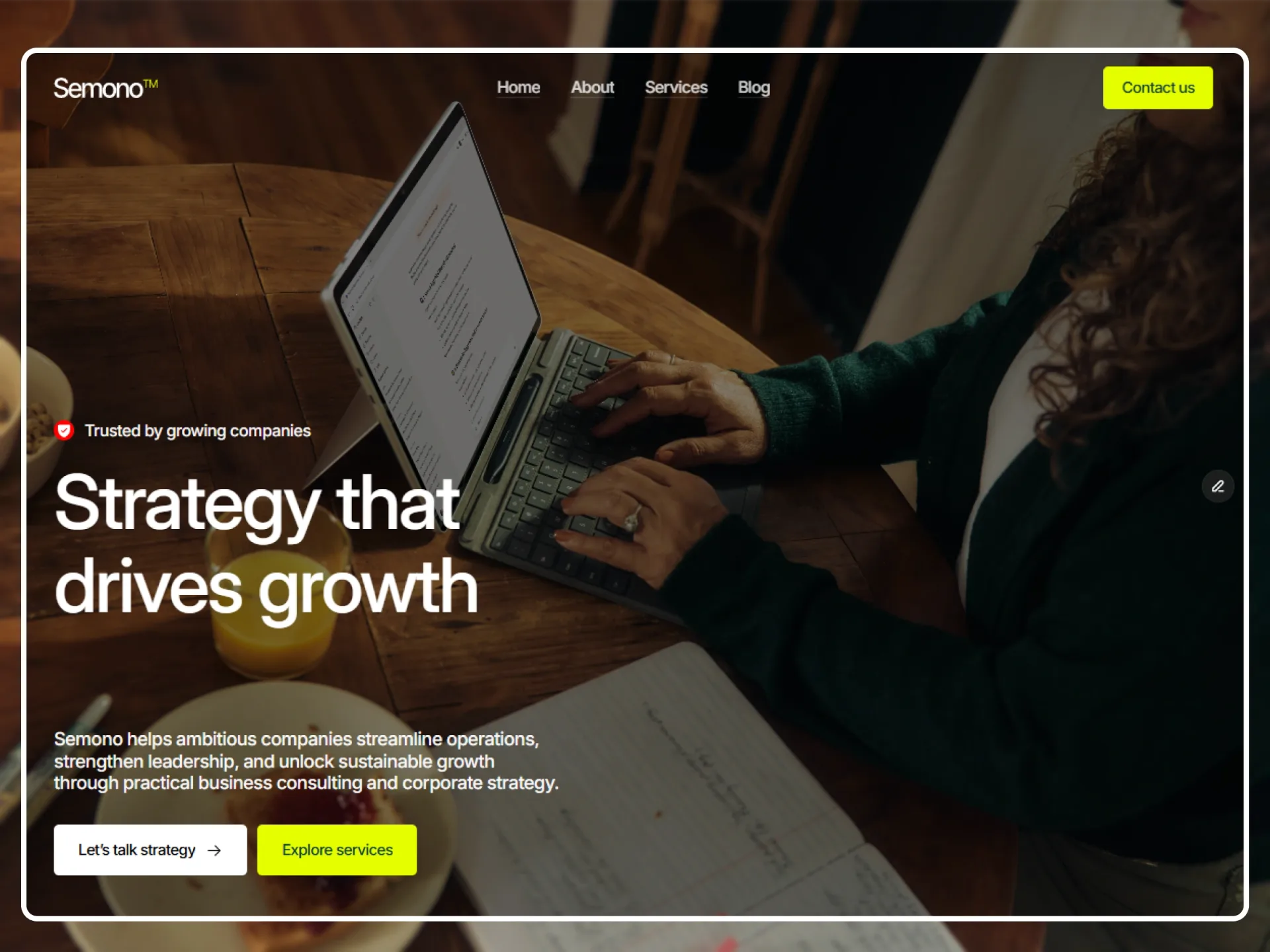
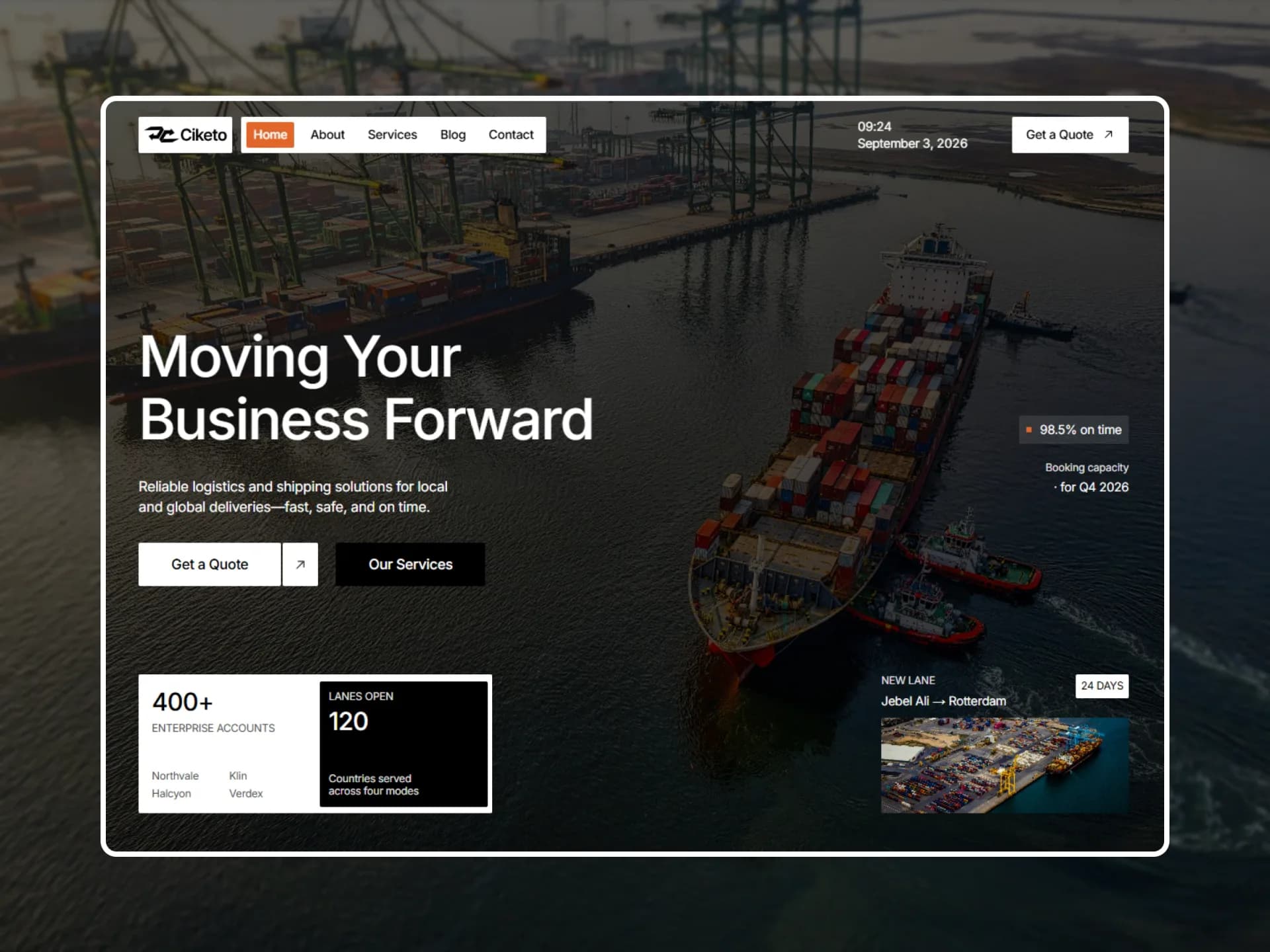
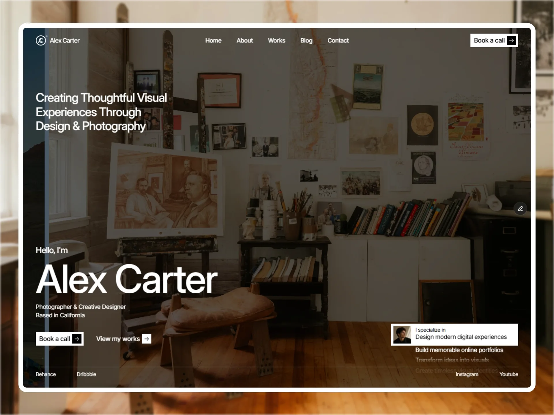
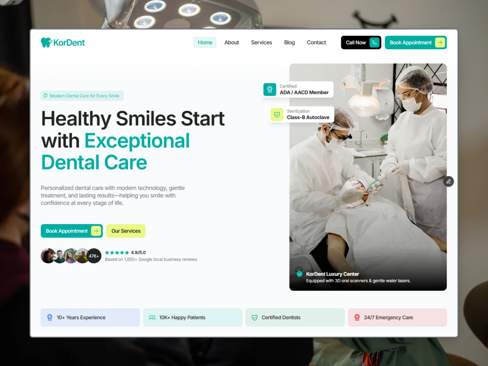
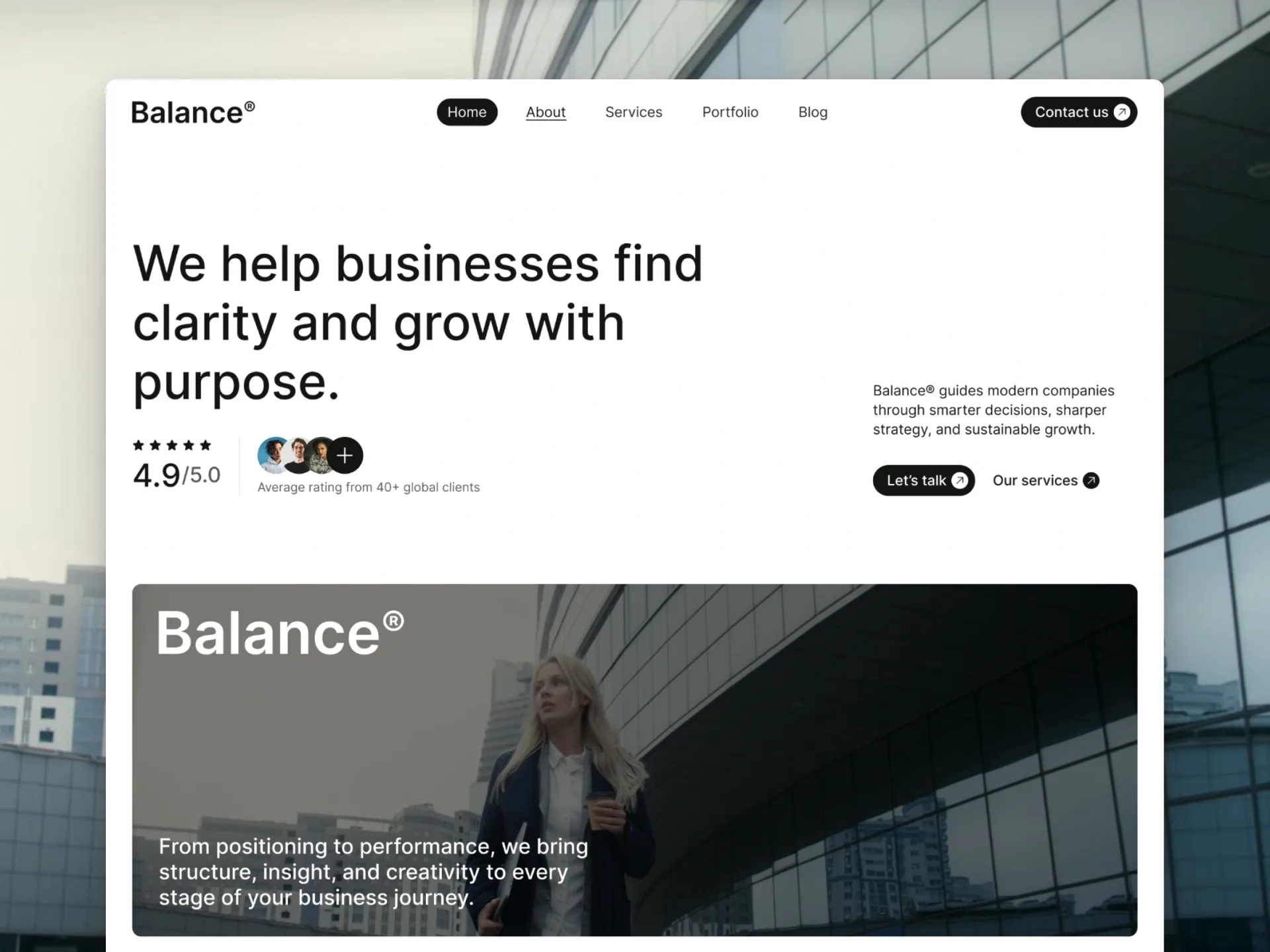
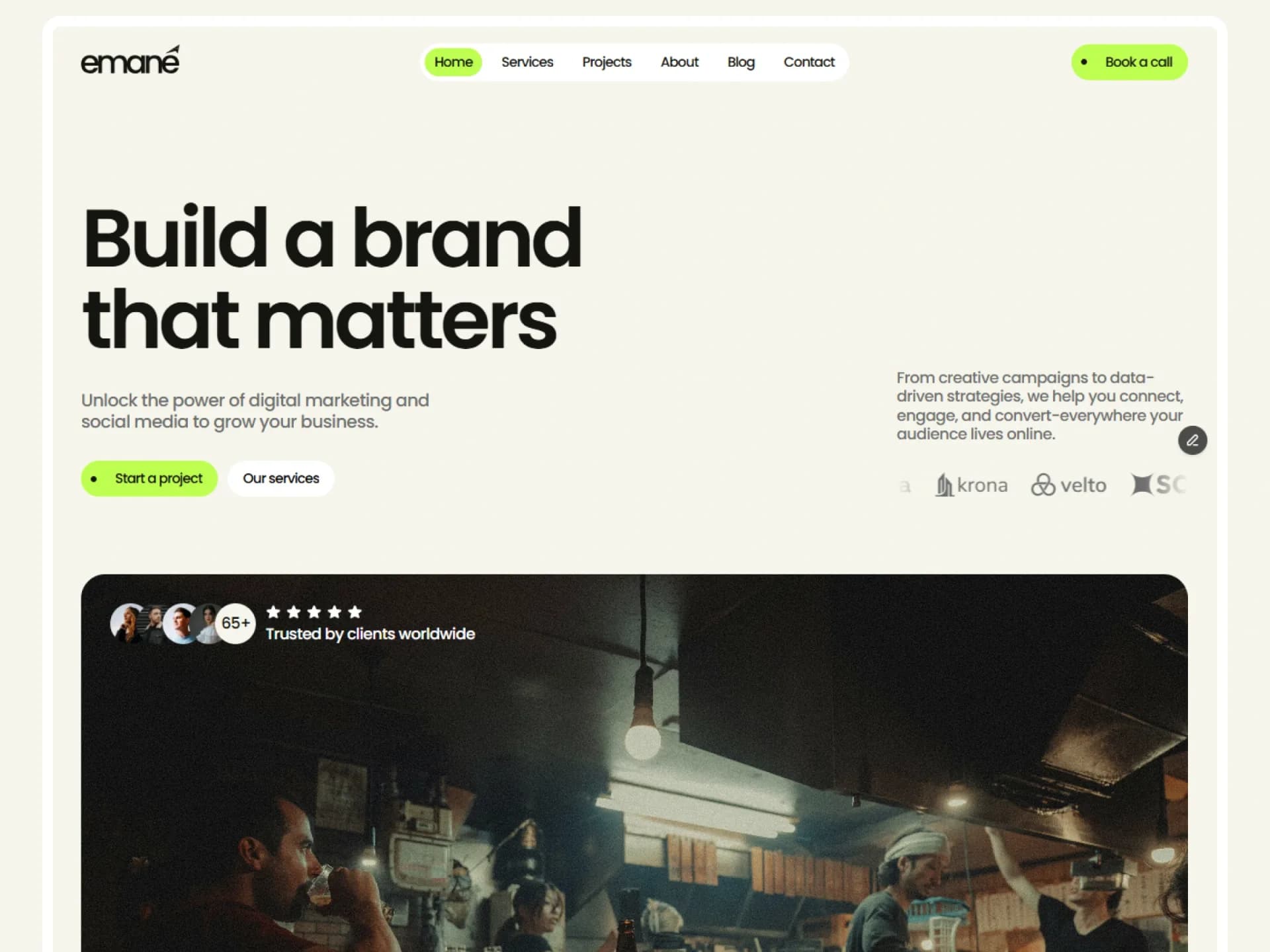
Layout
Section Columns
One to four columns, each an ordered stack of headings, texts, buttons and pictures, in five layouts: the section you arrange yourself.
Made for the page builder — try it there
Try it in the page builderBlocks come with Pro
Preview every block now, in any theme and at any width. The source, the install command and the AI prompt unlock when Pro opens, once the catalog reaches 20 templates.
Props
| Prop | Type | Default | Description |
|---|---|---|---|
| columns | { elements: SectionElement[] }[] | a heading, a text and a button beside a picture | One to four columns, in the order they sit; a fifth is not drawn. A column's elements are an ordered stack: { type: "heading", text, level?: "h2" | "h3" | "h4" }, { type: "text", text }, { type: "button", label, href, style?: "default" | "outline" } or { type: "image", src, alt, ratio?: "auto" | "square" | "landscape" | "portrait" }. |
| layout | "stacked" | "inline" | "split" | "split-reverse" | "centred" | "split" | How the columns sit. stacked: one under another at every width. inline: side by side in equal widths (two from 768px, three or four from 1024px). split: two across from 1024px, vertically centred. split-reverse: the same with each pair swapped from 1024px. centred: one narrow centred column. |
| align | "start" | "center" | "start" | Where the text and the buttons sit in their column. centred layouts centre everything whatever this says. |
| buttonStyle | "spring" | "flip" | "sweep" | "spring" | The look of every button of the section: spring (the arrow turns), flip (the label flips up) or sweep (a fill sweeps across the label). One choice for the whole block, so the buttons stay alike; the three take the same props. |
| className | string | — | Classes for the <section>. |
- The contract for blocks made from now on: slots (the content is columns[i].elements, plain data a builder or a person can add to, remove from and reorder without touching the code), a variant (layout is one named choice with a default, not a pile of flags) and order (the arrays' order is the order on the page, in every layout and at every width). The 60 older blocks keep theirs.
- One h2 per block: the first heading is an h2 unless you say otherwise; give a second heading in another column level h3 (the page builder does when it adds one).
- Pictures round to the theme's radius, with aspect-4/3, aspect-square or aspect-4/5 for landscape, square and portrait; auto keeps the picture's own proportions. Text is text-muted-foreground. The section has no surface, radius or hide props of its own: the page builder gives every block those as classes in className (bg-muted, [--radius:1rem], max-md:hidden).
- Buttons are a slot: buttonStyle picks Spring, Flip or Sweep Button from one map, and the three are kept to one interface (href, children, the same variants and sizes), so the choice changes the look and nothing else. A new block that lets the visitor swap a part does the same with a map named …Slot.
- No motion of its own besides the buttons: it is a layout, and it reads the theme and nothing else. Framebrick UI components join the elements with the page builder's components step.