Projects & work
Projects Mosaic
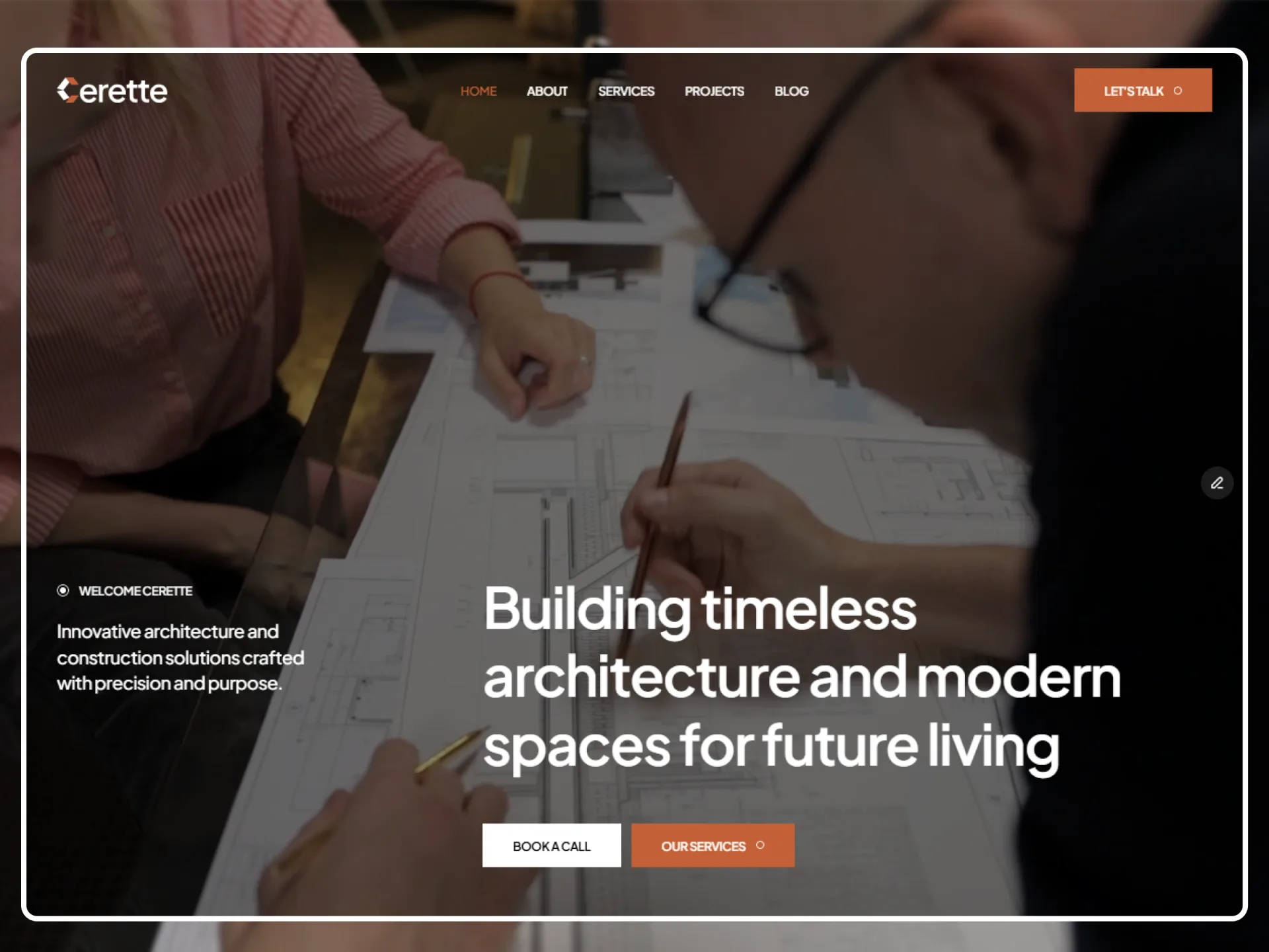
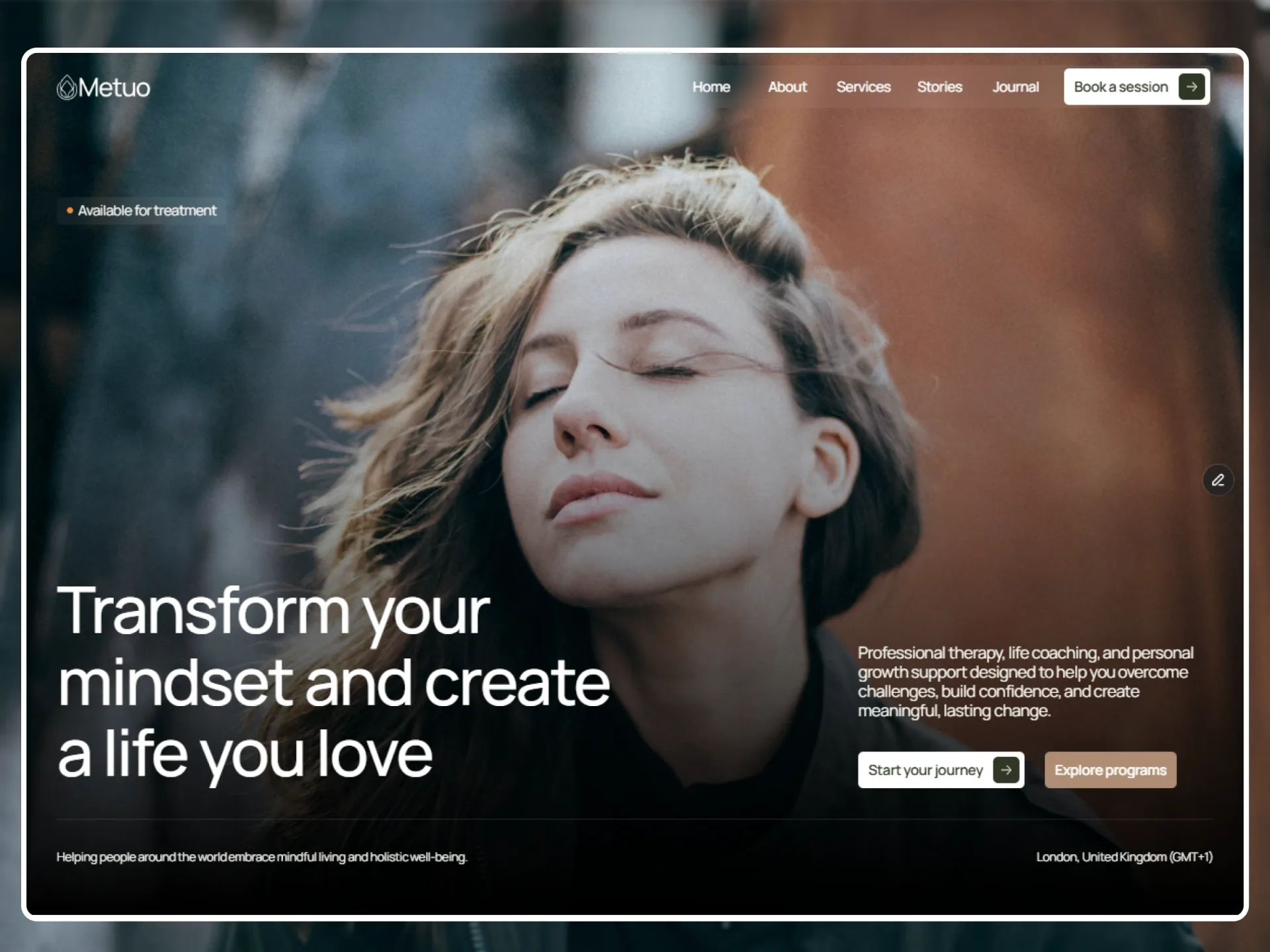
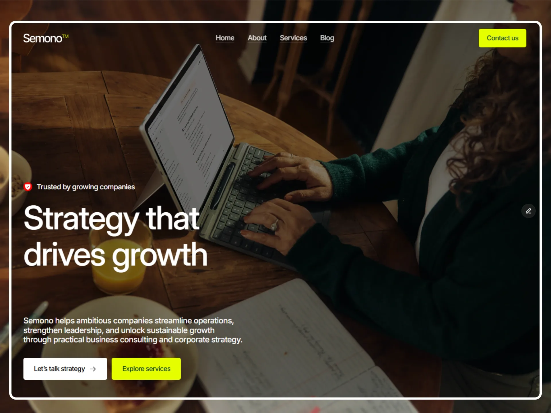
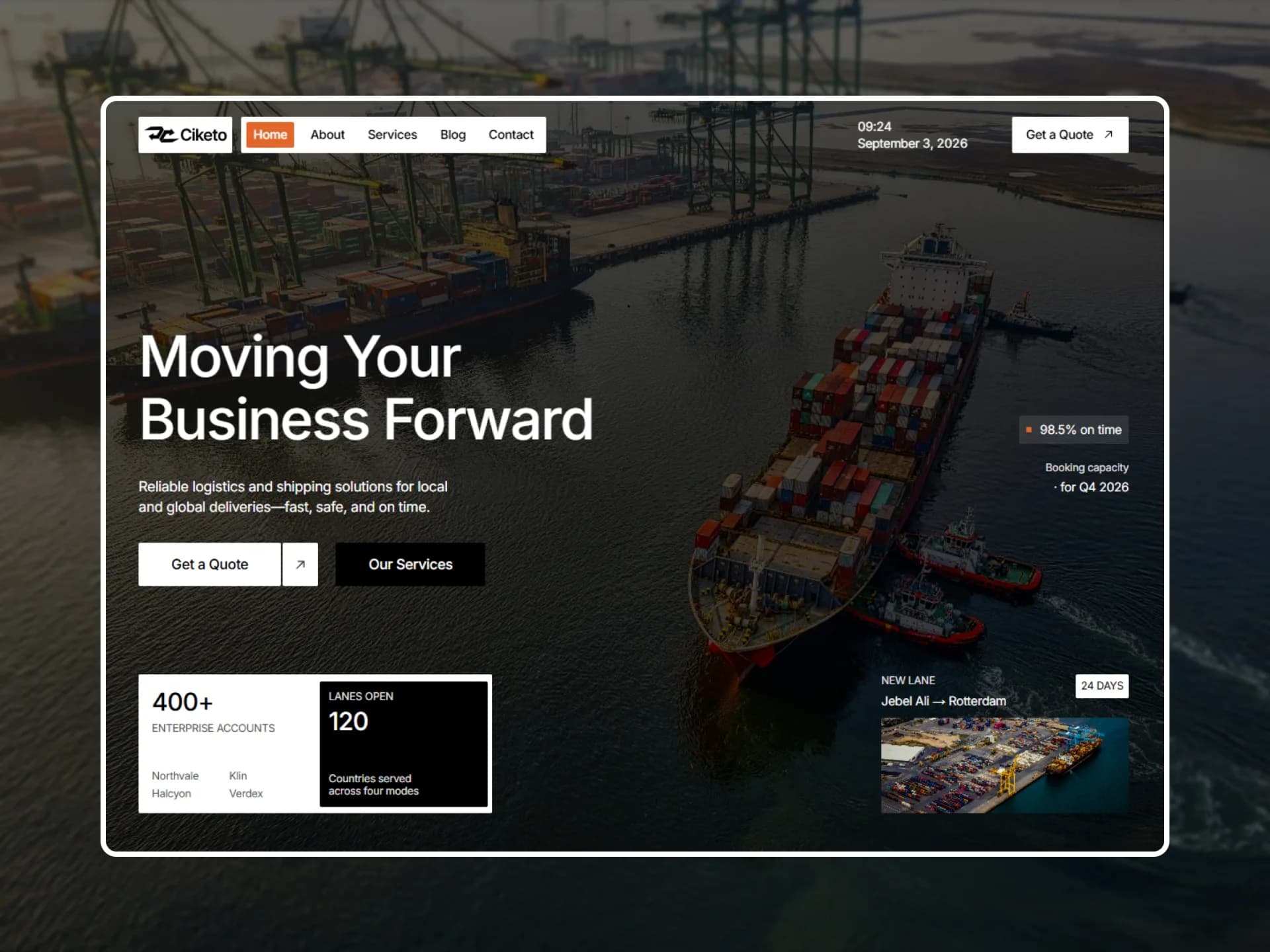
A heading with buttons, six projects as a mosaic of wide and narrow cards, a featured project on a dark band, and the rest in a grid.
Layout and motion from the Titen template — see it in contextBlocks come with Pro
Preview every block now, in any theme and at any width. The source, the install command and the AI prompt unlock when Pro opens, once the catalog reaches 20 templates.
Props
| Prop | Type | Default | Description |
|---|---|---|---|
| as | "h1" | "h2" | "h2" | Heading level — h1 (in the text-h1 size) when the block opens a projects or category page. |
| label / title | string | — | Small muted line and the heading (its words rise out of a blur in view); "" hides the label. |
| actions | { label, href }[] | All projects | Buttons at the right of the heading (under it on phones): "All projects", or one per category. [] for none. |
| projects | { title, href, summary, category, year, image }[] | 6 projects | The first six fill the mosaic; any after them go into a grid below. Each card is one link. |
| featured | project | false | a featured project | One project on a wide card, its title and summary on a dark band; false for none. |
| featuredAt | "start" | "end" | "end" | Where the featured card goes. |
| mosaic | boolean | true | false: every card in the grid (a category page). |
| className | string | — | Classes for the <section>. |
- The first six cards come as two rows of three: one column on phones, three columns from 768px, and from 1024px four columns where the first card of row one and the last of row two span two (wide, 2, 3 / 4, 5, wide). Further cards form a 1 / 2 / 3-column grid.
- Photos rest at 105% and settle to 100% while their card is hovered or focused (zoom-card rest). The headings' words rise out of a blur; cards rise 18px once half in view (scroll-reveal).
- The featured title stays white on its band; the theme's primary can't be read there.