Hero
Hero Projects
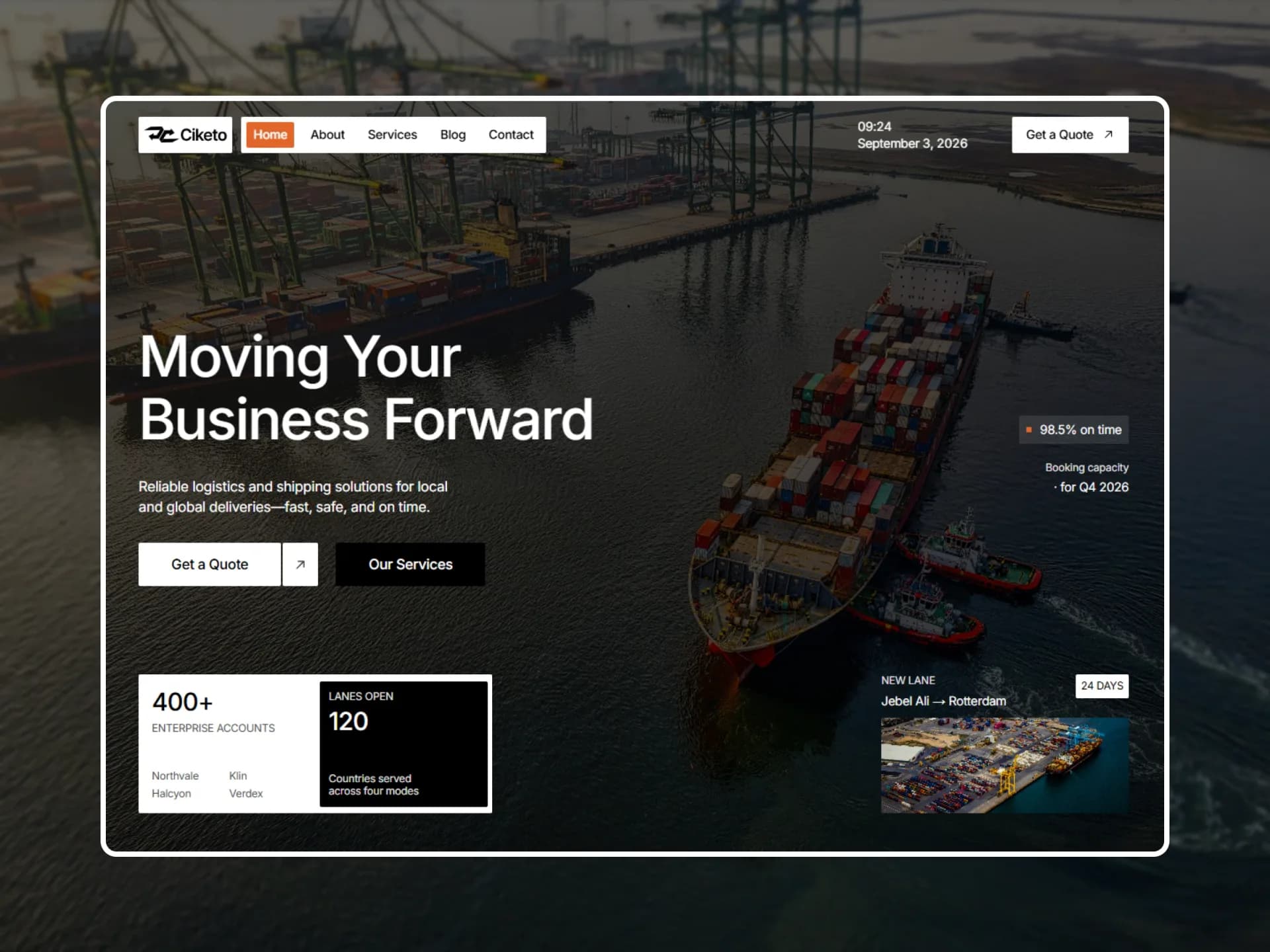
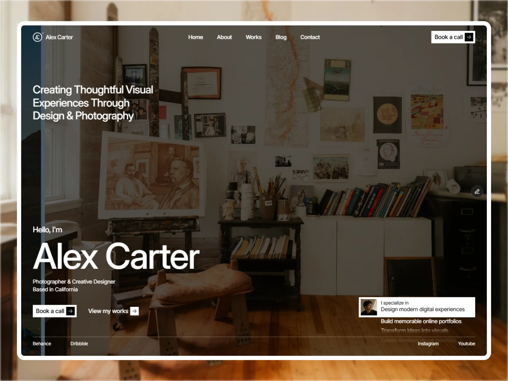
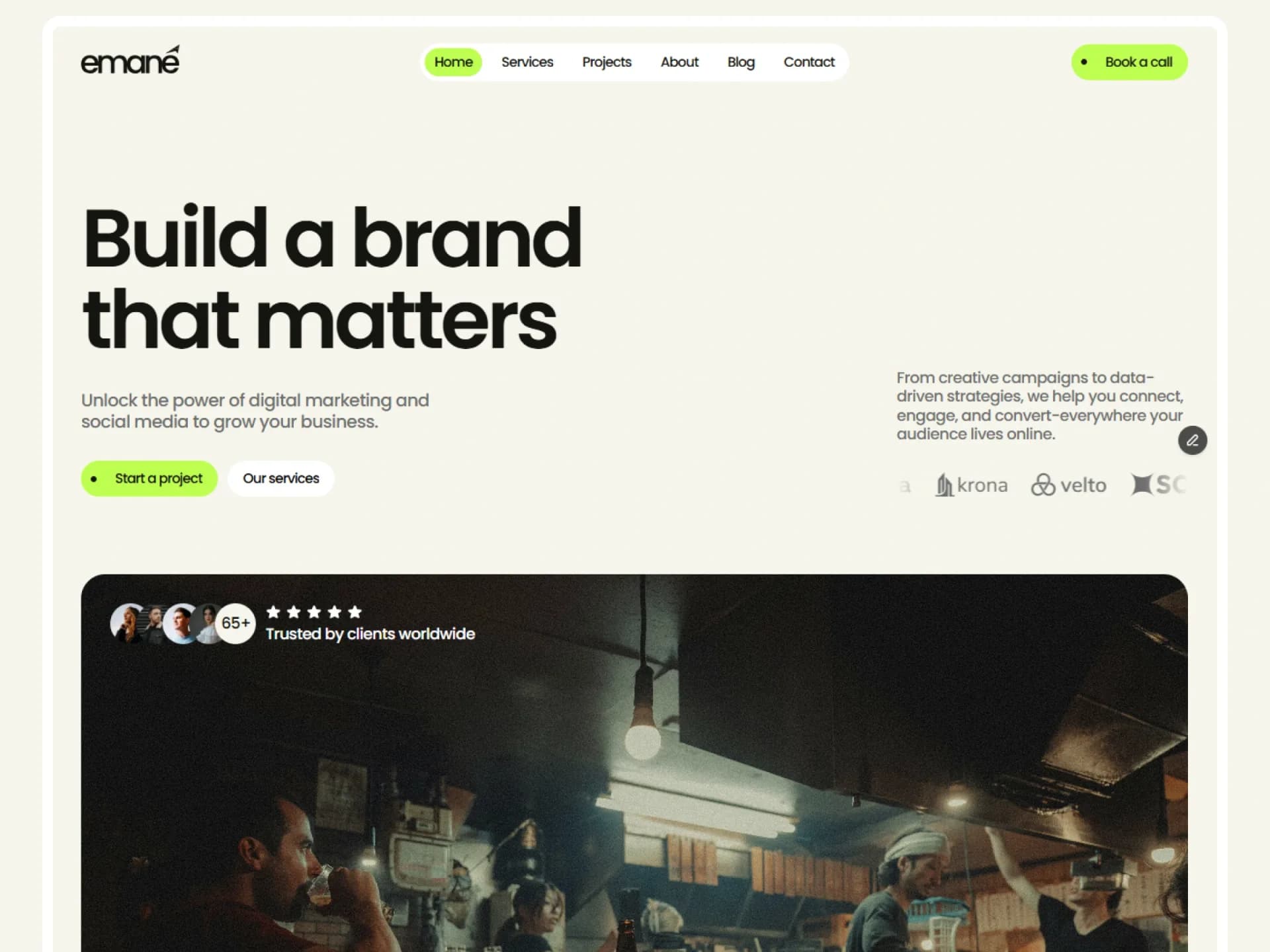
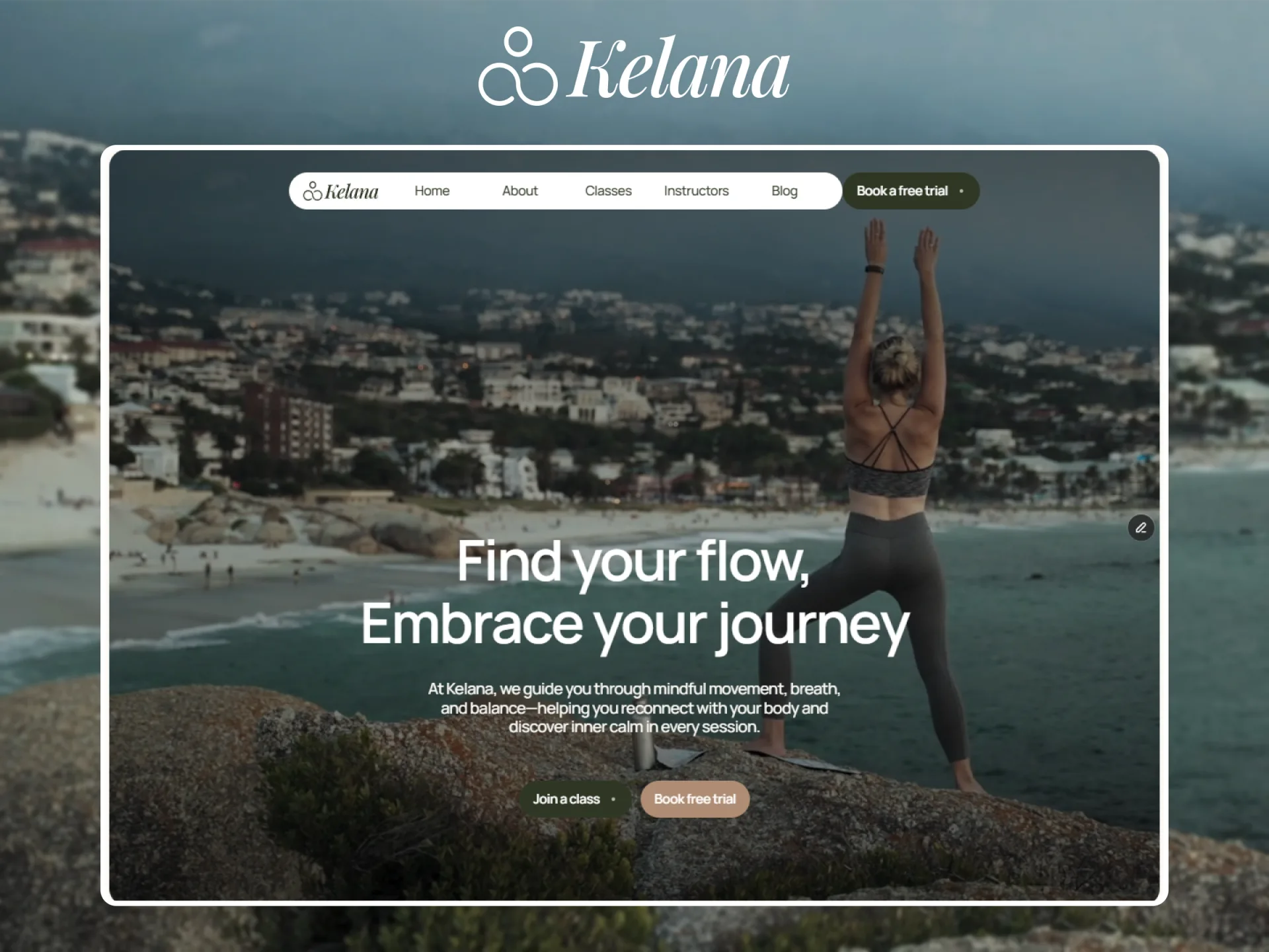
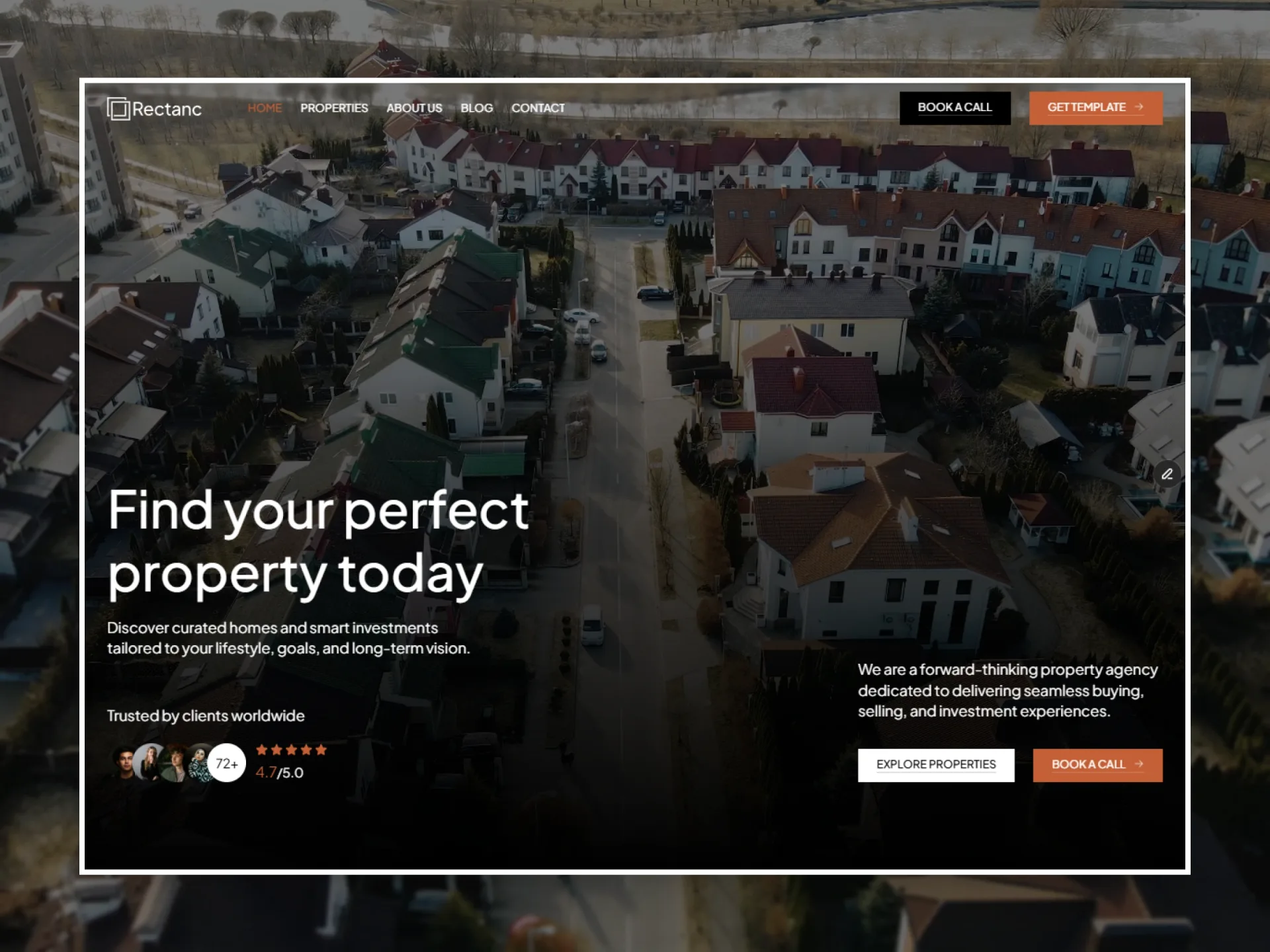
Headline with rating, avatars and two actions, then a row of recent projects that open on hover.
Layout and motion from the Nitip template — see it in contextimport { ExpandingPanels } from "@/components/ui/expanding-panels";
import { SpringButton } from "@/components/ui/spring-button";
import { UnderlineLink } from "@/components/ui/underline-link";
import { cn } from "@/lib/utils";
/*
* Hero Projects — headline with social proof and two actions, then a row of recent projects that open on hover.
* Source: marcframe/nitip → components/sections/HomeHeroSection.tsx (+ design-system ProjectRecentList).
*
* Layout kept from Framer: below 768px everything stacks; from 768px the intro is a row, bottom-aligned — headline,
* subtitle and proof on the left, a 256px column with the description and the actions at the right edge. The rating
* and the secondary action show from 768px. The projects row is 300px tall from 768px: a summary card (176px wide,
* 352px from 1024px), then the projects.
* Motion kept: the project you point at (or tab to, or tap) opens and the others narrow to 130px strips — spring,
* bounce 0, 0.4s (expanding-panels); the button and link hovers come with spring-button and underline-link.
* Dropped: Nitip's "View Project" cursor label.
*/
export type HeroProjectsImage = { src: string; alt: string };
export type HeroProjectsLink = { label: string; href: string };
export type HeroProject = { title: string; year: string; href: string; image: HeroProjectsImage };
export type HeroProjectsProps = {
/** Heading level: h1 when the hero opens the page. */
as?: "h1" | "h2";
title?: string;
subtitle?: string;
description?: string;
/** Score and scale, e.g. 4.9 of /5.0; false hides the rating. */
rating?: { score: string; max: string } | false;
customers?: { value: string; label: string };
/** Up to three faces next to the customer count (decorative). */
avatars?: HeroProjectsImage[];
primaryAction?: HeroProjectsLink;
secondaryAction?: HeroProjectsLink;
recent?: { title: string; count: string; countLabel: string; action: HeroProjectsLink };
projects?: HeroProject[];
className?: string;
};
const photo = (id: string, size = "w=1200") => `https://images.unsplash.com/${id}?auto=format&fit=crop&${size}&q=80`;
const face = (id: string) => photo(id, "crop=faces&w=96&h=96");
const defaults = {
title: "Grow your brand. Amplify your impact.",
subtitle: "Digital marketing and social media that turn attention into lasting growth.",
description:
"From creative campaigns to data-driven strategy, we help ambitious brands reach the right people and keep them.",
rating: { score: "4.9", max: "/5.0" },
customers: { value: "320+", label: "Happy clients" },
avatars: [
{ src: face("photo-1494790108377-be9c29b29330"), alt: "" },
{ src: face("photo-1507003211169-0a1dd7228f2d"), alt: "" },
{ src: face("photo-1573496359142-b8d87734a5a2"), alt: "" },
],
primaryAction: { label: "Start a project", href: "/contact" },
secondaryAction: { label: "See our work", href: "/projects" },
recent: {
title: "Recent projects",
count: "140+",
countLabel: "Projects delivered",
action: { label: "All projects", href: "/projects" },
},
projects: [
{
title: "Harvest Kitchen",
year: "2025",
href: "/projects/harvest-kitchen",
image: {
src: photo("photo-1504674900247-0877df9cc836"),
alt: "Plates of grilled meat and salads on a table, seen from above",
},
},
{
title: "Pulse Fitness",
year: "2025",
href: "/projects/pulse-fitness",
image: { src: photo("photo-1534438327276-14e5300c3a48"), alt: "Rack of dumbbells in a bright gym" },
},
{
title: "Atlas Outfitters",
year: "2024",
href: "/projects/atlas-outfitters",
image: { src: photo("photo-1441986300917-64674bd600d8"), alt: "Clothes on rails and shelves inside a shop" },
},
],
};
export function HeroProjects({
as: Heading = "h1",
title = defaults.title,
subtitle = defaults.subtitle,
description = defaults.description,
rating = defaults.rating,
customers = defaults.customers,
avatars = defaults.avatars,
primaryAction = defaults.primaryAction,
secondaryAction = defaults.secondaryAction,
recent = defaults.recent,
projects = defaults.projects,
className,
}: HeroProjectsProps) {
return (
<section className={cn("py-(--section-y)", className)}>
<div className="mx-auto flex max-w-(--container) flex-col gap-12 px-(--gutter) md:gap-16 lg:gap-20">
<div className="flex flex-col gap-10 md:flex-row md:items-end md:justify-between md:gap-12">
<div className="flex max-w-3xl flex-col gap-10 md:flex-1 md:gap-12">
<div className="flex flex-col gap-6">
<Heading className="font-heading text-display font-semibold tracking-tight text-balance">{title}</Heading>
<p className="max-w-md text-pretty text-muted-foreground">{subtitle}</p>
</div>
<div className="flex items-center gap-5">
{rating && (
<div className="hidden flex-col items-center gap-1 md:flex">
<span className="flex text-primary" aria-hidden>
{Array.from({ length: 5 }, (_, i) => (
<svg key={i} viewBox="0 0 16 16" className="size-3.5 fill-current">
<path d="M8 1.2l2 4.3 4.7.5-3.5 3.2 1 4.6L8 11.5l-4.2 2.3 1-4.6L1.3 6l4.7-.5z" />
</svg>
))}
</span>
<p>
<span className="sr-only">Rated </span>
<span className="text-lg font-semibold">{rating.score}</span>
<span className="text-sm text-muted-foreground">
<span className="sr-only"> out of </span>
<span aria-hidden>{rating.max}</span>
<span className="sr-only">{rating.max.replace("/", "")}</span>
</span>
</p>
</div>
)}
{avatars.length > 0 && (
<div className="flex">
{avatars.slice(0, 3).map((avatar, i) => (
<img
key={avatar.src}
src={avatar.src}
alt={avatar.alt}
width={48}
height={48}
className={cn("size-12 rounded-full bg-muted object-cover ring-2 ring-background", i > 0 && "-ml-3")}
style={{ zIndex: avatars.length - i }}
/>
))}
</div>
)}
<div>
<p className="font-heading text-h3 font-semibold tracking-tight">{customers.value}</p>
<p className="text-sm text-muted-foreground">{customers.label}</p>
</div>
</div>
</div>
<div className="flex flex-col gap-8 md:w-64 md:shrink-0 md:items-end md:gap-10">
<p className="text-lead text-pretty text-muted-foreground">{description}</p>
<div className="flex flex-col items-start gap-5 md:items-end">
<SpringButton href={primaryAction.href} size="lg">
{primaryAction.label}
</SpringButton>
<UnderlineLink href={secondaryAction.href} className="hidden md:inline-flex">
{secondaryAction.label}
</UnderlineLink>
</div>
</div>
</div>
<div className="flex flex-col gap-4 md:h-75 md:flex-row md:gap-3 lg:gap-5">
<div className="flex h-60 shrink-0 flex-col justify-between gap-6 rounded-lg bg-muted p-5 md:h-full md:w-44 lg:w-88">
<p className="font-heading text-h3 font-semibold tracking-tight">{recent.title}</p>
<div className="flex items-end justify-between gap-3 md:max-lg:flex-col md:max-lg:items-start md:max-lg:gap-6">
<div className="whitespace-nowrap">
<p className="font-heading text-h2 font-semibold tracking-tight">{recent.count}</p>
<p className="text-sm text-muted-foreground">{recent.countLabel}</p>
</div>
<UnderlineLink href={recent.action.href}>{recent.action.label}</UnderlineLink>
</div>
</div>
<ExpandingPanels
label={recent.title}
height={300}
collapsedSize={130}
className="min-w-0 md:flex-1"
items={projects.map((project) => ({
value: project.href,
label: project.title,
meta: project.year,
href: project.href,
media: <img src={project.image.src} alt={project.image.alt} className="object-cover" />,
}))}
/>
</div>
</div>
</section>
);
}Installation
$ npx shadcn@latest add https://framebrick.co/r/blocks/hero-projects.json1. Add the Framebrick UI components it uses (they bring Motion).
npx shadcn@latest add https://framebrick.co/r/expanding-panels.json https://framebrick.co/r/spring-button.json https://framebrick.co/r/underline-link.json2. Add the block tokens to
app/globals.cssonce (theming).npx shadcn@latest add https://framebrick.co/r/blocks/tokens.json3. Copy the block into
components/hero-projects.tsx.import { ExpandingPanels } from "@/components/ui/expanding-panels"; import { SpringButton } from "@/components/ui/spring-button"; import { UnderlineLink } from "@/components/ui/underline-link"; import { cn } from "@/lib/utils"; /* * Hero Projects — headline with social proof and two actions, then a row of recent projects that open on hover. * Source: marcframe/nitip → components/sections/HomeHeroSection.tsx (+ design-system ProjectRecentList). * * Layout kept from Framer: below 768px everything stacks; from 768px the intro is a row, bottom-aligned — headline, * subtitle and proof on the left, a 256px column with the description and the actions at the right edge. The rating * and the secondary action show from 768px. The projects row is 300px tall from 768px: a summary card (176px wide, * 352px from 1024px), then the projects. * Motion kept: the project you point at (or tab to, or tap) opens and the others narrow to 130px strips — spring, * bounce 0, 0.4s (expanding-panels); the button and link hovers come with spring-button and underline-link. * Dropped: Nitip's "View Project" cursor label. */ export type HeroProjectsImage = { src: string; alt: string }; export type HeroProjectsLink = { label: string; href: string }; export type HeroProject = { title: string; year: string; href: string; image: HeroProjectsImage }; export type HeroProjectsProps = { /** Heading level: h1 when the hero opens the page. */ as?: "h1" | "h2"; title?: string; subtitle?: string; description?: string; /** Score and scale, e.g. 4.9 of /5.0; false hides the rating. */ rating?: { score: string; max: string } | false; customers?: { value: string; label: string }; /** Up to three faces next to the customer count (decorative). */ avatars?: HeroProjectsImage[]; primaryAction?: HeroProjectsLink; secondaryAction?: HeroProjectsLink; recent?: { title: string; count: string; countLabel: string; action: HeroProjectsLink }; projects?: HeroProject[]; className?: string; }; const photo = (id: string, size = "w=1200") => `https://images.unsplash.com/${id}?auto=format&fit=crop&${size}&q=80`; const face = (id: string) => photo(id, "crop=faces&w=96&h=96"); const defaults = { title: "Grow your brand. Amplify your impact.", subtitle: "Digital marketing and social media that turn attention into lasting growth.", description: "From creative campaigns to data-driven strategy, we help ambitious brands reach the right people and keep them.", rating: { score: "4.9", max: "/5.0" }, customers: { value: "320+", label: "Happy clients" }, avatars: [ { src: face("photo-1494790108377-be9c29b29330"), alt: "" }, { src: face("photo-1507003211169-0a1dd7228f2d"), alt: "" }, { src: face("photo-1573496359142-b8d87734a5a2"), alt: "" }, ], primaryAction: { label: "Start a project", href: "/contact" }, secondaryAction: { label: "See our work", href: "/projects" }, recent: { title: "Recent projects", count: "140+", countLabel: "Projects delivered", action: { label: "All projects", href: "/projects" }, }, projects: [ { title: "Harvest Kitchen", year: "2025", href: "/projects/harvest-kitchen", image: { src: photo("photo-1504674900247-0877df9cc836"), alt: "Plates of grilled meat and salads on a table, seen from above", }, }, { title: "Pulse Fitness", year: "2025", href: "/projects/pulse-fitness", image: { src: photo("photo-1534438327276-14e5300c3a48"), alt: "Rack of dumbbells in a bright gym" }, }, { title: "Atlas Outfitters", year: "2024", href: "/projects/atlas-outfitters", image: { src: photo("photo-1441986300917-64674bd600d8"), alt: "Clothes on rails and shelves inside a shop" }, }, ], }; export function HeroProjects({ as: Heading = "h1", title = defaults.title, subtitle = defaults.subtitle, description = defaults.description, rating = defaults.rating, customers = defaults.customers, avatars = defaults.avatars, primaryAction = defaults.primaryAction, secondaryAction = defaults.secondaryAction, recent = defaults.recent, projects = defaults.projects, className, }: HeroProjectsProps) { return ( <section className={cn("py-(--section-y)", className)}> <div className="mx-auto flex max-w-(--container) flex-col gap-12 px-(--gutter) md:gap-16 lg:gap-20"> <div className="flex flex-col gap-10 md:flex-row md:items-end md:justify-between md:gap-12"> <div className="flex max-w-3xl flex-col gap-10 md:flex-1 md:gap-12"> <div className="flex flex-col gap-6"> <Heading className="font-heading text-display font-semibold tracking-tight text-balance">{title}</Heading> <p className="max-w-md text-pretty text-muted-foreground">{subtitle}</p> </div> <div className="flex items-center gap-5"> {rating && ( <div className="hidden flex-col items-center gap-1 md:flex"> <span className="flex text-primary" aria-hidden> {Array.from({ length: 5 }, (_, i) => ( <svg key={i} viewBox="0 0 16 16" className="size-3.5 fill-current"> <path d="M8 1.2l2 4.3 4.7.5-3.5 3.2 1 4.6L8 11.5l-4.2 2.3 1-4.6L1.3 6l4.7-.5z" /> </svg> ))} </span> <p> <span className="sr-only">Rated </span> <span className="text-lg font-semibold">{rating.score}</span> <span className="text-sm text-muted-foreground"> <span className="sr-only"> out of </span> <span aria-hidden>{rating.max}</span> <span className="sr-only">{rating.max.replace("/", "")}</span> </span> </p> </div> )} {avatars.length > 0 && ( <div className="flex"> {avatars.slice(0, 3).map((avatar, i) => ( <img key={avatar.src} src={avatar.src} alt={avatar.alt} width={48} height={48} className={cn("size-12 rounded-full bg-muted object-cover ring-2 ring-background", i > 0 && "-ml-3")} style={{ zIndex: avatars.length - i }} /> ))} </div> )} <div> <p className="font-heading text-h3 font-semibold tracking-tight">{customers.value}</p> <p className="text-sm text-muted-foreground">{customers.label}</p> </div> </div> </div> <div className="flex flex-col gap-8 md:w-64 md:shrink-0 md:items-end md:gap-10"> <p className="text-lead text-pretty text-muted-foreground">{description}</p> <div className="flex flex-col items-start gap-5 md:items-end"> <SpringButton href={primaryAction.href} size="lg"> {primaryAction.label} </SpringButton> <UnderlineLink href={secondaryAction.href} className="hidden md:inline-flex"> {secondaryAction.label} </UnderlineLink> </div> </div> </div> <div className="flex flex-col gap-4 md:h-75 md:flex-row md:gap-3 lg:gap-5"> <div className="flex h-60 shrink-0 flex-col justify-between gap-6 rounded-lg bg-muted p-5 md:h-full md:w-44 lg:w-88"> <p className="font-heading text-h3 font-semibold tracking-tight">{recent.title}</p> <div className="flex items-end justify-between gap-3 md:max-lg:flex-col md:max-lg:items-start md:max-lg:gap-6"> <div className="whitespace-nowrap"> <p className="font-heading text-h2 font-semibold tracking-tight">{recent.count}</p> <p className="text-sm text-muted-foreground">{recent.countLabel}</p> </div> <UnderlineLink href={recent.action.href}>{recent.action.label}</UnderlineLink> </div> </div> <ExpandingPanels label={recent.title} height={300} collapsedSize={130} className="min-w-0 md:flex-1" items={projects.map((project) => ({ value: project.href, label: project.title, meta: project.year, href: project.href, media: <img src={project.image.src} alt={project.image.alt} className="object-cover" />, }))} /> </div> </div> </section> ); }
Usage
import { HeroProjects } from "@/components/hero-projects";

<HeroProjects
  title="Grow your brand. Amplify your impact."
  primaryAction={{ label: "Start a project", href: "/contact" }}
  projects={[
    { title: "Harvest Kitchen", year: "2025", href: "/projects/harvest-kitchen", image: { src: "/work/harvest.jpg", alt: "…" } },
  ]}
/>
Props
| Prop | Type | Default | Description |
|---|---|---|---|
| as | "h1" | "h2" | "h1" | Heading level of the title. |
| title / subtitle / description | string | — | Headline, the line under it, and the text in the right column. |
| rating | { score, max } | false | 4.9 /5.0 | Stars and score, shown from 768px; false hides it. |
| customers | { value, label } | 320+ Happy clients | Figure next to the avatars. |
| avatars | { src, alt }[] | 3 faces | Up to three overlapping faces (decorative, alt usually empty). |
| primaryAction / secondaryAction | { label, href } | — | Button and text link; the link shows from 768px. |
| recent | { title, count, countLabel, action } | — | Summary card at the start of the projects row. |
| projects | { title, year, href, image: { src, alt } }[] | 3 projects | The row; the first starts open. |
| className | string | — | Classes for the <section>. |
- Below 768px everything stacks; from 768px the intro is a bottom-aligned row with a 256px column on the right, and the projects row is 300px tall.
- Pointing at a project, tabbing to it or tapping it opens it; the others narrow to 130px strips (spring, bounce 0, 0.4s). Below 640px the projects stack.
- Each project links to its page; its name and year label the link.
AI prompt
Paste into v0, Lovable, Bolt or Claude to rebuild this block in your own project.
Create a React + Tailwind CSS + Motion block called HeroProjects (Next.js).
- <section className="py-(--section-y)">, container mx-auto max-w-(--container) px-(--gutter), column gap-12 md:gap-16 lg:gap-20.
- Intro: stacked below 768px; from 768px a row, items-end, justify-between. Left (max-w-3xl): h1 font-heading text-display
  font-semibold tracking-tight, a max-w-md muted subtitle, then a row: five small stars in text-primary over a score
  ("4.9" text-lg semibold + "/5.0" muted, hidden below 768px), three 48px round overlapping avatars (-ml-3, ring-2 ring-background),
  and a figure (font-heading text-h3 semibold) over a muted text-sm label.
  Right (w-64, items-end from 768px): text-lead muted description, then a shadcn-style button with an arrow that turns 45° on hover
  and, from 768px, a text link whose underline grows from the left on hover.
- Projects row (h-75 from 768px): a summary card (rounded-lg bg-muted p-5, w-44 / lg:w-88) with a font-heading text-h3 title,
  a text-h2 count, a muted label and a text link; then the projects: panels share the row, the open one grows (flex-grow 1)
  and the others shrink to 130px — spring bounce 0, duration 0.4s — on pointer enter, focus and tap. Each panel is an image
  link (rounded-lg, object-cover) with the title and the year under it, fading in with the same spring. Below 640px stack them.
- Only shadcn variables and block tokens; images are plain <img> with alt text.