Header
Header Centered
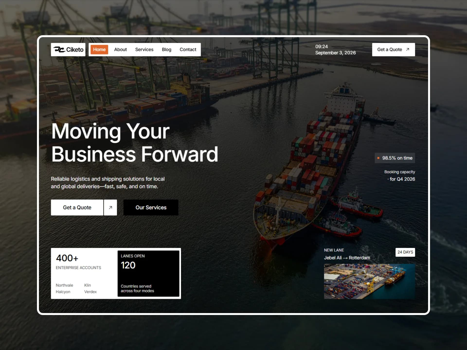
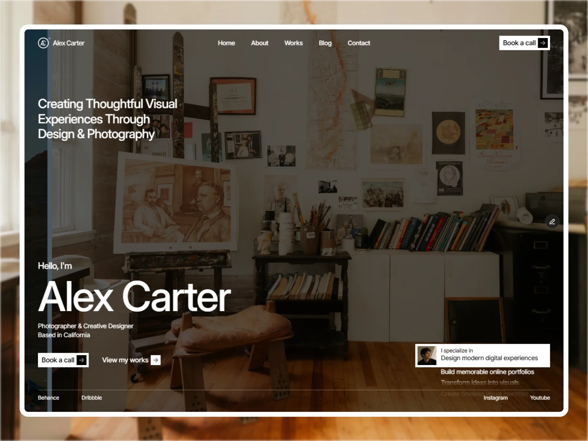
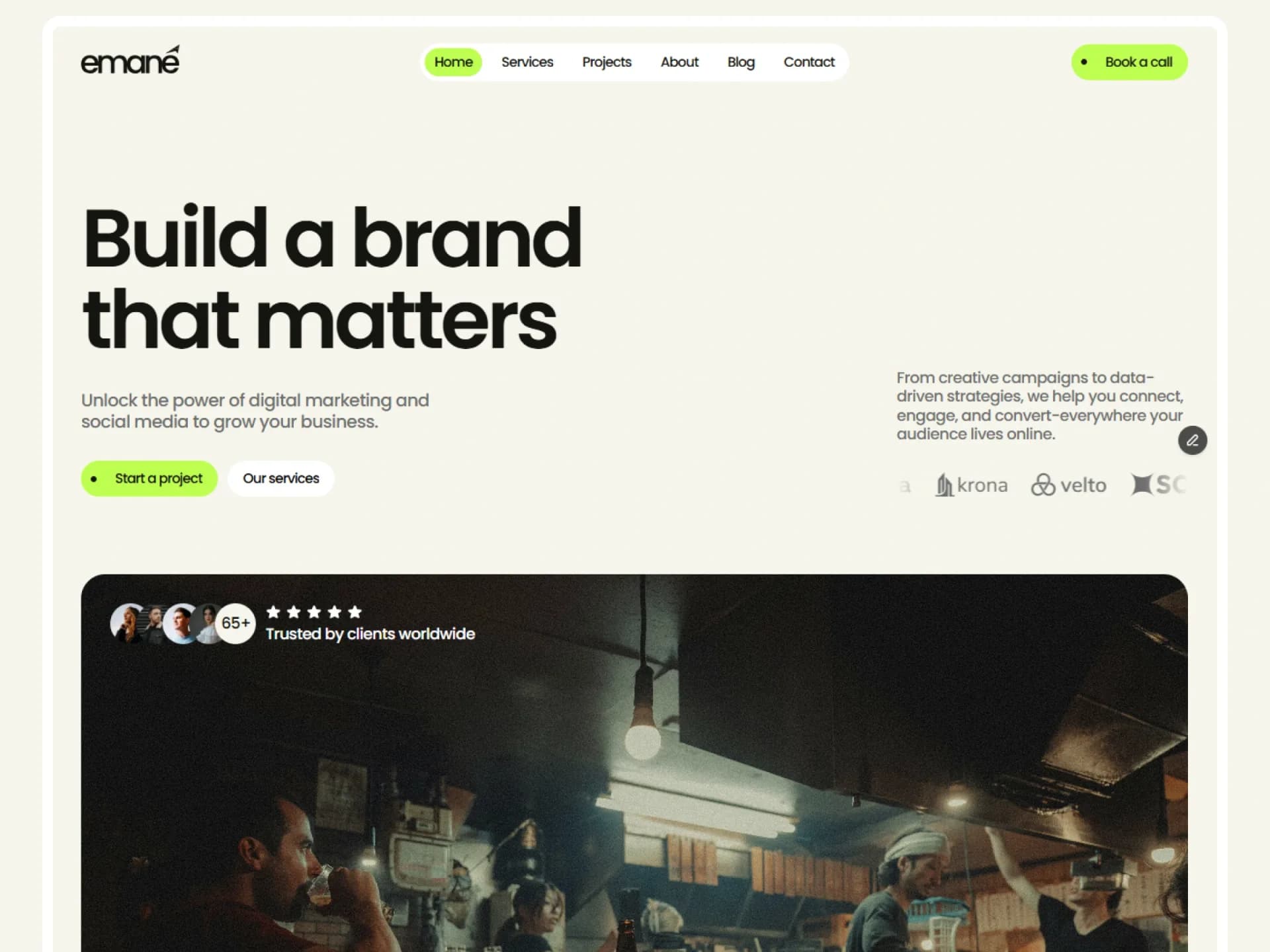
Sticky header with the brand on the left, navigation centered and a call to action on the right. It clears and fades on scroll down; link labels roll on hover.
Layout and motion from the Nitip template — see it in context"use client";
import * as React from "react";
import Link from "next/link";
import { usePathname } from "next/navigation";
import { AnimatePresence, motion, useMotionValueEvent, useScroll, type Transition } from "motion/react";
import { Hamburger } from "@/components/ui/hamburger";
import { SpringButton } from "@/components/ui/spring-button";
import { cn } from "@/lib/utils";
/*
* Header Centered — brand on the left, navigation centered, call to action on the right; sticky at the top.
* Source: marcframe/nitip → components/site/Header.tsx (+ design-system Navigation / MenuButton / Hamburger).
*
* Kept from Framer:
* - From 1024px, scrolling down (more than 4px, after the first 20px) clears the background and fades the brand and
* the button out in 400ms; scrolling up brings them back. The navigation stays.
* - Navigation hover: the background fades in (400ms) and the label rolls up while a copy rolls in from below —
* spring bounce 0.2, 0.4s, 24px travel.
* - Below 768px a menu button opens the links and the button under the bar with a height reveal (spring bounce 0,
* 0.4s; content fades in 0.25s after 0.1s, out in 0.15s). Choosing a link closes it.
* Changed: sticky instead of fixed, so it needs no spacer and stacks with any block; Escape closes the phone menu.
* Reduced motion: MotionConfig skips the roll and the reveal; the fades are CSS transitions, which
* motion-reduce:transition-none turns off.
*/
const roll: Transition = { type: "spring", bounce: 0.2, duration: 0.4 };
const soft: Transition = { type: "spring", bounce: 0, duration: 0.4 };
export type HeaderLink = { label: string; href: string };
export type HeaderCenteredProps = {
/** Brand shown on the left; `logo` replaces the text. */
brand?: { name: string; href: string; logo?: React.ReactNode };
links?: HeaderLink[];
cta?: HeaderLink;
/** Path of the current page; defaults to the router's pathname. A link is current on its page and below it. */
current?: string;
className?: string;
};
const defaults = {
brand: { name: "Northstar", href: "/" },
links: [
{ label: "Home", href: "/" },
{ label: "Services", href: "/services" },
{ label: "Projects", href: "/projects" },
{ label: "About", href: "/about" },
{ label: "Blog", href: "/blog" },
],
cta: { label: "Contact us", href: "/contact" },
};
const isCurrent = (href: string, path: string) =>
href === "/" ? path === "/" : path === href || path.startsWith(`${href}/`);
export function HeaderCentered({
brand = defaults.brand,
links = defaults.links,
cta = defaults.cta,
current,
className,
}: HeaderCenteredProps) {
const pathname = usePathname();
const path = current ?? pathname ?? "";
const { scrollY } = useScroll();
const [scrolled, setScrolled] = React.useState(false);
const [open, setOpen] = React.useState(false);
const menuId = React.useId();
/* Small dead zones keep trackpad jitter and the very top of the page from flickering the state. */
useMotionValueEvent(scrollY, "change", (y) => {
const delta = y - (scrollY.getPrevious() ?? y);
if (y < 20) setScrolled(false);
else if (delta > 4) setScrolled(true);
else if (delta < -4) setScrolled(false);
});
React.useEffect(() => {
if (!open) return;
const onKey = (event: KeyboardEvent) => event.key === "Escape" && setOpen(false);
window.addEventListener("keydown", onKey);
return () => window.removeEventListener("keydown", onKey);
}, [open]);
const fade =
"transition-opacity duration-400 ease-out motion-reduce:transition-none lg:group-data-[scrolled=true]:pointer-events-none lg:group-data-[scrolled=true]:opacity-0";
return (
<header
data-scrolled={scrolled}
className={cn(
"group sticky top-0 z-50 bg-background transition-colors duration-400 ease-out motion-reduce:transition-none lg:data-[scrolled=true]:bg-transparent",
className,
)}
>
<div className="relative mx-auto flex h-16 max-w-(--container) items-center justify-between gap-6 px-(--gutter) md:h-20">
<Link
href={brand.href}
className={cn(
"rounded-md font-heading text-lg font-semibold tracking-tight outline-none focus-visible:ring-[3px] focus-visible:ring-ring/50",
fade,
)}
>
{brand.logo ?? brand.name}
</Link>
<nav
aria-label="Main"
className="absolute left-1/2 hidden -translate-x-1/2 items-center gap-1 rounded-lg border border-border bg-background p-1 md:flex"
>
{links.map((link) => (
<NavLink key={link.href} link={link} current={isCurrent(link.href, path)} />
))}
</nav>
<SpringButton href={cta.href} className={cn("hidden lg:inline-flex", fade)}>
{cta.label}
</SpringButton>
<Hamburger open={open} onOpenChange={setOpen} controls={menuId} className="md:hidden" />
</div>
<AnimatePresence initial={false}>
{open && (
<motion.div
id={menuId}
initial={{ height: 0, opacity: 0 }}
animate={{ height: "auto", opacity: 1, transition: { height: soft, opacity: { duration: 0.25, delay: 0.1 } } }}
exit={{ height: 0, opacity: 0, transition: { height: soft, opacity: { duration: 0.15 } } }}
className="overflow-hidden md:hidden"
>
<div className="flex flex-col items-start gap-5 px-(--gutter) pt-4 pb-6">
<nav aria-label="Mobile" className="flex flex-col items-start gap-1">
{links.map((link) => (
<NavLink key={link.href} link={link} current={isCurrent(link.href, path)} onNavigate={() => setOpen(false)} />
))}
</nav>
<SpringButton href={cta.href} onClick={() => setOpen(false)}>
{cta.label}
</SpringButton>
</div>
</motion.div>
)}
</AnimatePresence>
</header>
);
}
/* One navigation link. The current page is filled and has no hover; the others roll their label on hover. */
function NavLink({ link, current, onNavigate }: { link: HeaderLink; current: boolean; onNavigate?: () => void }) {
return (
<motion.span initial="rest" animate="rest" whileHover={current ? undefined : "hover"} className="inline-flex">
<Link
href={link.href}
onClick={onNavigate}
aria-current={current ? "page" : undefined}
className={cn(
"inline-flex rounded-md px-3 py-1.5 text-sm font-medium outline-none transition-colors duration-400 ease-out focus-visible:ring-[3px] focus-visible:ring-ring/50 motion-reduce:transition-none",
current ? "bg-primary text-primary-foreground" : "text-foreground hover:bg-accent hover:text-accent-foreground",
)}
>
<span className="relative block h-5 overflow-hidden">
<motion.span variants={{ rest: { y: 0 }, hover: { y: -24 } }} transition={roll} className="relative block">
<span className="block">{link.label}</span>
<span aria-hidden className="absolute top-6 left-0 block">
{link.label}
</span>
</motion.span>
</span>
</Link>
</motion.span>
);
}Installation
$ npx shadcn@latest add https://framebrick.co/r/blocks/header-centered.json1. Add the Framebrick UI components it uses (they bring Motion).
npx shadcn@latest add https://framebrick.co/r/hamburger.json https://framebrick.co/r/spring-button.json2. Add the block tokens to
app/globals.cssonce (theming).npx shadcn@latest add https://framebrick.co/r/blocks/tokens.json3. Install the dependencies.
npm install motion4. Copy the block into
components/header-centered.tsx."use client"; import * as React from "react"; import Link from "next/link"; import { usePathname } from "next/navigation"; import { AnimatePresence, motion, useMotionValueEvent, useScroll, type Transition } from "motion/react"; import { Hamburger } from "@/components/ui/hamburger"; import { SpringButton } from "@/components/ui/spring-button"; import { cn } from "@/lib/utils"; /* * Header Centered — brand on the left, navigation centered, call to action on the right; sticky at the top. * Source: marcframe/nitip → components/site/Header.tsx (+ design-system Navigation / MenuButton / Hamburger). * * Kept from Framer: * - From 1024px, scrolling down (more than 4px, after the first 20px) clears the background and fades the brand and * the button out in 400ms; scrolling up brings them back. The navigation stays. * - Navigation hover: the background fades in (400ms) and the label rolls up while a copy rolls in from below — * spring bounce 0.2, 0.4s, 24px travel. * - Below 768px a menu button opens the links and the button under the bar with a height reveal (spring bounce 0, * 0.4s; content fades in 0.25s after 0.1s, out in 0.15s). Choosing a link closes it. * Changed: sticky instead of fixed, so it needs no spacer and stacks with any block; Escape closes the phone menu. * Reduced motion: MotionConfig skips the roll and the reveal; the fades are CSS transitions, which * motion-reduce:transition-none turns off. */ const roll: Transition = { type: "spring", bounce: 0.2, duration: 0.4 }; const soft: Transition = { type: "spring", bounce: 0, duration: 0.4 }; export type HeaderLink = { label: string; href: string }; export type HeaderCenteredProps = { /** Brand shown on the left; `logo` replaces the text. */ brand?: { name: string; href: string; logo?: React.ReactNode }; links?: HeaderLink[]; cta?: HeaderLink; /** Path of the current page; defaults to the router's pathname. A link is current on its page and below it. */ current?: string; className?: string; }; const defaults = { brand: { name: "Northstar", href: "/" }, links: [ { label: "Home", href: "/" }, { label: "Services", href: "/services" }, { label: "Projects", href: "/projects" }, { label: "About", href: "/about" }, { label: "Blog", href: "/blog" }, ], cta: { label: "Contact us", href: "/contact" }, }; const isCurrent = (href: string, path: string) => href === "/" ? path === "/" : path === href || path.startsWith(`${href}/`); export function HeaderCentered({ brand = defaults.brand, links = defaults.links, cta = defaults.cta, current, className, }: HeaderCenteredProps) { const pathname = usePathname(); const path = current ?? pathname ?? ""; const { scrollY } = useScroll(); const [scrolled, setScrolled] = React.useState(false); const [open, setOpen] = React.useState(false); const menuId = React.useId(); /* Small dead zones keep trackpad jitter and the very top of the page from flickering the state. */ useMotionValueEvent(scrollY, "change", (y) => { const delta = y - (scrollY.getPrevious() ?? y); if (y < 20) setScrolled(false); else if (delta > 4) setScrolled(true); else if (delta < -4) setScrolled(false); }); React.useEffect(() => { if (!open) return; const onKey = (event: KeyboardEvent) => event.key === "Escape" && setOpen(false); window.addEventListener("keydown", onKey); return () => window.removeEventListener("keydown", onKey); }, [open]); const fade = "transition-opacity duration-400 ease-out motion-reduce:transition-none lg:group-data-[scrolled=true]:pointer-events-none lg:group-data-[scrolled=true]:opacity-0"; return ( <header data-scrolled={scrolled} className={cn( "group sticky top-0 z-50 bg-background transition-colors duration-400 ease-out motion-reduce:transition-none lg:data-[scrolled=true]:bg-transparent", className, )} > <div className="relative mx-auto flex h-16 max-w-(--container) items-center justify-between gap-6 px-(--gutter) md:h-20"> <Link href={brand.href} className={cn( "rounded-md font-heading text-lg font-semibold tracking-tight outline-none focus-visible:ring-[3px] focus-visible:ring-ring/50", fade, )} > {brand.logo ?? brand.name} </Link> <nav aria-label="Main" className="absolute left-1/2 hidden -translate-x-1/2 items-center gap-1 rounded-lg border border-border bg-background p-1 md:flex" > {links.map((link) => ( <NavLink key={link.href} link={link} current={isCurrent(link.href, path)} /> ))} </nav> <SpringButton href={cta.href} className={cn("hidden lg:inline-flex", fade)}> {cta.label} </SpringButton> <Hamburger open={open} onOpenChange={setOpen} controls={menuId} className="md:hidden" /> </div> <AnimatePresence initial={false}> {open && ( <motion.div id={menuId} initial={{ height: 0, opacity: 0 }} animate={{ height: "auto", opacity: 1, transition: { height: soft, opacity: { duration: 0.25, delay: 0.1 } } }} exit={{ height: 0, opacity: 0, transition: { height: soft, opacity: { duration: 0.15 } } }} className="overflow-hidden md:hidden" > <div className="flex flex-col items-start gap-5 px-(--gutter) pt-4 pb-6"> <nav aria-label="Mobile" className="flex flex-col items-start gap-1"> {links.map((link) => ( <NavLink key={link.href} link={link} current={isCurrent(link.href, path)} onNavigate={() => setOpen(false)} /> ))} </nav> <SpringButton href={cta.href} onClick={() => setOpen(false)}> {cta.label} </SpringButton> </div> </motion.div> )} </AnimatePresence> </header> ); } /* One navigation link. The current page is filled and has no hover; the others roll their label on hover. */ function NavLink({ link, current, onNavigate }: { link: HeaderLink; current: boolean; onNavigate?: () => void }) { return ( <motion.span initial="rest" animate="rest" whileHover={current ? undefined : "hover"} className="inline-flex"> <Link href={link.href} onClick={onNavigate} aria-current={current ? "page" : undefined} className={cn( "inline-flex rounded-md px-3 py-1.5 text-sm font-medium outline-none transition-colors duration-400 ease-out focus-visible:ring-[3px] focus-visible:ring-ring/50 motion-reduce:transition-none", current ? "bg-primary text-primary-foreground" : "text-foreground hover:bg-accent hover:text-accent-foreground", )} > <span className="relative block h-5 overflow-hidden"> <motion.span variants={{ rest: { y: 0 }, hover: { y: -24 } }} transition={roll} className="relative block"> <span className="block">{link.label}</span> <span aria-hidden className="absolute top-6 left-0 block"> {link.label} </span> </motion.span> </span> </Link> </motion.span> ); }
Usage
import { HeaderCentered } from "@/components/header-centered";

<HeaderCentered
  brand={{ name: "Northstar", href: "/" }}
  links={[
    { label: "Home", href: "/" },
    { label: "Services", href: "/services" },
    { label: "Projects", href: "/projects" },
  ]}
  cta={{ label: "Contact us", href: "/contact" }}
/>
Props
| Prop | Type | Default | Description |
|---|---|---|---|
| brand | { name, href, logo? } | Northstar | Shown on the left; logo (any node) replaces the name. |
| links | { label, href }[] | 5 links | Navigation, centered from 768px, in the menu below. |
| cta | { label, href } | Contact us | Button at the right from 1024px, in the menu below. |
| current | string | usePathname() | Current path. A link is current on its page and on pages below it (/projects/x under /projects). |
| className | string | — | Classes for the <header>. |
- Sticky, so it needs no spacer; put it first on the page, outside <main>.
- From 1024px, scrolling down more than 4px (after the first 20px) clears the background and fades the brand and the button out in 400ms; scrolling up brings them back.
- Hover rolls a link's label up while a copy rolls in from below (spring bounce 0.2, 0.4s, 24px). The current link is filled and doesn't roll.
- Below 768px the menu button opens the links and the button with a height reveal; choosing a link or pressing Escape closes it.
- Reduced motion: the roll and the reveal are skipped by MotionConfig; the fades are CSS transitions turned off with motion-reduce.
AI prompt
Paste into v0, Lovable, Bolt or Claude to rebuild this block in your own project.
Create a React + Tailwind CSS + Motion (motion/react) block called HeaderCentered using Next.js Link and usePathname.
- A sticky <header> (top-0, z-50, bg-background) with a container: mx-auto max-w-(--container) px-(--gutter), h-16 (md:h-20).
- Brand text on the left (font-heading text-lg font-semibold tracking-tight). Navigation absolutely centered from 768px in a
  box with border border-border bg-background p-1 rounded-lg, links rounded-md px-3 py-1.5 text-sm font-medium.
  The current link (its path or below it) is bg-primary text-primary-foreground with aria-current="page".
- A shadcn-style button with an arrow on the right from 1024px (the arrow turns 45° on hover).
- Link hover: bg-accent fades in over 400ms; the label sits in a 20px-tall clipped box and rolls up 24px while an identical
  copy (24px below it, aria-hidden) rolls in — spring bounce 0.2, duration 0.4s. The current link has no hover.
- Scroll (from 1024px): track scrollY; below 20px reset; scrolling down more than 4px sets data-scrolled=true, up more than 4px
  sets false. Scrolled: header background transparent, brand and button opacity 0 and pointer-events none, 400ms ease-out.
- Below 768px a "Menu / Close" button with three lines that cross into an X (aria-expanded, aria-controls) opens a panel
  under the bar: stacked links and the button. Animate height 0 → auto with a spring (bounce 0, 0.4s), opacity in 0.25s after
  0.1s, out in 0.15s. Close on link click and on Escape.
- Use only shadcn CSS variables and the block tokens (--container, --gutter, font-heading).