Features & services
Features Cards
A split title over cards without a photo, each with an icon, a step chip or a number at the top and its title and text at the foot.
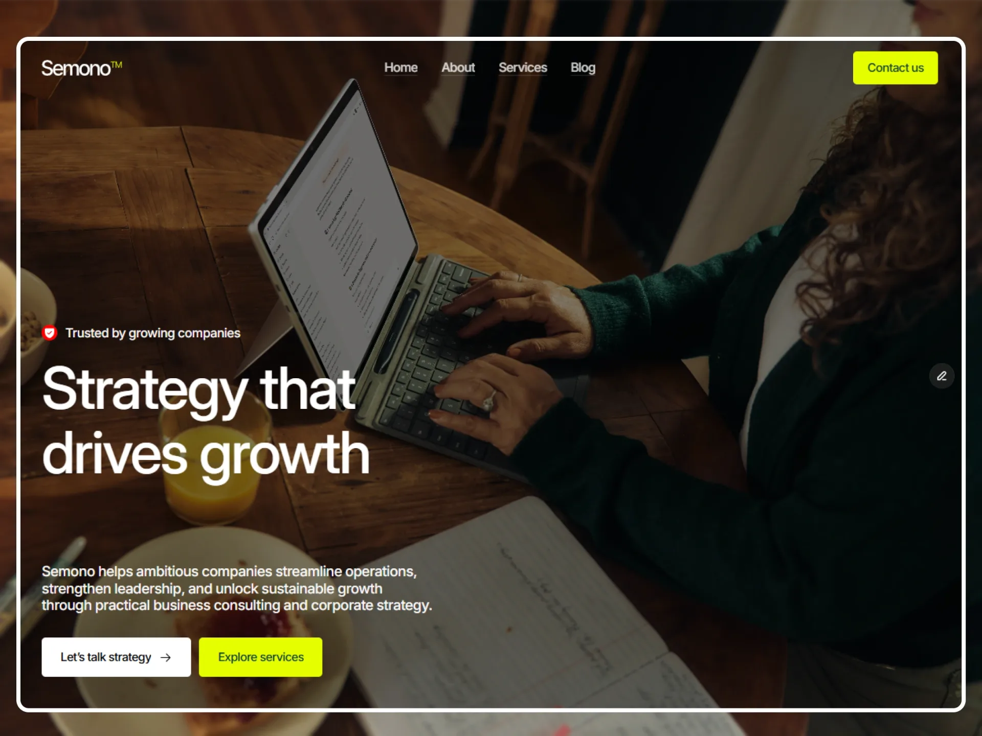
Layout and motion from the Semono template — see it in contextTry it in the page builderBlocks come with Pro
Preview every block now, in any theme and at any width. The source, the install command and the AI prompt unlock when Pro opens, once the catalog reaches 20 templates.
Props
| Prop | Type | Default | Description |
|---|---|---|---|
| label | string | "How we work" | A small line above the heading; empty for none. |
| title | string | — | The h2, up to 640px. |
| lead | string | — | Text at the right of the heading from 1024px (under it below), up to 520px; empty for none. |
| items | { title, text, symbol? }[] | 4 cards | The cards in the order they sit. symbol is the icon when mark="icon": briefcase, chart, people, target, shield, spark, layers or clock. |
| mark | "icon" | "step" | "number" | "icon" | What sits at the top of every card: an icon in a 36px square in the primary colour, a "Step 01" chip, or the number. |
| columns | 3 | 4 | 4 | Cards a row from 1024px (one below 768px, two from 768px). |
| stepLabel | string | "Step" | The word in the step chip. |
| className | string | — | Classes for the <section>. |
- Cards are 250px tall, 300px from 1024px, on the muted surface; 5px apart with icons and 10px with steps or numbers. Each card's title is an h3.
- Each card rises 40px into place from transparent, once, 0.1s late, when its first pixel comes into view (scroll-reveal); in place at once with reduced motion.