Installation and theming
Blocks install with the shadcn CLI into any Next.js project with Tailwind CSS 4. Each one brings its components, packages and the block tokens; a theme is the CSS variables in app/globals.css.
- 1
Start from a shadcn project
Next.js with Tailwind CSS 4 and shadcn/ui initialised. New project:
npx create-next-app@latest my-app cd my-app npx shadcn@latest init - 2
Add a block
Each block page has its command. It adds the block to
components/, the Framebrick UI components and shadcn primitives it uses, its npm packages, and the block tokens:npx shadcn@latest add https://framebrick.co/r/blocks/hero-title.json - 3
The block tokens
Every block depends on the registry item
tokens: the type scale and spacing variables in:rootand thetext-display…text-leadutilities in@theme inline. It only adds what yourapp/globals.cssdoesn't define yet, so your values survive the next block you install. To add it on its own first:npx shadcn@latest add https://framebrick.co/r/blocks/tokens.json - 4
Optional: register the namespace
Add Framebrick Blocks to
components.jsonto install with a short name —npx shadcn@latest add @framebrick-blocks/hero-title:{ "registries": { "@framebrick-blocks": "https://framebrick.co/r/blocks/{name}.json" } }
Theming
Color and corners use the standard shadcn variables, unchanged. Headings, type scale and spacing use the block tokens — fluid, so they scale from 390 to 1280 pixels on their own. Blocks read nothing else, so one file restyles the page.
--background--foreground--card--muted--muted-foreground--primary--primary-foreground--secondary--accent--border--input--ring--radius| Token | Default | Used as | For |
|---|---|---|---|
| --font-heading | var(--font-sans) | font-heading | Heading font — set in @theme inline, the line shadcn itself adds. Defaults to the body font. |
| --text-display | clamp(2.5rem, 1.75rem + 3.75vw, 4.5rem) | text-display | Hero headings. |
| --text-h1 | clamp(2.25rem, 1.6rem + 2.8vw, 3.75rem) | text-h1 | Page titles. |
| --text-h2 | clamp(1.875rem, 1.45rem + 1.9vw, 3rem) | text-h2 | Section headings — one per block. |
| --text-h3 | clamp(1.25rem, 1.1rem + 0.6vw, 1.5rem) | text-h3 | Card and item headings. |
| --text-lead | clamp(1.0625rem, 1rem + 0.35vw, 1.25rem) | text-lead | Intro paragraphs under a heading. |
| --section-y | clamp(4rem, 8vw, 8rem) | py-(--section-y) | Top and bottom padding of every block. |
| --container | 80rem | max-w-(--container) | Maximum width of block content. |
| --gutter | clamp(1.25rem, 4vw, 2.5rem) | px-(--gutter) | Side padding of block content. |
Try a sample theme
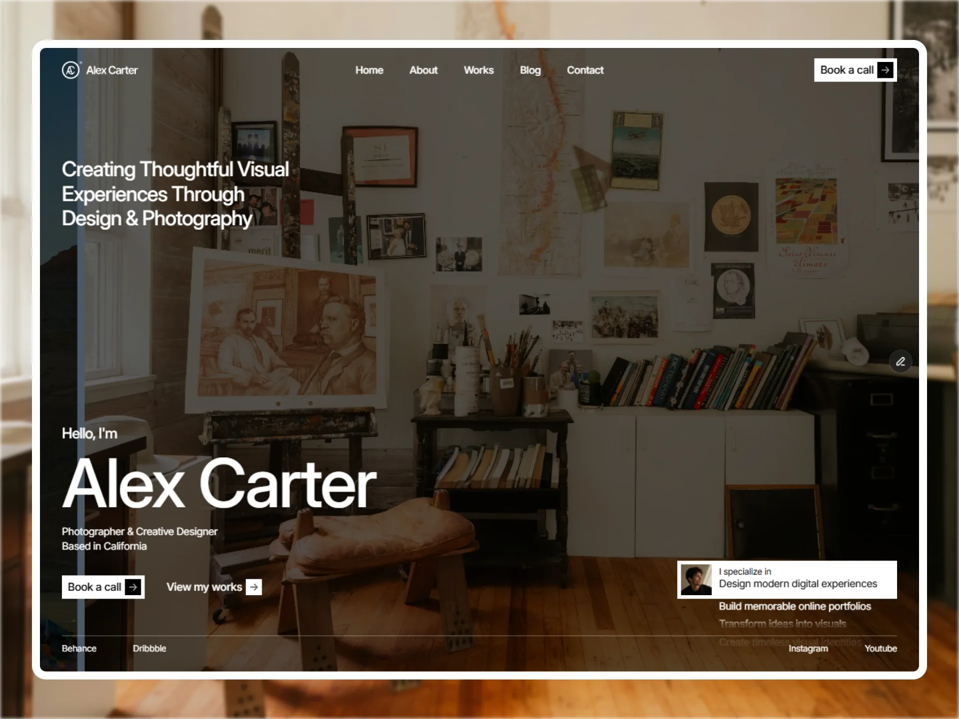
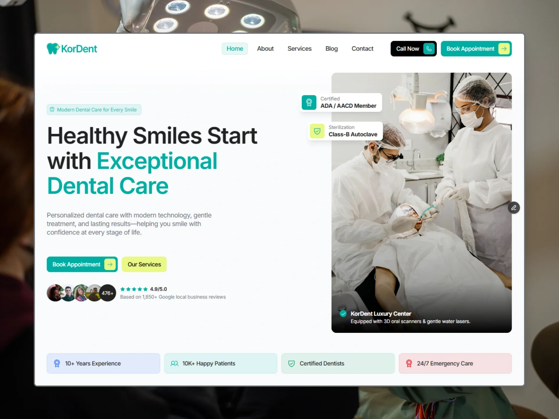
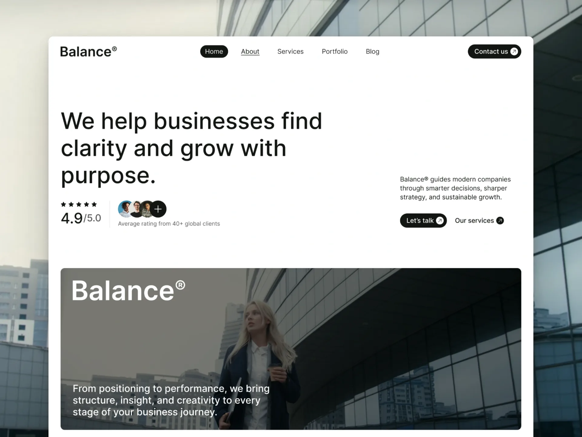
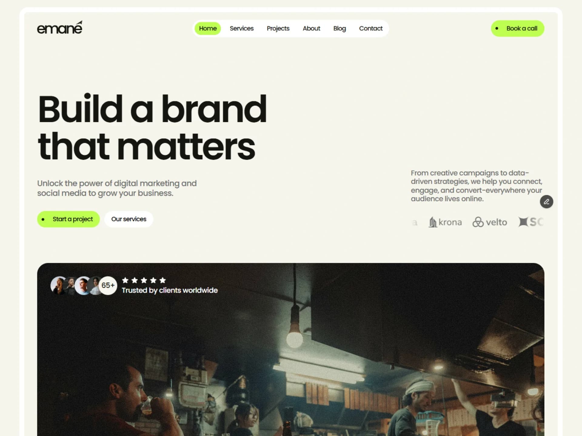
The same markup under the default theme and three sample themes — plain token sets, never a template's look. Every block preview on the site follows the theme you pick.
Sample theme CSS
Paste over the matching lines in :root and .dark of your app/globals.css.
Warm paper, brick red, serif headings, roomy spacing and small radius.
/* Heading font: load Newsreader with next/font in app/layout.tsx as variable "--font-heading",
   then point shadcn's heading line at it. */
@theme inline {
  --font-heading: var(--font-heading);
}

:root {
  --radius: 0.25rem;
  --background: oklch(0.985 0.008 85);
  --foreground: oklch(0.22 0.02 50);
  --card: oklch(0.965 0.014 85);
  --card-foreground: oklch(0.22 0.02 50);
  --popover: oklch(0.985 0.008 85);
  --popover-foreground: oklch(0.22 0.02 50);
  --primary: oklch(0.5 0.14 38);
  --primary-foreground: oklch(0.985 0.008 85);
  --secondary: oklch(0.935 0.02 80);
  --secondary-foreground: oklch(0.25 0.02 50);
  --muted: oklch(0.945 0.018 82);
  --muted-foreground: oklch(0.49 0.03 60);
  --accent: oklch(0.925 0.028 75);
  --accent-foreground: oklch(0.22 0.02 50);
  --border: oklch(0.88 0.022 80);
  --input: oklch(0.88 0.022 80);
  --ring: oklch(0.5 0.14 38);
  --text-display: clamp(2.75rem, 1.75rem + 4.5vw, 5.5rem);
  --text-h1: clamp(2.5rem, 1.7rem + 3.4vw, 4.25rem);
  --text-h2: clamp(2rem, 1.5rem + 2.2vw, 3.5rem);
  --text-h3: clamp(1.375rem, 1.2rem + 0.7vw, 1.75rem);
  --section-y: clamp(5rem, 10vw, 10rem);
  --container: 72rem;
  --gutter: clamp(1.5rem, 5vw, 3rem);
}

.dark {
  --background: oklch(0.18 0.012 60);
  --foreground: oklch(0.95 0.014 85);
  --card: oklch(0.22 0.014 60);
  --card-foreground: oklch(0.95 0.014 85);
  --popover: oklch(0.22 0.014 60);
  --popover-foreground: oklch(0.95 0.014 85);
  --primary: oklch(0.72 0.13 45);
  --primary-foreground: oklch(0.18 0.012 60);
  --secondary: oklch(0.27 0.016 60);
  --secondary-foreground: oklch(0.95 0.014 85);
  --muted: oklch(0.27 0.016 60);
  --muted-foreground: oklch(0.73 0.03 75);
  --accent: oklch(0.3 0.02 60);
  --accent-foreground: oklch(0.95 0.014 85);
  --border: oklch(0.95 0.014 85 / 12%);
  --input: oklch(0.95 0.014 85 / 16%);
  --ring: oklch(0.72 0.13 45);
}
Cool grays, electric blue, monospaced headings, square corners and dense spacing.
/* Heading font: load Geist Mono with next/font in app/layout.tsx as variable "--font-heading",
   then point shadcn's heading line at it. */
@theme inline {
  --font-heading: var(--font-heading);
}

:root {
  --radius: 0rem;
  --background: oklch(0.985 0.002 250);
  --foreground: oklch(0.2 0.012 250);
  --card: oklch(1 0 0);
  --card-foreground: oklch(0.2 0.012 250);
  --popover: oklch(1 0 0);
  --popover-foreground: oklch(0.2 0.012 250);
  --primary: oklch(0.52 0.22 264);
  --primary-foreground: oklch(0.985 0 0);
  --secondary: oklch(0.95 0.006 250);
  --secondary-foreground: oklch(0.2 0.012 250);
  --muted: oklch(0.955 0.005 250);
  --muted-foreground: oklch(0.5 0.016 250);
  --accent: oklch(0.94 0.02 264);
  --accent-foreground: oklch(0.3 0.12 264);
  --border: oklch(0.89 0.006 250);
  --input: oklch(0.89 0.006 250);
  --ring: oklch(0.52 0.22 264);
  --text-display: clamp(2.125rem, 1.5rem + 3vw, 3.75rem);
  --text-h1: clamp(1.875rem, 1.4rem + 2.2vw, 3rem);
  --text-h2: clamp(1.5rem, 1.25rem + 1.2vw, 2.25rem);
  --text-h3: clamp(1.125rem, 1.05rem + 0.35vw, 1.25rem);
  --text-lead: clamp(1rem, 0.95rem + 0.25vw, 1.125rem);
  --section-y: clamp(3rem, 6vw, 5.5rem);
  --container: 76rem;
  --gutter: clamp(1rem, 3vw, 2rem);
}

.dark {
  --background: oklch(0.16 0.008 250);
  --foreground: oklch(0.96 0.004 250);
  --card: oklch(0.2 0.01 250);
  --card-foreground: oklch(0.96 0.004 250);
  --popover: oklch(0.2 0.01 250);
  --popover-foreground: oklch(0.96 0.004 250);
  --primary: oklch(0.72 0.16 255);
  --primary-foreground: oklch(0.16 0.008 250);
  --secondary: oklch(0.25 0.01 250);
  --secondary-foreground: oklch(0.96 0.004 250);
  --muted: oklch(0.24 0.01 250);
  --muted-foreground: oklch(0.7 0.014 250);
  --accent: oklch(0.28 0.05 262);
  --accent-foreground: oklch(0.9 0.05 255);
  --border: oklch(1 0 0 / 12%);
  --input: oklch(1 0 0 / 16%);
  --ring: oklch(0.72 0.16 255);
}
Lavender tints, violet, rounded grotesque headings and large radius.
/* Heading font: load Bricolage Grotesque with next/font in app/layout.tsx as variable "--font-heading",
   then point shadcn's heading line at it. */
@theme inline {
  --font-heading: var(--font-heading);
}

:root {
  --radius: 1.25rem;
  --background: oklch(0.99 0.006 300);
  --foreground: oklch(0.24 0.04 285);
  --card: oklch(0.97 0.014 300);
  --card-foreground: oklch(0.24 0.04 285);
  --popover: oklch(0.99 0.006 300);
  --popover-foreground: oklch(0.24 0.04 285);
  --primary: oklch(0.55 0.21 290);
  --primary-foreground: oklch(0.99 0.006 300);
  --secondary: oklch(0.94 0.03 300);
  --secondary-foreground: oklch(0.35 0.1 290);
  --muted: oklch(0.955 0.016 300);
  --muted-foreground: oklch(0.51 0.045 285);
  --accent: oklch(0.93 0.045 330);
  --accent-foreground: oklch(0.32 0.08 330);
  --border: oklch(0.91 0.022 300);
  --input: oklch(0.91 0.022 300);
  --ring: oklch(0.55 0.21 290);
  --container: 76rem;
}

.dark {
  --background: oklch(0.19 0.03 285);
  --foreground: oklch(0.96 0.01 300);
  --card: oklch(0.23 0.035 285);
  --card-foreground: oklch(0.96 0.01 300);
  --popover: oklch(0.23 0.035 285);
  --popover-foreground: oklch(0.96 0.01 300);
  --primary: oklch(0.74 0.15 295);
  --primary-foreground: oklch(0.19 0.03 285);
  --secondary: oklch(0.28 0.04 285);
  --secondary-foreground: oklch(0.96 0.01 300);
  --muted: oklch(0.27 0.035 285);
  --muted-foreground: oklch(0.74 0.035 290);
  --accent: oklch(0.3 0.06 320);
  --accent-foreground: oklch(0.93 0.04 320);
  --border: oklch(1 0 0 / 10%);
  --input: oklch(1 0 0 / 15%);
  --ring: oklch(0.74 0.15 295);
}
Be the first to know
Get new templates and components first
One short email when we release a template or a free component. No spam — unsubscribe anytime.
We use your email only for Framebrick updates. Privacy policy