Getting started — Ciketo AI Prompts
The pack builds Ciketo one prompt at a time. Each prompt describes one part of the site exactly — sizes, spacing, text styles, motion, content — and names the screenshots that show how it should look. This guide takes you from the download to a finished site.
What you need
Section titled “What you need”- An AI tool that writes and runs a website: a chat builder (Lovable, Bolt, v0, Replit) or a coding agent (Cursor, Claude Code, Codex, Windsurf). Notes for each are in Notes for each tool.
- A plan with room for about 20 to 30 messages: the 16 prompts, plus a few follow-ups to fix details. Free plans usually run out before the end.
- A web browser to open
Prompts.html.
What is in the pack
Section titled “What is in the pack”| Folder or file | What it is for |
|---|---|
Prompts.html |
Open this first: every prompt with a Copy button, the screenshots to attach, and your progress |
prompts/ |
The same prompts as Markdown files (01-foundation.md … 16-finish.md) |
references/ |
Screenshots of every page layout: home-desktop-1.png (1200 px wide, top to bottom), home-tablet-1.png (810 px) and home-phone-1.png (390 px wide, strips side by side) |
content/ |
The demo text as JSON: site.json, pages/*.json, collections/*.json |
assets/ |
images/ (placeholders at the right sizes and the sample client logos) and icons/ |
checklist.md |
Section heights per page, for agents that can measure what they built |
The order of the prompts
Section titled “The order of the prompts”| # | Prompt | What it builds |
|---|---|---|
| 1 | Foundation | The project, the design tokens (colours, text styles, spacing, motion), the rules for breakpoints, images and the quote form, the icons |
| 2 | Components | Buttons, menu links, the logo, the hamburger and the clock, section titles, post cards, facts, the services and FAQ accordions, the step selector, the client ticker, rich text, form fields and the quote form … — everything the pages are made of |
| 3 | Layout | Header (with the clock and the phone menu) and footer, and the site details (site.json) |
| 4–6 | Content | The collections: clients, trade lanes, services and testimonials; the posts (in two parts); the legal pages |
| 7–15 | Pages | One prompt per page layout: Home, About, Services, Service, Blog, Post, Contact, Legal, 404 |
| 16 | Finish | Browser titles and descriptions, share image, icons, sitemap and robots, a last check of every page |
Each prompt builds on the ones before it, so keep the order.
With a chat builder
Section titled “With a chat builder”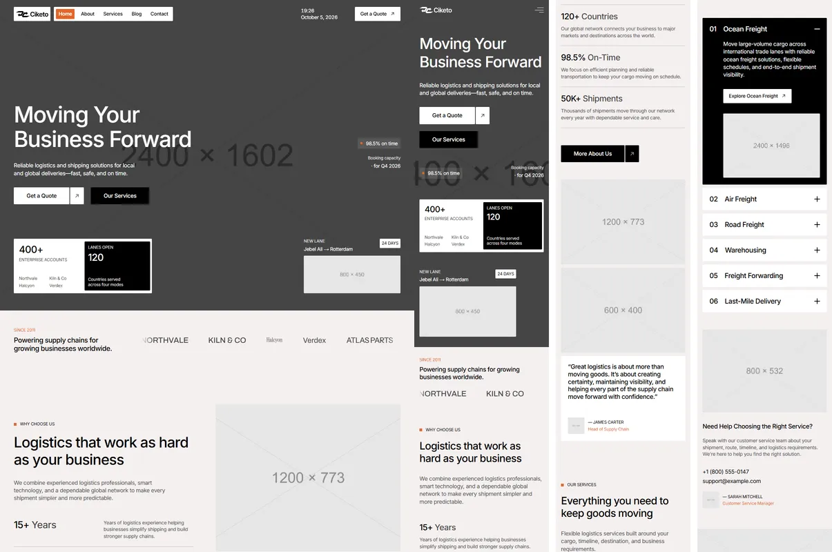
- Open
Prompts.htmland choose Lovable, Bolt, v0, Replit at the top. - Start a new, empty project in your tool.
- Copy prompt 1. In the tool’s message box, attach the screenshots listed on the card (drag them from the
referencesfolder, or use the attach button), paste the prompt and send it. - Wait until the tool has finished and the preview works. Compare it with the screenshots; if something is off, ask for that one fix in a short message (“On desktop, the header’s clock should sit left of the Get a Quote button, as in the screenshot”).
- Tick the prompt in
Prompts.htmland go on with the next one.
The Content prompts (4–6) are long on purpose: they carry the demo text of every service, lane, post, testimonial and legal page. Send them as they are. The tool saves them as files and shows nothing new yet — that is expected.
Some page prompts list more screenshots than a tool takes in one message (Home has eight desktop slices and four phone images). Attach the desktop ones first; if your tool has a limit, send the rest in a short follow-up (“Here are the phone screenshots for the same page”).
With a coding agent
Section titled “With a coding agent”- Copy the whole pack into your project folder and name it
ciketo/. - Open
Prompts.html, choose Cursor, Claude Code, Codex, Windsurf at the top, and copy the kickoff prompt. - Send it to the agent. It copies the content and images into the project, then works through the prompts in order, opening the screenshots for each page. The Content prompts are skipped — the files are already there.
- Check each page as it lands, in the browser, at phone and desktop width. Agents that can run a browser can also
compare their result with
ciketo/checklist.md.
Checking a page
Section titled “Checking a page”- Put the site next to the page’s screenshots at 1200, 810 and 390 px wide: same sections, in the same order, with the same alignment and spacing.
- Resize the window slowly from phone to desktop: the layout changes at 810 px and 1200 px and never scrolls sideways.
- Hover the buttons, cards and menu on a computer; scroll Home and watch the header turn solid; open the services accordion, the How it works steps and the FAQ; choose another client in the testimonials; send the quote form in demo mode.
Photos are grey placeholders until you add your own — see Making it yours.