Design — Ciketo Astro
The look comes from a small set of tokens. Change a token and every page, component and state follows, so you rarely need to touch a component.
See everything first
Section titled “See everything first”Run npm run dev and open http://localhost:4321/style-guide. It shows the colours, text styles, buttons, form
fields, cards and every other component with its name. When you want to know what a change will affect, look there.
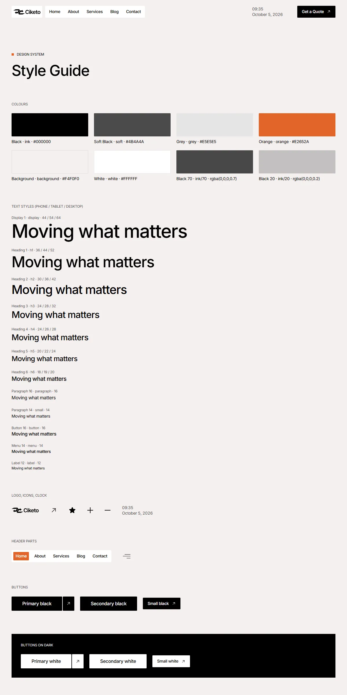
Colours
Section titled “Colours”src/design-system/theme.css:
@theme { --color-ink: #000000; /* Black: headings, dark buttons and cards, the footer */ --color-soft: #4b4a4a; /* Soft Black: body text, dates and other details */ --color-grey: #e5e5e5; /* Grey: text on dark backgrounds, lines */ --color-orange: #e2652a; /* Orange: labels, the current page, step numbers, button hovers */ --color-background: #f4f0f0; /* Background: the page, and the header once you scroll */}Each name becomes a Tailwind class: bg-ink, text-soft, bg-orange. Swap the hex values for your own palette and
the whole site changes. Keep enough contrast between text and its background (at least 4.5:1), or the site becomes hard
to read.
Faded colours are opacity modifiers on the same colour: bg-ink/70 (the dark cover over the photos of Home, Contact and
404), bg-ink/50 (the call to action), bg-ink/20 (divider lines), bg-white/10 (the line in the footer). They follow
the palette when you change the colour.
A few colours are also written where they animate, because Motion animates values, not class names. Change them with the palette:
- the Orange of the small buttons’ hover in
src/design-system/components/actions/Button.astro, and of the current page in the menu inMenuLink.astro(rgb(226, 101, 42)), with the menu links’ Grey hover (rgb(229, 229, 229)); - the Background of the header in
src/components/site/Header.astroandheader.ts(rgba(244, 240, 240, …)); - the black and white of the services list on Home in
src/design-system/components/patterns/ServiceAccordion.astroandsrc/design-system/scripts/service-accordion.ts; - the red of the form’s “Something went wrong” in
src/design-system/components/forms/SubmitButton.astro.
The header is transparent at the top of Home, Contact and 404, takes the page background once you scroll, and turns
white while the phone menu is open: src/components/site/header.ts.
The Ciketo logo is drawn as SVG paths in src/design-system/components/brand/Logo.astro: the arrow mark (mark) and the
wordmark (wordmark), in the current text colour. That’s why it is black in the header’s white box, white over the dark
covers on phones and white in the footer. To use your own:
- As an SVG: replace the paths with your logo’s path data and set the
viewBoxto your artwork’s size. - As an image file: replace the
<svg>with an<img>of your file.
The logo is 94 × 18 px everywhere (h-[18px] w-[94px] in Logo.astro): change those classes to fit your proportions.
Its label for screen readers is site.name.
The browser icons are public/icon.svg and public/apple-icon.png.
The template loads Inter with the Astro Fonts API, in astro.config.mjs:
fonts: [ { provider: fontProviders.google(), name: "Inter", cssVariable: "--font-inter", weights: ["100 900"], … },],To use another Google font, change name and keep cssVariable. Inter is a variable font, so weights is its whole
range: give a variable font its own range (["200 800"] for Manrope), or list the weights the site uses for a font
that isn’t variable: ["400", "500", "600"] (text; headings and buttons; bold starts and the form’s “Thank you”). For a
font you have licensed yourself, use fontProviders.local() with your files, for example in src/assets/fonts/ (see
the Astro fonts guide). Astro downloads the font when the site builds and
serves it from your own domain, so there is no request to Google at runtime.
The <Font> line in src/layouts/Layout.astro loads it on every page, and theme.css makes it the site’s font
(--font-sans).
Text styles
Section titled “Text styles”src/design-system/tokens/text.ts holds the sizes, weights and line heights, named after the design (Display 1,
Heading 1–6, Paragraph 16, Paragraph 14, Button 16, Menu 14, Label 12):
display, h1, h2, h3, h4, h5, h6paragraph, small, button, menu, labelEach is a set of Tailwind classes. The headings have the phone size first and the tablet (md:) and desktop (lg:)
sizes after, for example h2: "text-[30px] md:text-[36px] lg:text-[42px] leading-[1.2] font-medium tracking-[-0.03em]".
Paragraphs, labels, menu and button text are the same at every size. Section labels are Label 12 in capitals (the
uppercase class where they’re used). Change the numbers here rather than in the components, and headings stay
consistent across the site.
Use them as class={text.h2} or combine: class={cn(text.h6, "text-white")}.
Breakpoints
Section titled “Breakpoints”Three sizes, set in theme.css:
| Width | Tailwind prefix | |
|---|---|---|
| Phone | below 810 px | (none) |
| Tablet | 810–1199 px | md: |
| Desktop | 1200 px and up | lg: |
Content is at most 1600 px wide (800 px on the legal pages). The side padding is 15 px on phones, 20 px on tablets and
40 px on desktops, and most sections have 60 / 80 / 100 px of space above and below
(src/design-system/components/layout/section.ts).
Motion
Section titled “Motion”src/design-system/tokens/motion.ts holds the transitions. The scripts in src/design-system/scripts/ play them with
Motion:
| Token | Used for |
|---|---|
spring |
Buttons (the orange sweep, the arrow), the header and the phone menu, the services list, the steps, the testimonials, the FAQ |
springSoft |
The plus and minus icons, the hamburger lines, the zoom on blog card photos |
springMenu |
The menu links’ hover |
appearText, appearStagger, appearBlock |
The Home hero on load: the title word by word, then the text, buttons, figures and lane card rising |
Lower a spring’s duration for a snappier feel, or raise bounce for a livelier one.
| Effect | Where to change it |
|---|---|
| The Home hero appears on load | <TextAppear> and <Appear> in src/components/sections/HomeHeroSection.astro (delay in seconds). A plain element with the same class shows at once. |
| The client logos scroll left at 20 px a second, 60 px apart | Add speed and gap to <Ticker> in src/components/sections/ClientsSection.astro (the defaults are in Ticker.astro) |
| The blog shows six posts, then six more as you scroll | pageSize on <BlogListSection> in src/pages/blog.astro (6 when left out) |
| The header is transparent at the top of Home, Contact and 404 | cover on <Layout> in src/pages/index.astro, contact.astro and 404.astro; the page’s first section carries data-header-cover so it starts under the header |
With “reduce motion” switched on in the visitor’s system, the hero shows at once, hovers and panels change without animating, and the logo row and the blog’s spinner stand still.
Rounded corners, spacing, shadows
Section titled “Rounded corners, spacing, shadows”Ciketo’s corners are 2 px: buttons, boxes, cards, photos and form fields (rounded-[2px]). Only the spinners are round.
Spacing is Tailwind classes on the components (p-5, gap-[50px]). Tailwind’s scale is 4 px per step, so p-5 is
20 px. Change them where you see them; the style guide shows the result immediately. There are no drop shadows: the
form fields draw their 1 px border with an inset shadow (src/design-system/components/forms/field.ts).
Components
Section titled “Components”src/design-system/components/ holds the buttons, the menu, the post card, the clock, the facts, the accordions, the
steps, the logo row, the form fields and the icons. Their behaviour is in src/design-system/scripts/. The
README lists every component next to the Framer component it comes from, and every
script with what it does. The sections that make up a page are one level up, in src/components/sections/, and are
listed in Pages and sections.
The icons are Phosphor shapes stored as path data in
src/design-system/components/icons/paths.ts (arrow-up-right in the buttons, star in the ratings), and
<Icon name="star" /> draws one in the current text colour. To add one:
-
Open the icon on phosphoricons.com and copy the SVG.
-
Take the
d="…"of its<path>. -
Add a line:
"my-icon": "M128,24A104,104,0,1,0,…",
Then use <Icon name="my-icon" class="size-5" />. Paths use a 256 × 256 grid, which is what Phosphor exports.