Getting started — Ciketo Figma
Open the file
Section titled “Open the file”Your purchase gives you the Ciketo Figma file in one of two forms:
- A duplicate link. Open it while signed in to Figma and choose Duplicate (or Open in Figma). A copy lands in your Drafts; move it to a team or project from the file menu.
- A
.figfile. In Figma, go to your Drafts or a project, then Import (or drag the file onto the Figma window).
Either way the copy is yours: edit it freely and invite your team. A free Figma plan is enough to open and edit it.
Start with the Read Me page inside the file — it summarises this guide.
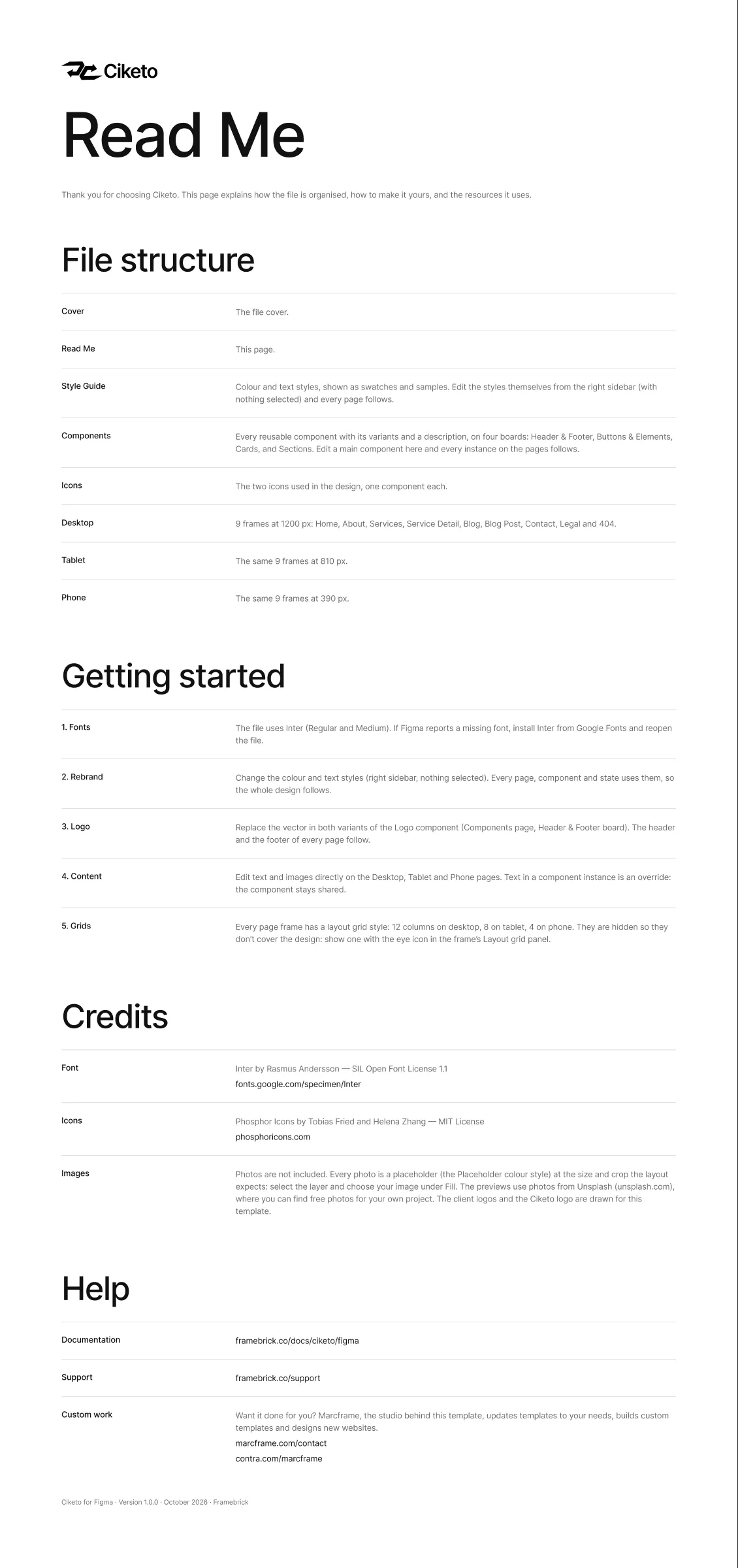
The file uses one typeface: Inter — Medium for headings, buttons and the menu, Regular for everything else. Figma’s browser and desktop apps include it through Google Fonts, so it usually works straight away. If Figma shows a Missing fonts warning, install Inter on your computer from Google Fonts and reopen the file.
The pages
Section titled “The pages”| Page | What is on it |
|---|---|
| Cover | The file cover |
| Read Me | File structure, getting started, credits and help |
| Style Guide | The colour and text styles, shown as swatches and samples (Colours and text styles) |
| Components | Every reusable component with its variants, on four boards: Header & Footer, Buttons & Elements, Cards, Sections (Components) |
| Icons | The two icons used in the design, one component each, from Phosphor Icons (MIT licence) |
| Desktop | The 9 page frames at 1200 px |
| Tablet | The same 9 frames at 810 px |
| Phone | The same 9 frames at 390 px |
Page frames
Section titled “Page frames”Each breakpoint page holds the frames in site order, named <Page> - <Breakpoint>:
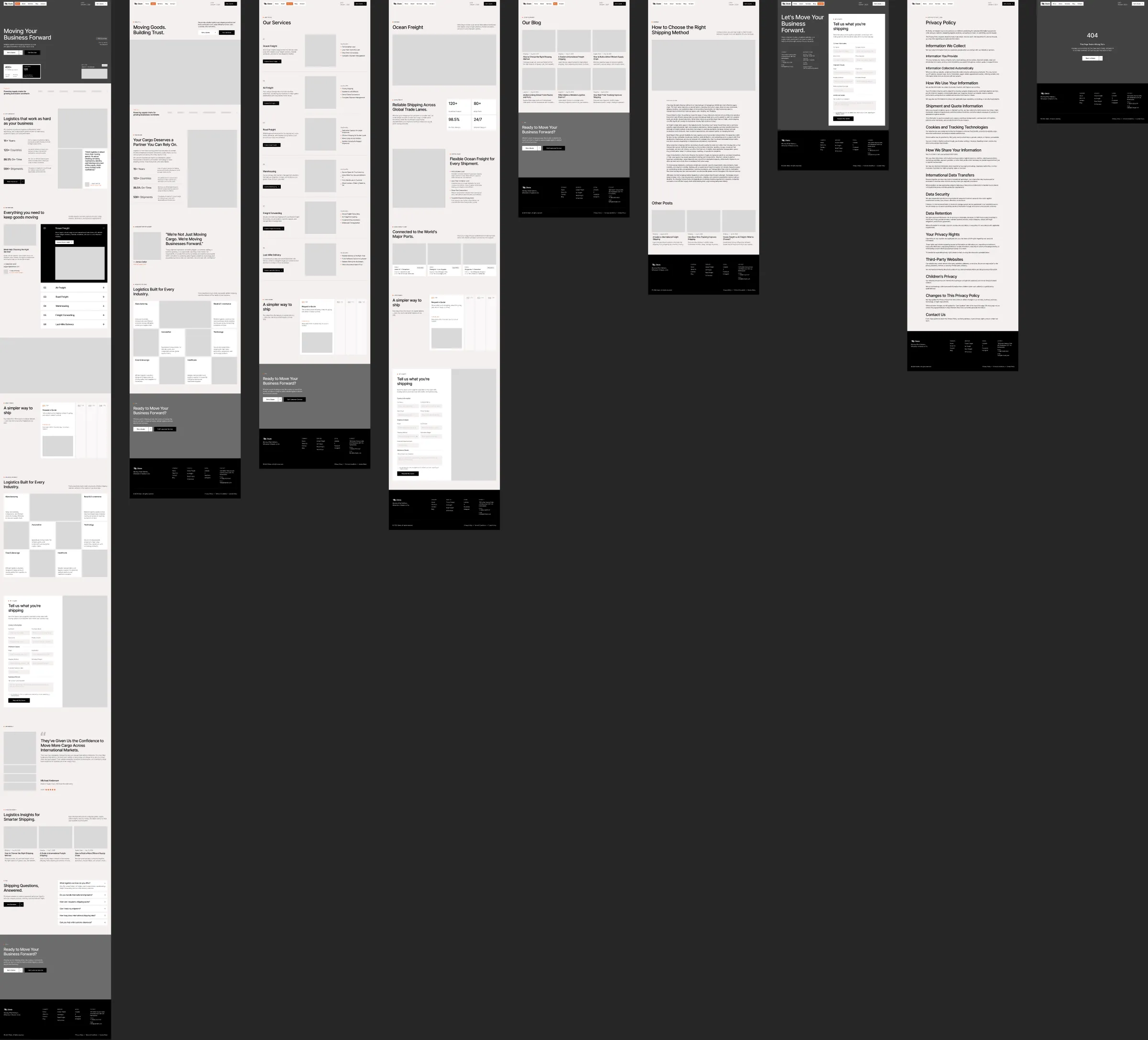
| Frame | Page of the site |
|---|---|
| Home | The hero with the client and lane cards, client logos, why choose us with four figures, the services accordion and a help card, a photo band, “How it works”, the industries, the quote form, testimonials, the latest posts, the FAQ and a call to action |
| About | The page title and a wide photo, client logos, who we are with the figures, a message from the company’s leader, the industries and a call to action |
| Services | Every service with its summary, key benefits and photo, “How it works” and a call to action |
| Service Detail | One service (Ocean Freight): the hero, the introduction with its figures, the key benefits, the trade lanes, “How it works” and the quote form |
| Blog | The post list (the first six posts) and a call to action |
| Blog Post | One article and other posts |
| Contact | The quote form over a photo cover, with the address, phone and e-mail |
| Legal | The privacy policy — the same layout serves the terms and the cookie policy |
| 404 | Page not found |
Frame widths are the breakpoints the design is built for — Desktop 1200 px, Tablet 810 px, Phone 390 px — and each frame has a matching layout grid (hidden by default; see Colours and text styles).
Finding things
Section titled “Finding things”- Pages list (top of the left sidebar): jump between the pages above.
- Layers panel (
Alt/Option + 1): frames and layers are named after what they are — “Header”, “Footer”, “Hero”, “Services”, “Post Card”. - Assets panel (
Alt/Option + I): every component with a short description, ready to drag onto a frame. - Right-click a component → Go to main component to jump from a page to where the component is defined.
Before you change anything
Section titled “Before you change anything”Duplicate the frames you are about to rework (Ctrl/Cmd + D) or save a named version (File → Save to version
history), so you can always compare with the original design.