Design — Goeboek HTML
The look of Goeboek’s HTML edition comes from a few design tokens in one file, src/css/style.css, and from Tailwind CSS classes on the pages; this guide shows where each part of the look is set and how to rebuild the stylesheet.
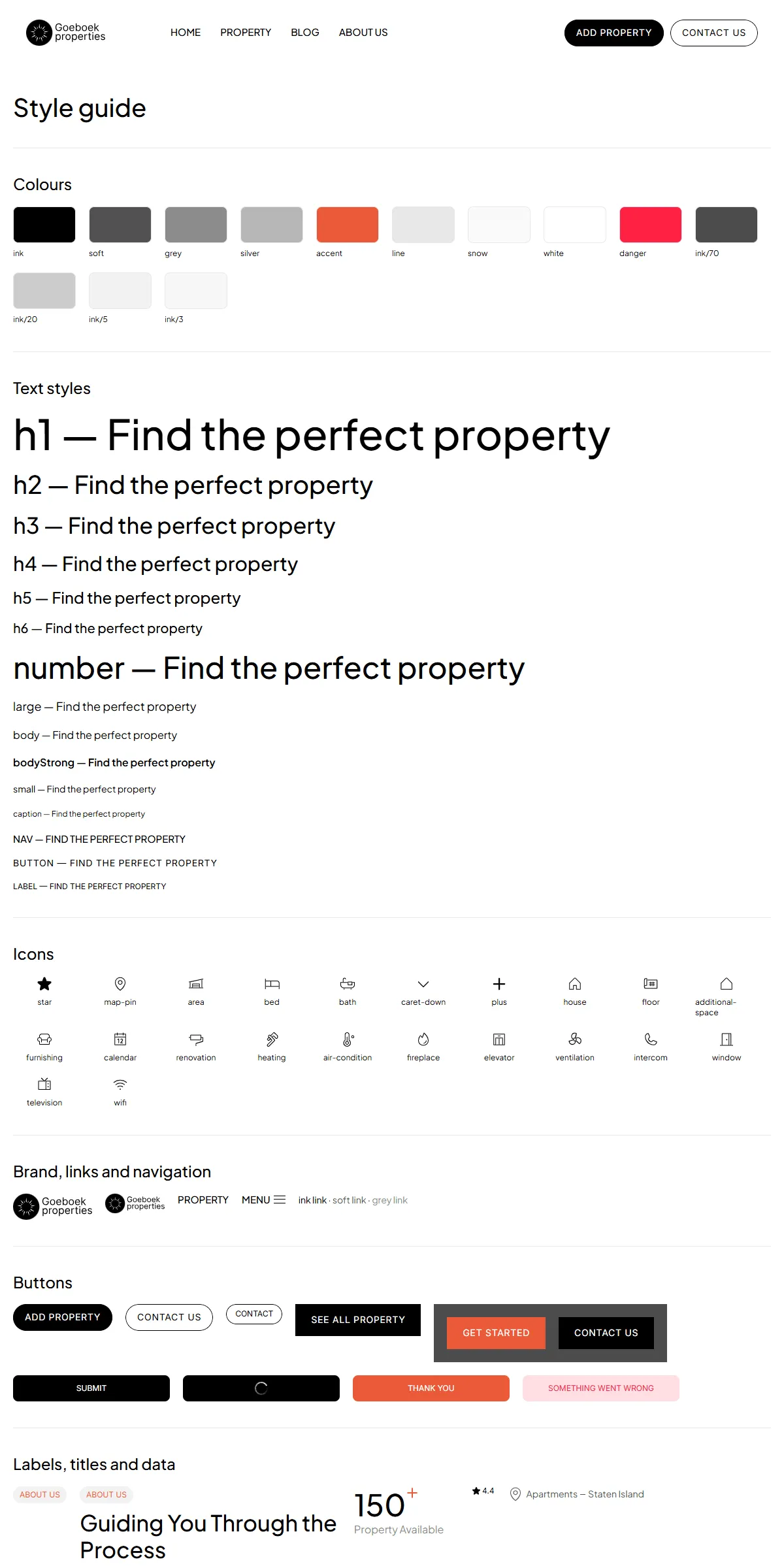
See everything first
Section titled “See everything first”Open style-guide.html. It shows the colours, the text styles, the icons, the logo, links and navigation, the buttons,
the labels, titles and numbers, the property cards, the agent card, the post and testimonial cards, the slideshow, the
form and the footer, each with its name. It’s the quickest way to find a component to copy.
Colours
Section titled “Colours”src/css/style.css, in @theme:
--color-ink: #000000; /* Black: titles, buttons, the header links */--color-white: #ffffff; /* White: the page, the header */--color-soft: #525252; /* Soft Black: body text, meta links, the footer links */--color-grey: #8c8c8c; /* Grey: "Property Available", "Agent", the 404 number */--color-silver: #b7b7b7; /* Light grey: text on the dark CTA photo */--color-accent: #eb5939; /* Accent: labels, hovered links, the buttons' hover */--color-line: #e8e8e8; /* Line: dividers and the section's top border */--color-snow: #fafafa; /* the footer's fill */--color-danger: #ff2244; /* a form button that failed (fill at 15 %, label full) */Each name becomes a class: bg-ink, text-soft, text-accent. The translucent blacks and whites are opacity steps
written on the elements: bg-ink/3 for the card and panel fills, ink/5 for the label chips and hairlines, ink/20 for
the photo veil and the testimonial arrows, ink/70 for the call to action’s veil, ink/80 for the hero’s arrows,
white/60 for the card’s type tag and white/80 for the agent’s name chip. Change --color-accent and the accent
follows everywhere. Rebuild the stylesheet after any change (below).
The site is light by design and has no dark theme. Keep text on its background at a contrast of 4.5 : 1 or more.
Logo and icons
Section titled “Logo and icons”The logo, in the header and the footer of every page (and beside each post), is a round mark beside the name in two lines, “Goeboek” over “properties”. It is markup, not a picture of text:
<a href="index.html" aria-label="Goeboek" class="@container relative block shrink-0 h-10 w-[121px] …" …> <img src="assets/images/logo-mark.svg" alt="" width="175" height="175" class="absolute top-0 left-0 h-full w-auto" /> <span aria-hidden="true" class="absolute top-[4cqw] left-[36.31%] font-inter text-[13.17cqw] …"> <span class="block">Goeboek</span><span class="block">properties</span> </span></a>- The name: change
Goeboekandpropertiesin the two<span class="block">(find and replace in files), and thearia-label, what screen readers read. The name is sized to the box (121 × 40 from 810 px, 91 × 30 on phones, where the header holds a second, smaller copy of the link): a much longer name runs past it. - The mark: replace
assets/images/logo-mark.svg(square) with yours under the same name and every page follows. - A logo file of your own: replace the
<img>and the<span>s with one<img src="assets/images/logo.svg" alt="" class="size-full object-contain" />in every page.
icon.png (192 × 192) is the browser tab’s icon and apple-icon.png (180 × 180) the home-screen icon, both in the root
folder: the round mark, made from the original design’s favicon. Replace both with your mark under the same names. Every
page links them in its <head> (404.html from the site’s root):
<link rel="icon" href="icon.png" type="image/png" sizes="192x192" /><link rel="apple-touch-icon" href="apple-icon.png" sizes="180x180" />The other icons (the star of the ratings, the map pin, the bed, the bath and the size of the cards, the plus of the
hero’s numbers, the caret of the phone filter and the icons of the property details and utilities) are
Phosphor shapes drawn as inline <svg> in the pages; copy one from style-guide.html. A new
icon is the <path d="…"> of a Phosphor SVG in the same <svg viewBox="0 0 256 256" fill="currentColor">.
Plus Jakarta Sans (every heading and text) and Inter (the button and label styles) are variable fonts in
assets/fonts/ (plus-jakarta-sans-variable.woff2, inter-variable.woff2), declared with @font-face at the top of
src/css/style.css. The same file sets a resized Arial as each font’s fallback, so the text keeps its width while the
fonts load.
To use another font, put its .woff2 files in assets/fonts/, point the @font-face rules at them (keep the
font-family name, or change --font-jakarta / --font-inter-face to the new name), and rebuild the stylesheet.
Text styles
Section titled “Text styles”The text styles are groups of classes, the same on every page:
| Style | Classes | Used for |
|---|---|---|
| Heading 1 | text-[38px] leading-[1.1] font-medium md:text-5xl lg:text-[64px] xl:text-7xl |
Home’s title |
| Heading 2 | text-[32px] leading-[1.2] font-medium md:text-[34px] lg:text-[38px] xl:text-[44px] |
Section titles, the listings’ titles |
| Heading 3 | text-[28px] leading-[1.2] font-medium md:text-[30px] lg:text-[34px] xl:text-4xl |
The About titles, a property’s title, the hero card’s title |
| Heading 5 | text-xl leading-[1.2] font-medium md:text-[22px] lg:text-2xl |
Card titles, the hero card’s price |
| Heading 6 | text-lg leading-[1.2] font-medium md:text-[19px] lg:text-xl |
Footer headings, card prices, agent names, form groups |
| Number | text-4xl leading-[1.2] font-medium md:text-[42px] lg:text-[46px] xl:text-[54px] |
The hero’s numbers, the titles of Blog, About, Contact, Add property and the success pages |
| Large | text-lg leading-[1.4] font-normal |
Home’s lead, the listings’ texts |
| Text | text-base leading-[1.4] font-normal |
Section texts, quotes, card excerpts |
| Small | text-sm leading-[1.4] font-normal |
Meta, names, dates, footer links |
| Menu | text-[15px] leading-[1.2] font-medium uppercase |
The header’s links |
| Button | font-inter text-sm leading-[1.2] font-normal uppercase tracking-[0.05em] |
Button labels |
| Label | font-inter text-xs leading-[1.2] font-normal uppercase |
Label chips, the type tag, ratings |
There is also a Heading 4 (text-[26px] … xl:text-[32px], the hero card’s numbers and the contact call to action) and a
Caption (text-xs leading-[1.4]). To change a style everywhere, find and replace its classes in all files, then rebuild
the stylesheet.
Breakpoints
Section titled “Breakpoints”Set in @theme in src/css/style.css:
| Width | Class prefix | |
|---|---|---|
| Phone | below 810 px | (none) |
| Tablet | 810–1199 px | md: |
| Laptop | 1200–1439 px | lg: |
| Desktop | 1440 px and up | xl: |
From 1200 px the listings, the property pages and the posts put their sidebar beside the content; below, it moves above (the listings’ filter) or under it (a property’s agent, tour form and “More in”; a post’s recent posts).
Rebuilding the stylesheet
Section titled “Rebuilding the stylesheet”assets/css/style.css holds only the classes the pages use. Adding a class that no page uses yet, or changing the
theme, needs a rebuild (Node.js 20 or newer):
npm install # oncenpm run build:css # or npm run watch:css while you workThe build reads src/css/style.css, every .html file of the root and of its folders, and assets/js/main.js, and
writes the minified assets/css/style.css. Edit src/css/style.css, never the built file.
Motion
Section titled “Motion”assets/js/main.js runs the motion with Motion:
- Home’s testimonials step every 4 seconds and its large property cards every 8 seconds (each box’s
data-interval), with a spring, and only while they are in view; - a hovered property card runs through its photos every 1.5 seconds;
- the phone menu and the phone filter open and close with a spring.
Every hover (the buttons rolling their label, the links’ underline, the colour changes) is CSS with one spring curve
(ease-spring duration-spring). There are no page transitions and no scroll effects. With “reduce motion” switched on in
the visitor’s system, the slideshows stand still and moves jump to their end; fades and colour changes stay.
Corners, lines, shadows
Section titled “Corners, lines, shadows”Photos and cards have 8 px corners (rounded-lg), the call to action’s photo 20 px, the form fields 4 px, and the
buttons and chips are round-ended. Sections start with a 1 px Line along their top, and cards and chips are framed by a
1 px hairline in Black 5 %. There are no shadows.