Design — Goeboek Astro
The look of this Astro template comes from a small set of tokens: change one and nearly every page, component and state follows.
So you rarely need to touch a component. This guide covers the colours, the logo and icon, the fonts, the text styles, the spacing, the motion and the components.
See everything first
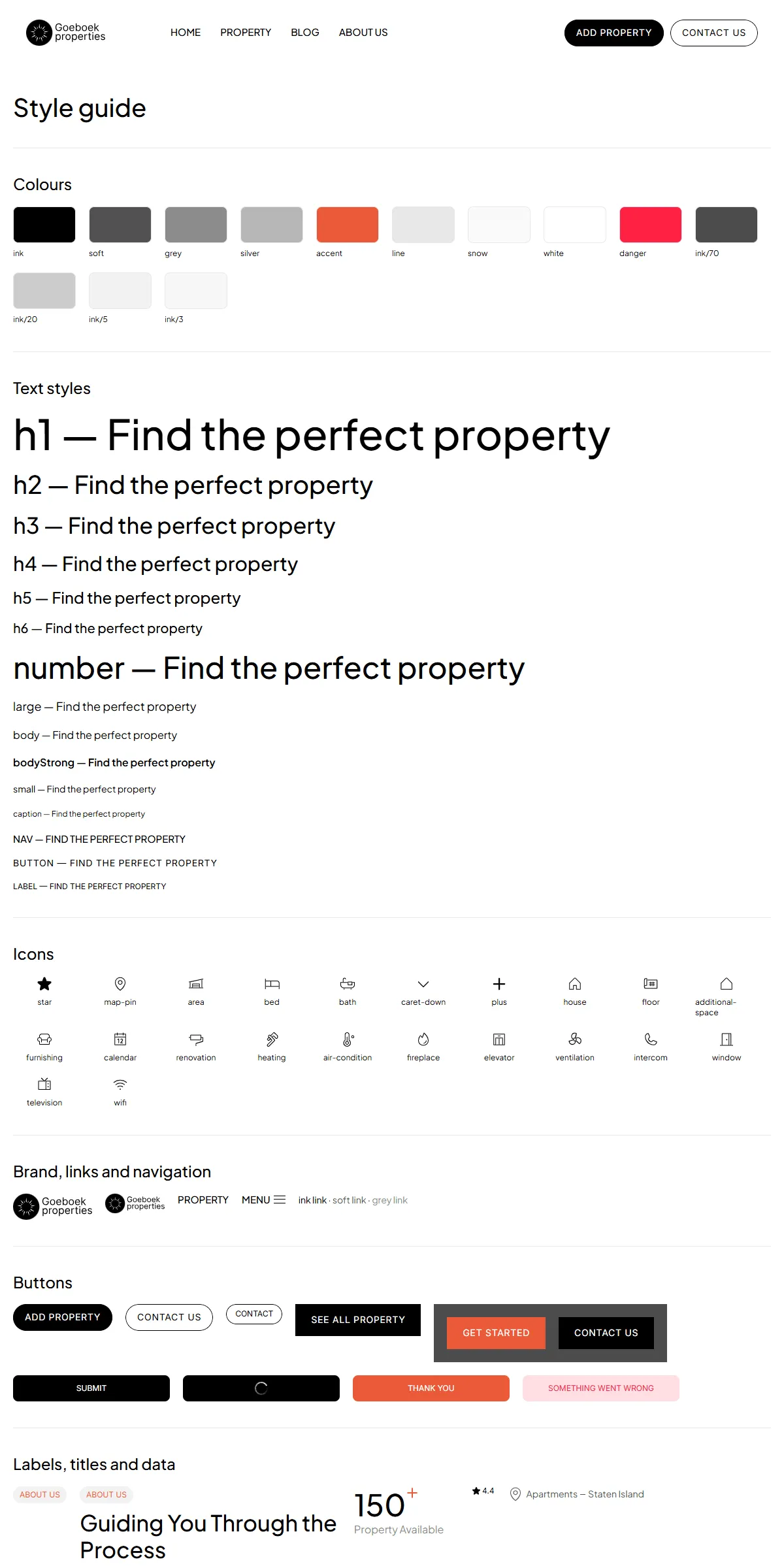
Section titled “See everything first”Run npm run dev and open http://localhost:4321/style-guide. It shows the colours, the text styles, the icons, the
logo, links and navigation, the buttons, the labels, titles and figures, the property cards, the listing filter with the
agent card and “Load More”, the post and testimonial cards, the slideshow and the form, each with its name. When you want
to know what a change will affect, look there.
Colours
Section titled “Colours”src/design-system/theme.css:
@theme { --color-ink: #000000; /* Black: titles, buttons, the header links */ --color-white: #ffffff; /* White: the page, the header */ --color-soft: #525252; /* Soft Black: body text, meta links, the footer links */ --color-grey: #8c8c8c; /* Grey: "Property Available", "Agent", the 404 number */ --color-silver: #b7b7b7; /* Light grey: text on the dark call-to-action photo */ --color-accent: #eb5939; /* Accent: labels, hovered links, the buttons' hover */ --color-line: #e8e8e8; /* Line: dividers and the sections' top border */ --color-snow: #fafafa; /* the footer's fill */ --color-danger: #ff2244; /* a form button that failed (fill at 15 %) */}Each name becomes a Tailwind class: bg-ink, text-soft, text-accent, border-line. The translucent blacks and
whites are opacity steps written on the components: bg-ink/3 for the card and panel fills, ink/5 for the label chips
and hairlines, ink/20 for the veil over the card photos, bg-ink/70 for the call to action’s veil, ink/80 for the
slideshow arrows, white/60 for the cards’ type tag and white/80 for the agent’s name chip. Change --color-accent
and the orange follows everywhere.
The site is light by design and has no dark theme. Keep text on its background at a contrast of 4.5 : 1 or more, or the site becomes hard to read.
The logo is the round mark beside the name in two lines (“Goeboek” / “properties”, in Inter). It is not a picture of
text, so you change the name and the mark separately, in logo in src/content/site.json:
"logo": { "mark": "/images/logo-mark.svg", "first": "Goeboek", "second": "properties", "label": "Goeboek"}mark is the round mark (a square image, shown as tall as the logo), first and second the two lines of the name, and
label what screen readers read for the link home. Logo in src/design-system/components/brand/Logo.astro draws it as
a link home in a box of 121 × 40 (91 × 30 in the phone header), with the name sized to the box’s width; the footer and
the post pages’ sidebar show the same logo. A much longer name runs past the box: shorten it, or change the text size
(text-[13.17cqw]) and the box sizes (h-10 w-[121px], h-[30px] w-[91px]) in Logo.astro. To use a logo file of
your own instead, replace the mark and the two lines with one image in Logo.astro.
Browser icon
Section titled “Browser icon”public/icon.png (192 × 192) is the icon in the browser tab and public/apple-icon.png (180 × 180) the one on a phone’s
home screen, both made from the original design’s favicon (the round mark). They are linked in the <head> of
src/layouts/Layout.astro: replace both with your mark, keeping the names, or change the sizes there if your files
have other sizes.
The template serves its two fonts from its own files, through the Astro Fonts API in astro.config.mjs: Plus Jakarta
Sans (weights 200 to 800) for every heading and text, and Inter (100 to 900) for the button and label styles, both the
Latin variable fonts in src/assets/fonts/:
{ provider: fontProviders.local(), name: "Plus Jakarta Sans", cssVariable: "--font-jakarta", options: { variants: [{ weight: "200 800", style: "normal", src: ["./src/assets/fonts/plus-jakarta-sans-latin-variable.woff2"] }], }, fallbacks: ["Plus Jakarta Sans Fallback", "sans-serif"], optimizedFallbacks: false,},theme.css makes --font-jakarta the site font (font-sans) and --font-inter-face the font-inter class, each with
a fallback (Arial sized like the font, the @font-face rules at the end of theme.css) so the page doesn’t shift while
the fonts load. If you change a font, change or remove its fallback rule too.
To use another font, put its .woff2 files in src/assets/fonts/ and point the entry at them, keeping the
cssVariable; or name a Google font with provider: fontProviders.google(), which the Fonts API downloads when the site
builds. A font that isn’t variable lists one variant per weight ({ weight: "400", … }). Either way the fonts are served
from your own domain, with no request to Google at runtime.
Text styles
Section titled “Text styles”src/design-system/tokens/text.ts holds the sizes and line heights. The headings step down on laptops, tablets and
phones; the text styles keep their size.
| Style | Size (phone / tablet / laptop / desktop) | Used for |
|---|---|---|
h1 |
38 / 48 / 64 / 72 at 1.1, medium | The hero title |
h2 |
32 / 34 / 38 / 44, medium | Section titles, the listing pages’ titles |
h3 |
28 / 30 / 34 / 36, medium | The About titles, a property’s title, the hero card’s title |
h4 |
26 / 28 / 30 / 32, medium | The hero card’s figures, the filter’s heading, the property page’s block titles |
h5 |
20 / 22 / 24 / 24, medium | Card titles, the hero card’s price, the values, the success pages’ subtitle |
h6 |
18 / 19 / 20 / 20, medium | Footer headings, card prices, agent names, form groups |
number |
36 / 42 / 46 / 54, medium | The hero’s facts, the page titles of Blog, About, Contact, Add property and the success pages |
large |
18 at 1.4 | The hero’s lead, the listing pages’ text |
body |
16 at 1.4 | Section texts, quotes, card excerpts |
bodyStrong |
16 at 1.4, semibold | Emphasised text |
small |
14 at 1.4 | Meta lines, names, dates, footer links |
caption |
12 at 1.4 | “More Details” |
nav |
15, medium, upper case | The header’s links and “Menu” |
button |
Inter 14, upper case, 0.05 em apart | Button labels |
label |
Inter 12, upper case | Label chips, the type tag, small buttons, ratings |
Change the numbers in text.ts rather than in the components, and text stays consistent across the site. Use a style as
class={text.h2} or combine: class={cn(text.body, "text-soft")}.
Breakpoints and spacing
Section titled “Breakpoints and spacing”Four sizes, set in theme.css:
| Width | Tailwind prefix | |
|---|---|---|
| Phone | below 810 px | (none) |
| Tablet | 810–1199 px | md: |
| Laptop | 1200–1439 px | lg: |
| Desktop | 1440 px and up | xl: |
Sections are full width with side padding of 20 px on phones, 30 on tablets, 40 on laptops and 50 on desktops. From
1200 px the listing and property pages put their sidebar (375 px wide, 400 from 1440) beside the cards; below, it goes
above the cards (the filter) or under the page (the property’s agent and tour form), past a line. Spacing is Tailwind
classes on the components (gap-5, gap-[30px]); Tailwind’s scale is 4 px per step, so gap-5 is 20 px.
Motion
Section titled “Motion”Every hover and state change uses one spring (stiffness 500, damping 60, about 0.7 s, no overshoot): in CSS as
ease-spring duration-spring (theme.css), in Motion as spring. src/design-system/tokens/motion.ts
holds the transitions and the speeds:
| Token | Values | Used for |
|---|---|---|
spring |
stiffness 500, damping 60 | Every animation of the scripts that sets no transition of its own (play in src/design-system/utils/play.ts): the menu button, the phone filter opening |
slideSpring |
stiffness 200, damping 40 | Every slideshow step |
slideInterval |
hero 8 s, testimonials 4 s, a hovered card’s photos 1.5 s | How long each slide stays |
The form button’s tween (0.2 s, ease-form) and the spinner (animate-turn, once a second) are in theme.css.
What moves, and where to change it:
| Effect | Where to change it |
|---|---|
| Home’s large property cards step every 8 seconds, with dots and, on hover, arrows | Slideshow.astro and scripts/slideshow.ts, used by src/components/sections/Hero.astro |
| The hero’s testimonials step every 4 seconds | the same slideshow |
| A hovered property card’s photo steps through the main photo and the next two, and the agent’s chip slides in | PropertyCard.astro and scripts/property-card.ts |
| The square buttons flip from one colour to the other, and the labels of the pill buttons roll up a line, on hover | FlipButton.astro, RollLabel.astro, PillButton.astro (CSS) |
| The phone filter opens and closes | ListingFilter.astro and scripts/listing-filter.ts |
| “Load More” shows the next cards and moves the focus to the first new one | LoadMore.astro and scripts/load-more.ts |
| The phone menu opens under the header | src/components/site/Header.astro and header.ts next to it, the button in MenuButton.astro and scripts/menu-button.ts |
There are no page transitions and no scroll effects. A slideshow plays only while it is on screen.
Reduced motion
Section titled “Reduced motion”With “reduce motion” switched on in the visitor’s system, the slideshows don’t play by themselves (the arrows and dots
still work), and moves, turns and size changes jump to their end. Fades and colour changes stay. The scripts check the
setting through reducedMotion in src/design-system/utils/play.ts; the CSS animations with motion-reduce:.
Corners, lines, shadows
Section titled “Corners, lines, shadows”Photos and cards have 8 px corners, the call to action’s photo 20 px, the filter, the form fields and “Load More” 4 px,
and the pill buttons are round-ended. Cards and panels are framed by a 1 px hairline in Black 5 % drawn inside the box
(src/design-system/components/utils/surface.ts), and sections are separated by a 1 px line in --color-line. There
are no drop shadows.
Components
Section titled “Components”src/design-system/components/ holds the logo, the buttons and links (PillButton, FlipButton, RollLabel,
TextLink, ActionLink), the header’s links and menu button, the section layout (Section, SectionTitle, Label,
Divider), the rating and the hero’s facts (Rating, Stat), the cards (PropertyCard, PropertyFeature for the
hero, PropertyMeta, AgentCard, PostCard, TestimonialCard), the images (FillImage, SizedImage), the
slideshow, the listing filter, the list with “Load More”, the rich text and the forms (Form, FormField,
RadioGroup, SubmitButton). Their props are typed in src/design-system/types.ts; the browser scripts of the
interactive ones (the slideshows, the property cards, the menu button, the filter, “Load More”, the forms and the
copyright year) are in src/design-system/scripts/. The sections that make up a page are one level up, in
src/components/sections/, and are listed in Pages and sections.
The icons are Phosphor shapes stored as path data in
src/design-system/components/icons/paths.ts, in the light weight unless noted: star (the ratings, the fill weight),
map-pin, area, bed and bath (the cards), caret-down (the phone filter, regular), plus (the hero’s facts,
bold), and the property page’s rows: house, floor, additional-space, furnishing, calendar, renovation,
heating, air-condition, fireplace, elevator, ventilation, intercom, window, television and wifi.
Icon.astro draws one in the current text colour. To add an icon:
-
Open the icon on phosphoricons.com and copy the SVG.
-
Take the
d="…"of its<path>. -
Add a line to
iconPaths:"my-icon": "M128,24A104,104,0,1,0,…",
Then use <Icon name="my-icon" class="size-5" />. Paths use a 256 × 256 grid, which is what Phosphor exports.