Components — Goeboek Figma
The pages are built from components, so a change to a component reaches every page that uses it. The main components live on the Components page, on four boards; every page frame holds instances of them. Each of the 20 components has a short description, shown when you hover it in the Assets panel and repeated on its board.
Using components
Section titled “Using components”- Add one: drag it from the Assets panel (
Alt/Option + I) onto a frame. - Change a variant: select an instance and pick the variant in the right sidebar (for example Header → Breakpoint: Phone, Menu: Open).
- Override content: double-click into an instance and change its text or image. Overrides stay when the main component changes. The cards also have text properties (Title, Price, Size, Beds, Bath, Agent, Category, Location, Type, Excerpt, Date, Quote, Name, Rating…) you can edit straight from the right sidebar.
- Edit for everyone: right-click an instance → Go to main component, and edit it there.
- Break the link: Detach instance (
Ctrl/Cmd + Alt/Option + B) when one place needs something the component can’t do. The copy stops following the main component.
The hover, open, sending and error variants document how the interface reacts. Use them to show states in a presentation, or connect them with Prototype → While hovering / On click to click through the design. The pages show every component at rest.
Header & Footer
Section titled “Header & Footer”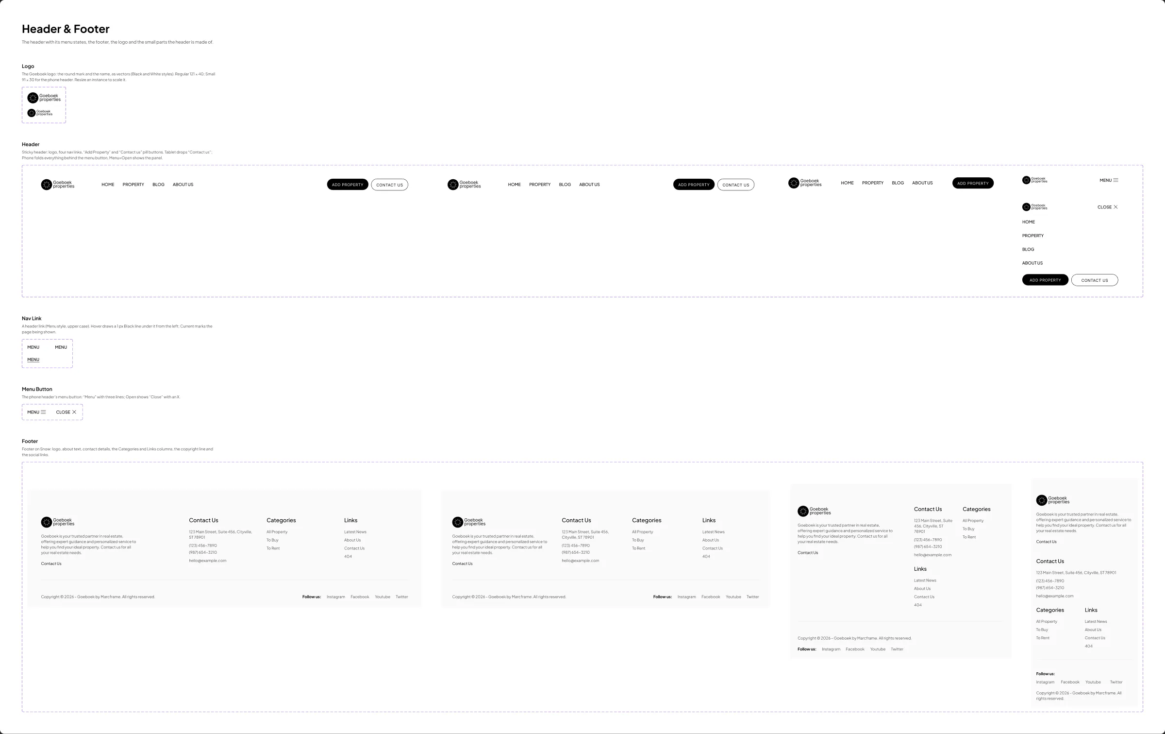
| Component | Variants |
|---|---|
| Logo | Size: Regular, Small — the round mark and the name, as vectors (Black and White styles); Small is the phone header’s |
| Header | Breakpoint: Desktop, Laptop, Tablet, Phone × Menu: Closed, Open — the logo, Home, Property, Blog and About Us, then “Add Property” and “Contact us”; the phone header folds them behind the menu button, Open shows the panel |
| Nav Link | State: Default, Hover, Current — a header link; hover draws a line under it; text property Label |
| Menu Button | State: Closed, Open — “Menu” with three lines; Open shows “Close” with an X |
| Footer | Breakpoint: Desktop, Laptop, Tablet, Phone — about the agency, contact details, the Categories and Links columns, the copyright line and the social links |
To put your logo everywhere, edit the Logo component once.
Buttons & Elements
Section titled “Buttons & Elements”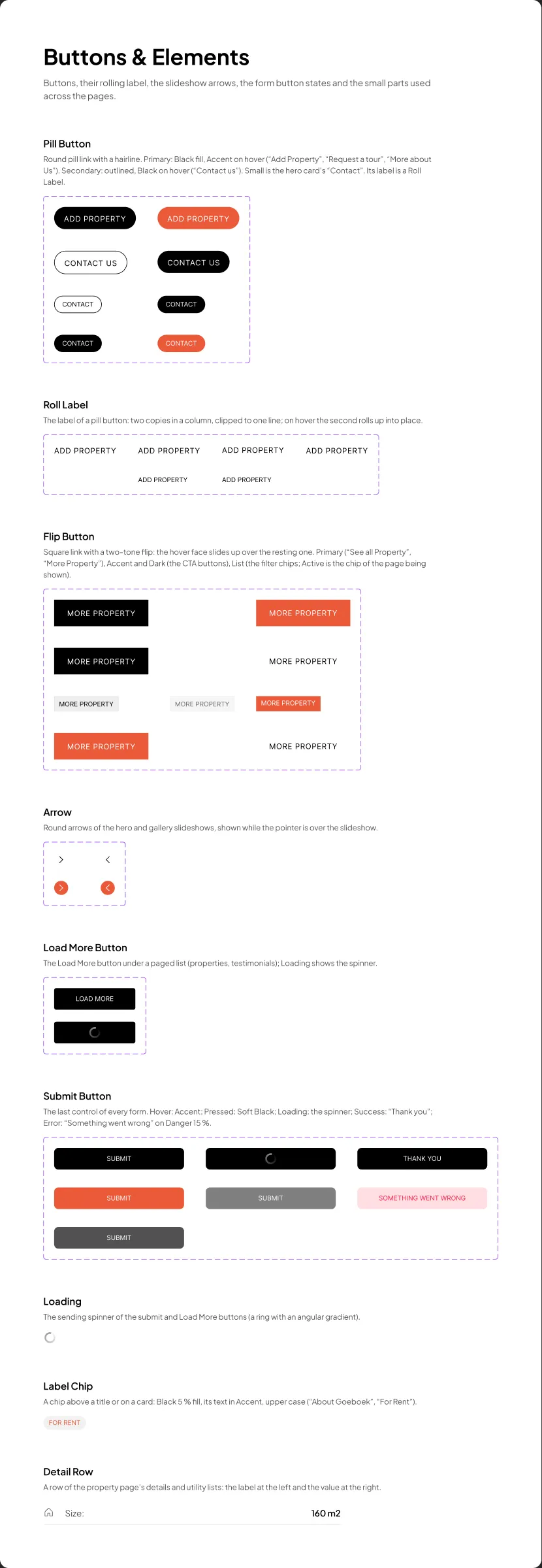
| Component | Variants |
|---|---|
| Pill Button | Look: Primary, Secondary × Size: Regular, Small × State: Default, Hover — the round link (“Add Property”, “Request a tour”, “Contact us”); its label is a Roll Label |
| Roll Label | Size: Regular, Small × State — the pill button’s label: on hover a second copy rolls up into place; text property Label |
| Flip Button | Look: Primary, Accent, Dark, List × State: Default, Hover (Active for List) — the square link with a two-tone flip (“See all Property”, “More Property”, the call-to-action buttons) and the filter chips; text property Label |
| Arrow | Direction: Right, Left × State: Default, Hover — the slideshow arrows |
| Load More Button | State: Default, Loading — under the property and testimonial lists |
| Submit Button | State: Default, Hover, Pressed, Loading, Disabled, Success, Error — the last control of every form |
| Loading | — the spinner of the Submit and Load More buttons |
| Label Chip | — the small label above a title or on a card (“About Goeboek”, “For Rent”); text property Text |
| Detail Row | — a row of the property page’s details and utilities; text properties Label and Value |
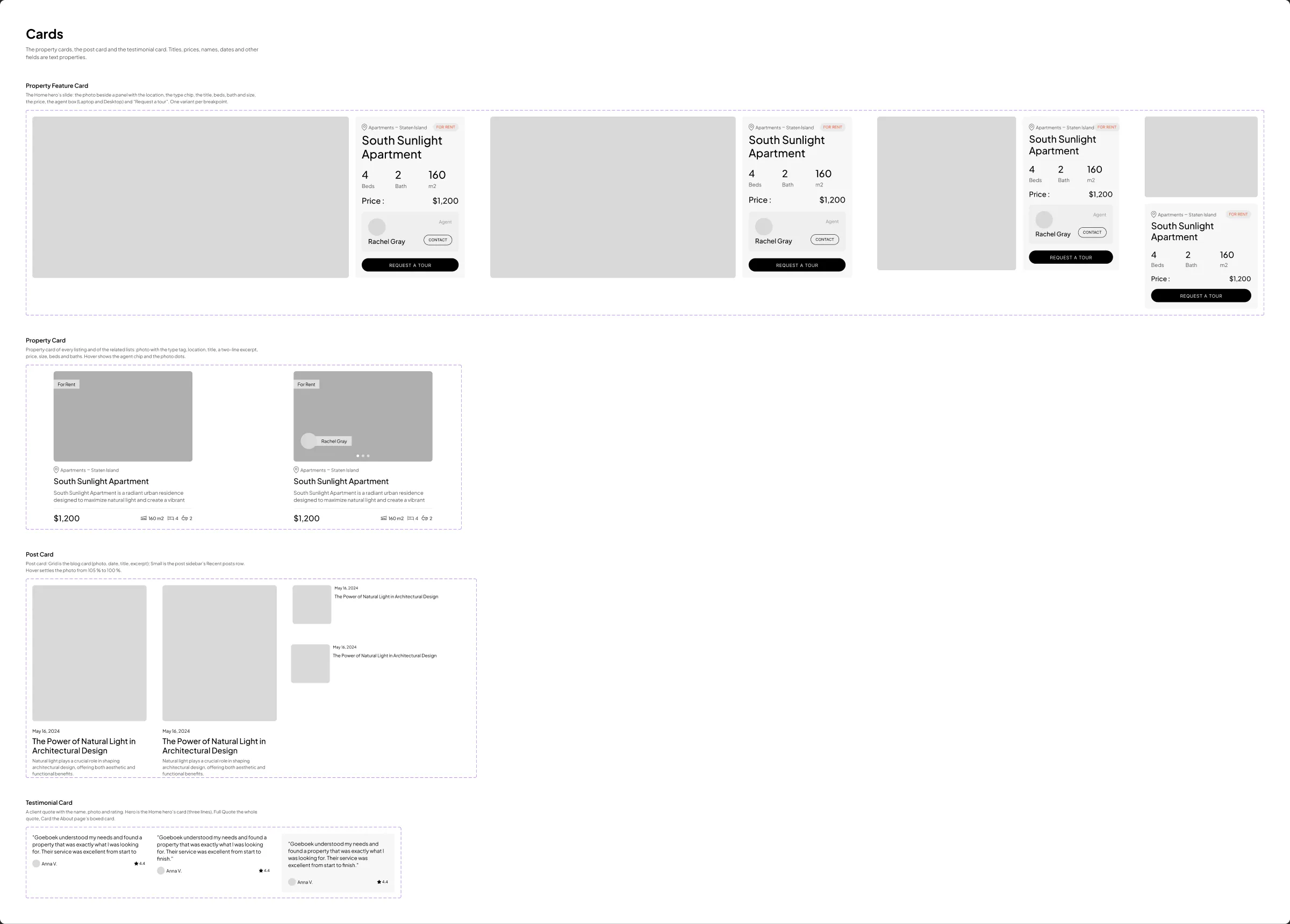
| Component | Variants |
|---|---|
| Property Feature Card | Breakpoint: Desktop, Laptop, Tablet, Phone — the Home hero’s slide: the photo beside a panel with the location, the type chip, the title, beds, bath and size, the price, the agent (from laptop width) and “Request a tour”; text properties Title, Category, Location, Beds, Bath, Size, Price, Agent |
| Property Card | State: Default, Hover — every listing’s card: photo with the type tag, location, title, excerpt, price, size, beds and baths; Hover shows the agent chip and the photo dots; text properties Type, Agent, Category, Location, Title, Excerpt, Price, Size, Beds, Bath |
| Post Card | Layout: Grid, Small × State: Default, Hover — Grid is the blog card (photo, date, title, excerpt), Small the post sidebar’s Recent posts row; text properties Date, Title, Excerpt |
| Testimonial Card | Style: Hero, Full Quote, Card — a client quote with the name, photo and rating; Hero is the Home hero’s three-line quote, Card the About page’s boxed card; text properties Quote, Name, Rating |
Sections
Section titled “Sections”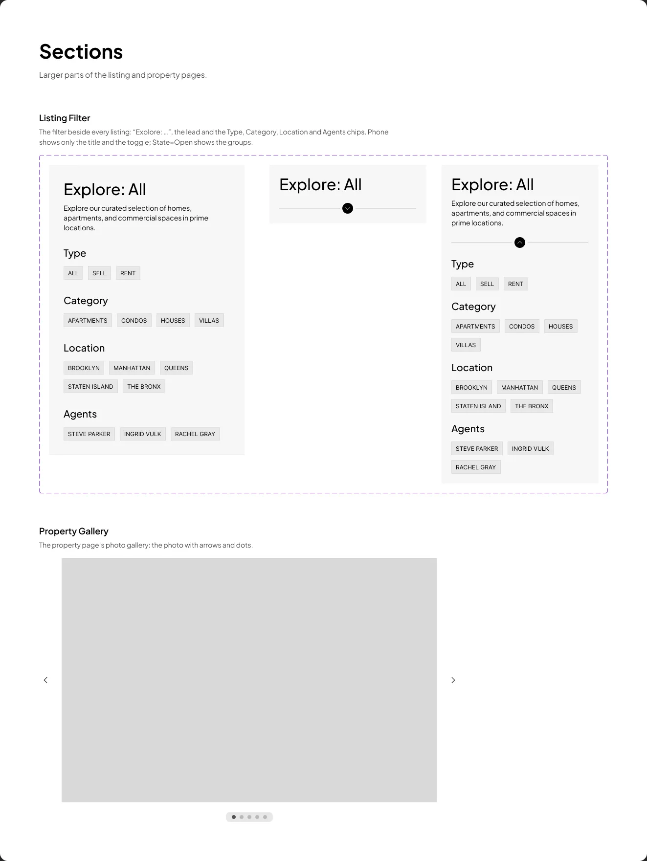
| Component | Variants |
|---|---|
| Listing Filter | Breakpoint: Desktop, Phone × State: Open, Closed — “Explore: …”, the lead and the Type, Category, Location and Agents chips; on phones only the title and the toggle until it is opened |
| Property Gallery | — the property page’s photo with its arrows and dots |
Components with breakpoint variants (Header, Footer, Property Feature Card, Listing Filter) switch by variant; set the one that matches the frame. The others keep one design and stretch to the width of their column.