Design — Denzel Next.js
The look of this Next.js template comes from a small set of tokens: change one and nearly every page, component and state follows.
So you rarely need to touch a component. This guide covers the colours, the logo and icon, the fonts, the text styles, the spacing, the motion and the components.
See everything first
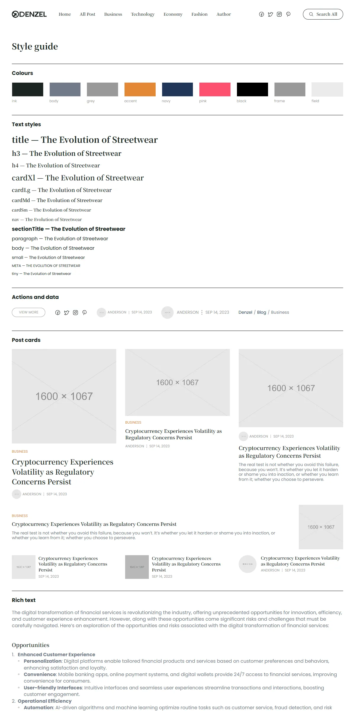
Section titled “See everything first”Run npm run dev and open http://localhost:3000/style-guide. It shows the colours, the text styles, the pill button,
the social icons, the author line, the breadcrumbs, the seven looks of the post card and a post’s rich text, each with its
name. When you want to know what a change will affect, look there.
Colours
Section titled “Colours”src/design-system/theme.css:
@theme { --color-ink: #1c2522; /* headings, titles, links, the search button's hover fill */ --color-body: #707a88; /* excerpts, descriptions, post text */ --color-grey: #999999; /* meta (author, date), "View All", the current menu link */ --color-accent: #e38836; /* category labels, hovers */ --color-navy: #203656; /* the breadcrumb links on category pages, the author page's socials, typed newsletter text */ --color-pink: #fe4f70; /* the category breadcrumb links on hover */ --color-white: #ffffff; --color-black: #000000; /* the section dividers */ --color-rule: rgb(0 0 0 / 0.2); /* the thin dividers inside the sidebar widgets */ --color-frame: #999999; /* the hairline around the sidebar widgets and the pill buttons */ --color-veil: rgb(0 0 0 / 0.2); /* the dark veil over the slider's photos */ --color-scrim: rgb(0 0 0 / 0.6); /* behind the search box */ --color-search: #333333; /* the search box's text */ --color-search-line: #eeeeee; /* the line under the search field */ --color-search-hover: #f3f3f3; /* the highlighted search result */ --color-field: #ebebeb; /* the hairline of the newsletter field */ --color-error: #e5484d;}Each name becomes a Tailwind class: bg-ink, text-body, text-accent. Swap the values for your own palette and the
site changes. Keep text on its background at a contrast of 4.5 : 1 or more, or the site becomes hard to read.
The logo is one SVG file, public/images/logo.svg: the round mark and the “DENZEL” wordmark, drawn as shapes in Ink, 118
× 24. Logo in src/design-system/components/brand/Logo.tsx shows it as a link home, at that size, in the header, the
menu, the sidebar’s About box and the footer. To use your own:
- Same proportions: replace
logo.svgwith your file (an SVG or, with the path changed inlogoinsrc/content/site.ts, a PNG). - Other proportions: also change the
118and24(and thew-[118px]andh-6classes) inLogo.tsx, or the logo is squeezed into the old box.
The logo’s name for screen readers is logo.alt in src/content/site.ts. The logo sits on white everywhere, so one dark
version is enough.
Browser icons
Section titled “Browser icons”src/app/icon.svg is the round mark for the browser tab: dark, and white when the browser uses a dark theme (a
prefers-color-scheme rule inside the file). src/app/apple-icon.png (180 × 180) is the home-screen icon. They are
named in src/app/layout.tsx. Replace both with your own mark.
The template loads two Google fonts once, through next/font in src/app/layout.tsx:
const notoSerif = Noto_Serif_JP({ variable: "--font-noto-serif", weight: ["500", "600", "700", "900"], subsets: ["latin"], preload: true });const poppins = Poppins({ variable: "--font-poppins", weight: ["400", "600", "700"], subsets: ["latin"] });theme.css makes --font-noto-serif the serif font (font-serif: titles, card titles, the menu) and --font-poppins
the site font (font-sans: everything else). Only the weights listed are loaded: add one if you use another.
To use other Google fonts, import them by name from next/font/google and keep the variable names:
import { Lora, Inter } from "next/font/google";const notoSerif = Lora({ variable: "--font-noto-serif", subsets: ["latin"] });const poppins = Inter({ variable: "--font-poppins", subsets: ["latin"] });A font that isn’t variable needs its weights listed, as above. For a font you have licensed yourself, use
next/font/local and point it at the files in src/app/fonts/. Next.js serves the fonts from your own domain either way,
so there is no request to Google at runtime.
Text styles
Section titled “Text styles”src/design-system/tokens/text.ts holds the sizes and line heights. They keep their size on every screen; where a card
changes size, it uses another style.
| Style | Font | Size / line height | Used for |
|---|---|---|---|
title |
Noto Serif JP, bold | 28 / 1.4 | The page titles (category, author, post, 404) |
h3 |
Noto Serif JP, bold | 22 / 1.4 | Headings of level 2 and 3 in a post |
h4 |
Noto Serif JP, semibold | 18 / 1.4 | Headings of level 4 to 6 in a post |
cardXl |
Noto Serif JP, semibold | 24 / 1.4 | The large post of Editor’s Pick |
cardLg |
Noto Serif JP, semibold | 18 / 1.4 | The large posts of Trending |
cardMd |
Noto Serif JP, semibold | 16 / 1.4 | The grid cards and the lists |
cardSm |
Noto Serif JP, semibold | 14 / 1.4 | The small cards (slider, Trending, Recent, footer) |
nav |
Noto Serif JP, medium | 14 / 1.4 | The menu, “Search All” |
sectionTitle |
Poppins, bold | 18 / 1.2 | “Editor’s Pick”, “Recent”, “Newsletter” |
paragraph |
Poppins | 16 / 1.2 | The footer, the sidebar, page descriptions |
body |
Poppins | 16 / 1.4 | A post’s text |
small |
Poppins | 14 / 1.2 | Excerpts, breadcrumbs, the newsletter note |
meta |
Poppins, upper case | 12 / 1.2 | Category, author, date |
tiny |
Poppins | 12 / 1.2 | “View All”, “View More” |
Change the numbers in text.ts rather than in the components, and text stays consistent across the site. Use a style as
className={text.title} or combine: className={cn(text.meta, "text-accent")}.
Breakpoints and spacing
Section titled “Breakpoints and spacing”Three sizes, set in theme.css:
| Width | Tailwind prefix | |
|---|---|---|
| Phone | below 810 px | (none) |
| Tablet | 810–1199 px | md: |
| Desktop | 1200 px and up | lg: |
The content is centred and at most 1220 px wide; the side padding is 20 px on phones, 30 px on tablets and 40 px on
desktops (sectionGutters and Section in src/design-system/components/layout/Section.tsx; the space above and below
is set per section). From desktops up, the sidebar takes 30 % of the width beside the main column, 50 px apart; below
1200 px it follows the column (WithSidebar). The header is fixed to the top; <main> starts below a spacer of its
height, 92 px on phones and tablets and 96 px on desktops (Pages and sections).
Motion
Section titled “Motion”Most hovers are CSS: the post photos settle from 110 % to 100 % (105 % in Recent’s round photos) with a spring curve
(--ease-spring in theme.css, 714 ms), titles and category labels underline, the menu links, “View All” and the social
icons turn Accent, the pill buttons’ label and hairline turn Accent, the “Search All” button fills with Ink, and the
slider’s dark veil clears. The Motion
library drives the rest. src/design-system/tokens/motion.ts holds its transitions:
| Token | Values | Used for |
|---|---|---|
spring |
stiffness 500, damping 60 | The menu opening under the header, and every Motion element that sets no transition of its own (MotionProvider) |
slideSpring |
stiffness 200, damping 40 | The slider’s step |
springSoft |
stiffness 300, damping 30 | Available for your own components |
There are no page transitions and no scroll effects. What moves, and where to change it:
| Effect | Where to change it |
|---|---|
| The row under the header moves one post to the left every 5 seconds and loops; four posts show on desktops, two on tablets, one on phones | INTERVAL and GAP in src/design-system/components/media/PostSlider.tsx |
| The post photos settle on hover | PostPhoto in src/design-system/components/cards/PostCard.tsx |
| The menu opens under the header on phones and tablets | src/components/site/Header.tsx |
| The search box scales in from 95 % (slides down on phones) | src/design-system/components/navigation/SearchDialog.tsx |
Reduced motion
Section titled “Reduced motion”With “reduce motion” switched on in the visitor’s system, the slider stands still (its first posts stay in view), the
photos don’t settle on hover, and Motion skips its transform animations: the search box appears in place. Fades, colour
changes and the menu’s opening stay. MotionProvider (wrapped around every page in src/app/layout.tsx) does this for
Motion; the CSS hover checks the setting with motion-reduce:.
Corners, spacing, shadows
Section titled “Corners, spacing, shadows”Photos are square-cornered, except the round ones (avatars, Recent, Explore Topics). The pill buttons and “Search All” are
round-ended, the newsletter field and button have 8 px corners, the search box 16 px on tablets and desktops. The sidebar
widgets are framed by a 1 px grey hairline; the only drop shadow is under the search box. Spacing is Tailwind classes on
the components (gap-5, gap-[30px]). Tailwind’s scale is 4 px per step, so gap-5 is 20 px. Change them where you
see them; the style guide shows the result immediately.
Components
Section titled “Components”src/design-system/components/ holds the logo, the pill button, the newsletter form, the search box, the section layout
(Section, Divider, WithSidebar, SectionTitle, Breadcrumbs), the author line and the social icons, the post card
with its seven looks (lead, stack, feature, row, mini, slide, recent), the sidebar widgets (AboutWidget,
RecentWidget, TopicsWidget), the slider and the rich text. Its README lists every
component. The sections that make up a page are one level up, in src/components/sections/, and are listed in
Pages and sections.
The icons are Phosphor shapes stored as path data in
src/design-system/components/icons/paths.ts: facebook, twitter, instagram, pinterest and search.
<Icon name="search" /> draws one in the current text colour. To add an icon:
-
Open the icon on phosphoricons.com and copy the SVG.
-
Take the
d="…"of its<path>. -
Add a line to
iconPaths:"my-icon": "M128,24A104,104,0,1,0,…",
Then use <Icon name="my-icon" className="size-5" />. Paths use a 256 × 256 grid, which is what Phosphor exports. A new
social network also needs its name added to the SocialLink type in src/content/types.ts and to SocialIconLink in
src/design-system/components/data/SocialIcons.tsx.