Design — Denzel Astro
The look of this Astro template comes from a small set of tokens: change one and nearly every page, component and state follows.
So you rarely need to touch a component. This guide covers the colours, the logo, the fonts, the text styles, the spacing, the motion, the components and the icons.
See everything first
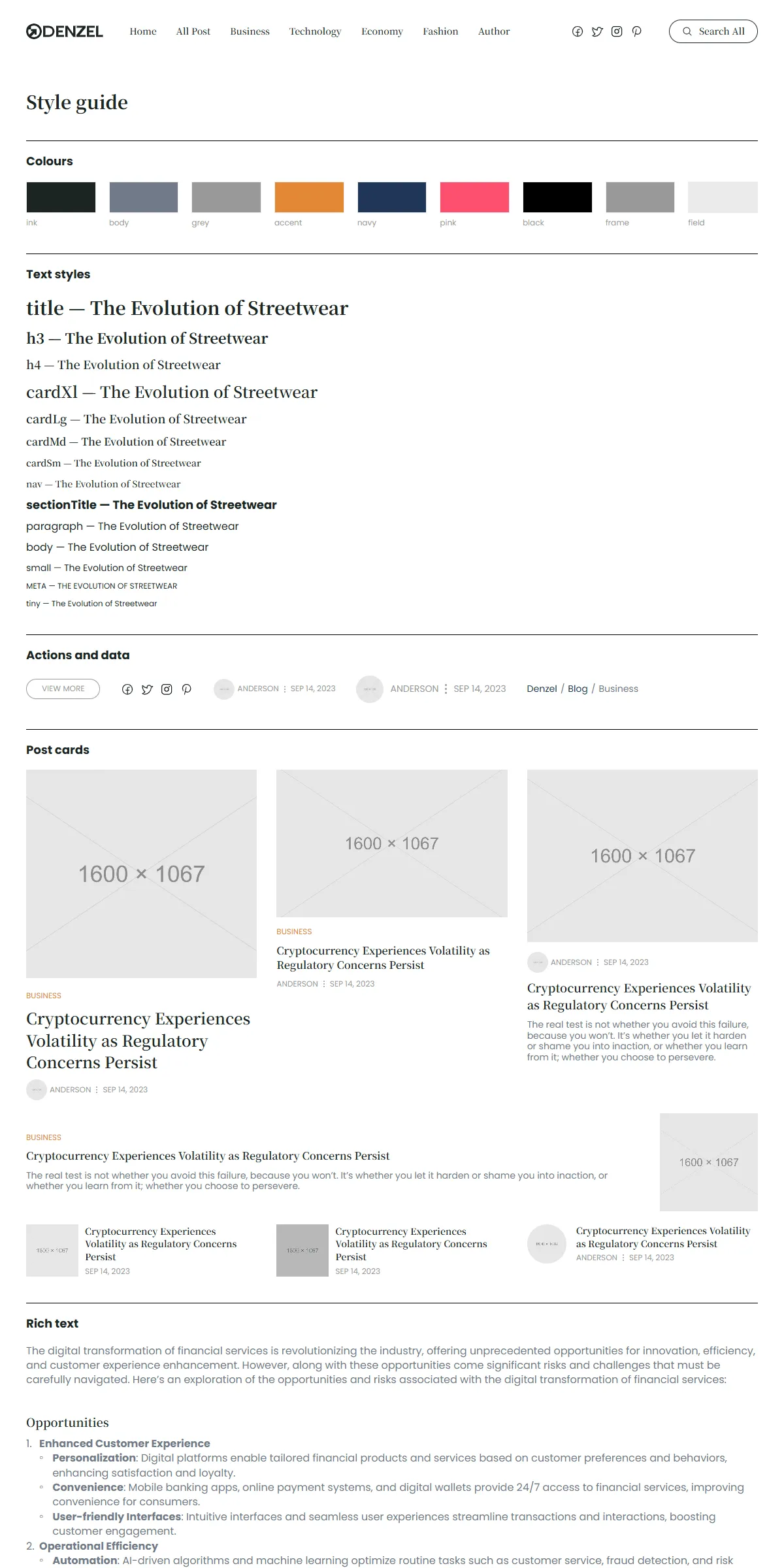
Section titled “See everything first”Run npm run dev and open http://localhost:4321/style-guide. It shows the colours and the text styles, then the
“View More” button, the social icons, the author and date line in its two sizes and the breadcrumb, the seven looks of the
post card, and a sample of rich text. When you want to know what a change will affect, look there.
Colours
Section titled “Colours”src/design-system/theme.css:
@theme { --color-ink: #1c2522; /* headings, titles, links, the search button's hover fill */ --color-body: #707a88; /* excerpts, descriptions, post text */ --color-grey: #999999; /* meta (author, date), "View All", the current menu link */ --color-accent: #e38836; /* category labels */ --color-navy: #203656; /* the breadcrumb links on category pages, the author page's socials, typed newsletter text */ --color-pink: #fe4f70; /* the category breadcrumb links on hover */ --color-white: #ffffff; --color-black: #000000; /* the section dividers */ --color-rule: rgb(0 0 0 / 0.2); /* the thin dividers inside the sidebar boxes */ --color-frame: #999999; /* the hairline around the sidebar boxes and the pill buttons */ --color-veil: rgb(0 0 0 / 0.2); /* the dark veil over the slider's photos */ --color-scrim: rgb(0 0 0 / 0.6); /* behind the search dialog */ --color-search: #333333; /* the search dialog's text */ --color-search-line: #eeeeee; /* the line under the search field */ --color-search-hover: #f3f3f3; /* the highlighted search result */ --color-field: #ebebeb; /* the hairline of the newsletter field */ --color-error: #e5484d; /* a form message that failed */}Each name becomes a Tailwind class: bg-ink, text-body, shadow-frame. Swap the values for your own palette and the
site changes. The template is Ink text on white, with grey meta, black dividers and one orange accent for the category
labels; the button and the links turn orange on hover. Keep text on its background at 4.5 : 1 or more, or the site
becomes hard to read.
A few colours sit outside the tokens, so change them too when you change a colour:
| Colour | Where |
|---|---|
| The logo (Ink) | src/assets/images/logo.svg |
| The browser icon (Ink, white in a dark browser theme) and the home screen icon | public/icon.svg, public/apple-icon.png |
| The search box’s shadow | src/design-system/components/navigation/SearchDialog.astro |
The logo is an image file, src/assets/images/logo.svg (118 × 24): the round Denzel mark and the name, in Ink. The
header, the sidebar’s About box and the footer show it through src/design-system/components/brand/Logo.astro, as a link
to Home, in a 118 × 24 box. To use your own:
- Same size: replace
logo.svgwith your logo, 118 × 24 or the same proportions. Keep the name, or changelogo.srcinsrc/content/site.json. - Other proportions: change the box in
Logo.astro(h-6 w-[118px], andwidthandheightof the image) to your logo’s size. The header row is 32 px tall on phones and tablets and 36 px on desktops.
The logo’s name for screen readers is logo.alt in src/content/site.json. The browser icon (public/icon.svg) is the
mark alone; replace it and public/apple-icon.png (180 × 180) with your own, keeping the file names, or change the
<link> lines in src/layouts/Layout.astro.
The template loads two fonts with the Astro Fonts API, in astro.config.mjs: Noto Serif JP (the titles, the card
titles, the menu, the rich-text headings) as four local files in src/assets/fonts/ (noto-serif-jp-latin-500.woff2
to -900.woff2, the Latin letters of each weight), and Poppins (everything else) from Google Fonts.
fonts: [ { provider: fontProviders.local(), name: "Noto Serif JP", cssVariable: "--font-noto-serif", options: { variants: ["500", "600", "700", "900"].map((weight) => ({ weight, style: "normal", src: [`./src/assets/fonts/noto-serif-jp-latin-${weight}.woff2`] })), }, fallbacks: ["Noto Serif JP Fallback", "serif"], optimizedFallbacks: false, }, { provider: fontProviders.google(), name: "Poppins", cssVariable: "--font-poppins", weights: ["400", "600", "700"], styles: ["normal"], subsets: ["latin"], fallbacks: ["Poppins Fallback", "sans-serif"], optimizedFallbacks: false, },],The <Font> lines in src/layouts/Layout.astro load them on every page, and theme.css maps them to the Tailwind
classes font-serif (--font-noto-serif) and font-sans (--font-poppins). There is no italic in the template.
To use another Google font for the titles, replace the Noto Serif JP entry with one like Poppins’s, changing name and
the weights and keeping cssVariable:
provider: fontProviders.google(),name: "Lora",cssVariable: "--font-noto-serif",weights: ["500", "600", "700"],styles: ["normal"],List weights the font has: a weight it doesn’t have makes Google Fonts refuse the request, and the build warns
No data found for font family … and leaves the site on the fallback font. The text styles use 400, 500, 600 and 700,
and 900 for the bold words of rich-text headings. theme.css also defines Noto Serif JP Fallback (Times New Roman) and
Poppins Fallback (Arial), resized to the two fonts’ metrics so the page does not shift when the fonts arrive: remove the
one you replace from fallbacks (and its @font-face) when you change a font, or adjust its numbers. For a font you have
licensed yourself, use fontProviders.local() with your files, for example in src/assets/fonts/ (see the
Astro fonts guide). Astro downloads the fonts when the site builds and
serves them from your own domain either way, so there is no request to Google at runtime.
Text styles
Section titled “Text styles”src/design-system/tokens/text.ts holds the sizes, line heights and weights. They keep their size on every screen; where a
card changes size, it picks another style.
| Style | Font | Size / line height | Used for |
|---|---|---|---|
title |
Noto Serif JP, bold | 28 / 1.4 | The page titles (category, author, post, 404) |
h3 |
Noto Serif JP, bold | 22 / 1.4 | Rich-text headings of levels 2 and 3 |
h4 |
Noto Serif JP, semibold | 18 / 1.4 | Rich-text headings of levels 4 to 6 |
cardXl, cardLg, cardMd, cardSm |
Noto Serif JP, semibold | 24, 18, 16, 14 / 1.4 | Card titles, from Editor’s Pick’s large post down to the small ones |
nav |
Noto Serif JP, medium | 14 / 1.4 | The menu and the search button |
sectionTitle |
Poppins, bold | 18 / 1.2 | “Editor’s Pick”, “Recent”, the footer’s titles |
paragraph |
Poppins | 16 / 1.2 | The footer, the sidebar, page descriptions |
body |
Poppins | 16 / 1.4 | The post text |
small |
Poppins | 14 / 1.2 | Excerpts, breadcrumbs, the newsletter note |
meta |
Poppins, upper case | 12 / 1.2 | Category, author, date |
tiny |
Poppins | 12 / 1.2 | “View All”, “View More” |
Change the numbers in text.ts rather than in the components, and text stays consistent across the site. Use a style as
class={text.title} or combine: class={cn(text.meta, "text-accent")}.
Breakpoints and spacing
Section titled “Breakpoints and spacing”Three sizes, set in theme.css:
| Width | Tailwind prefix | |
|---|---|---|
| Phone | below 810 px | (none) |
| Tablet | 810–1199 px | md: |
| Desktop | 1200 px and up | lg: |
The side padding is 20 px on phones, 30 px on tablets and 40 px on desktops (sectionGutters in
src/design-system/components/layout/section.ts); each section sets its own padding above and below. Content is at most
1220 px wide and stays centred on wider screens. Beside the sidebar, the main column grows and the sidebar takes 30 % of
the width from desktops up, 50 px apart; below 1200 px the sidebar follows the column (WithSidebar.astro). The header is
fixed to the top, 92 px tall on phones and tablets and 96 px on desktops (Pages and sections); <main>
starts below a spacer of the same height.
Motion
Section titled “Motion”Denzel moves on hover, in the slider’s loop and when the menu or the search opens; nothing animates on load and nothing is
tied to the scroll. src/design-system/tokens/motion.ts holds the springs the scripts play with Motion, and theme.css
holds the CSS curve of the photos:
| Token | Values | Used for |
|---|---|---|
spring |
stiffness 500, damping 60 | The phone menu growing and shrinking |
springSoft |
stiffness 300, damping 30 | Not used by the pages (the slider’s veil fades with a CSS transition) |
slideSpring |
stiffness 200, damping 40 | The slider’s step every 5 s |
searchSpring |
stiffness 600, damping 40 | The search box scaling in from 95 % (tablets and desktops) |
--ease-spring (CSS) |
the spring above as a curve, use with duration-[714ms] |
The post photos settling from 110 % to 100 % on hover |
Hovers are CSS classes in the markup (group-hover:, transition): a card’s photo settles to its size, a card’s title
underlines, a category label underlines, the “View More” pill and the social icons turn orange, the “Search All” pill
fills with Ink, and the slider’s veil clears. There are no page transitions and nothing counts up.
| Effect | Where to change it |
|---|---|
| The slider moves one card every 5 seconds and loops | INTERVAL in src/design-system/scripts/post-slider.ts; PostSlider.astro (four cards on desktops, two on tablets, one on phones) |
| The photo zoom on hover | src/design-system/components/cards/PostPhoto.astro (scale-110, scale-105 for the round ones) |
| The phone menu | src/components/site/header.ts |
| The search box | src/design-system/components/navigation/SearchDialog.astro and scripts/search.ts |
| “Latest” shows eight posts, a post ends with three related and three by its author | latest.count in src/content/pages/home.json; post.related.count and post.more.count in blog.json |
Reduced motion
Section titled “Reduced motion”With “reduce motion” switched on in the visitor’s system, movement is left out: the slider stands still, a photo under the
pointer jumps to its size instead of settling, the phone menu and the search box appear without growing, scaling or sliding. Colour changes and fades stay.
tween() in src/design-system/utils/tween.ts, which the menu and the search animate through, makes moves and sizes
jump; the slider’s script checks the setting itself, and the photo hover checks it with motion-reduce:.
Corners, spacing, shadows
Section titled “Corners, spacing, shadows”The layout is square: photos, cards and the sidebar boxes have no corners; the photos of the authors, the topics and
Recent are circles; the “View More” pill and the search buttons are fully round, the newsletter field and its button
have 8 px corners and the search box 16 px (from tablets up). The sidebar boxes and the pills have a 1 px hairline
(frame), and only the search box has a shadow. Spacing is Tailwind classes on the components (gap-5,
gap-[30px], py-[60px]). Tailwind’s scale is 4 px per step, so gap-5 is 20 px. Change them where you see them; the
style guide shows the result immediately.
Components
Section titled “Components”src/design-system/components/ holds the logo, the “View More” pill and the newsletter form, the search dialog, the
section layout with its divider, title, breadcrumbs and the column with the sidebar, the author and date line and the
social icons, the post card (seven looks: lead, stack, feature, row, mini, slide, recent) and its photo,
the sidebar boxes (About, Recent, Explore Topics), the images and the slider, rich text and the icons. Their behaviour is
in src/design-system/scripts/: each component with state calls an init*() function from its own <script>. The
README lists every component, and the sections that make up a page are one level up, in
src/components/sections/ (Pages and sections).
The icons are Phosphor shapes stored as path data in
src/design-system/components/icons/paths.ts: facebook, twitter, instagram, pinterest and search.
<Icon name="search" /> draws one in the current text colour. To add one:
-
Open the icon on phosphoricons.com and copy the SVG.
-
Take the
d="…"of its<path>. -
Add a line to
iconPaths:"my-icon": "M128,24A104,104,0,1,0,…",
Then use <Icon name="my-icon" class="size-5" />. Paths use a 256 × 256 grid, which is what Phosphor exports; an icon
drawn on another grid gets its viewBox in iconViewBoxes. A social network needs its icon here and its name in the
SocialIconLink type of src/design-system/types.ts (and SocialLink in src/content/schemas.ts) before it can be added
to socials.