Colours and text styles — Denzel Figma
Every colour and every piece of text in the file uses a style. Change a style and every frame, component and state that uses it updates — this is how you rebrand Denzel in minutes instead of recolouring layers one by one.
Open them from the right sidebar with nothing selected (Local styles), or see them laid out on the Style Guide page.
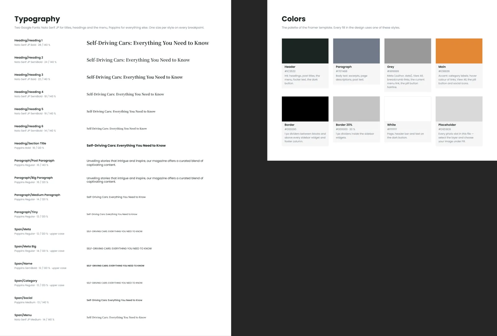
Colour styles
Section titled “Colour styles”| Style | Value | Used for |
|---|---|---|
| Header | #1C2522 (ink) | Headings, titles, card titles, the menu, the logo |
| Paragraph | #707A88 | Body text: excerpts, descriptions, the text of a post |
| Grey | #999999 | The meta line (author, date), “View All”, the current menu link, the hairline around the widgets and the pill buttons |
| Main | #E38836 (accent) | Category labels and hovers |
| Border | #000000 | The black dividers above each block |
| Border 20% | #000000 at 20 % | The thin dividers inside the sidebar widgets and lists |
| White | #FFFFFF | The page, the header, cards, text on photos |
| Placeholder | #D9D9D9 | Every photo slot — replace it with your image |
Eight more, the Docs/ styles (Surface, Surface Strong, Card, Line, Text, Text Muted, Text Inverse and Accent), colour the boards on the Style Guide, Components, Icons, Read Me and Cover pages. The page designs don’t use them.
Rebranding the palette
Section titled “Rebranding the palette”- Deselect everything, open Local styles, and click the edit icon next to a colour style.
- Change the hex value — keep the style’s name, so everything that uses it follows.
- Change Border 20% together with Border: it is the same colour at 20 % opacity.
Change Main to your brand colour and every category label and hover follows; Header drives the titles and the menu, Paragraph the running text. Keep text on its background at a contrast of 4.5:1 or more: the demo keeps Framer’s values, and Grey and Main on white are lower than that (Paragraph is just under) — so use darker values for small text if accessibility matters to you.
Text styles
Section titled “Text styles”Two families: Noto Serif JP for the headings, the card titles and the menu, Poppins for everything else. Each style has one size on every breakpoint — there is no Desktop, Tablet or Phone set. Where a card is smaller on a phone, it uses a smaller style instead.
Headings — Noto Serif JP
Section titled “Headings — Noto Serif JP”| Style | Size | Weight | Line height | Used for |
|---|---|---|---|---|
| Heading/Heading 1 | 28 | Bold | 140 % | Page titles (category, author, post, 404) |
| Heading/Heading 2 | 24 | SemiBold | 140 % | The large Editor’s Pick title |
| Heading/Heading 3 | 22 | Bold | 140 % | The larger headings inside a post |
| Heading/Heading 4 | 18 | SemiBold | 140 % | The smaller headings inside a post, the large Trending titles |
| Heading/Heading 5 | 16 | SemiBold | 140 % | Card titles (the Blog grid, the lists) |
| Heading/Heading 6 | 14 | SemiBold | 140 % | Small card titles (the slider, small Trending posts, Recent, the footer posts) |
| Span/Menu | 14 | Medium | 140 % | The header links |
Paragraphs and labels — Poppins
Section titled “Paragraphs and labels — Poppins”| Style | Size | Weight | Line height | Used for |
|---|---|---|---|---|
| Heading/Section Title | 18 | Bold | 120 % | Block titles: Editor’s Pick, Trending, Latest, the widgets, the footer columns |
| Paragraph/Post Paragraph | 16 | Regular | 140 % | The text of a post |
| Paragraph/Big Paragraph | 16 | Regular | 120 % | The footer, the sidebar, page descriptions |
| Paragraph/Medium Paragraph | 14 | Regular | 120 % | Excerpts, breadcrumbs, the newsletter note |
| Paragraph/Tiny | 12 | Regular | 120 % | “View All” and small notes |
| Span/Meta | 12 | Regular | 120 %, upper case | Author and date on the cards |
| Span/Meta Big | 14 | Regular | 120 %, upper case | Author and date on the Post page |
| Span/Name | 12 | SemiBold | 120 %, upper case | Topic names in the topics widget |
| Span/Category | 12 | Regular | 120 %, upper case | Category labels on the cards |
| Span/Social | 13 | Medium | 120 % | The social links |
The upper-case styles set the capitals themselves: type “Business”, not “BUSINESS”.
The Docs/ text styles (eight of them) set the text on the Style Guide, Components, Icons, Read Me and Cover pages. The page designs don’t use them.
Changing the font
Section titled “Changing the font”- Open Local styles and edit a text style: change the font family.
- Repeat for every text style — Figma has no single “font” setting.
The quickest route is a plugin that swaps fonts across styles (search the Figma Community for “font replacer”). Swap the serif and the sans separately, and check long titles afterwards: another font may run wider and wrap differently.
Breakpoints
Section titled “Breakpoints”| Size | Frame width | Side margins | Sidebar |
|---|---|---|---|
| Desktop | 1200 px | 40 px | Beside the main column, 30 % wide, 50 px apart |
| Tablet | 810 px | 30 px | Below the main column |
| Phone | 390 px | 20 px | Below the main column |
Layout grids
Section titled “Layout grids”Every page frame has a grid style that matches its breakpoint:
| Grid style | Columns | Gutter | Margins | Fits |
|---|---|---|---|---|
| Grid/Desktop | 12 | 30 px | 40 px | The main column beside the sidebar, the three-column Blog grid |
| Grid/Tablet | 8 | 30 px | 30 px | Two-column grids |
| Grid/Phone | 4 | 20 px | 20 px | One column of 350 |
They are hidden by default so they don’t cover the design: select a frame and press Shift + G (or click the eye icon
in its Layout grid panel) to show its grid. New frames get the same grid by picking the style in that panel.
These are the widths the Framer, Next.js, Astro and HTML editions switch layouts at, so a design you adjust here translates directly.