Components — Denzel Figma
The pages are built from components, so a change to a component reaches every page that uses it. The main components live on the Components page, on four boards; every page frame holds instances of them. Each of the 22 components has a short description, shown when you hover it in the Assets panel and repeated on its board.
Using components
Section titled “Using components”- Add one: drag it from the Assets panel (
Alt/Option + I) onto a frame. - Change a variant: select an instance and pick the variant in the right sidebar (for example Header → Breakpoint: Phone, Menu: Open).
- Override content: double-click into an instance and change its text or image. Overrides stay when the main component changes. Many components also have text properties (Title, Category, Author Name, Date, Excerpt, Label, Name, Description, Bio, Count…) you can edit straight from the right sidebar.
- Edit for everyone: right-click an instance → Go to main component, and edit it there.
- Break the link: Detach instance (
Ctrl/Cmd + Alt/Option + B) when one place needs something the component can’t do. The copy stops following the main component.
The hover and open variants document how the interface reacts. Use them to show states in a presentation, or connect them with Prototype → While hovering / On click to click through the design. The pages show every component at rest.
Header & Footer
Section titled “Header & Footer”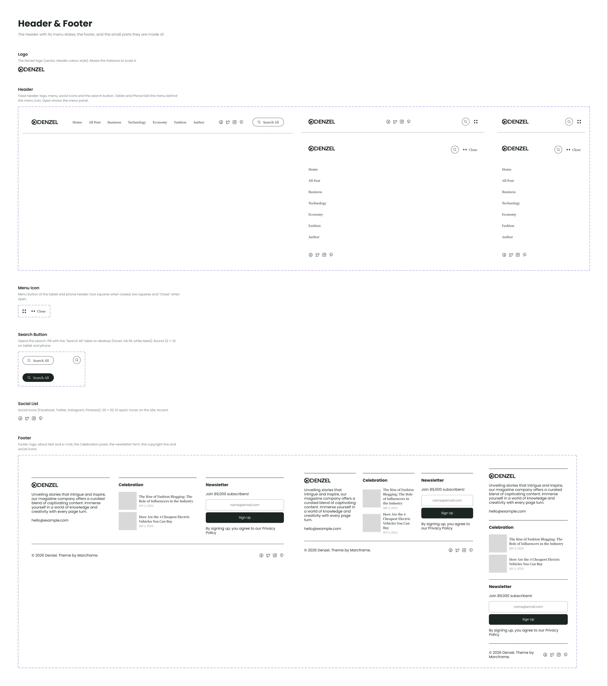
| Component | Variants |
|---|---|
| Logo | — the ring mark and the DENZEL wordmark, as vectors in the Header colour; scales with the instance |
| Header | Breakpoint: Desktop, Tablet, Phone × Menu: Closed, Open — the logo, the seven menu links, the socials and the search button; on tablets and phones the menu icon and the open menu |
| Menu Icon | State: Closed, Open — the tablet and phone menu button |
| Search Button | Style: Pill, Round × State: Default, Hover — “Search All” with its icon; Round is the icon alone |
| Social List | — the Facebook, Twitter, Instagram and Pinterest links |
| Footer | Breakpoint: Desktop, Tablet, Phone — about the magazine with the e-mail, two picked posts, the newsletter, then the copyright line with the socials |
To put your logo everywhere, edit the Logo component once.
Buttons & Elements
Section titled “Buttons & Elements”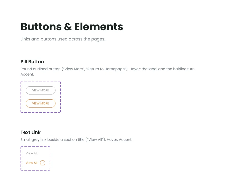
| Component | Variants |
|---|---|
| Pill Button | State: Default, Hover — the outlined pill with an upper-case label (“View More”, “Return to Homepage”); text property Label |
| Text Link | State: Default, Hover — “View All” beside a block title; text property Label |
Post Cards
Section titled “Post Cards”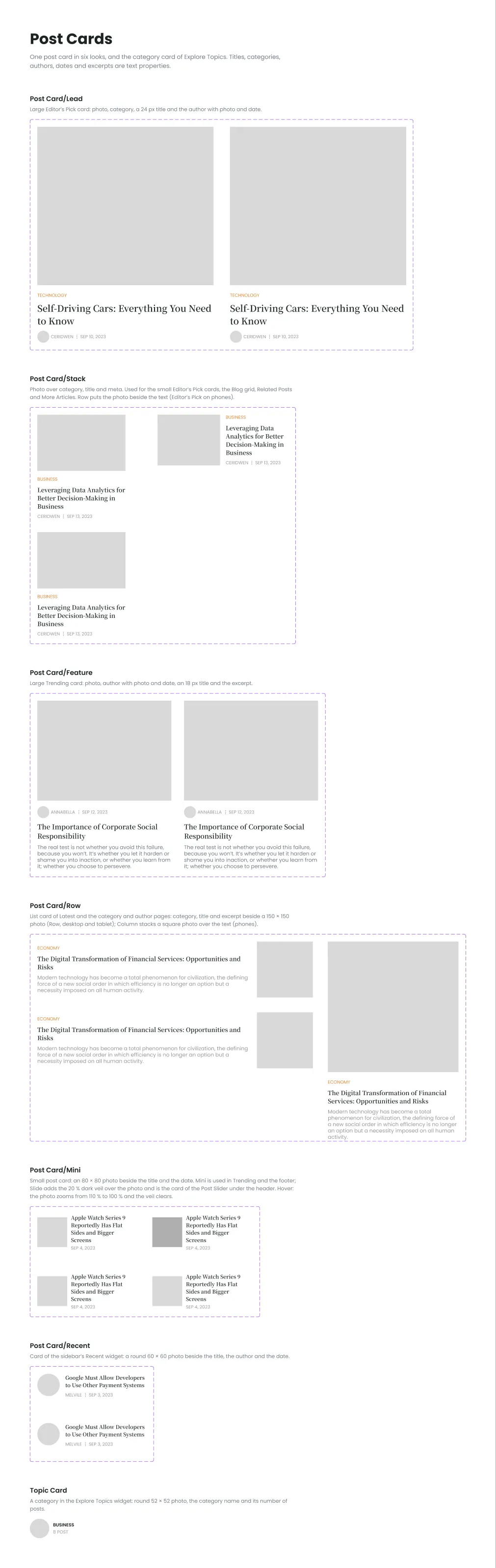
Every post card has the text properties Title, Category, Author Name and Date, and Excerpt where the card shows one; its hover variant shows how the photo and links react.
| Component | Variants |
|---|---|
| Post Card/Lead | State: Default, Hover — the large post of Editor’s Pick |
| Post Card/Stack | Layout: Column, Row × State: Default, Hover — photo above the text: the small Editor’s Pick posts, the Blog grid, Related Posts and More Articles; Row puts the photo beside the text (Editor’s Pick on phones) |
| Post Card/Feature | State: Default, Hover — the large Trending post |
| Post Card/Row | Layout: Row, Column × State: Default, Hover — category, title and excerpt beside a square photo (Latest, the category and author lists); Column puts the photo on top, as on phones |
| Post Card/Mini | Style: Mini, Slide × State: Default, Hover — an 80 × 80 photo with the title and date (small Trending posts, the footer); Slide adds a veil over the photo for the post slider |
| Post Card/Recent | State: Default, Hover — a round photo with the title, author and date, in the Recent widget |
| Topic Card | — a category with its photo and post count; properties Category and Count (“8 Post”) |
Sidebar & Sections
Section titled “Sidebar & Sections”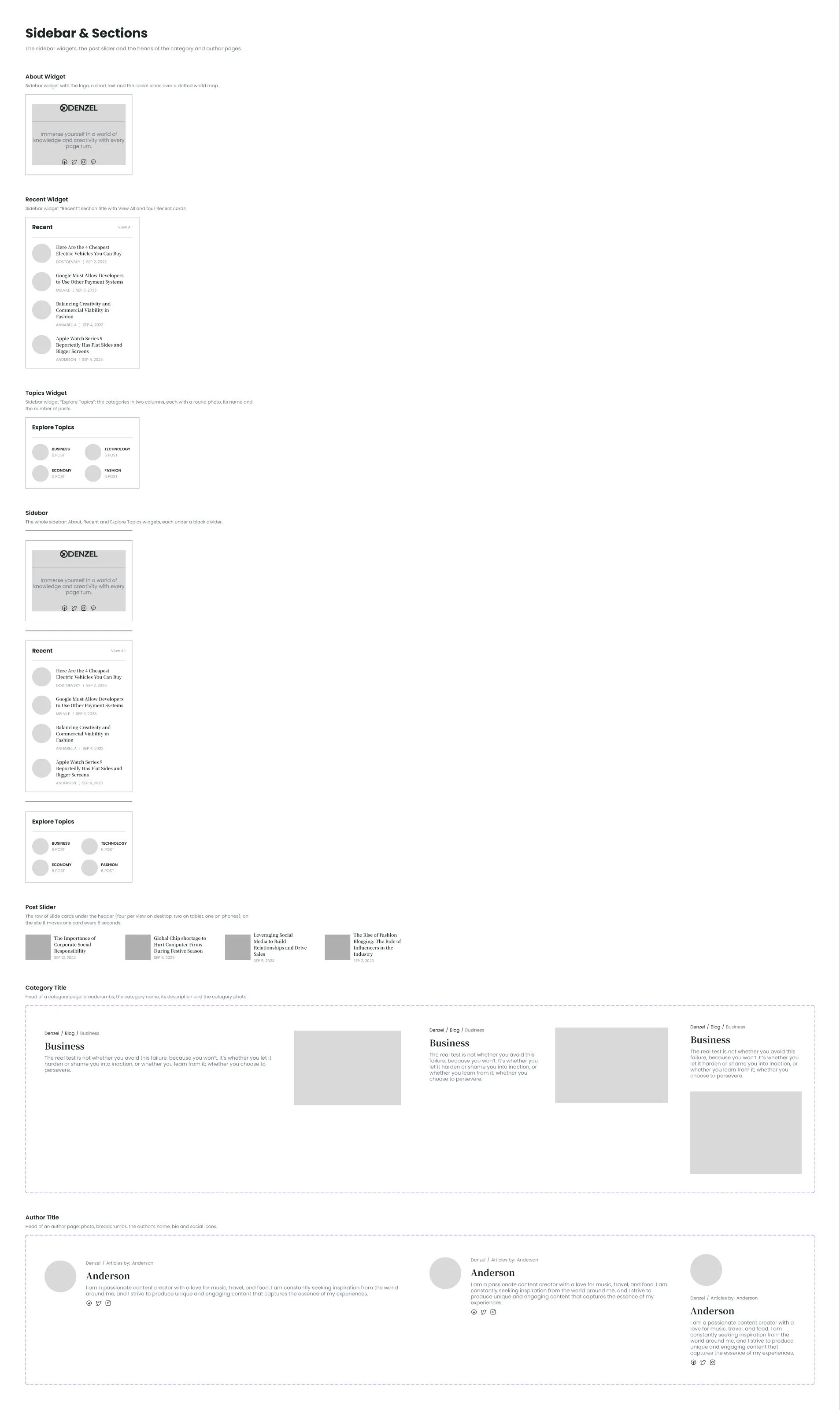
| Component | Variants |
|---|---|
| About Widget | — the logo, one line about the magazine and the socials |
| Recent Widget | — the Recent title and four recent posts |
| Topics Widget | — Explore Topics: four topic cards |
| Sidebar | — the three widgets stacked, as on Home, Category, Author and Post |
| Post Slider | — the row of picked posts under the header on Home |
| Category Title | Breakpoint: Desktop, Tablet, Phone — the head of a category page; text properties Name and Description |
| Author Title | Breakpoint: Desktop, Tablet, Phone — the head of an author page with the photo and socials; text properties Name and Bio |
Components with breakpoint variants (Header, Footer, Category Title, Author Title) switch by variant; set the one that matches the frame. The others keep one design and stretch to the width of their column.