Design — Tustel Next.js
The look comes from a small set of tokens. Change a token and nearly every page, component and state follows, so you rarely need to touch a component.
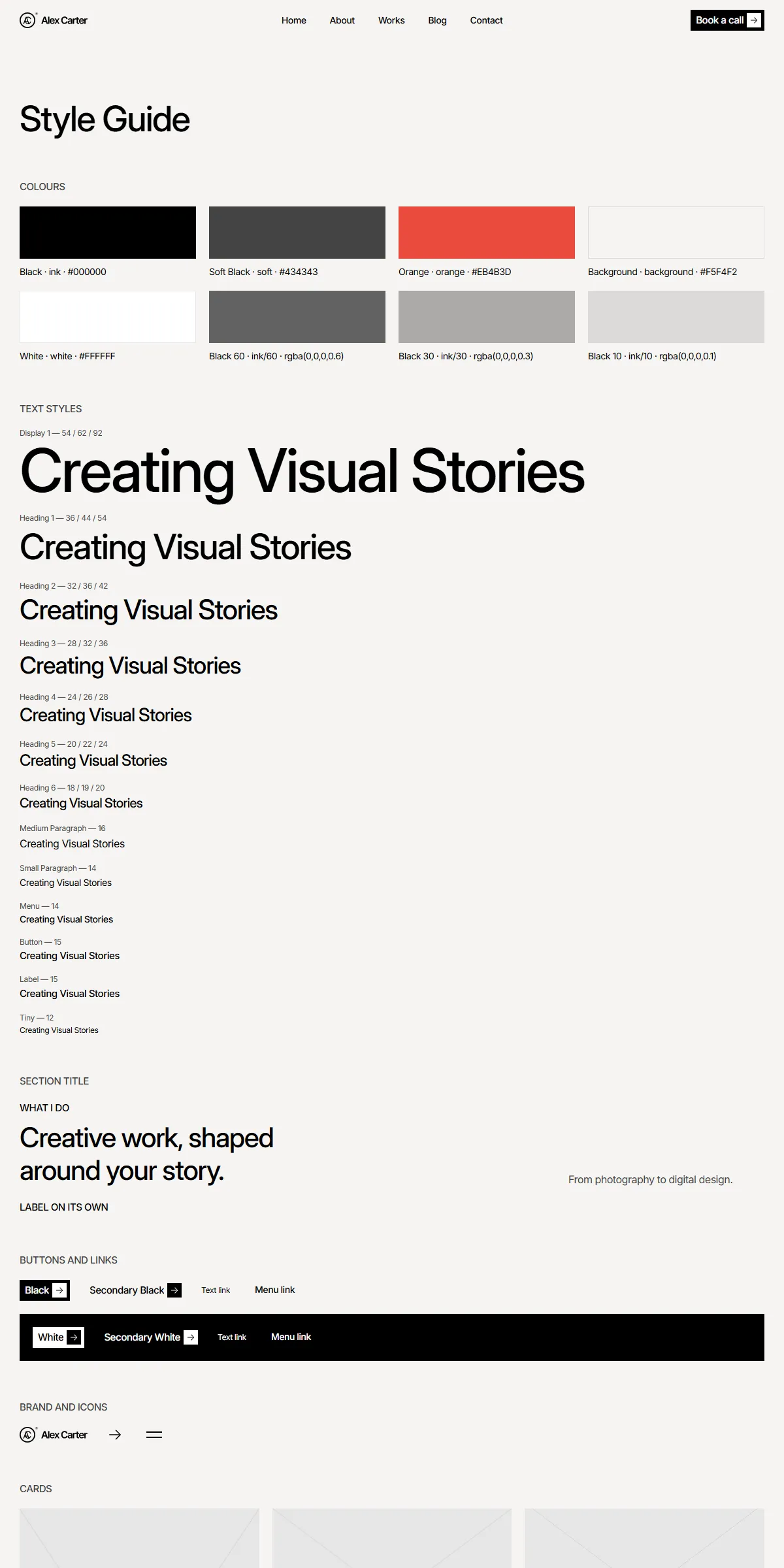
See everything first
Section titled “See everything first”Run npm run dev and open http://localhost:3000/style-guide. It shows the colours, the text styles, the section
title, the buttons and links, the logo, the menu button, the project and post cards, the specialities card, the logo
ticker, the counters, the form with its button’s states and rich text, with their names. When you want to know what a
change will affect, look there.
Colours
Section titled “Colours”src/design-system/theme.css:
@theme { --color-ink: #000000; /* headings, text, dark buttons, the covers over photos */ --color-soft: #434343; /* body text, labels, captions, dates */ --color-orange: #eb4b3d; /* hovers, the chosen service, the active project, required-field asterisks */ --color-background: #f5f4f2; /* the page and the solid header */}Each name becomes a Tailwind class: bg-ink, text-soft, bg-orange. Swap the hex values for your own palette and
the site changes. Keep enough contrast between text and its background (at least 4.5:1), or the site becomes hard to
read. White is Tailwind’s own white: the footer, the form fields, the specialities card and the white buttons over
photos.
Faded colours are opacity modifiers on the same colour, such as bg-ink/60 or bg-white/30: ink/60 is the dark cover
over the Home and 404 photos (and the slideshow arrows), ink/30 the labels under a project’s title, the line in the
About hero and the form’s placeholders, ink/10 the lines between a project’s details, white/30 the line in the Home
hero. The photo band darkens towards ink at the bottom. They follow the palette when you change the colour.
A few components animate a colour with Motion, so they write the value out instead of using the token. Change these
too when you change a colour; search the file for the value. The paths start in src/design-system/components/
unless they say otherwise:
| Colour | Also written in |
|---|---|
Black (#000000) and white (#ffffff) |
actions/Button.tsx (the boxes, labels, squares and arrows of the four button styles), actions/TextLink.tsx (the social links and the menu links); black also in src/components/sections/ServicesSection.tsx and src/components/sections/PortfolioSection.tsx, for the services and projects that are not chosen |
Orange (#eb4b3d) |
actions/Button.tsx and actions/TextLink.tsx (the hovers), src/components/sections/ServicesSection.tsx (the chosen service), src/components/sections/PortfolioSection.tsx (the active project in the List view) |
| Background | src/components/site/Header.tsx (the solid header’s fill, rgba(245, 244, 242, …)) |
The form keeps a few colours of its own: the field borders and the select’s grey placeholder in forms/FormField.tsx,
the pressed button and the red error state (“Something went wrong”) in forms/SubmitButton.tsx. The style guide’s
colour swatches repeat the hex values as text, in src/app/style-guide/page.tsx.
The Alex Carter logo (the AC monogram in a ring, the name and a small ® mark) is drawn as SVG paths in
src/design-system/components/brand/Logo.tsx, in the current text colour. That’s why it is white over the Home and 404
photos, and black on the solid header and in the footer. To use your own:
- As an SVG: replace the path data in
fills(the filled shapes) andstrokes(the outlines, each with its stroke width) with your logo’s paths, and set theviewBoxto your artwork’s size. - As an image file: replace the
<svg>with an<Image>of your file. An image keeps its own colours, also over the photos of Home and the 404 page, so pick one that reads on both.
It is 104 × 24 px everywhere: change h-6 w-[104px] in Logo.tsx to fit your proportions. Its label for screen
readers is site.owner. The same artwork is in public/images/logo.svg (black) and public/images/logo-white.svg
(white) for use elsewhere; the site itself draws the logo from Logo.tsx.
The browser icons are src/app/icon.svg (the monogram; it turns white in a dark browser theme) and
src/app/apple-icon.png.
The template loads Inter through next/font in src/app/layout.tsx:
const inter = Inter({ variable: "--font-inter", subsets: ["latin"], axes: ["opsz"], style: ["normal", "italic"],});Inter is one variable font here: every weight, the italic (for the emphasis in posts) and its optical-size axis. The text
styles pin that axis, which gives two looks from one file: 32 for the headings (Framer’s “Inter Display”) and 14 for
everything else, written as [font-variation-settings:'opsz'_32] in src/design-system/tokens/text.ts. theme.css
makes --font-inter the site font (--font-sans).
To use another Google font, import it by name from next/font/google and keep the variable name:
import { Manrope } from "next/font/google";const inter = Manrope({ variable: "--font-inter", subsets: ["latin"], weight: ["400", "500", "600"] });Leave out axes: ["opsz"] unless the new font has an optical-size axis, and style if it has no italic: Next.js stops
with an error otherwise. Without the axis, the font-variation-settings in the text styles simply do nothing. The
three weights are regular text (400), headings, buttons, labels and menu links (500), and the form’s “Thank you” and
“Something went wrong” (600); a font that isn’t variable needs them listed as above. For a font you have licensed
yourself, use next/font/local and point it at the files in src/app/fonts/. Next.js serves the font from your own
domain either way, so there is no request to Google at runtime.
Text styles
Section titled “Text styles”src/design-system/tokens/text.ts holds the sizes, weights and line heights, named after the design:
display, h1, h2, h3, h4, h5, h6paragraph, small, menu, button, label, tinyEach is a set of Tailwind classes. The headings are Inter Display at weight 500, with the phone size first and the
tablet (md:) and desktop (lg:) sizes after: display is 54 / 62 / 92 px, h1 36 / 44 / 54, h2 32 / 36 / 42, down
to h6 18 / 19 / 20. Paragraph (16 px), small (14), menu (14), button (15), label (15) and tiny (12) are Inter at the
same size everywhere. Every style has −0.03em letter spacing. Section labels are the label style in capitals. Change
the numbers here rather than in the components, and text stays consistent across the site.
Three sizes live with their component: the counters’ numbers (40 / 46 / 54 px) in
src/design-system/components/data/FactList.tsx, the phone menu’s links (24 px) in src/components/site/Header.tsx,
and the form fields’ 16 px text in src/design-system/components/forms/FormField.tsx.
Use the styles as className={text.h2} or combine: className={cn(text.h6, "text-white")}.
Breakpoints
Section titled “Breakpoints”Three sizes, set in theme.css:
| Width | Tailwind prefix | |
|---|---|---|
| Phone | below 810 px | (none) |
| Tablet | 810–1199 px | md: |
| Desktop | 1200 px and up | lg: |
Content is at most 1440 px wide. The side padding is 15 px on phones, 20 px on tablets and 30 px on desktops, and most
sections have 60 / 80 / 100 px above and below (sectionGutters and sectionPadding in
src/design-system/components/layout/Section.tsx).
Motion
Section titled “Motion”src/design-system/tokens/motion.ts holds the transitions:
| Token | Used for |
|---|---|
spring |
Buttons (the orange band, the rolling label, the turning square and the sliding arrow), the social and menu links, the project and post card hovers, the header’s fill and fade, the phone menu opening |
springQuick |
The Catalog / List switch on Home and the highlighted project in the List view |
springSoft |
The menu button’s lines turning into a cross, and the services on Home (the chosen one’s colour, the accordion on phones) |
slideSpring |
The slideshows: the Home hero photos and the testimonials |
fadeUp, fadeUpDistance, loadUpDistance, loadUpDelay |
Blocks fading up 18 px as they scroll into view, or 7 px on page load (<Reveal>) |
heroBlockEase |
The Home hero’s buttons, card and social links rising 50 px on load |
appearEase, letterStagger, wordStagger, lineStagger |
The text effects (<TextAppear>): letters, words or lines appearing 0.05 s apart |
Lower a spring’s duration for a snappier feel, or raise bounce for a livelier one.
| Effect | Where to change it |
|---|---|
| The Home hero shows a new photo every 5 s | interval={5} on <Slideshow> in src/components/sections/HomeHeroSection.tsx |
| The testimonials move on every 8 s | interval={8} in src/components/sections/TestimonialsSection.tsx |
| The client logos move 20 px a second, 50 px apart | speed={20} and gap={50} on <Ticker> in src/components/sections/ClientsSection.tsx |
| The specialities in the Home hero card scroll up 5 px a second | speed={5} (twice) in src/design-system/components/patterns/SpecialtiesCard.tsx |
| Texts appear on load: the Home hero letter by letter, page titles word by word, labels and introductions line by line | <TextAppear> in the sections (by="letters", "words" or "lines"); a plain element with the same className shows at once |
| Blocks fade up as they scroll into view | <Reveal> in the sections; a plain element with the same className shows at once |
| The counters count up by one every 5 ms | src/design-system/components/data/Counter.tsx |
| Portfolio and Blog show six items on desktop and four below, then more as you scroll | pageSize={6} and smallPageSize={4} on <PagedList> in src/components/sections/ProjectListSection.tsx and PostListSection.tsx |
| The header over the Home photo, and the header that hides as you scroll down | src/components/site/Header.tsx (Pages and sections) |
With “reduce motion” switched on in the visitor’s system, movement is switched off: texts and blocks fade in where they
stand instead of rising, button labels and arrows no longer roll and turn, the slideshows no longer move on by
themselves, the tickers and loading spinners stand still and the counters show their final number at once. Fades,
colour changes and the hover fills stay. MotionProvider (in the design system, wrapped around every page in
src/app/layout.tsx) does most of this; the slideshow, ticker and counter components check the setting themselves.
Corners, spacing, shadows
Section titled “Corners, spacing, shadows”Tustel’s corners are square: buttons, form fields, cards and photos. Only the portraits (the testimonials and the About
hero) and the slideshow arrows are round, and there are no drop shadows. Spacing is Tailwind classes on the components
(gap-5, p-3, gap-[50px]). Tailwind’s scale is 4 px per step, so gap-5 is 20 px. Change them where you see them;
the style guide shows the result immediately.
Components
Section titled “Components”src/design-system/components/ holds the buttons and links, the logo, the arrow icon, the text effects and scroll
reveals, the menu button, the section layout, the project and post cards, the slideshow, the counters, the tickers, the
specialities card, the paged list, rich text and the form fields. Its README lists
every component next to the Framer component it comes from. The sections that make up a page are one level up, in
src/components/sections/, and are listed in Pages and sections.
The arrow in the buttons is a Phosphor shape stored as path data in
src/design-system/components/icons/paths.ts (arrow-right), and <Icon name="arrow-right" /> draws it in the
current text colour. To add one:
-
Open the icon on phosphoricons.com and copy the SVG.
-
Take the
d="…"of its<path>. -
Add a line to
iconPaths:"my-icon": "M128,24A104,104,0,1,0,…",
Then use <Icon name="my-icon" className="size-5" />. Paths use a 256 × 256 grid, which is what Phosphor exports. The
slideshow’s two arrows are chevrons drawn in src/design-system/components/media/Slideshow.tsx.