Components — Tustel Figma
The pages are built from components, so a change to a component reaches every page that uses it. The main components live on the Components page, one board each; every page frame holds instances of them. Each component has a short description, shown when you hover it in the Assets panel.
Using components
Section titled “Using components”- Add one: drag it from the Assets panel (
Alt/Option + I) onto a frame. - Change a variant: select an instance and pick the variant in the right sidebar (for example Header → Breakpoint: Phone, Look: Primary, Menu: Open).
- Override content: double-click into an instance and change its text or image. Overrides stay when the main component changes. Many components also have text properties (Button Text, Project Title, Category, Post Title, Date, Quote, Client Name…) you can edit straight from the right sidebar.
- Edit for everyone: right-click an instance → Go to main component, and edit it there.
- Break the link: Detach instance (
Ctrl/Cmd + Alt/Option + B) when one place needs something the component can’t do. The copy stops following the main component.
The hover, open, chosen, active, loading, success and error variants document how the interface reacts. Use them to show states in a presentation, or connect them with Prototype → While hovering / On click to click through the design. The pages show every component at rest.
Header and footer
Section titled “Header and footer”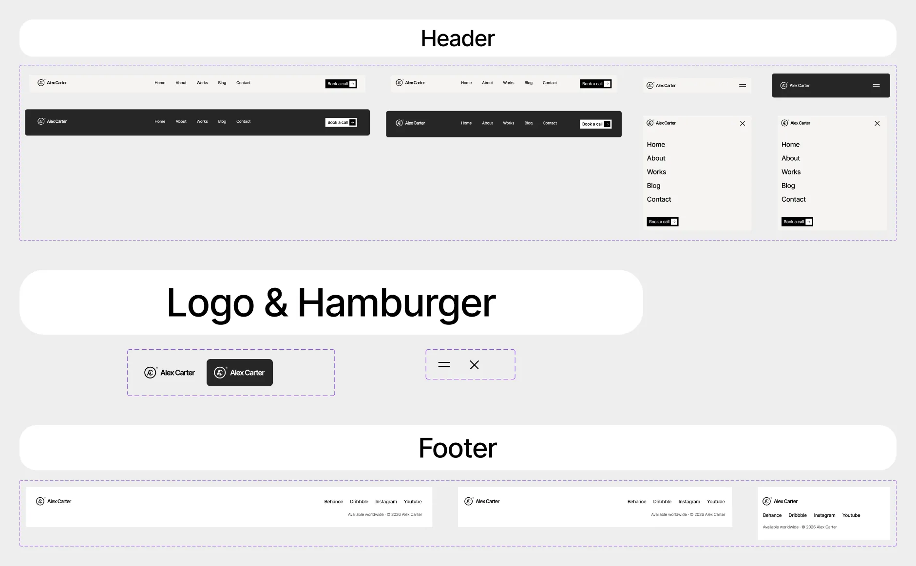
| Component | Variants |
|---|---|
| Logo | Color: Black, White — the AC monogram and the name, as a vector; Black on light backgrounds, White over photos |
| Header | Breakpoint: Desktop, Tablet, Phone × Look: Primary, Secondary × Menu: Closed, Open — Primary is the solid bar on the page background, Secondary the transparent bar over a photo (Home, 404); Menu Open is the phone menu |
| Hamburger | State: Closed, Open — the phone menu button: two lines that turn into an X |
| Footer | Breakpoint: Desktop, Tablet, Phone — logo, social links and the note |
To put your logo everywhere, edit the Logo component once (both variants).
Buttons
Section titled “Buttons”
| Component | Variants |
|---|---|
| Menu | Style: Black, White, Secondary Black, Secondary White, Phone × State: Default, Hover — a menu link; on hover Orange fills it from the left and the text turns white. Phone is the large link of the open phone menu |
| Primary | Style: Black, White, Secondary Black, Secondary White × State: Default, Hover — the button with a label and an arrow in a square; Black and White have a box, Secondary has none. On hover an Orange band rises, the label rolls, the square turns and the arrow slides |
| Submit Button | State: Default, Hover, Pressed, Loading, Disabled, Success, Error — the contact form’s send button; Success shows “Thank you”, Error “Something went wrong” |
| Component | Variants |
|---|---|
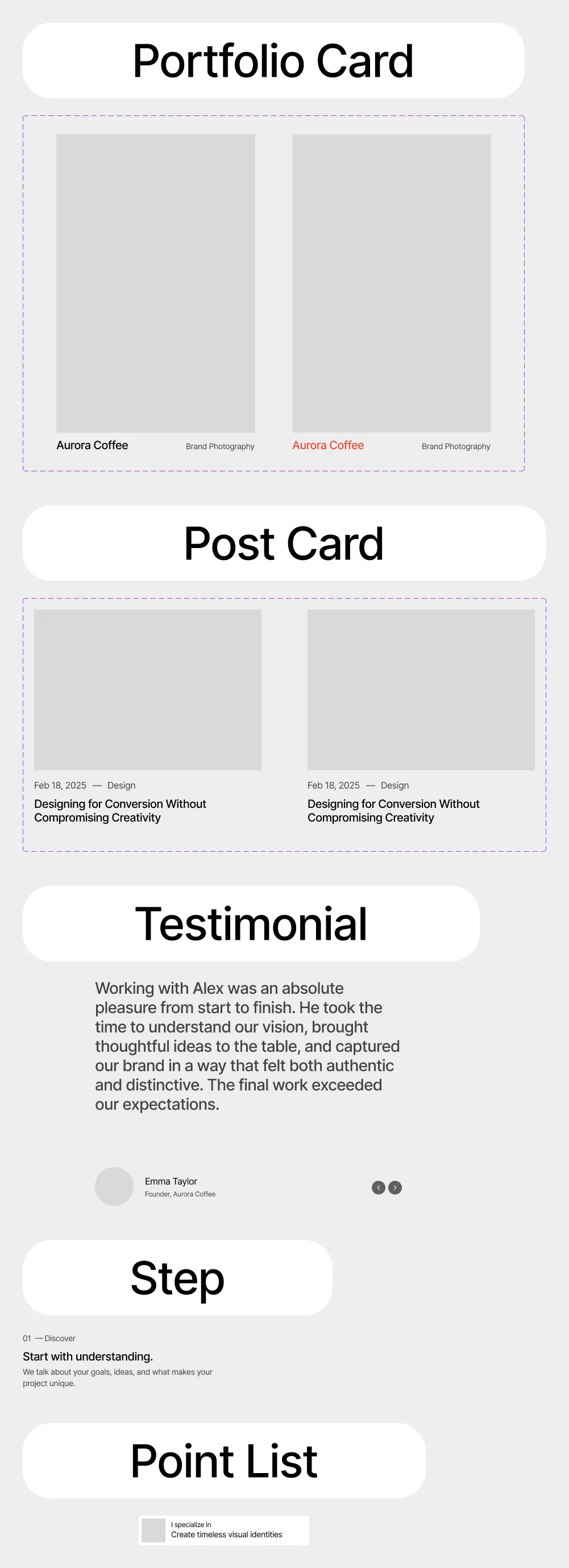
| Portfolio Card | State: Default, Hover — a project: photo at its own proportions, title and category. Hover shrinks the photo inside a blurred frame and rolls the title to Orange |
| Post Card | State: Default, Hover — a journal post: photo, date and category, title. Hover zooms the photo out |
| Testimonial | — a quote, the client’s portrait, name and role |
| Step | — one step of “How I work” on About: number, title and text |
| Point List | — the specialities card of the Home hero: portrait, “I specialize in” and the five scrolling specialities |
| Service | Part: Full, Phone, Details, Title × State — the parts of a numbered service that the Service List is built from; Phone is the accordion row on phones |
Sections
Section titled “Sections”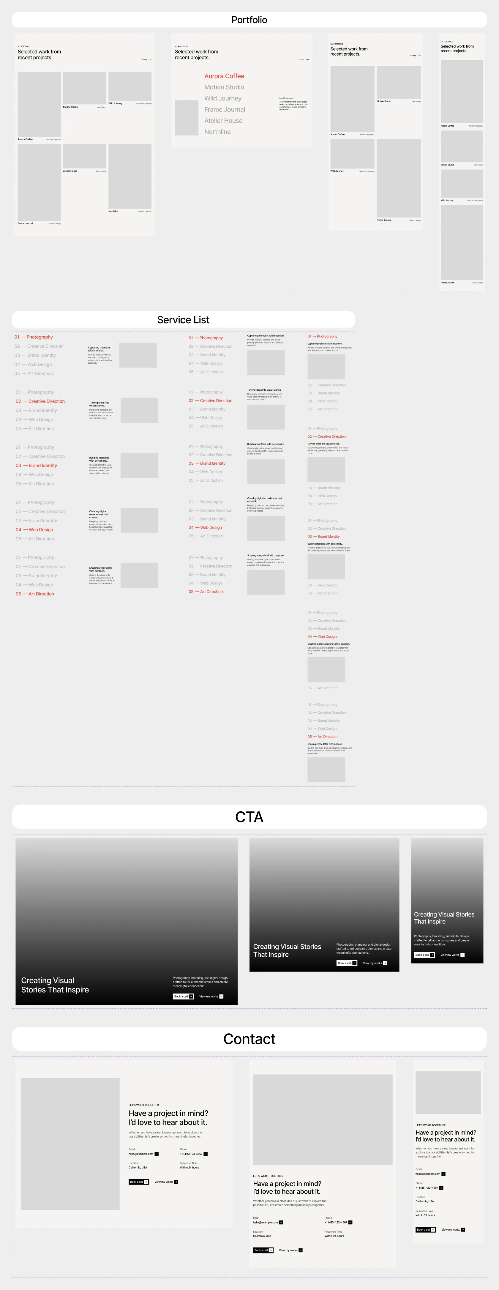
| Component | Variants |
|---|---|
| Portfolio | Breakpoint: Desktop, Tablet, Phone × View: Catalog, List — the Home portfolio section: title, the Catalog / List switch (desktop) and the project cards or the list |
| Portfolio List | Breakpoint: Desktop, Phone × Active: 01–06 — the List view: six large titles, the Active one Orange with its photo and summary |
| Service List | Breakpoint: Desktop, Tablet, Phone × Chosen: 01–05 — the Home services list: five numbered services, the Chosen one Orange with its details |
| CTA | Breakpoint: Desktop, Tablet, Phone — the photo band “Creating Visual Stories That Inspire” with a short text and two buttons, on Home and About |
| Contact | Breakpoint: Desktop, Tablet, Phone — “Let’s work together”: photo, title, text, e-mail, phone, location, response time and two buttons, on Home and every project |
The Icons page holds the icons the design uses, one component each, named Icon/<name>: Arrow Right from
Phosphor Icons (MIT License), in every Primary button, and Chevron Left and Chevron Right
from Lucide (ISC License), the testimonial arrows. The buttons use the Arrow Right component, so a
change to it reaches every button. For the full sets, install the free Phosphor or Lucide plugin from the Figma
Community.
Adding your own
Section titled “Adding your own”Build new components next to the existing ones on the Components page, and use the colour and text styles (Colours and text styles) instead of raw values — that keeps your additions rebrandable with the rest.