Design — Tustel HTML
Tustel is styled with Tailwind CSS classes and a few colour, font and breakpoint tokens. Most changes are HTML edits; a new colour or font needs a CSS rebuild.
How the styling works
Section titled “How the styling works”The pages are styled with Tailwind CSS classes written in the HTML
(class="flex flex-col gap-2.5 text-ink"). assets/css/style.css contains exactly the classes the pages use,
generated from src/css/style.css.
That means two kinds of change:
| Change | Rebuild the stylesheet? |
|---|---|
| Move, copy or delete elements; use classes that already appear somewhere in the site | No |
Change a colour, a font, a breakpoint; use a class that appears nowhere yet (say mt-7) |
Yes |
Rebuilding the stylesheet
Section titled “Rebuilding the stylesheet”Once, install the tools (needs Node.js 20 or newer):
npm installThen, after a change:
npm run build:css # one buildnpm run watch:css # rebuilds on every save while you workBoth write assets/css/style.css. The build scans the .html files in the root folder and one folder down
(portfolio/, blog/), and assets/js/main.js, so a class you add there is picked up. Upload the new style.css
with your pages.
Colours
Section titled “Colours”In src/css/style.css:
@theme { --color-ink: #000000; /* Black: headings, text, dark buttons, the covers over photos */ --color-soft: #434343; /* Soft Black: body text, labels, captions, dates */ --color-orange: #eb4b3d; /* Orange: hovers, the chosen service, the active project, required-field asterisks */ --color-background: #f5f4f2; /* Background: the page and the solid header */}Each becomes a class (bg-ink, text-soft, bg-orange). Change the values, rebuild, and the whole site follows. Keep
text on its background at a contrast of at least 4.5:1 so it stays readable. White is Tailwind’s own white: the
footer, the form fields, the specialities card and the white buttons over photos.
Faded colours are opacity modifiers on the same colour, such as bg-ink/60 or bg-white/30: ink/60 is the dark
cover over the Home and 404 photos (and the testimonial arrows), ink/30 the labels under a project’s title, the line
in the About hero and the form’s placeholders, ink/10 the lines between a project’s details, white/30 the line in
the Home hero. The photo band darkens towards ink at the bottom. They follow the palette when you change the colour.
A few colours are also written out in the HTML or in the site script, because the script animates them. If you change
a token, replace its value in the files too (find and replace in files, assets/js/main.js included):
| Colour | Written as | Where |
|---|---|---|
| Black | #000000 |
The data-motion and style attributes of the buttons, the menu links and the social links; the services that are not chosen and the projects that are not active in the List view on Home (also in main.js) |
| White | #ffffff |
The data-motion and style attributes of the buttons and links: their boxes, labels, squares and arrows |
| Orange | #eb4b3d |
The hovers of the buttons without a box (“View my works”, the e-mail and phone links) and of the social links, the chosen service, the active project in the List view (also in main.js) |
| Background | rgba(245, 244, 242, 1), rgba(245, 244, 242, 0) (search for 245, 244, 242) |
The header: the style of each <nav data-bar>, and assets/js/main.js, which fills the solid header |
Black and white are written many times over, in the hovers. Replace them only if you change the black or the white of the design, and check the result in the style guide.
The form keeps a few colours of its own, written in the classes of contact.html: the field borders
(rgba(0,0,0,0.1), and rgba(0,0,0,0.3) on the field in use), the select’s grey placeholder (#999999), the pressed
button (#333333) and the red error state of the button, “Something went wrong” (rgb(255,34,68) on
rgba(255,34,68,0.15)). Change them there (and in the style guide’s sample form) and rebuild the stylesheet. The
spinner under Works and the Blog is grey too (rgb(153,153,153), in its classes).
Logo and icons
Section titled “Logo and icons”The Alex Carter logo (the AC monogram in a ring, the name and a small ® mark) is an <svg viewBox="0 0 104 24">
drawing inside the logo link, four times on every page: in the three bars of the header and in the footer. It’s drawn
in the current text colour: white over the Home and 404 photos, black on the solid header and in the footer. To use
your own, replace each <svg>…</svg> with your logo’s, keeping aria-hidden="true" and class="block size-full" on
it and fill="currentColor" (or stroke="currentColor", for outlines) on its shapes so that it changes colour like
the original. VS Code’s Replace in Files does every page at once: turn on regular expressions (.*), search for
<svg viewBox="0 0 104 24"(.|\n)*?</svg\s*>and replace it with your <svg> on one line. Then replace aria-label="Alex Carter" on the link with your name.
The logo shows at 104 × 24 px everywhere (h-6 w-[104px] on the link); change the width for a logo of other
proportions, and rebuild the stylesheet if that class is new. The same artwork is in assets/images/logo.svg (black)
and assets/images/logo-white.svg (white) for use elsewhere; the pages draw the logo inline.
icon.svg (the monogram; it turns white in a dark browser theme) and apple-icon.png (180 × 180 px) in the root
folder are the icons in the browser tab and on a phone’s home screen. Replace the files, keeping the names.
The interface icons in the pages are inline SVG. The arrow in the buttons is a Phosphor icon, written twice in each button: one slides out on hover as the other slides in. The testimonial arrows are chevrons from Lucide. To use another icon, open it on phosphoricons.com, copy its SVG and paste it where the old one is. Icons take their colour from the text around them.
Inter ships in assets/fonts/ as two variable files, upright (inter-variable-2.woff2) and italic
(inter-variable-1.woff2, for the emphasis in posts), declared at the top of src/css/style.css:
@font-face { font-family: "Inter"; src: url("../fonts/inter-variable-1.woff2") format("woff2"); font-weight: 100 900; font-style: italic; … }@font-face { font-family: "Inter"; src: url("../fonts/inter-variable-2.woff2") format("woff2"); font-weight: 100 900; font-style: normal; … }:root { --font-inter: Inter, "Inter fallback: Arial", sans-serif; }Every page uses it through font-sans on the <body>. Inter’s optical-size axis gives two looks from one file: the
headings use 32 (Framer’s “Inter Display”) and everything else 14, written in the classes as
[font-variation-settings:'opsz'_32] and [font-variation-settings:'opsz'_14].
To use another font:
- Put its
.woff2files inassets/fonts/. - Change the two
@font-facerules (font-familyandsrc) and the first name in--font-inter. The pages use the weights 400, 500 and 600 (600 for the form’s “Thank you” and “Something went wrong”): a font that isn’t variable needs one@font-facerule per weight file. - Rebuild the stylesheet.
A font without an optical-size axis simply ignores the font-variation-settings classes; without an italic, the
browser slants the regular face for the emphasis in posts. The Inter fallback: Arial rules size Arial like Inter
while the font loads; with another font, you can delete them and their name in --font-inter.
The font files cover Western European languages (the rules’ unicode-range). For other alphabets, use files that
include them and remove the unicode-range. Fonts from Google Fonts can be downloaded as
files with https://gwfh.mranftl.com, so they are served from your own domain, which is faster and needs no consent
banner.
Sizes and spacing
Section titled “Sizes and spacing”Text sizes are classes with a phone value first and the tablet (md:) and desktop (lg:) values after:
text-[32px] md:text-[36px] lg:text-[42px]. The style guide lists them: Display 54 / 62 / 92 px, the headings from
36 / 44 / 54 down to 18 / 19 / 20, and the paragraph (16), small (14), menu (14), button (15), label (15) and tiny (12)
styles. Every style has −0.03em letter spacing (tracking-[-0.03em]), and section labels are the label style in
capitals.
Spacing uses Tailwind’s scale (4 px per step, so gap-5 is 20 px) or exact values in brackets (py-[60px]). Content
is at most 1440 px wide (max-w-[1440px]), with 15, 20 and 30 px at the sides, and most sections have 60 / 80 / 100 px
above and below. Tustel’s corners are square: buttons, form fields, cards and photos. Only the portraits of the
testimonials and the About hero, the testimonial arrows and the spinners are round, and there are no drop shadows.
| Width | Prefix | |
|---|---|---|
| Phone | below 810 px | (none) |
| Tablet | 810–1199 px | md: |
| Desktop | 1200 px and up | lg: |
max-md: and max-lg: apply below those widths: max-lg:hidden hides a card of Works or the Blog on phones and
tablets.
The header
Section titled “The header”Every page carries the same header, with three bars, and its classes pick the ones that show:
- Over the photo on Home and the 404 page. Both open with a full-screen photo whose
<section>carriesdata-header-cover. There the bar markeddata-bar="cover"lies over the photo in white and scrolls away with the page. A second, solid bar (data-bar="scroll", the page background with black text) appears while the visitor scrolls back up, but not near the top of the page: it is tied to the client logos, whose section carriesdata-header-reveal, and fades in as they scroll past. The 404 page has no such section, so its second bar never shows. - Every other page shows the solid bar marked
data-bar="page", fixed at the top. It hides as soon as the visitor scrolls down and comes back when they scroll up. - Changing it. To put the header over a photo on another page, start that page with a dark, full-screen section
marked
data-header-cover. To give Home the solid header of the other pages, remove the mark from its first section. The looks are chosen in CSS (thein-[body:has([data-header-cover])]classes of the header), so nothing jumps after the page loads;assets/js/main.jsplays the scrolling and the phone menu. - The menu. The link of the current page carries
aria-current="page"and looks like the others, as in the original design; screen readers hear it as the current page. On phones each bar holds the logo and a two-line button; the menu opens under them with the links and “Book a call”, and closes when a link is followed.
Components
Section titled “Components”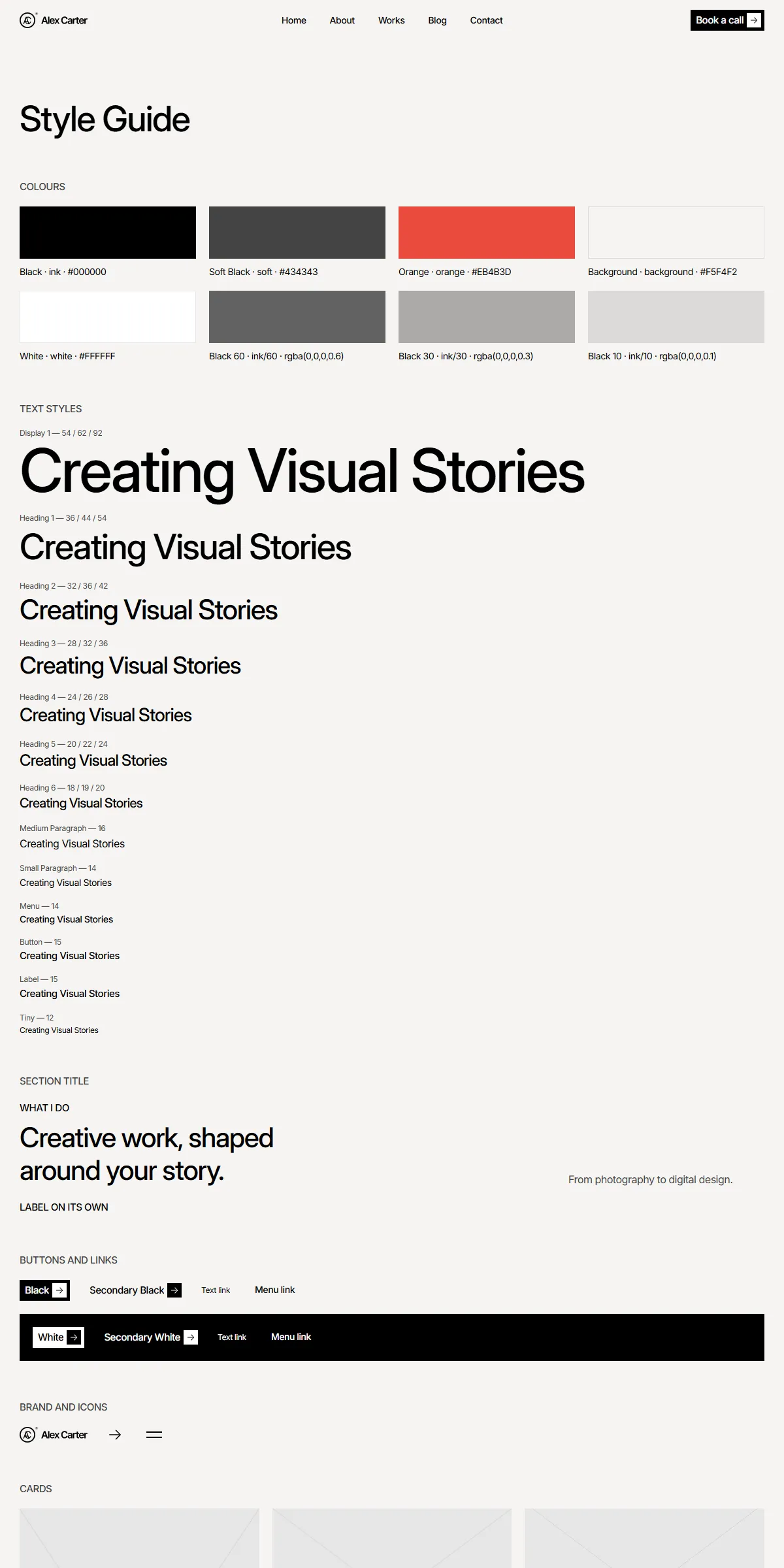
style-guide.html shows the colours, the text styles, the section title, the buttons and links, the logo, the arrow
icon and the menu button, the project and post cards, the specialities card and the tickers, the counters, the form
with its button’s states and rich text, each with its name. To reuse one, copy its markup from there or from the page
that shows it.
Elements with data-… attributes are wired to the site script, so keep those attributes when you copy them:
data-header, data-bar, data-header-cover, data-header-reveal, data-hamburger, data-appear, data-hover,
data-motion, data-slideshow, data-ticker, data-counter, data-current-year, data-services,
data-portfolio-switch, data-paged-list, data-form, …
Motion
Section titled “Motion”The hover effects, the texts and blocks that appear, the header, the slideshows, the tickers, the counters, the
Catalog / List switch, the services and the paged lists are all in assets/js/main.js. A few settings are written in
the HTML:
| Effect | Where |
|---|---|
| The Home slideshow shows a new photo every 5 s, the testimonials every 8 s | data-interval="5" and data-interval="8" on their data-slideshow element in index.html |
| The client logos move 20 px a second, 50 px apart | data-ticker="20" and data-gap="50" on the ticker row; the gap is also style="gap: 50px" on the row and on each of its three copies |
| The specialities in the Home hero card scroll up 5 px a second | data-ticker="5" on both tickers of the card |
| Texts appear on load: the Home hero letter by letter, page titles word by word, labels and introductions line by line | data-appear="letter", "word" or "lines", with data-delay in seconds (Editing the site) |
| Blocks fade up 18 px as they scroll into view, or 7 px on page load; the Home hero’s buttons, card and social links rise 50 px | data-appear="reveal", "load" or "hero", with style="opacity: 0.001; transform: translateY(…)". Remove both from an element to show it at once. |
| Hovers on buttons, links and cards | data-hover on the element, and data-motion on its parts: the rest and hover values the script moves between. data-transition="spring" gives the menu and social links their slower spring. |
| The counters count up by one every 5 ms | data-counter and data-from (Editing the site) |
| Works and the Blog show six items on desktops and four below, then more as you scroll | data-page-size="6" and data-small-page-size="4" on the list (Editing the site) |
With “reduce motion” switched on in the visitor’s system, movement is switched off: texts and blocks fade in where they stand instead of rising, button labels and arrows no longer roll and turn, the slideshows no longer move on by themselves, the tickers and loading spinners stand still and the counters show their final number at once. Fades, colour changes and the hover fills stay.