Design — Titen HTML
The pages are styled with Tailwind CSS classes and a handful of colour, font and breakpoint tokens. Most changes are edits in the HTML; a new colour or font means one rebuild of the stylesheet.
How the styling works
Section titled “How the styling works”The pages are styled with Tailwind CSS classes written in the HTML
(class="px-5 py-2.5 bg-ink text-white hover:bg-accent"). assets/css/style.css contains exactly the classes the pages
use, generated from src/css/style.css.
That means two kinds of change:
| Change | Rebuild the stylesheet? |
|---|---|
| Move, copy or delete elements; use classes that already appear somewhere in the site | No |
Change a colour, a font, a breakpoint; use a class that appears nowhere yet (say mt-7) |
Yes |
Rebuilding the stylesheet
Section titled “Rebuilding the stylesheet”Once, install the tools (needs Node.js 20 or newer):
npm installThen, after a change:
npm run build:css # one buildnpm run watch:css # rebuilds on every save while you workBoth write assets/css/style.css. The build scans every .html file and assets/js/main.js for classes, so a class
you add anywhere is picked up. Upload the new style.css with your pages.
Colours
Section titled “Colours”In src/css/style.css:
@theme { --color-ink: #121212; /* text, dark buttons, the footer and dark sections */ --color-background: #f5f1e5; /* the page, and the header once you scroll */ --color-sand: #e0dcd7; /* the Projects band on Home, the Beginnings section on About */ --color-accent: #c36036; /* button hovers, award names, accent buttons */ --color-orange: #e8481c; /* the current page in the menu, the rating star */ --color-danger: #e8481c; /* form errors */}Each becomes a class (bg-ink, text-accent, bg-sand). Change the values, rebuild, and the whole site follows. Keep
text on its background at a contrast of at least 4.5:1 so it stays readable.
A few colours are also written in the HTML, because the site script animates them:
- The title of the wide project card (Home, category pages) turns from white to the accent colour on hover:
data-motion='{"rest":{"color":"#ffffff"},"hover":{"color":"#c36036"}}'. If you change--color-accent, replace#c36036in those attributes across the files too. - The header switches between transparent with white text and the page background with dark text. The classes for
each state are in
assets/js/main.js, so changebg-backgroundinsrc/css/style.css(the token), not in the script.
Logo and icons
Section titled “Logo and icons”The Titen logo is an <svg> drawing inside the logo link in the header and the footer of every page. It’s drawn in the
current text colour, which is why it is black on the page and white on dark covers and in the footer. To use your own,
replace the <path d="…"> (and the viewBox) in those two places with your logo’s, using find and replace in files.
The header shows it at 62 × 25 px (49 × 20 px on phones), the footer at 74 × 30 px.
icon.svg and apple-icon.png in the root folder are the icons in the browser tab and on a phone’s home screen.
Replace the files, keeping the names.
The interface icons in the pages are inline SVG (Phosphor). To use another one, open it on phosphoricons.com, copy its SVG and paste it where the old one is. Icons take their colour from the text around them.
Plus Jakarta Sans ships in assets/fonts/plus-jakarta-sans-variable.woff2 and is declared at the top of
src/css/style.css:
@font-face { font-family: "Plus Jakarta Sans"; src: url("../fonts/plus-jakarta-sans-variable.woff2") format("woff2"); font-weight: 400; … }:root { --font-jakarta: "Plus Jakarta Sans", "Plus Jakarta Sans fallback: Arial", …, sans-serif; }To use another font:
- Put its
.woff2file inassets/fonts/. - Change the
@font-facerules (font-familyandsrc) and the first name in--font-jakarta. - Rebuild the stylesheet.
Fonts from Google Fonts can be downloaded as files with https://gwfh.mranftl.com, so they are served from your own domain, which is faster and needs no consent banner.
The search panel is set in Inter (assets/fonts/inter-variable.woff2, --font-inter), as on the original design.
Sizes and spacing
Section titled “Sizes and spacing”Text sizes are classes with a phone value first and the tablet (md:) and desktop (lg:) values after:
text-[30px] md:text-4xl lg:text-[42px]. Spacing uses Tailwind’s scale (4 px per step, so p-5 is 20 px and gap-12
is 48 px) or exact values in brackets (py-[60px]). Titen is square: buttons, form fields and photos have no rounded
corners. The exceptions are the testimonial cards (10 px), the search panel (16 px) and the round icons.
| Width | Prefix | |
|---|---|---|
| Phone | below 810 px | (none) |
| Tablet | 810–1199 px | md: |
| Desktop | 1200 px and up | lg: |
Components
Section titled “Components”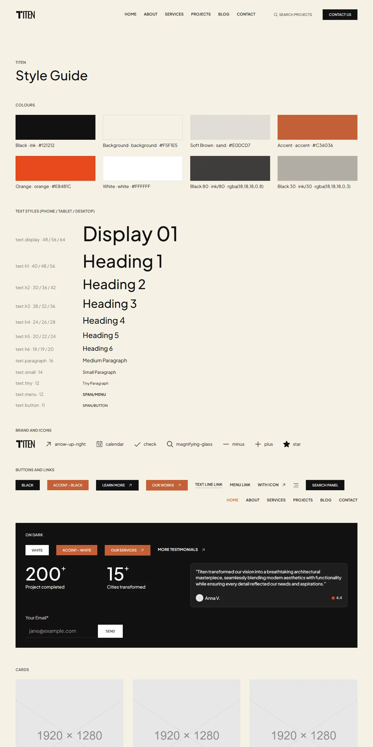
style-guide.html shows every button, form field, card and section with its name. To reuse one, copy its markup from
there or from the page that shows it.
Elements with data-… attributes are wired to the site script, so keep those attributes when you copy them:
data-hover, data-motion, data-appear, data-toggle, data-on, data-off, data-slideshow, data-loop-video,
data-search, data-form, …
Motion
Section titled “Motion”The appear effects, hover effects, the accordion, the service list, the slideshows, the search and the videos are all in
assets/js/main.js, and respect the visitor’s “reduce motion” setting. A few settings are written in the HTML:
| Effect | Where |
|---|---|
| The Home testimonials change every 4 seconds | data-interval="4" on the slideshow in index.html (seconds) |
| Blocks rise in as you scroll | data-appear="block" with style="opacity: 0; transform: translateY(18px)". Remove both from an element to show it at once. |
| Headings appear word by word | data-appear="word" on each word. Remove the attribute and the style to show a word at once. |