Getting started — Titen Figma
Open the file
Section titled “Open the file”Your purchase gives you the Titen Figma file in one of two forms:
- A duplicate link. Open it while signed in to Figma and choose Duplicate (or Open in Figma). A copy lands in your Drafts; move it to a team or project from the file menu.
- A
.figfile. In Figma, go to your Drafts or a project, then Import (or drag the file onto the Figma window).
Either way the copy is yours: edit it freely and invite your team. A free Figma plan is enough to open and edit it.
Start with the Read Me page inside the file — it summarises this guide.
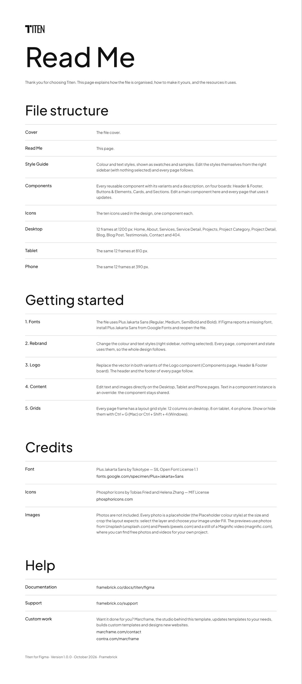
The file uses one typeface: Plus Jakarta Sans — Regular, Medium and SemiBold, and Bold for the highlighted lines in the service texts (the Highlight style). Figma’s browser and desktop apps include it through Google Fonts, so it usually works straight away. If Figma shows a Missing fonts warning, install Plus Jakarta Sans on your computer from Google Fonts and reopen the file.
The pages
Section titled “The pages”| Page | What is on it |
|---|---|
| Cover | The file cover |
| Read Me | File structure, getting started, credits and help |
| Style Guide | The colour and text styles, shown as swatches and samples (Colours and text styles) |
| Components | Every reusable component with its variants, on four boards: Header & Footer, Buttons & Elements, Cards, Sections (Components) |
| Icons | The ten icons used in the design, one component each, from Phosphor Icons (MIT licence) |
| Desktop | The 12 page frames at 1200 px |
| Tablet | The same 12 frames at 810 px |
| Phone | The same 12 frames at 390 px |
Page frames
Section titled “Page frames”Each breakpoint page holds the frames in site order, named <Page> - <Breakpoint>:
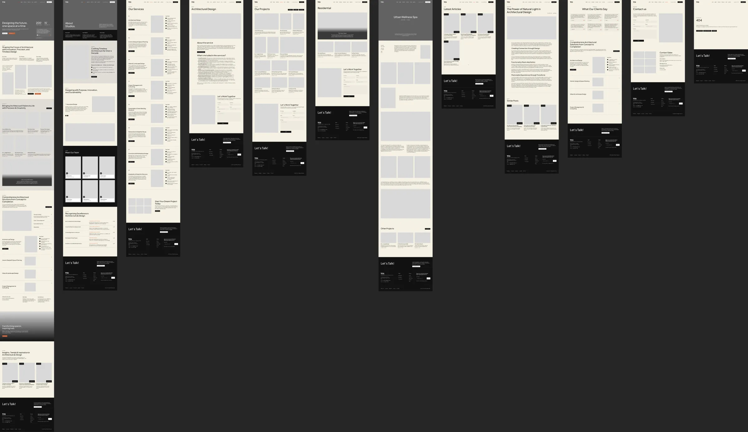
| Frame | Page of the site |
|---|---|
| Home | Home: the hero with client testimonials, about, projects, services, call to action and the latest posts |
| About | About: the studio’s values and beginnings, its approach, a video band, the team and the awards |
| Services | All eight services, one row each, and a call to action |
| Service Detail | One service: about it, what’s included, the brochure button and the contact form |
| Projects | All twelve projects and the contact form |
| Project Category | The projects of one sector (Residential, Hospitality or Commercial) and the contact form |
| Project Detail | One project: its cover and details, the story with its galleries, and other projects |
| Blog | Blog overview |
| Blog Post | One article and similar posts |
| Testimonials | Client quotes and the service list |
| Contact | The contact form, the location, e-mail and phone |
| 404 | Page not found |
Frame widths are the breakpoints the design is built for — Desktop 1200 px, Tablet 810 px, Phone 390 px — and each frame has a matching layout grid (hidden by default; see Colours and text styles).
Finding things
Section titled “Finding things”- Pages list (top of the left sidebar): jump between the pages above.
- Layers panel (
Alt/Option + 1): frames and layers are named after what they are — “Header”, “Footer”, “Hero”, “Project 01”, “Post Card”. - Assets panel (
Alt/Option + I): every component with a short description, ready to drag onto a frame. - Right-click a component → Go to main component to jump from a page to where the component is defined.
Before you change anything
Section titled “Before you change anything”Duplicate the frames you are about to rework (Ctrl/Cmd + D) or save a named version (File → Save to version
history), so you can always compare with the original design.