Colours and text styles — Titen Figma
Every colour and every piece of text in the file uses a style. Change a style and every frame, component and state that uses it updates — this is how you rebrand Titen in minutes instead of recolouring layers one by one.
Open them from the right sidebar with nothing selected (Local styles), or see them laid out on the Style Guide page.
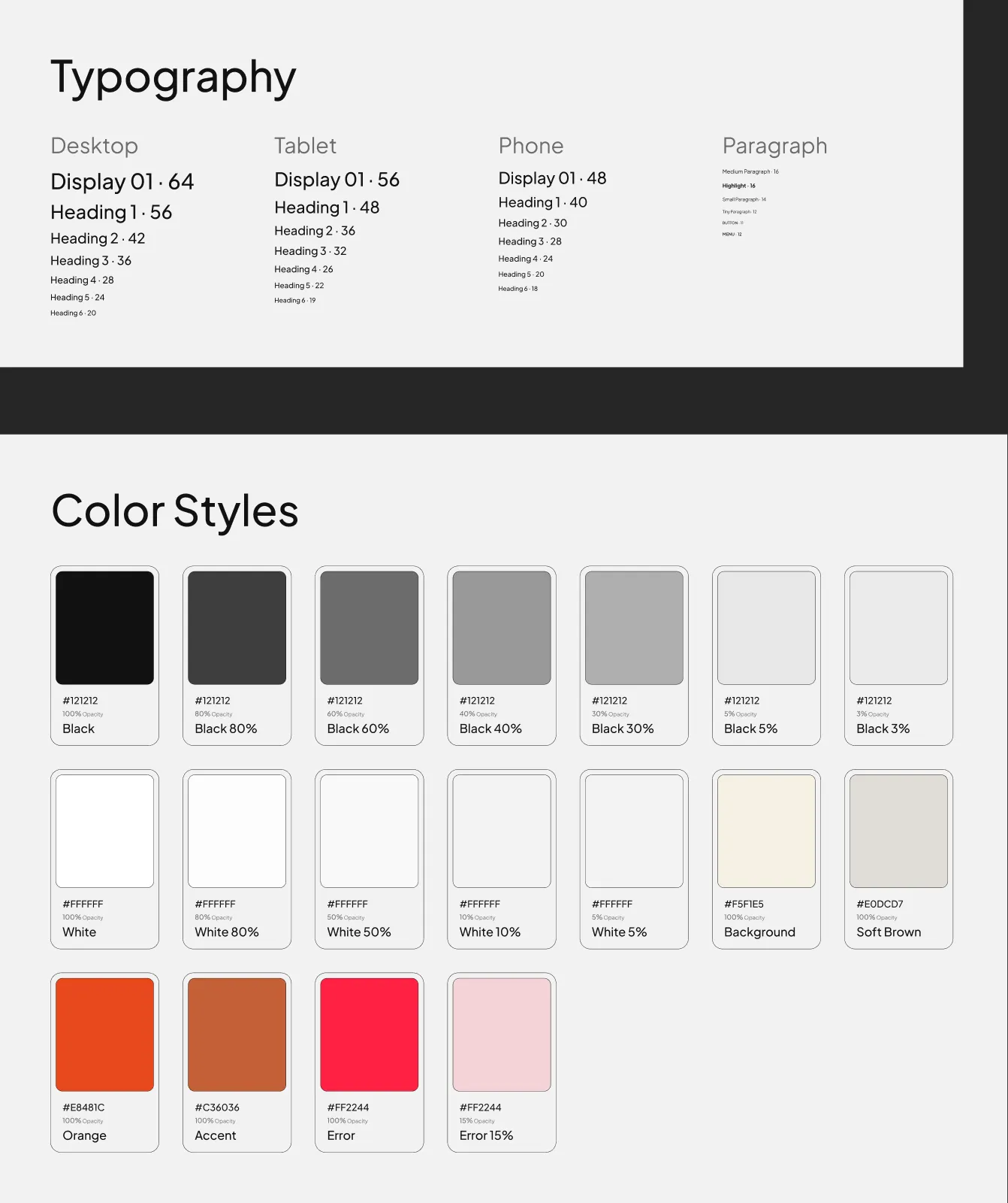
Colour styles
Section titled “Colour styles”| Style | Value | Used for |
|---|---|---|
| Black | #121212 | Text, dark buttons, the footer, chips on cards |
| Black 80% | #121212 at 80 % | Section labels, muted paragraphs |
| Black 60% | #121212 at 60 % | The meta line on project cards |
| Black 40% | #121212 at 40 % | The page path under each search result |
| Black 30% | #121212 at 30 % | Divider lines, the text-link line |
| Black 5% | #121212 at 5 % | Form field and card borders |
| Black 3% | #121212 at 3 % | Form fields, testimonial cards |
| White | #FFFFFF | Text on dark covers, white buttons |
| White 80% | #FFFFFF at 80 % | Footer text and links |
| White 50% | #FFFFFF at 50 % | The footer field’s placeholder |
| White 10% | #FFFFFF at 10 % | Footer lines, borders on the hero cards |
| White 5% | #FFFFFF at 5 % | The hero testimonial cards |
| Background | #F5F1E5 | The page, the header once scrolled |
| Soft Brown | #E0DCD7 | The projects band on Home, the Beginnings section on About |
| Orange | #E8481C | The current page in the menu, rating stars |
| Accent | #C36036 | Accent buttons, hover colours, award names, the text-link hover line |
| Transparent | #FFFFFF at 0 % | Invisible fills that keep a layer clickable |
| Error, Error 15% | #FF2244, and at 15 % | The submit button’s error state |
| Placeholder | #D9D9D9 | Every photo slot — replace it with your image |
They sit in three groups: Black, White and Other. Three more, Docs/Surface, Docs/Surface Strong and Docs/Card, colour the boards on the Style Guide, Components, Icons and Read Me pages. The page designs don’t use them.
Rebranding the palette
Section titled “Rebranding the palette”- Deselect everything, open Local styles, and click the edit icon next to a colour style.
- Change the hex value — keep the style’s name, so everything that uses it follows.
- Change the Black and White tints together: they are the same colour at different opacities.
Change Accent to your brand colour and every accent button, hover and award name follows. Keep text on its background at a contrast of 4.5:1 or more: white on the demo’s Accent measures 4.16:1, a little under, so a slightly darker accent reads better on small labels.
Text styles
Section titled “Text styles”Plus Jakarta Sans throughout. Headings are Medium (500), paragraphs Regular (400).
Headings — one style per breakpoint
Section titled “Headings — one style per breakpoint”| Style | Desktop | Tablet | Phone | Line height | Used for |
|---|---|---|---|---|---|
| Display 01 | 64 | 56 | 48 | 120 % | “Let’s Talk!” at the top of the footer |
| Heading 1 | 56 | 48 | 40 | 120 % | Page titles, the Home hero, fact numbers |
| Heading 2 | 42 | 36 | 30 | 120 % | Section titles |
| Heading 3 | 36 | 32 | 28 | 120 % | Headings in posts |
| Heading 4 | 28 | 26 | 24 | 120 % | Service titles in lists |
| Heading 5 | 24 | 22 | 20 | 120 % | The fact suffix (+) |
| Heading 6 | 20 | 19 | 18 | 120 % | Card titles, value titles, accordion rows |
Styles are grouped by breakpoint: Desktop/Heading 1, Tablet/Heading 1, Phone/Heading 1 and so on. Pick the group of the frame you are working in.
Paragraphs and interface text
Section titled “Paragraphs and interface text”| Style | Size | Weight | Line height | Used for |
|---|---|---|---|---|
| Paragraph / Medium Paragraph | 16 | Regular | 140 % | Body text, intros, rich text |
| Paragraph / Highlight | 16 | Bold | 140 % | Bold lines inside body text (“What’s included” on the service pages) |
| Paragraph / Small Paragraph | 14 | Regular | 140 % | Quotes, footer text, dates |
| Paragraph / Tiny Paragraph | 12 | Regular | 120 % | Ratings |
| Paragraph / Button | 11 | Medium, uppercase, +2 % | 120 % | Button labels |
| Paragraph / Menu | 12 | SemiBold, uppercase, +2 % | 120 % | Menu links, section labels, text links, card meta |
Button and Menu set the capitals themselves (text case Upper): type labels in normal case (“Contact us”) and they show in capitals.
The Docs/ text styles (Display, Title, Heading, Board Label, Subheading, Body, Paragraph, Caption, Label and the Swatch styles) set the labels on the Style Guide, Components, Icons, Read Me and Cover pages. The page designs don’t use them.
Changing the font
Section titled “Changing the font”- Open Local styles and edit a text style: change the font family.
- Repeat for every text style — Figma has no single “font” setting.
The quickest route is a plugin that swaps fonts across styles (search the Figma Community for “font replacer”). Check long headings afterwards: another font may run wider and wrap differently.
Breakpoints
Section titled “Breakpoints”| Size | Frame width | Side margins | Section padding (top and bottom) |
|---|---|---|---|
| Desktop | 1200 px | 50 px | 100 px |
| Tablet | 810 px | 30 px | 80 px |
| Phone | 390 px | 16 px | 60 px |
Layout grids
Section titled “Layout grids”Every page frame has a grid style that matches its breakpoint:
| Grid style | Columns | Gutter | Margins | Fits |
|---|---|---|---|---|
| Grid/Desktop | 12 | 30 px | 50 px | Three-column card grids (cards 347 wide, 30 apart) |
| Grid/Tablet | 8 | 30 px | 30 px | Two-column grids (360 wide) |
| Grid/Phone | 4 | 16 px | 16 px | One column of 358 |
They are hidden by default so they don’t cover the design. Show them with Ctrl + G (Mac) or Ctrl + Shift + 4 (Windows), or with the eye icon in the frame’s Layout grid panel. New frames get the same grid by picking the style in that panel.
These are the widths the Framer, Next.js, Astro and HTML editions switch layouts at, so a design you adjust here translates directly.