Design — Compose Digi Next.js
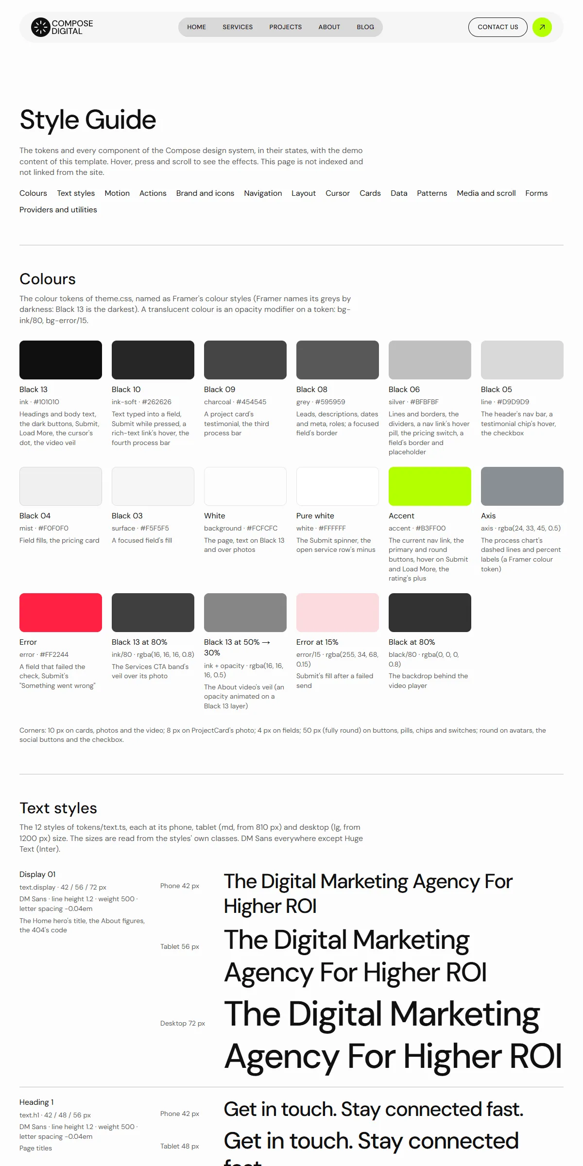
The look of this Next.js template comes from a small set of tokens: change one and nearly every page, component and state follows.
So you rarely need to touch a component. This guide covers the colours, the logo, the fonts, the text styles, the spacing, the motion, the custom cursor, the components and the icons.
See everything first
Section titled “See everything first”Run npm run dev and open http://localhost:3000/style-guide. It shows the colours, the text styles, the motion, the
buttons and links, the logo and the icons, the menu, the section layout, the cursor, the cards, the rating and the
process chart, the patterns (the service list, the plan card with its switch, the testimonials, the moving strips, Load
More, rich text), the video card and the scroll effects, and the form with its states, each with its name. When you want
to know what a change will affect, look there.
Colours
Section titled “Colours”src/design-system/theme.css (Framer’s colour names in brackets; Framer names its greys by darkness, Black 13 the
darkest):
@theme { --color-ink: #101010; /* [Black 13] headings, body text, dark buttons and bands, the cursor's dot */ --color-ink-soft: #262626; /* [Black 10] text typed into a field, the Submit button while pressed */ --color-charcoal: #454545; /* [Black 09] a project card's testimonial */ --color-grey: #595959; /* [Black 08] leads, descriptions, dates and meta, roles */ --color-silver: #bfbfbf; /* [Black 06] lines, borders, dividers, a menu link's hover pill */ --color-line: #d9d9d9; /* [Black 05] the header's menu bar, the footer */ --color-mist: #f0f0f0; /* [Black 04] field fills, the plan card */ --color-surface: #f5f5f5; /* [Black 03] the header bar, a focused field */ --color-background: #fcfcfc; /* [White] the page, text on dark */ --color-white: #ffffff; /* the Submit spinner, an open service row's minus */ --color-accent: #b3ff00; /* [Accent] the current menu link, the lime buttons, Submit and Load More on hover */ --color-axis: rgba(24, 33, 45, 0.5); /* the process chart's dashed lines and percent labels */ --color-error: #ff2244; /* a field that failed the check, "Something went wrong" */}Each name becomes a Tailwind class: bg-ink, text-grey, border-silver. Swap the hex values for your own palette
and the site changes. Black 13 on White reads at about 19 : 1 and Black 08 at about 7 : 1; keep text on its background at
4.5 : 1 or more, or the site becomes hard to read. The lime accent is a background behind dark text (about 15 : 1), never
a text colour on the light page.
Translucent colours are opacity modifiers on a token, as in the original design: ink/80 (the veil of the Services call
to action), ink/50 (the veil over the Home quote’s photo), error/15 (the Submit button’s fill after a failed send).
They follow their token when you change it. The About video card’s veil (Black 13 at 50 %, 30 % on hover) is animated in
VideoCard.tsx, and the backdrop behind its player is black/80.
A few colours sit outside the tokens, so change them too when you change a colour:
| Colour | Where |
|---|---|
| Black 13, Black 06 and the lime repeated as values, because Motion animates them | src/design-system/components/cursor/Cursor.tsx, navigation/NavLink.tsx |
Two greys of the original design (#222222, rgba(6,7,9,0.5)) |
src/components/site/Footer.tsx, Cursor.tsx |
| The logo: a Black 13 mark with a White sunburst, and the Black 13 wordmark | src/design-system/components/brand/Logo.tsx |
| The browser icons | public/icon.svg, src/app/apple-icon.png |
| The logo as a file for use elsewhere | public/images/logo.svg |
| The swatches of the style guide repeat the hex values as text | src/app/style-guide/tokens.ts |
The Compose Digital logo, the round mark with its sunburst and the two-line wordmark, is drawn as SVG paths in
src/design-system/components/brand/Logo.tsx (word, rays and a circle, on a viewBox="0 0 127 40"). To use your own:
- As an SVG: replace the paths with your logo’s, and set the
viewBoxto your artwork’s size. - As an image file: replace the
<svg>with an<Image>of your file.
The size is set where the logo is used: 127 × 40 on desktops and 95 × 30 on tablets in the header
(src/components/site/Header.tsx, h-[30px] w-[95px] lg:h-10 lg:w-[127px]), 89 × 28 in the phone header, and 127 × 40 in
the footer (src/components/site/Footer.tsx). Change those classes to fit your proportions. The link’s name for screen
readers is site.name (src/content/site.ts). The browser icons are described in Editing the content.
The template loads two Google fonts through next/font in src/app/layout.tsx:
const dmSans = DM_Sans({ variable: "--font-dm-sans", subsets: ["latin"] });const inter = Inter({ variable: "--font-inter", subsets: ["latin"] });Both are variable fonts, every weight in one file. theme.css makes --font-dm-sans the site font (--font-sans) and
--font-inter the display font (--font-display). DM Sans carries nearly everything: the text at weight 400, the
headings, the menu and the button labels at 500, bold words at 700. Inter draws Huge Text (the footer’s moving service
names), the signs after the About figures and the line under the footer’s logo.
To use another Google font, import it by name from next/font/google and keep the variable name:
import { Manrope } from "next/font/google";const dmSans = Manrope({ variable: "--font-dm-sans", subsets: ["latin"] });A font that isn’t variable needs its weights listed (weight: ["400", "500", "700"]). For a font you have licensed
yourself, use next/font/local and point it at the files in src/app/fonts/. Next.js serves the fonts from your own
domain either way, so there is no request to Google at runtime. The headings set a letter spacing of −0.04em (Display 01,
Heading 1) or none, Menu +0.03em (src/design-system/tokens/text.ts): change it there if your font looks cramped.
The footer’s “Tell Us Your New Ideas” is drawn across the full width: its size (md:text-[8.532cqw] in Footer.tsx) is
measured for those words in DM Sans. With another title or font, change that number until the line fills the width.
Text styles
Section titled “Text styles”src/design-system/tokens/text.ts holds the sizes and line heights, named as in the original design:
| Style | Phone | Tablet (md:) |
Desktop (lg:) |
Used for |
|---|---|---|---|---|
display (Display 01) |
42 | 56 | 72 | The Home hero’s title, the About figures |
h1 |
42 | 48 | 56 | Page titles, a post’s, a project’s and a job’s title, the 404’s title |
h2 |
30 | 36 | 42 | Section titles |
h3 |
28 | 30 | 32 | Home’s “Who are we?” title, About’s statement and “Open Positions”, the plan card’s price, a project client’s words, the headings of a service’s and a job’s texts |
h4 |
24 | 26 | 28 | “WHO WE ARE?”, the plan card’s title |
h5 |
20 | 22 | 24 | Card titles, the service list’s rows, the Home quote, the year and client on a project |
h6 |
18 | 19 | 20 | The invitation box’s text, team names, the Home strip’s captions, the process chart, the footer’s column titles |
huge (Huge Text, Inter) |
38 | 46 | 54 | The footer’s moving service names |
hugeStroke |
54 | 54 | 54 | The outlined names of the footer’s strip |
big (Big Paragraph) |
18 | 18 | 18 | Leads |
paragraph (Medium Paragraph) |
16 | 16 | 16 | Body text, descriptions |
small (Small Paragraph) |
14 | 14 | 14 | Meta, card text |
menu |
13 | 13 | 13 | The menu links, button labels and labels above titles, in capitals (weight 500, +0.03em) |
The headings are DM Sans 500 at a line height of 1.2, the paragraph styles 400 at 1.4. Change the numbers in text.ts
rather than in the components, and text stays consistent across the site. Use a style as className={text.h2} or
combine: className={cn(text.h6, "text-grey")}.
Breakpoints and spacing
Section titled “Breakpoints and spacing”Three sizes, set in theme.css:
| Width | Tailwind prefix | |
|---|---|---|
| Phone | below 810 px | (none) |
| Tablet | 810–1199 px | md: |
| Desktop | 1200 px and up | lg: |
The content stops at 1440 px and stays centred on wider screens; the dark bands and the full-width photos run the full
width. The side padding is 20 px on phones, 30 px on tablets and 40 px on desktops, and most sections have 60 / 80 /
100 px above and below (sectionGutters and sectionPadding in
src/design-system/components/layout/Section.tsx; the gap between a section’s blocks is set per section). The header is
sticky at the top and part of the page: 68 px tall on phones, 104 px on tablets and 112 px on desktops
(Pages and sections).
Motion
Section titled “Motion”src/design-system/tokens/motion.ts holds the transitions Motion uses:
| Token | Values | Used for |
|---|---|---|
spring (S0) |
no bounce, 0.4 s | The label roll of every button and menu link, the phone menu opening |
springSoft (S2) |
bounce 0.2, 0.4 s | The menu pill’s fill, the buttons’ arrow turn, the text links’ underline, the service list, the plan switch, the process chart |
springCard (SC) |
stiffness 500, damping 60 | The cursor’s change of shape, the card photos’ zoom, the social buttons, the footer’s round button, the testimonial chips |
springPop (SP) |
stiffness 400, damping 30 | The About video card: its veil and the Play mark on hover |
theme.css holds the CSS side: --ease-form (the Submit button’s fills, 0.2 s), --animate-ticker (the moving
strips) and --animate-turn (the spinner). Lower a spring’s duration for a snappier feel, or raise bounce for a
livelier one. MotionProvider (wrapped around every page in src/app/layout.tsx) also makes spring the default of
every Motion element that sets no transition of its own.
There are no page transitions, no load animations and no count-ups. What moves, and where to change it:
| Effect | Where to change it |
|---|---|
| The Home strip of projects (20 px a second), the footer’s two rows of service names (30, in opposite directions) and the About client logos (15) | <Ticker speed={…}> in src/components/sections/HomeHeroSection.tsx, src/components/site/Footer.tsx, src/components/sections/AboutVideoSection.tsx |
| The custom cursor | below |
| The service list on Home: one row open at a time | src/design-system/components/patterns/ServiceAccordion.tsx |
| The plan card’s Weekly / Monthly switch | src/design-system/components/patterns/PricingCard.tsx |
| The Services testimonials changing every five seconds (a click on a client shows theirs; keyboard focus pauses it) | testimonials.interval in src/content/pages/services.ts; TestimonialSlider.tsx |
| The process chart filling in once it is fully on screen | src/design-system/components/data/ProcessGraph.tsx |
| A project’s cover settling from 120 %, its two middle photos sliding and growing into place, the client’s words fading in from 30 % | <ScrollTransform> in ProjectHeroSection.tsx, ProjectImageSections.tsx, ProjectTestimonialSection.tsx (from: where it starts) |
| A project’s two big photos, and the Services call to action’s photo, moving slower than the page | <Parallax speed={…}> in ProjectImageSections.tsx and ServicesCtaSection.tsx |
| A service’s photo growing from 80 % into place | <ScrollTransform> in ServiceImageSection.tsx |
| The card photos zooming from 105 % to 100 % on hover | ProjectCard.tsx, PostCard.tsx, ServiceCard.tsx, PostNavCard.tsx in src/design-system/components/cards/ |
| The team cards dimming the others to 50 % on hover (desktops) | src/design-system/components/cards/TeamList.tsx |
| Projects, Blog and Careers showing the next items with “Load More” | list.pageSizes in projects.ts and blog.ts, pageSizes in careers.ts (phones, tablets, desktops) |
| The About video opening in a player over the page | src/design-system/components/media/VideoCard.tsx |
| “Scroll to Explore” gliding to the next block | src/design-system/components/actions/TextLink.tsx |
The custom cursor
Section titled “The custom cursor”Over the page content (not the header and footer, and never on touch screens), a mouse pointer is followed by a small
Black 13 dot. It turns into a ring over photos and the service list, and into a pill with a word over a card: “View
Project” over projects, “Read” over posts, “More Details” with a plus over services, “Play” over the About video. Over
the cards and the Play button the system pointer is hidden (cursor-none), as in the original design; elsewhere it
stays.
The cursor is src/design-system/components/cursor/Cursor.tsx, placed once in src/app/layout.tsx. An element chooses
its look with data-cursor; the words are cursorLabels and serviceCursorLabel in src/content/site.ts and
video.cursor in about.ts. Contact, a post’s article and the 404 page turn it off (data-cursor="none", the cursor="none" of a
Section).
To remove it from the whole site, delete <Cursor /> from layout.tsx.
Reduced motion
Section titled “Reduced motion”With “reduce motion” switched on in the visitor’s system, movement is left out: the moving strips stand still, the scroll
effects and the slower-moving photos stay in place, the rows, the plan card and the testimonials change at once, the
process chart shows full, the cursor changes shape without morphing, “Scroll to Explore” jumps, and the spinner stands
still. Fades and colour changes stay. MotionProvider makes Motion skip its transform and layout animations; the CSS
animations check the setting with motion-reduce:, and the scroll effects check it themselves.
Corners, spacing, shadows
Section titled “Corners, spacing, shadows”Corners are 10 px on cards, photos and the video, 8 px on the project cards’ photo, 4 px on fields, and fully round on
buttons, pills, chips, the switch, avatars, the social buttons and the checkboxes. There are no drop shadows. Spacing is
Tailwind classes on the components (gap-5, p-5, gap-[50px]). Tailwind’s scale is 4 px per step, so gap-5 is 20 px.
Change them where you see them; the style guide shows the result immediately.
Components
Section titled “Components”src/design-system/components/ holds the buttons and links, the logo and the icons, the menu link and the menu button,
the section layout and the divider, the cursor, the cards (project, post, service, job, team), the rating and the process
chart, the patterns (the service list, the plan card, the testimonials, the moving strip, Load More, rich text, the section
title), the video card, the scroll effects and the form parts. Its README lists every
component with what it does and how it moves. The sections that make up a page are one level up, in
src/components/sections/, and are listed in Pages and sections.
The icons — the arrows, the stars, the plus and minus, the quotes, the check, the Play mark and the social network logos
— are Phosphor shapes stored as path data in
src/design-system/components/icons/paths.ts; <Icon name="arrow-up-right" /> draws one in the current text colour. The
large quote mark of the Services testimonials is the original design’s own (quote-mark, on its own grid in
iconViewBoxes). To add an icon:
-
Open the icon on phosphoricons.com and copy the SVG.
-
Take the
d="…"of its<path>. -
Add a line to
iconPaths:"my-icon": "M128,24A104,104,0,1,0,…",
Then use <Icon name="my-icon" className="size-5" />. Paths use a 256 × 256 grid, which is what Phosphor exports. If you
keep the style guide, add the new name to icons in src/app/style-guide/tokens.ts too: that list is exhaustive on
purpose, so npm run build stops until you do.