Design — Compose Digi HTML
Compose Digi’s HTML pages are styled with Tailwind CSS classes and a few colour, font and breakpoint tokens; a new colour or font needs a CSS rebuild.
How the styling works
Section titled “How the styling works”The pages are styled with Tailwind CSS classes written in the HTML
(class="flex flex-col gap-5 text-grey"). assets/css/style.css contains exactly the classes the pages use,
generated from src/css/style.css.
That means two kinds of change:
| Change | Rebuild the stylesheet? |
|---|---|
| Move, copy or delete elements; use classes that already appear somewhere in the site | No |
Change a colour, a font, a breakpoint; use a class that appears nowhere yet (say mt-7) |
Yes |
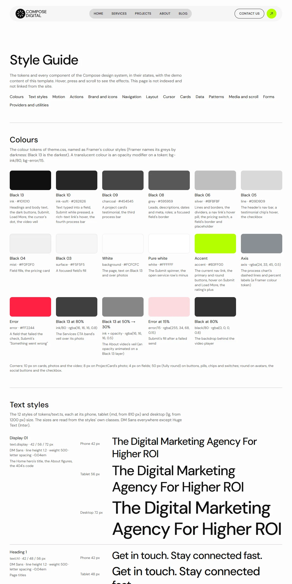
style-guide.html shows the colours and text styles, then every component with its name. When you want to know what a
change will affect, look there.
Rebuilding the stylesheet
Section titled “Rebuilding the stylesheet”Once, install the tools (needs Node.js 20 or newer):
npm installThen, after a change:
npm run build:css # one buildnpm run watch:css # rebuilds on every save while you workBoth write assets/css/style.css. The build scans the .html files in the root folder and one folder down (services/,
projects/, careers/, blog/), and assets/js/main.js, so a class you add there is picked up. Upload the new
style.css with your pages.
Colours
Section titled “Colours”In src/css/style.css:
@theme { --color-ink: #101010; /* headings, body text, dark buttons and bands */ --color-ink-soft: #262626; /* text typed into a field, link hovers */ --color-charcoal: #454545; --color-grey: #595959; /* leads, descriptions, meta */ --color-silver: #bfbfbf; /* lines, borders, placeholders, the process bars */ --color-line: #d9d9d9; /* dividers, the footer's light half, the menu's pill */ --color-mist: #f0f0f0; /* field fills */ --color-surface: #f5f5f5; /* the header bar, light cards */ --color-background: #fcfcfc; /* the page, text on dark */ --color-white: #ffffff; --color-accent: #b3ff00; /* the lime of the current menu link and the round arrow buttons */ --color-axis: rgba(24, 33, 45, 0.5); /* the process chart's dashed lines and percent labels */ --color-error: #ff2244; /* the form's error state */}Each name becomes a class (bg-ink, text-grey, border-silver, bg-accent). Change the values, rebuild, and the
pages follow. The palette is near-black on an off-white page with one lime accent: Ink on Background reads at about
18 : 1, Grey on Background at about 7 : 1. Keep text on its background at 4.5 : 1 or more, so it stays readable.
The translucent shades are opacity modifiers on a token, so they follow it when you change it: bg-ink/80 (the veil
over the Services call to action’s photo), bg-ink/50 (the veil over the Home quote band’s photo), bg-black/80
(behind the video window), bg-error/15 (the Submit button’s error fill), ring-ink/10
and shadow-ink/5 (the checkboxes’ edge).
A few colours sit outside the tokens:
| Colour | Where |
|---|---|
Lime #b3ff00, Silver #bfbfbf and a see-through white rgba(252, 252, 252, 0) as values |
The header’s links: the current link’s fill and the others’ hover fill are written in each link’s style and data-motion in every page (Editing the site). When you change Accent or Silver, also replace these values in every .html file |
Ink #101010 and Background #FCFCFC |
The logo’s drawing in every page (fill="#101010", the mark’s stroke="#FCFCFC"), icon.svg, and the cursor’s dot and ring (assets/js/main.js, and the cursor’s first look at the end of every page) |
#222222 |
The cursor’s pill (“View Project”, “Read” …) in main.js, and the year in the footer |
| The swatches of the style guide repeat the hex values as text | style-guide.html |
Gradients: the tickers fade out at both ends (a mask from transparent to black over the first and last eighth).
Logo and icons
Section titled “Logo and icons”The logo, a round mark and the words “COMPOSE DIGITAL”, is an <svg viewBox="0 0 127 40"> drawing inside the logo link
of the header (twice: the bar for tablets and desktops, and the phone header) and of the footer in every page. Its
shapes are filled with Ink (fill="#101010"). To use your own, replace the <svg>…</svg> with your logo’s, keeping
aria-hidden="true" and class="block size-full" on it. VS Code’s Replace in Files does every page at once: turn
on regular expressions (.*), search for
<svg viewBox="0 0 127 40"(.|\n)*?</svg\s*>and replace it with your <svg> on one line. Then replace aria-label="Compose" on the three links with your name.
The logo is 95 × 30 px in the tablet header, 127 × 40 px in the desktop header and the footer, and 89 × 28 px on
phones: the links carry h-[30px] w-[95px] lg:h-10 lg:w-[127px], h-7 w-[89px] and h-10 w-[127px]. For a logo of
other proportions, change the widths to your artwork’s ratio in the three links, and rebuild the stylesheet if a class
is new.
icon.svg (the round mark, 40 × 40) is the icon in the browser tab; apple-icon.png (180 × 180) is the icon on a
phone’s home screen. Replace the files, keeping the names. assets/images/logo.svg is the logo as a file for use
elsewhere.
The interface icons are inline SVG from Phosphor: the arrows of the buttons, the stars of
the rating, the plus and minus of the service list, the checks of the plans, the play button and the social buttons
(Behance, Dribbble, Instagram, Twitter, X), drawn on a 256 × 256 grid in the current text colour. To use another icon,
open it on phosphoricons.com, copy its <path d="…"> and paste it in place of the old one. The service list’s plus and
minus are swapped by the script, so they are also in main.js (search for iconPaths).
Two variable fonts ship in assets/fonts/, declared at the top of src/css/style.css:
- DM Sans (
dm-sans-variable.woff2, weights 100 to 1000) for every text; - Inter (
inter-variable.woff2, weights 100 to 900) for the footer’s ticker of service names (the “Huge Text” style, classfont-display).
@font-face{font-family:"DM Sans"; src:url("../fonts/dm-sans-variable.woff2") format("woff2"); font-display:swap; unicode-range:…; font-weight:100 1000; font-style:normal; }:root{--font-dm-sans:"DM Sans","DM Sans Fallback",sans-serif; }Every page uses DM Sans through font-sans on the <body>. Text is set in weight 400, the headings, the menu and the
button labels in 500.
To use another font:
- Put its
.woff2files inassets/fonts/. - Change the
@font-facerule (font-familyandsrc) and the first name in--font-dm-sans(or--font-inter). A font that isn’t variable needs one@font-facerule per weight file (400 and 500). - Rebuild the stylesheet.
The DM Sans Fallback and Inter Fallback rules size Arial like each font while it loads; with another font, you can
delete them and their names. The font files cover Western European languages (the rules’ unicode-range); for other
alphabets, use files that include them and remove the unicode-range. Fonts from Google Fonts
can be downloaded as files with https://gwfh.mranftl.com, so they are served from your own domain, which is faster and
needs no consent banner.
Sizes and spacing
Section titled “Sizes and spacing”Text sizes are classes with a phone value first and the tablet (md:) and desktop (lg:) values after:
text-[30px] md:text-[36px] lg:text-[42px]. The style guide lists every text style:
| Style | Phone | Tablet | Desktop | Used for |
|---|---|---|---|---|
| Display | 42 | 56 | 72 | The Home hero’s title, the About figures, the 404’s code |
| Heading 1 | 42 | 48 | 56 | Page titles |
| Heading 2 | 30 | 36 | 42 | Section titles, the rating’s score |
| Heading 3 | 28 | 30 | 32 | Home’s “Who are we?” statement, “Open Positions”, a price, the headings in a post |
| Heading 4 | 24 | 26 | 28 | The plan card’s title |
| Heading 5 | 20 | 22 | 24 | Card and row titles, the video caption |
| Heading 6 | 18 | 19 | 20 | Team names, the process phases, Prev / Next, the footer’s column titles |
| Huge Text (Inter) | 38 | 46 | 54 | The footer’s ticker of service names |
| Big Paragraph | 18 | 18 | 18 | The Home hero’s lead, the testimonial quote, a service’s details |
| Medium Paragraph | 16 | 16 | 16 | Body text, leads, descriptions, field labels |
| Small Paragraph | 14 | 14 | 14 | Card text and meta, checkbox names, the rating’s caption |
| Menu | 13 | 13 | 13 | Menu links, button labels, eyebrows, dates (upper case) |
Headings have a line height of 1.2, the paragraphs 1.4. Display and Heading 1 are spaced a little tighter
(tracking-[-0.04em]), the Menu style a little wider (tracking-[0.03em]).
Spacing uses Tailwind’s scale (4 px per step, so gap-5 is 20 px) or exact values in brackets (gap-[50px]). Content
is at most 1440 px wide (max-w-[1440px]), with 20, 30 and 40 px at the sides; most sections have 60 / 80 / 100 px above
and below. Corners: round on buttons, the menu, the header bar, chips and the plan switch; 10 px on card photos, the
post cover, the video card and the plan card; 8 px on a project card’s photo; 4 px on the fields. The only shadow is
the cursor’s faint glow.
| Width | Prefix | |
|---|---|---|
| Phone | below 810 px | (none) |
| Tablet | 810–1199 px | md: |
| Desktop | 1200 px and up | lg: |
max-md: and max-lg: apply below those widths.
Components
Section titled “Components”style-guide.html shows the colours, the text styles, the motion, the actions (buttons, text links, the round arrow
buttons, the social buttons), the logo and the icons, the navigation, the layout, the cursor, the cards (project, post,
service, job, team, the plan card), the data (figures, the rating, the process chart), the patterns (the service list,
the tickers, the testimonial slider, Load More, rich text), the media and scroll effects, and the form with its button’s
states, each with its name. To reuse one, copy its markup from there or from the page that shows it.
Elements with data-… attributes are wired to the site script, so keep those attributes when you copy them:
data-header, data-phone-header, data-phone-bar, data-phone-menu, data-hamburger, data-close-soon,
data-hover, data-motion, data-transition, data-cursor, data-ticker, data-ticker-track, data-speed,
data-service-accordion, data-accordion-button, data-accordion-fill, data-collapse, data-pricing-card,
data-plans, data-pricing-option, data-pricing-features, data-pricing-price, data-pricing-unit,
data-process-graph, data-phase-width, data-phase-shown, data-testimonial-slider, data-slider-chip,
data-video-card, data-video-play, data-video-dialog, data-team-list, data-load-more, data-page-sizes,
data-parallax, data-scroll-transform, data-text-link-hash, data-form, data-field, data-submit,
data-current-year, …
The cursor
Section titled “The cursor”On computers with a mouse, a small dark dot follows the pointer over the page’s <main> (the header and the footer keep
the normal pointer). An element’s data-cursor sets what it becomes over that element:
data-cursor |
The cursor | Where |
|---|---|---|
| (none) | The dot | Most of the page |
"active" |
A ring 44 px wide | The “Who are we?” photos, the service list on Home |
Any other text, e.g. "View Project" |
A dark pill with that text and an arrow | Project cards (“View Project”), post cards (“Read”), service cards (“More Details”), the video’s Play button (“Play”, with data-cursor-glyph="play-fill") |
"none" |
The normal pointer | Contact, a post’s article, the 404 page |
To change a pill’s word, change the data-cursor value. On phones and tablets (touch), there is no custom cursor.
Motion
Section titled “Motion”Everything that moves is in assets/js/main.js, apart from the tickers and the Submit button’s spinner (CSS). Nothing
appears on load: the motion follows the pointer, a press or the scroll. A few settings are written in the HTML:
| Effect | Where |
|---|---|
| Buttons and the header’s links: the label rolls up to a second copy, the round arrow turns, the link pill fills | data-hover on the element, and data-motion on its parts: the rest and hover values the script moves between |
| Text links: an underline grows under the label and the arrow moves 4 px | data-hover and data-motion |
| Card photos settle as the pointer comes in | data-motion with data-transition="card" |
| The tickers move left (the footer’s second row right) without end | data-ticker data-speed="…" (pixels per second) (Editing the site) |
| The service list opens one row at a time | data-service-accordion (Editing the site) |
| The phone menu grows from 68 to 386 px | data-phone-header, data-hamburger |
| The Services call to action’s photo, and a project’s main and final photos, move slower than the page | data-parallax='{"speed":50,"offset":50}': the photo’s speed in percent of the page’s (speedPhone, speedTablet for smaller screens) |
| A project’s cover settles from 120 %, Image 01 slides in from the right, Image 02 grows in, the testimonial brightens from 30 %, a service’s photo grows from 80 % | data-scroll-transform='{"from":{"scale":1.2}}': where the element starts when it enters the screen (fromPhone, fromTablet); it reaches its place as it scrolls in |
| The process chart’s bars fill in | data-process-graph, data-phase-width (Editing the site) |
| The plan switch slides and the list, price and unit change | data-pricing-card (Editing the site) |
| The testimonial slider turns every five seconds | data-interval (Editing the site) |
| The team dims the members you don’t point at (desktops) | data-team-list |
The springs of the script are near the top of assets/js/main.js (search for tokens/motion.ts); the same springs as CSS
curves (--ease-spring-a, --ease-spring-b, --ease-spring-c), the tickers’ and the spinner’s animations are in
src/css/style.css.
Reduced motion
Section titled “Reduced motion”With “reduce motion” switched on in the visitor’s system, movement is left out: the tickers stand still, the scroll effects and the parallax photos stay in place, and the rows, the menu, the switch and the slider change at once instead of moving. Fades and colour changes stay.