Colours and text styles — Compose Digi Figma
Every colour and every piece of text in the file uses a style. Change a style and every frame, component and state that uses it updates — this is how you rebrand Compose Digi in minutes instead of recolouring layers one by one.
Open them from the right sidebar with nothing selected (Local styles), or see them laid out on the Style Guide page.
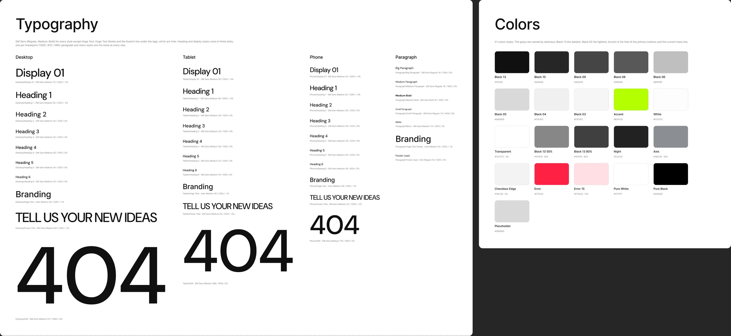
Colour styles
Section titled “Colour styles”The greys are named by darkness: Black 13 is the darkest, Black 03 the lightest.
| Style | Value | Used for |
|---|---|---|
| Black 13 | #101010 | Headings and body text, the dark buttons (Load More, Submit), the footer’s ticker band, ticked checkboxes, the open accordion circle, the outlines of the outlined buttons |
| Black 10 | #262626 | Text typed into a field, a text link’s hover colour, the Submit button while pressed, one bar of the process chart |
| Black 09 | #454545 | The client’s words on project cards, one bar of the process chart |
| Black 08 | #595959 | Leads and descriptions, card meta (dates, client, year), excerpts, the post meta labels, a focused field’s border |
| Black 06 | #BFBFBF | Every 1 px rule and divider, field borders, placeholders, a menu link’s hover fill, the pricing switch’s track |
| Black 05 | #D9D9D9 | The header’s link pill, the footer’s main block, an unticked checkbox, a client chip’s hover fill |
| Black 04 | #F0F0F0 | The fill of fields and of the pricing card |
| Black 03 | #F5F5F5 | The header bar on tablets and desktops, a focused field’s fill |
| Accent | #B3FF00 | The current menu link, the primary buttons and the round arrow button, the Load More and Submit hover fill, the plus circle of the rating |
| White | #FCFCFC | The page, the header, light text on dark (the ticker band, buttons, the cursor pill) |
| Transparent | #FCFCFC at 0 % | An empty fill for layers that must keep a fill slot (cursor states, outlined buttons) |
| Black 13 50% | #101010 at 50 % | The veil over the Home quote photo and the About video |
| Black 13 80% | #101010 at 80 % | The veil over the Services call to action photo |
| Night | #222222 | The cursor pill and the year in the footer’s bottom line |
| Axis | #18212D at 50 % | The process chart’s dashed lines and percent labels |
| Checkbox Edge | #18212D at 5 % | The hairline around a checkbox |
| Error | #FF2244 | A field’s message and border after a failed check, the Submit label after a failed send |
| Error 15 | #FF2244 at 15 % | The Submit button’s fill after a failed send |
| Pure White | #FFFFFF | The tick of a checked box, the minus of an open row, the Submit spinner |
| Pure Black | #000000 | The footer’s line under the logo |
| Placeholder | #D9D9D9 | Every photo slot — replace it with your image |
Six more, the Docs/ styles, colour the boards on the Style Guide, Components, Icons, Read Me and Cover pages. The page designs don’t use them.
Rebranding the palette
Section titled “Rebranding the palette”- Deselect everything, open Local styles, and click the edit icon next to a colour style.
- Change the hex value — keep the style’s name, so everything that uses it follows.
- Change the tints together with their base: Black 13 50% and 80% with Black 13, Axis and Checkbox Edge with their blue-grey, Error 15 with Error, Transparent with White.
Change Accent to your brand colour and every primary button, the current menu link and the hovers follow; Black 13 drives the text and the dark buttons. Keep text on its background at a contrast of 4.5:1 or more: the demo keeps a few Framer values that are lower — the project testimonial fading in from 30 % opacity, the other people in the services slider at 50 %, the process chart’s axis labels and the form’s error message on its pink fill — so use stronger values if accessibility matters to you.
Text styles
Section titled “Text styles”DM Sans throughout, except Huge Text, Huge Text Stroke and the footer’s line under the logo, which are Inter. Headings and the menu are Medium (500), paragraphs Regular (400), the bold runs in rich text Bold (700). Display 01 and Heading 1 are set tight (−4 % letter spacing).
Headings — one style per breakpoint
Section titled “Headings — one style per breakpoint”| Style | Desktop | Tablet | Phone | Line height | Used for |
|---|---|---|---|---|---|
| Display 01 | 72 | 56 | 42 | 120 % | The Home hero title |
| Heading 1 | 56 | 48 | 42 | 120 % | Page titles (page heroes, Careers, a job, a post, Contact, the 404) |
| Heading 2 | 42 | 36 | 30 | 120 % | Section titles, the rating score |
| Heading 3 | 32 | 30 | 28 | 120 % | Headings inside a post and a job, the job type, prices |
| Heading 4 | 28 | 26 | 24 | 120 % | The pricing card’s title |
| Heading 5 | 24 | 22 | 20 | 120 % | Card titles (post, project, service, job), accordion rows, the video caption |
| Heading 6 | 20 | 19 | 18 | 120 % | Footer column titles, Prev / Next labels, team names, the ticker cards’ client, the process phases |
| Huge Text (Inter) | 54 | 46 | 38 | 120 %, −1 % | The footer ticker’s solid service names |
| Footer Title | 85 | 54 | 42 | 120 %, −2 %, upper case | The footer’s “Tell Us Your New Ideas”, set to fill its row |
| 404 | 517 | 380 | 170 | 100 % | The big “404” |
Styles are grouped by breakpoint: Desktop/Heading 1, Tablet/Heading 1, Phone/Heading 1 and so on. Pick the group of the frame you are working in. Heading 5 and 6 take the in-between sizes 22 and 19 on tablets, as on the live site.
Paragraphs and interface text
Section titled “Paragraphs and interface text”| Style | Size | Weight | Line height | Used for |
|---|---|---|---|---|
| Paragraph / Big Paragraph | 18 | Regular | 140 % | Leads of heroes, the 404’s lead, testimonial quotes |
| Paragraph / Medium Paragraph | 16 | Regular | 140 % | Body text, rich text, descriptions, field labels, footer links |
| Paragraph / Medium Bold | 16 | Bold | 140 % | Bold runs inside rich text |
| Paragraph / Small Paragraph | 14 | Regular | 140 % | Card excerpts and meta, the post meta labels, checkbox names, the footer’s bottom line |
| Paragraph / Menu | 13 | Medium | 120 %, +3 %, upper case | Menu links, button and text-link labels, eyebrows, card dates, the cursor pill’s label |
| Paragraph / Huge Text Stroke (Inter) | 54 | Medium | 120 %, −1 % | The footer ticker’s outlined service names (the same size at every breakpoint) |
| Paragraph / Footer Lead (Inter) | 16 | Regular | 120 % | The line under the footer logo |
The Docs/ text styles (Display, Title, Heading, Subheading, Swatch Name, Body, Caption and Label) set the text on the Style Guide, Components, Icons, Read Me and Cover pages. The page designs don’t use them.
The footer’s two rows of service names are drawn as vector shapes (the text is outlined), so they look the same on every computer; the Huge Text and Huge Text Stroke styles are there for new text you add in that look. To change a name, draw it again with a text layer in one of those styles.
Changing the font
Section titled “Changing the font”- Open Local styles and edit a text style: change the font family.
- Repeat for every text style — Figma has no single “font” setting.
The quickest route is a plugin that swaps fonts across styles (search the Figma Community for “font replacer”). Check long headings afterwards: another font may run wider and wrap differently.
Breakpoints
Section titled “Breakpoints”| Size | Frame width | Side margins | Section padding (top and bottom) | Card gap |
|---|---|---|---|---|
| Desktop | 1200 px | 40 px | 100 px | 30 px |
| Tablet | 810 px | 30 px | 80 px | 30 px |
| Phone | 390 px | 20 px | 60 px | 30 px |
Layout grids
Section titled “Layout grids”Every page frame has a grid style that matches its breakpoint:
| Grid style | Columns | Gutter | Margins | Fits |
|---|---|---|---|---|
| Grid/Desktop | 12 | 30 px | 40 px | Three-column card grids (posts, projects, services) |
| Grid/Tablet | 8 | 30 px | 30 px | Two-column grids |
| Grid/Phone | 4 | 30 px | 20 px | One column of 350 |
They are hidden by default so they don’t cover the design: select a frame and click the eye icon in its Layout grid panel to show its grid (the Ctrl + G / Ctrl + Shift + 4 shortcut shows or hides only the grids whose eye is on). New frames get the same grid by picking the style in that panel.
These are the widths the Framer, Next.js, Astro and HTML editions switch layouts at, so a design you adjust here translates directly.