Components — KorDent Figma
The pages are built from components, so a change to a component reaches every page that uses it. The main components live on the Components page, on four boards; every page frame holds instances of them. Each of the 33 components (28 with variants, 5 single) has a short description, shown when you hover it in the Assets panel and repeated on its board.
Using components
Section titled “Using components”- Add one: drag it from the Assets panel (
Alt/Option + I) onto a frame. - Change a variant: select an instance and pick the variant in the right sidebar (for example Header → Breakpoint: Phone, Menu: Open).
- Override content: double-click into an instance and change its text or image. Overrides stay when the main component changes. The buttons and cards also have text properties (Label, Title, Summary, Description, Price, Name, Speciality, Quote, Review, Outcome Name…) you can edit straight from the right sidebar.
- Edit for everyone: right-click an instance → Go to main component, and edit it there.
- Break the link: Detach instance (
Ctrl/Cmd + Alt/Option + B) when one place needs something the component can’t do. The copy stops following the main component.
The hover, open, chosen, sending and error variants document how the interface reacts. Use them to show states in a presentation, or connect them with Prototype → While hovering / On click to click through the design. The pages show every component at rest.
Header & Footer
Section titled “Header & Footer”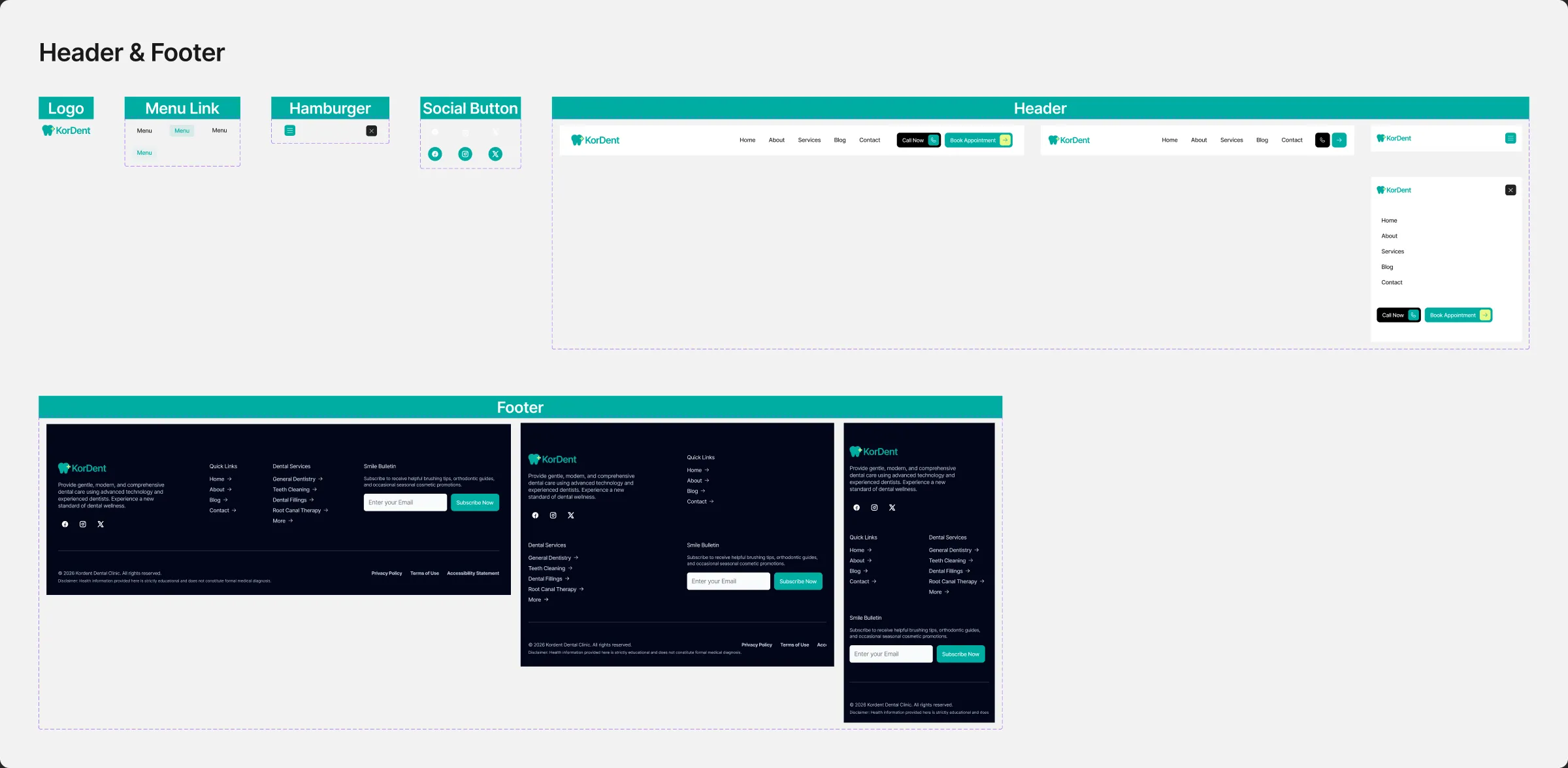
| Component | What it is |
|---|---|
| Logo | The tooth mark and the KorDent name, as vectors (Green and Yellow styles) |
| Menu Link | State — a header link: at rest, hovered (a Green 5 % fill, the label in Green) and the current page (Green on Green 10 %); text property Label |
| Hamburger | State: Closed, Open — the phone menu button: three lines on Green; Open turns them into an X on Black |
| Social Button | Network: Facebook, Instagram, X × State — the footer’s round buttons; on hover they fill with Green |
| Header | Breakpoint × Menu — the logo, Home, About, Services, Blog and Contact, then “Call Now” and “Book Appointment”; the tablet header shows the two buttons as icons, the phone header folds everything behind the menu button, Open shows the panel |
| Footer | Breakpoint: Desktop, Tablet, Phone — the newsletter, the clinic’s details, the link columns, the social buttons, the copyright line, the legal links and the disclaimer |
To put your logo everywhere, edit the Logo component once.
Buttons & Elements
Section titled “Buttons & Elements”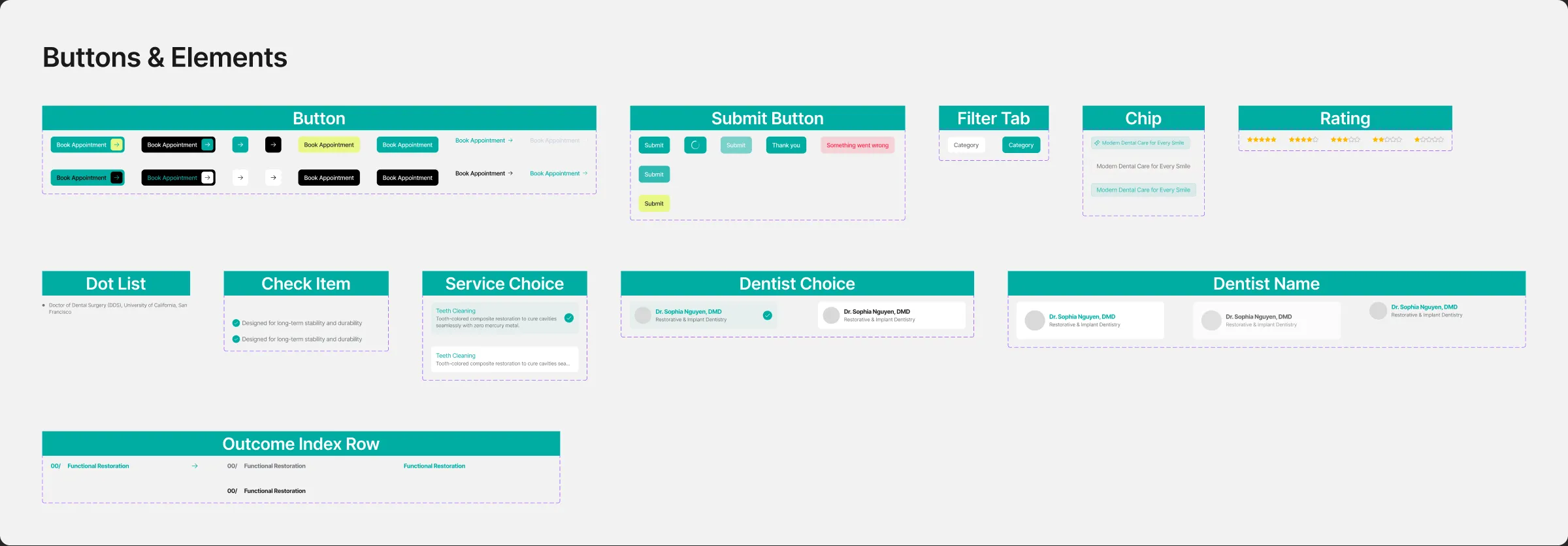
| Component | What it is |
|---|---|
| Button | Look × State: Default, Hover — the site’s eight looks: Primary and Secondary with an icon box, Lime, Green, Text, Footer, and the two icon-only buttons of the tablet header; text property Label |
| Submit Button | State — the last control of every form: at rest, sending (the spinner), sent (“Thank you”) and failed (the error label in Error on Error 15 %) |
| Filter Tab | A department tab above the service cards; the chosen one is Green with a white label |
| Chip | Style — the small label above a section title, the dentist’s speciality and the treatments of an outcome card |
| Rating | Five Star-coloured stars, as on the review cards |
| Dot List | A titled list with dots: a dentist’s education, experience, languages and office hours |
| Check Item | Width: Fit, Fill — a green check and a line of text: the outcome cards’ quality lists and the call to action’s promises |
| Service Choice | A treatment of the booking form as a radio card: title, summary and the round check; State: Default, Checked |
| Dentist Choice | A dentist of the booking form as a radio card: photo, name, speciality and the round check; State: Default, Checked |
| Dentist Name | A dentist’s tab: round photo, name and speciality |
| Outcome Index Row | A numbered row of the outcomes index on the Home page (shown on desktop) |
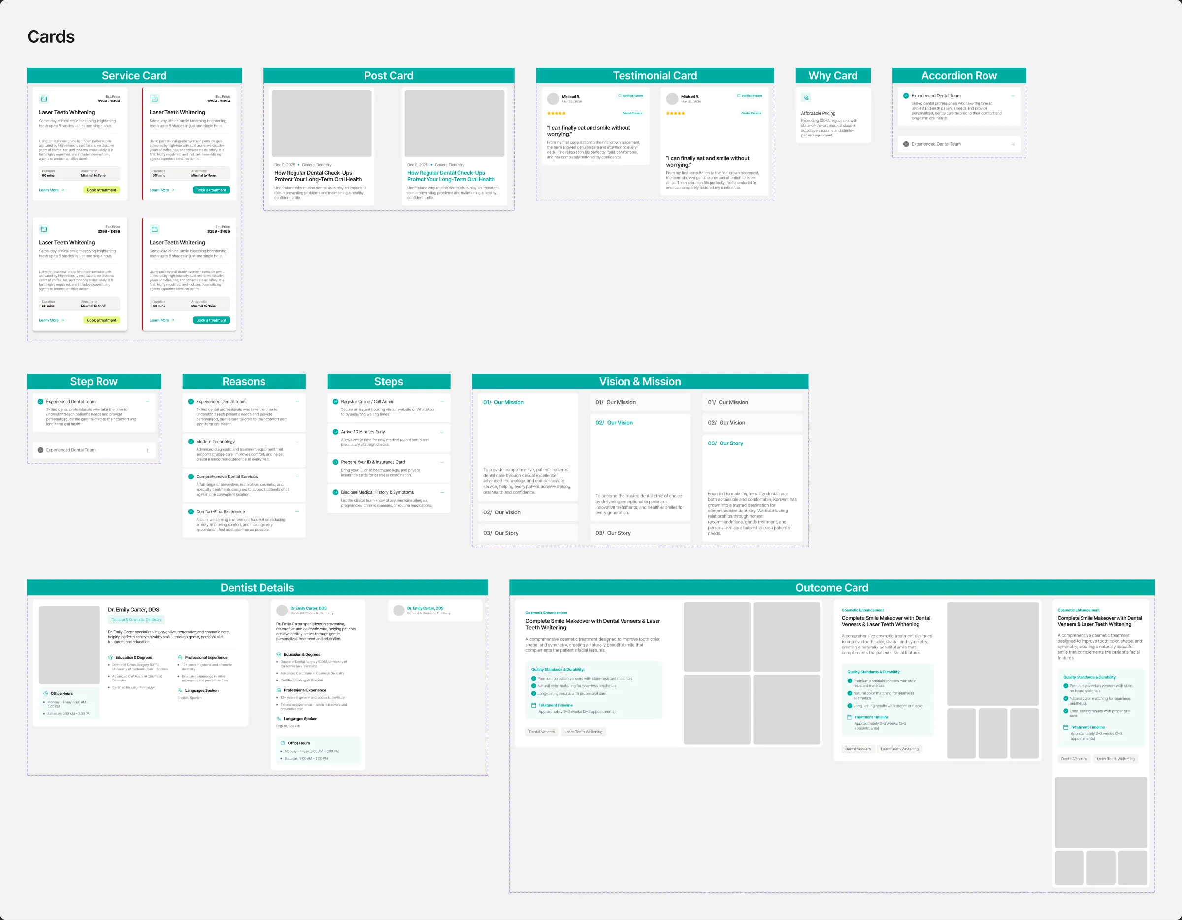
| Component | What it is |
|---|---|
| Service Card | Style × State — a service: icon, estimated price, title, summary, description, duration and anaesthetic, “Learn More” and “Book a treatment”; hover lifts it and fills the icon box, the emergency service adds a red line; text properties Title, Summary, Description, Price… |
| Post Card | The blog card: photo, date and category, title and excerpt |
| Testimonial Card | Width — a patient review: photo, name, date, the Verified Patient tag, the stars and the treatment, the quote and the review; text properties Name, Quote, Review… |
| Why Card | A reason of Why Choose Us: icon, title and text |
| Accordion Row | A row of an accordion, open or closed: the round check, the title, the plus-minus mark and, when open, the text |
| Step Row | A numbered step of the patient guide: number, title and text |
| Reasons | The Home page’s “Why Patients Trust KorDent” accordion: four rows, one open at a time |
| Steps | The patient guide’s four numbered steps (Services page) |
| Vision & Mission | Active — the About story’s three cards (mission, vision, story), one open at a time |
| Dentist Details | Layout — a dentist’s name, speciality, bio, education, experience and languages; the phone layout stacks the columns |
| Outcome Card | Breakpoint: Desktop, Tablet, Phone — a treatment outcome: category and title, text, the quality list, the timeline, the treatments as chips, and four photos; text property Outcome Name… |
Sections
Section titled “Sections”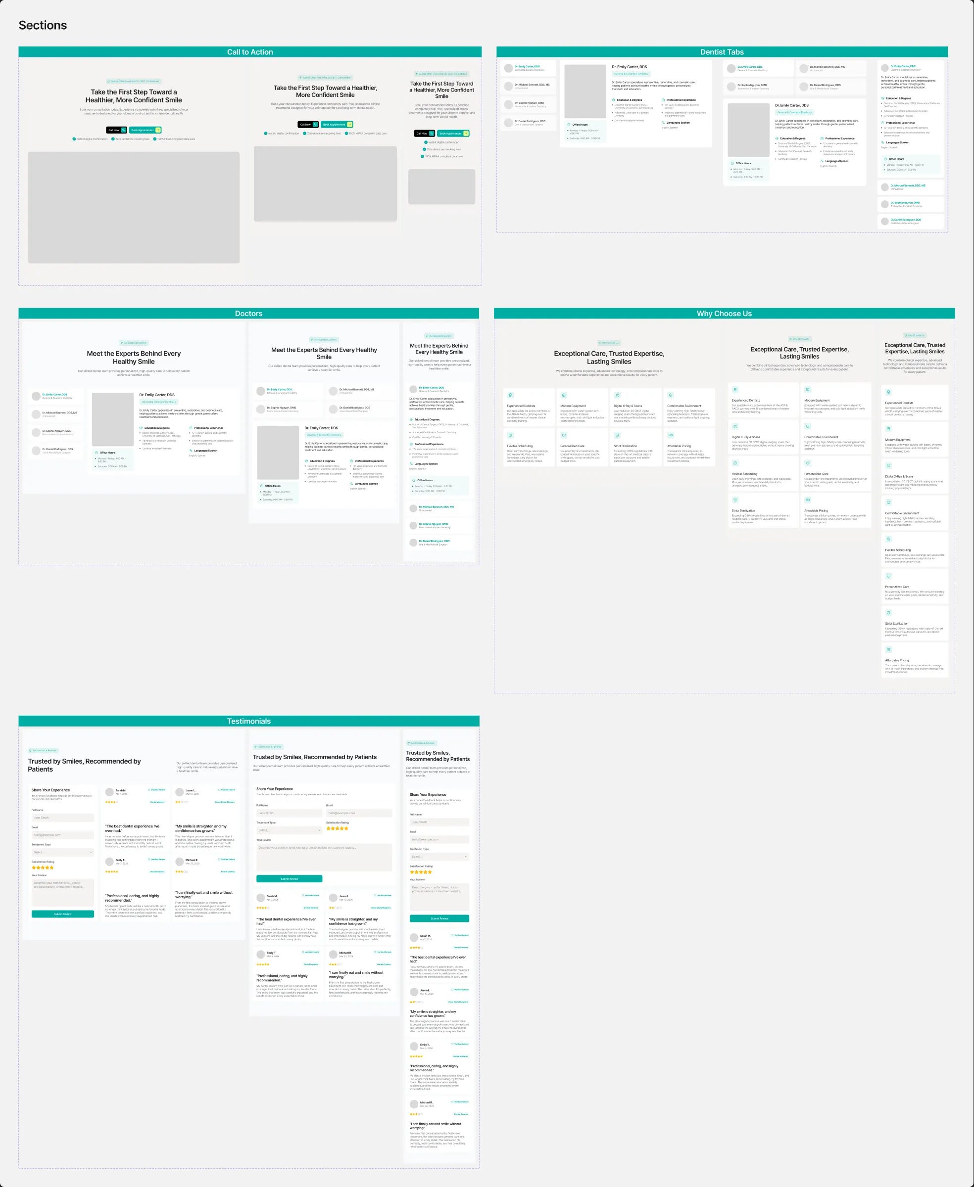
| Component | What it is |
|---|---|
| Call to Action | Breakpoint — the closing band of most pages: title, text, the three promises, “Book Appointment” and “Call Now”, and the photo |
| Dentist Tabs | Breakpoint — the four dentists as tabs, with the chosen one’s photo, details and office hours |
| Doctors | Breakpoint — the Doctors section of Home and About: its title block and the dentist tabs |
| Why Choose Us | Breakpoint — the section title and the reason cards |
| Testimonials | Breakpoint — the section title and the review cards |
Components with breakpoint variants (Header, Footer, Outcome Card and the five sections) switch by variant; set the one that matches the frame. The others keep one design and stretch to the width of their column. Some layers inside them are hidden on purpose — the closed rows of an accordion, the dentists of the tabs that are not chosen, the closed phone menu — they are the states the website switches between.