Design — KorDent Astro
The look of this Astro template comes from a small set of tokens: change one and nearly every page, component and state follows.
So you rarely need to touch a component. This guide covers the colours, the logo, the fonts, the text styles, the spacing, the motion, the components and the icons.
See everything first
Section titled “See everything first”Run npm run dev and open http://localhost:4321/style-guide. It shows the colours, the text styles, the buttons and
links, the logo, the icons and chips, the cards (service, post, review, outcome, dentist), the patterns (accordions,
tabs, the filter, rich text with a table) and the forms with their states, each with its name. When you want to know
what a change will affect, look there.
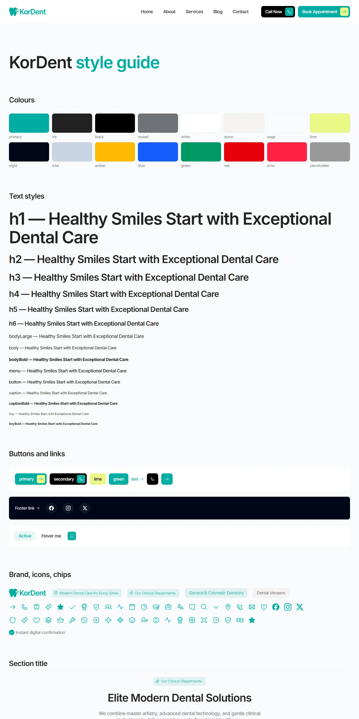
Colours
Section titled “Colours”src/design-system/theme.css:
@theme { --color-primary: #00ada2; /* the accent: primary buttons, active tabs, icons, chips, links */ --color-ink: #222222; /* headings and strong text */ --color-black: #000000; /* the secondary button ("Call Now"), simple buttons on hover */ --color-muted: #6f7278; /* body text, labels, meta */ --color-white: #ffffff; /* cards, the header, text on dark */ --color-stone: #f5f3f2; /* hairlines, form fields, info panels, the Outcomes and call-to-action bands */ --color-page: #f8fafc; /* the page background */ --color-lime: #e9f885; /* the yellow button, icon covers, the plus of the logo */ --color-night: #020618; /* the footer */ --color-mist: #cad5e2; /* text on the footer */ --color-amber: #ffb900; /* the rating stars of reviews */ --color-blue: #155dfc; /* a fact's tint */ --color-green: #009966; /* a fact's tint */ --color-red: #e7000b; /* a fact's tint, the emergency service's hover line, "Closed" */ --color-red-deep: #ad0009; /* the emergency number's hover (Contact) */ --color-error: #ff2244; /* the form button's error label (its fill is error/15) */ --color-placeholder: #999999; /* placeholders, the select's chevron, table borders */}Each name becomes a Tailwind class: bg-primary, text-muted, border-stone. Swap the hex values for your own
palette and the site changes. Faded colours are opacity modifiers on a token: primary/10 is the chips and the active
menu link, primary/5 the menu hover and the tinted panels (the safety banner), black/5 the hairlines on white cards,
white/5 the footer’s social buttons. They follow the palette when you change the colour.
Primary carries white text on the buttons, and Primary text sits on white: in the demo both read at about 2.8 : 1, below the 4.5 : 1 that small text needs. If your accent is free to change, a darker one reads better; keep body text on its background at 4.5 : 1 or more (Muted on the page background is about 4.6 : 1).
A few colours sit outside the tokens, so change them too when you change a colour:
| Colour | Where |
|---|---|
| The logo file: the mark and the wordmark in Primary, the plus in Lime | src/assets/images/logo.svg (the site itself draws the logo from Logo.astro, which reads the tokens) |
| The browser icon: the tooth mark in Primary | public/icon.svg, public/apple-icon.png |
The KorDent logo (the tooth mark with its plus, and the wordmark) is drawn as SVG paths, kept in
src/design-system/components/brand/logo-paths.ts and drawn by Logo.astro with var(--color-primary) and, for the
plus, var(--color-lime), so it follows those two tokens. It is 124 × 28 px in the header on desktop, 106 × 24 on
tablets and in the footer, and 89 × 20 in the header on phones; the sizes are the class of <Logo> in
src/components/site/Header.astro and Footer.astro. To use your own:
- As an SVG: replace the entries of
logo-paths.tswith your logo’s paths (dandfill), and set the twoviewBox="0 0 125 28"inLogo.astro(with and without a link) to your artwork’s size; adjust the widths in the header and footer to its proportions. - As an image file: replace the
<svg>inLogo.astrowith an<img>of your file (or Astro’s<Image>). It sits on the white header and on the dark footer, so pick one that reads on both, or use two files.
Its name for screen readers is headerActions.logoLabel in src/content/site.json (“KorDent home”). The same artwork is
in src/assets/images/logo.svg for use elsewhere.
The template ships Inter as one variable font file, src/assets/fonts/inter-latin-variable.woff2 (Latin, every weight,
with its optical-size axis), loaded with Astro’s Fonts API in astro.config.mjs:
fonts: [ { provider: fontProviders.local(), name: "Inter", cssVariable: "--font-inter", options: { variants: [{ weight: "100 900", style: "normal", src: ["./src/assets/fonts/inter-latin-variable.woff2"] }], }, fallbacks: ["Inter Fallback", "sans-serif"], optimizedFallbacks: false, },],<Font cssVariable="--font-inter" preload /> in src/layouts/Layout.astro writes it into every page, and theme.css
makes --font-inter the site font (--font-sans). Until the file arrives the text shows in “Inter Fallback”, Arial
resized to Inter’s measures (@font-face in theme.css), so nothing jumps. The text styles pin the optical-size axis
at 14, the text cut of Inter, for every size ([font-variation-settings:'opsz'_14] in
src/design-system/tokens/text.ts). The template uses the weights 400 (text), 500 (menu and buttons), 600 (headings)
and 700 (bold labels).
To use another font:
- A file you have: put it in
src/assets/fonts/, changenameandsrcabove (andweightandstyleto what the file holds), and keepcssVariable: "--font-inter"so the theme picks it up. Delete the “Inter Fallback”@font-faceand its name infallbacks, or setoptimizedFallbacks: trueto let Astro compute one. - From Google Fonts: use
provider: fontProviders.google()with the font’snameand theweightsyou need; Astro downloads it when the site builds and serves it from your own domain.
Without an optical-size axis the font-variation-settings in the text styles simply do nothing.
Text styles
Section titled “Text styles”src/design-system/tokens/text.ts holds the sizes, weights and line heights, named as in the original design:
| Style | Phone | Tablet (md:) |
Desktop (lg:) |
Used for |
|---|---|---|---|---|
h1 |
36 | 44 | 56 | Page titles and the Home hero |
h2 |
28 | 32 | 36 | Section titles |
h3 |
26 | 28 | 32 | Rich-text headings (posts, legal pages) |
h4 |
24 | 26 | 28 | Rich-text headings |
h5 |
20 | 22 | 24 | The safety banner’s title |
h6 |
18 | 19 | 20 | Card titles, quotes, the forms’ titles, the service texts’ headings |
bodyLarge |
16 | 16 | 16 | Leads, descriptions, rich text, accordion titles |
body / bodyBold |
14 | 14 | 14 | Card text, lists / names, field labels |
menu |
15 | 15 | 15 | The header’s links (weight 500) |
button |
14 | 14 | 14 | Buttons, tabs, the footer’s links (weight 500) |
caption / captionBold |
12 | 12 | 12 | Chips, meta, roles / price labels, the footer’s legal links |
tiny / tinyBold |
10 | 10 | 10 | The footer’s disclaimer / the review cards’ badges |
Headings are weight 600 with −0.03em letter spacing and a line height of 1.1 (h1) or 1.2; the text styles are 1.3
(1.2 for menu and button). Change the numbers in text.ts rather than in the components, and text stays consistent
across the site. Use a style as class={text.h2} or combine: class={cn(text.h6, "text-primary")}.
Breakpoints and spacing
Section titled “Breakpoints and spacing”Three sizes, set in theme.css:
| Width | Tailwind prefix | |
|---|---|---|
| Phone | below 810 px | (none) |
| Tablet | 810–1199 px | md: |
| Desktop | 1200 px and up | lg: |
Content is at most 1300 px wide. The side padding is 15 px on phones, 20 px on tablets and 30 px on desktops, and most
sections have 60 / 80 / 100 px above and below (sectionGutters and sectionPadding in
src/design-system/components/layout/section.ts). Section title blocks sit 60 px above their content. The header is
68 px tall on phones and 78 px from tablets up; src/layouts/Layout.astro pads <main> by that
(Pages and sections).
Motion
Section titled “Motion”There is no front-end framework: small scripts in src/design-system/scripts/ (and src/components/site/header.ts)
run the motion with the Motion library, and each component calls its script from its own
<script>. The hovers are CSS. src/design-system/tokens/motion.ts holds the transitions:
| Token | Values | Used for |
|---|---|---|
spring (Spring A) |
no bounce, 0.4 s | Buttons (the label flip and the icon covers), the header’s links, the post cards, the service cards’ hover |
springSoft (Spring B) |
bounce 0.2, 0.4 s | Tabs (the service filter, the dentists, the outcomes), the accordions, the menu button, social buttons, chips |
springMenu |
no bounce, 0.2 s, each letter 0.075 s late | The letters of a header link rising in on hover |
appear, appearDistance, appearAmount |
tween 1 s, ease (0.59, 0.25, 0.12, 1.17); 18 px; half in view | Blocks rising into view as they scroll in, once |
loadDistance |
7 px | The Home hero and the page titles rising as the page loads |
formTween |
0.2 s | The colours of a form’s button |
theme.css holds the same curves as CSS for the hovers (--ease-appear, --ease-form, --ease-spring-a,
--ease-spring-b). A script that sets no transition of its own runs Spring A (play() in
src/design-system/utils/play.ts).
| Effect | Where to change it |
|---|---|
| Blocks rise as they scroll into view | <Appear> in the sections (scripts/appear.ts); a plain element with the same class shows at once |
| Page titles rise word by word out of a light blur | <TextAppear> in the page-title sections |
| How many services the grids show | limit in services (home.json, 6), list (services.json, 14) and departments (service.json, 6) |
| The first reason (Home) and the first step (Services) start open | defaultOpen on <Accordion> (0 by default, a row’s number from 0) in AboutSection.astro and PatientGuideSection.astro |
| The outcomes’ index and a service page’s contents stay 50 px under the top of the window on desktop | OutcomesSection.astro, ServiceDetailSection.astro; the booking panel the same in BookingSection.astro |
| The call-to-action video plays only while on the screen | scripts/in-view-video.ts |
Reduced motion
Section titled “Reduced motion”With “reduce motion” switched on in the visitor’s system, movement is left out: play() makes moves, turns and size
changes jump to their end (blocks fade in where they stand), the accordions open at once, the buttons’ hover movements
are switched off in CSS and the call-to-action video stays on its poster. Fades and colour changes stay.
Corners, shadows, spacing
Section titled “Corners, shadows, spacing”Corners are 12 px on the big photos and the white cards of the booking form, the service texts and the dentists, 8 px
on cards, panels, small photos and the facts, 6 px on form fields and icon boxes, and 2 px on the Open / Closed tags.
Avatars, the rating discs and the arrow covers are round. One shadow, --shadow-float in theme.css, lifts the hero’s
floating badges and a hovered service card. Spacing is Tailwind classes on the components (gap-5, p-5,
gap-[60px]); Tailwind’s scale is 4 px per step, so gap-5 is 20 px.
Components
Section titled “Components”src/design-system/components/ holds the buttons and menu links, the logo and the icons, the appear effects, the menu
button, the section layout and section titles, the images (FillImage, SizedImage), the cards (service, post,
review, outcome, dentist), the check items, the accordions, the filter tabs and search field, the table of contents,
rich text and the form parts (fields, choice cards, the star rating, the submit button). Their scripts are in
src/design-system/scripts/, their shapes in src/design-system/types.ts. The sections that make up a page are in
src/components/sections/, and are listed in Pages and sections.
There are two sets:
- Interface icons — the arrow, phone, check, star, calendar, clock, map pin, envelope, the social marks and the
rest — are Phosphor path data in
src/design-system/components/icons/paths.ts;<Icon name="arrow-right" />draws one in the current text colour. - Service and feature icons — the line icons of the service cards (
serviceIconsinsrc/content/schemas.ts) and the “Why Choose Us” cards (featureIcons) — are insrc/design-system/components/icons/shapes.tsand drawn by<ShapeIcon>. A service or a feature picks one by name in its collection; the build checks the name.
To add an interface icon:
-
Open the icon on phosphoricons.com and copy the SVG.
-
Take the
d="…"of its<path>. -
Add a line to
iconPaths:"my-icon": "M128,24A104,104,0,1,0,…",
Then use <Icon name="my-icon" class="size-5" />. Paths use a 256 × 256 grid, which is what Phosphor exports. The
style guide shows every icon of paths.ts by itself.
To add a service or feature icon, add an entry to shapePaths in shapes.ts (24 × 24 line drawings with a stroke of
1.5; each path has an x and y offset), then add its name to serviceIcons or featureIcons in
src/content/schemas.ts.