Design — Fitbricks Next.js
The look of this Next.js template comes from a small set of tokens: change one and nearly every page, component and state follows.
So you rarely need to touch a component. This guide covers the colours, the logo, the fonts, the text styles, the spacing, the motion, the components and the icons.
See everything first
Section titled “See everything first”Run npm run dev and open http://localhost:3000/style-guide. It shows the colours, the text styles, the logo, the
buttons and links, the menu buttons and category links, the club, program, feature, goal, app, testimonial, post,
Instagram, trainer and pricing cards, the store badges, the quote slider, the ticker and the carousel, the accordion,
the forms with their states and rich text, each with its name. When you want to know what a change will affect, look
there.
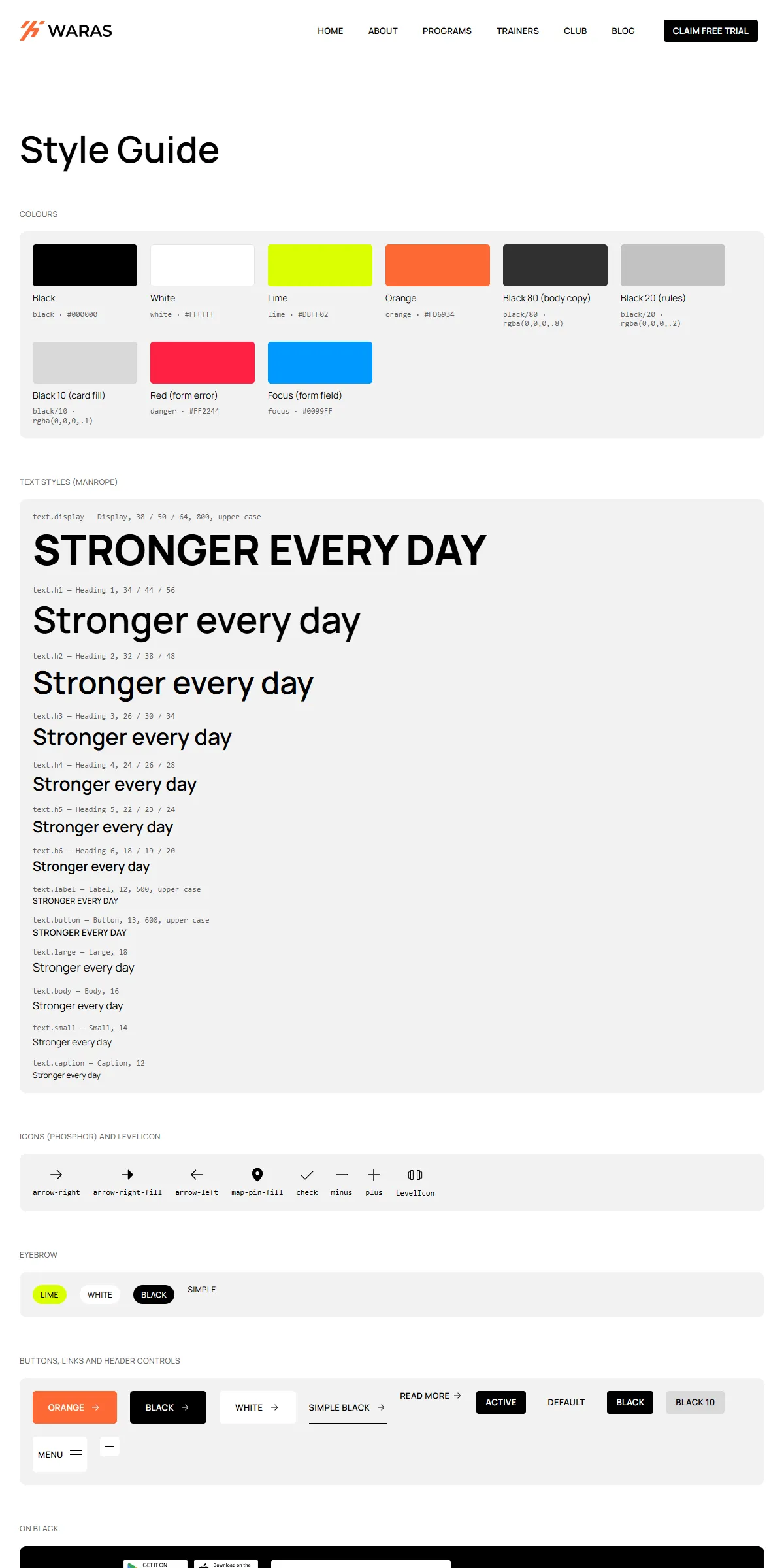
Colours
Section titled “Colours”src/design-system/theme.css:
@theme { --color-black: #000000; /* text, the dark buttons, the footer */ --color-white: #ffffff; /* the page, the header panels, light text */ --color-lime: #dbff02; /* the hero badge, feature blocks, the promotion panel, list ticks, category link hovers */ --color-orange: #fd6934; /* the main buttons, link hovers, card actions, the logo's mark */ --color-danger: #ff2244; /* "Something went wrong" */ --color-focus: #0099ff; /* the border of a focused form field */ --color-spinner: #999999; /* the ring of the loader of the lists that load on scroll */}Each name becomes a Tailwind class: bg-lime, text-orange, border-focus. Swap the hex values for your own palette
and the site changes. Fitbricks is black and white with two accents: your brand colour usually goes into orange (the
buttons and hovers), and a second one into lime. Faded colours are opacity modifiers on a token: text-black/80 is the
body copy, bg-black/10 the pale card fill, bg-black/20 the rules, bg-black/60 the veil on program cards,
text-white/80 the footer’s links. They follow the palette when you change the colour.
Keep body text on its background at 4.5 : 1 or more: 80 % black on white is about 12 : 1 in the demo. White text on orange or black on lime is worth checking when you change those two.
A few colours sit outside the tokens, so change them too when you change a colour:
| Colour | Where |
|---|---|
| The colour of each program category (the card’s symbol, the filter’s square) | color in src/content/collections/program-categories.ts |
| The logos: an orange mark with a white, black or black-on-white wordmark | public/images/logo-light.svg, logo-dark.svg, logo-black.svg |
| The browser icon, the orange mark | src/app/icon.svg, src/app/apple-icon.png |
| The category icons (white line icons) and the social icons of the trainer pages | public/images/category-*.svg, social-*.svg |
The logo is three image files of 142 × 30, named in logo in src/content/site.ts (and the promotion’s logo in
src/content/pages/home.ts):
| File | Where |
|---|---|
public/images/logo-light.svg |
The header over a cover photo (Home, Free trial, the program pages, the 404), the footer, About’s photo |
public/images/logo-dark.svg |
The white header of every other page, and the header once it turns white on tablets and phones |
public/images/logo-black.svg |
The Pilates Reformer promotion on Home |
src/design-system/components/brand/Logo.tsx draws them at 95 × 20 on phones, 118 × 25 on tablets and 142 × 30 on
desktops in the header, and 142 × 30 in the footer. To use your own, replace the files (an SVG, or a PNG twice the size
shown) and keep the proportions, or change the sizes in src/components/site/Header.tsx. The light logo sits on photos
and on black, the dark one on white. Its name for screen readers is alt.
The template loads Manrope once, through next/font in src/app/layout.tsx:
const manrope = Manrope({ variable: "--font-manrope", subsets: ["latin"], display: "swap" });Manrope is one variable font here, every weight from 200 to 800. theme.css makes --font-manrope the site font
(--font-sans). The template uses the weights 400 (text), 500 (labels), 600 (headings, buttons) and 800 (Home’s title).
To use another Google font, import it by name from next/font/google and keep the variable name:
import { Inter_Tight } from "next/font/google";const manrope = Inter_Tight({ variable: "--font-manrope", subsets: ["latin"] });A font that isn’t variable needs its weights listed (weight: ["400", "500", "600", "800"]). For a font you have
licensed yourself, use next/font/local and point it at the files in src/app/fonts/. Next.js serves the font from
your own domain either way, so there is no request to Google at runtime.
Text styles
Section titled “Text styles”src/design-system/tokens/text.ts holds the sizes, weights and line heights, named as in the original design:
| Style | Phone | Tablet (md:) |
Desktop (lg:) |
Used for |
|---|---|---|---|---|
display |
38 | 50 | 64 | Home’s hero title (weight 800, upper case) |
h1 |
34 | 44 | 56 | Page titles, big numbers |
h2 |
32 | 38 | 48 | Section titles |
h3 |
26 | 30 | 34 | Feature blocks, fact numbers, prices; level-3 headings in posts and legal pages |
h4 |
24 | 26 | 28 | Form titles; level-4 headings in posts |
h5 |
22 | 23 | 24 | Card titles (clubs, programs, goals, stories, app) |
h6 |
18 | 19 | 20 | Post card titles, the promotion’s note |
label |
12 | 12 | 12 | Eyebrows, post meta (weight 500, upper case) |
button |
13 | 13 | 13 | Buttons, menu links, footer column titles (weight 600, upper case) |
large |
18 | 18 | 18 | The hero’s lead, program levels |
body |
16 | 16 | 16 | Section texts, card texts, rich text |
small |
14 | 14 | 14 | Quotes, card meta, footer links |
caption |
12 | 12 | 12 | The name under a hero quote |
Headings are weight 600 at line height 1.2; paragraphs 1.4; labels and buttons have 3 % letter spacing. Change the
numbers in text.ts rather than in the components, and text stays consistent across the site. Use a style as
className={text.h2} or combine: className={cn(text.body, "text-black/80")}.
Breakpoints and spacing
Section titled “Breakpoints and spacing”Three sizes, set in theme.css:
| Width | Tailwind prefix | |
|---|---|---|
| Phone | below 810 px | (none) |
| Tablet | 810–1199 px | md: |
| Desktop | 1200 px and up | lg: |
Content is at most 1440 px wide and keeps growing above 1200 px. The side padding is 15 px on phones, 20 px on tablets and
30 px on desktops, and most sections have 60 / 80 / 100 px above and below (sectionGutters and sectionPadding in
src/design-system/components/layout/Section.tsx). The header is fixed at the top; pages without a cover photo start
70 px below it on phones and 94 px from tablets up (Pages and sections).
Motion
Section titled “Motion”src/design-system/tokens/motion.ts holds the transitions, for Motion:
| Token | Values | Used for |
|---|---|---|
spring |
no bounce, 0.4 s | The header’s panel and colours, the hero’s words; the default of every Motion element |
springBounce |
bounce 0.2, 0.4 s | The buttons’ arrow, the menu links’ fill, the hamburger |
tween |
0.4 s, ease in-out | A club card’s action rising, a story’s quote fading in |
pressSpring, pressScale |
bounce 0.25, 0.45 s, to 95 % | A club card’s action when pressed |
quoteInterval, quoteTween |
4 s, 0.4 s | The hero’s quotes changing by themselves |
heroRise, heroSpring, heroDelays |
from 7 px below, after 0.35 / 0.65 s | The hero’s badge, buttons and quote card on load |
textRise, textStagger, textDelays |
from 10 px, 0.075 s apart | The hero’s title word by word and its lead line by line |
appearFrom, appearSpring, appearAmount |
from 18 px, half in view | Home’s facts and memberships as they scroll into view |
tickerSpeed |
20 px/s | The members’ stories ticker on desktops |
theme.css holds the same curves as CSS for what runs without Motion (--ease-framer, --ease-zoom for the post
cards’ photos, --ease-spring, --ease-spring-bounce) and the ticker’s animation; hovers run in CSS with them.
MotionProvider (wrapped around every page in src/app/layout.tsx) makes spring the default of every Motion element
that sets no transition of its own.
| Effect | Where to change it |
|---|---|
| The hero’s quotes change every 4 s | quoteInterval in tokens/motion.ts |
| The stories ticker (desktop) and carousel (tablets, phones) | src/components/sections/home/TestimonialsSection.tsx, tickerSpeed |
| The header switches as you scroll over a cover photo | src/components/site/Header.tsx |
| Cards’ actions rise on hover (desktop) | riseTransition in src/design-system/components/cards/CardAction.tsx |
| Lists load six items at a time | list.pageSize in the page copy |
| The FAQ opens one row at a time | Accordion in src/design-system/components/patterns/ |
Reduced motion
Section titled “Reduced motion”With “reduce motion” switched on in the visitor’s system, movement is left out: MotionProvider makes Motion skip its
transform and layout animations (the hero’s words and blocks fade in without rising), the stories ticker stops, and the
accordion, the cards and the smooth scrolling go without their transitions (motion-reduce: in CSS). Fades and colour
changes stay, and the hero’s quotes still change.
Corners, spacing
Section titled “Corners, spacing”Corners are 10 px on cards and photos, 5 px on buttons, panels and fields, 4 px on menu links and 50 px on pills. There
are no shadows. Spacing is Tailwind classes on the components (gap-5, p-5, gap-[50px]); Tailwind’s scale is 4 px
per step, so gap-5 is 20 px.
Components
Section titled “Components”src/design-system/components/ holds the layout (section, title blocks), the logo and the eyebrow, the buttons and
links, the menu buttons, the hamburger and the category links, the cards (club, program, feature, goal, app,
testimonial, post, Instagram, trainer, program link, pricing), the store badges and the tick list, the quote slider, the
lists that load on scroll, the accordion, the ticker, the carousel, rich text, the YouTube embed, the appear effects, the
forms and the icons. Its README lists every component with its props and where it is
used. The sections that make up a page are one level up, in src/components/sections/, and are listed in
Pages and sections.
The arrows, the map pin, the tick, plus and minus are Phosphor path data in
src/design-system/components/icons/paths.ts. <Icon name="arrow-right" /> draws one in the current text colour. The
dumbbell of a program’s level is LevelIcon; the category icons and the trainers’ social icons are SVG files in
public/images/.
To add an icon:
-
Open the icon on phosphoricons.com and copy the SVG.
-
Take the
d="…"of its<path>. -
Add a line to
iconPaths:"barbell": "M248,120h-8V88a16,16,0,0,0-16-16H208V64a16,16,0,0,0-16-16H168…",
Then use <Icon name="barbell" className="size-5" />. Phosphor paths use a 256 × 256 grid. The style guide shows the
icons in use.