Design — Fitbricks HTML
Fitbricks is styled with Tailwind CSS classes and a few colour, font and breakpoint tokens. Most changes are HTML edits; a new colour or font needs a CSS rebuild.
How the styling works
Section titled “How the styling works”The pages are styled with Tailwind CSS classes written in the HTML
(class="flex flex-col gap-2.5 text-white"). assets/css/style.css contains exactly the classes the pages use,
generated from src/css/style.css.
That means two kinds of change:
| Change | Rebuild the stylesheet? |
|---|---|
| Move, copy or delete elements; use classes that already appear somewhere in the site | No |
Change a colour, a font, a breakpoint; use a class that appears nowhere yet (say mt-7) |
Yes |
Rebuilding the stylesheet
Section titled “Rebuilding the stylesheet”Once, install the tools (needs Node.js 20 or newer):
npm installThen, after a change:
npm run build:css # one buildnpm run watch:css # rebuilds on every save while you workBoth write assets/css/style.css. The build scans the .html files in the root folder and one folder down (program/,
club/, blog/ and the others), and assets/js/main.js, so a class you add there is picked up. Upload the new
style.css with your pages.
Colours
Section titled “Colours”In src/css/style.css:
@theme { --color-black: #000000; /* text, the dark buttons, the footer */ --color-white: #ffffff; /* the page, the header panels, light text */ --color-lime: #dbff02; /* the hero badge, feature blocks, the promotion panel, list ticks */ --color-orange: #fd6934; /* the main buttons, link hovers, card actions */ --color-danger: #ff2244; /* "Something went wrong" (its fill is the same red at 15 %) */ --color-focus: #0099ff; /* a focused form field's border */ --color-spinner: #999999; /* the ring of the loader in lists that load on scroll */}Each name is used in classes: bg-orange, text-black, bg-lime. Change a value and rebuild the stylesheet, and every
page follows. Fitbricks is black and white with two accents: your brand colour usually goes into orange (buttons, link
hovers, the menu’s hover) and a second one into lime. Faded colours are opacity modifiers on a token: black/10 and
black/20 are hairlines and fills, black/80 a veil on photos with text. Keep text on its background at 4.5 : 1 or
more, and check it on the buttons after you change orange.
Category colours are not tokens: each category’s colour is written on its programs’ cards as an inline style
(style="background-color: #00c4d1" for Mind & Body, #f7d354 Cardio, #cb3b31 Strength, #357a5a Dance, #fd6934
Default). To change one, replace its value in all files with find and replace; no rebuild is needed.
Logo and icons
Section titled “Logo and icons”The logo is three image files, 142 × 30, in assets/images/:
| File | Where |
|---|---|
logo-light.svg (white) |
The header over a photo (Home, the program pages, Free Trial, the 404 page), the footer, About’s hero photo |
logo-dark.svg (black) |
The white header |
logo-black.svg (black) |
Home’s promotion panel |
The header swaps the light and the dark logo as it turns clear or white (data-light-src and data-dark-src on its
logo link name them). It shows them at 95 × 20 px on phones, 118 × 25 on tablets and 142 × 30 on desktops. Replace the
files with yours under the same names (SVG, or PNG twice the size shown, then change the src and the two data-
attributes) and keep the proportions, or change the sizes in their classes (h-5 w-[95px] md:h-[25px] …) and rebuild the
stylesheet. The logo images carry alt="Waras": put your gym’s name there with find and replace in files.
icon.svg (the Waras mark) and apple-icon.png (180 × 180 px) in the root folder are the icons in the browser tab and
on a phone’s home screen. Replace the files, keeping the names.
The arrows, the map pin and the other small icons are inline SVG from Phosphor, drawn on a
256 × 256 grid in the current text colour. To use another icon, open it on phosphoricons.com, copy its <path d="…">
and paste it in place of the old one. The social marks (social-*.svg, icon-instagram.svg), the category symbols
(category-*.svg) and the store badges (app-store-*.svg, google-play-*.svg) are image files in assets/images/.
Manrope ships in assets/fonts/ as one variable file, manrope-variable.woff2 (weights 200 to 800), declared at the top
of src/css/style.css:
@font-face{font-family:"Manrope"; src:url("../fonts/manrope-variable.woff2") format("woff2"); font-display:swap; font-weight:200 800; font-style:normal; }:root{--font-manrope:Manrope,"Manrope Fallback"; }Every page uses it through font-sans. “Manrope Fallback” is Arial resized to Manrope’s width, shown while the font
loads, so the text doesn’t jump. The template uses the weights 400 (text), 500 (labels), 600 (headings, buttons, the
menu), 700 (bold text) and 800 (Home’s title).
To use another font:
- Put its
.woff2files inassets/fonts/. - Change the
@font-facerule (font-family,srcand the weight range) and the first name in--font-manrope. A font that isn’t variable needs one@font-facerule per weight file. - Rebuild the stylesheet. Remove the “Manrope Fallback” rule, or tune its overrides to your font.
Fonts from Google Fonts can be downloaded as files with https://gwfh.mranftl.com, so they are served from your own domain, which is faster and needs no consent banner.
Sizes and spacing
Section titled “Sizes and spacing”Text sizes are classes with a phone value first and the tablet (md:) and desktop (lg:) values after:
text-[32px] md:text-[38px] lg:text-[48px]. The style guide lists every text style:
| Style | Phone | Tablet | Desktop | Used for |
|---|---|---|---|---|
| Display | 38 | 50 | 64 | Home’s hero title (upper case) |
| Heading 1 | 34 | 44 | 56 | Page titles (About, Blog, Clubs…) and big numbers |
| Heading 2 | 32 | 38 | 48 | Section titles |
| Heading 3 | 26 | 30 | 34 | The feature blocks, the fact numbers, prices |
| Heading 4 | 24 | 26 | 28 | Form titles, a post’s headings |
| Heading 5 | 22 | 23 | 24 | Card titles (clubs, programs, coaching, stories, the app) |
| Heading 6 | 18 | 19 | 20 | Post card titles, the promotion’s note |
| Large | 18 | 18 | 18 | The hero’s lead, program levels |
| Body | 16 | 16 | 16 | Section texts, card texts, rich text |
| Small | 14 | 14 | 14 | Quotes, card meta, footer links |
| Button, Label | 13, 12 | 13, 12 | 13, 12 | Buttons, menu links and footer titles; eyebrows and post meta (upper case) |
Breakpoints are 810 px (tablet, md:) and 1200 px (desktop, lg:), in src/css/style.css. Content is at most 1440 px
wide and keeps growing up to that width on large screens; the side padding is 15 px on phones, 20 px on tablets and
30 px on desktops, and most sections have 60 / 80 / 100 px above and below. Corners are 10 px on cards and photos, 5 px
on buttons and fields.
Components
Section titled “Components”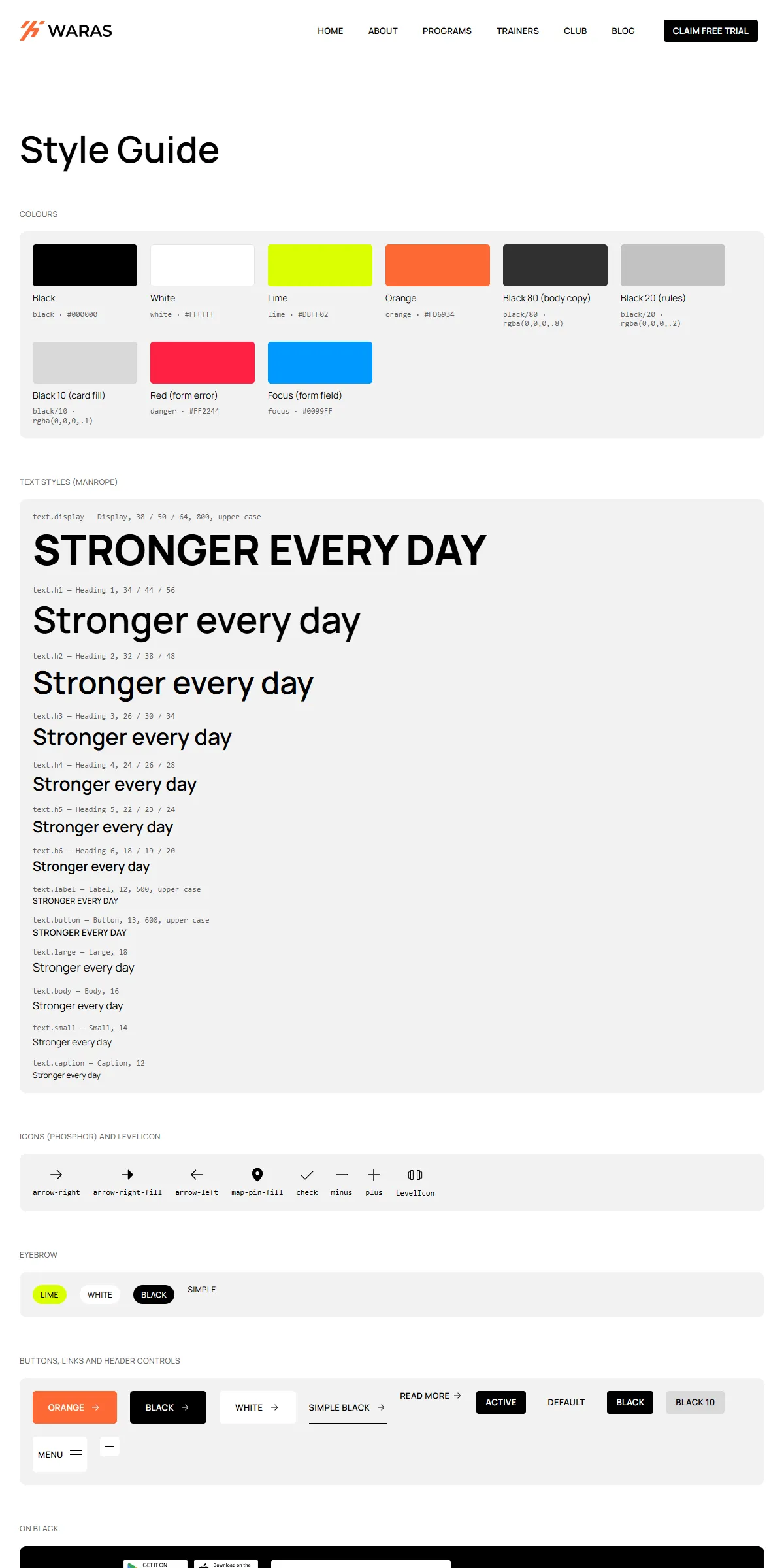
style-guide.html shows the colours, the text styles, the logos, the buttons and links, the menu parts, the eyebrows,
the title blocks, every card, the forms with their states, rich text and the YouTube embed, each with its name. To reuse
one, copy its markup from there or from the page that shows it.
Elements with data-… attributes are wired to the site script, so keep those attributes when you copy them:
data-header, data-header-bar, data-header-logo, data-header-menu, data-header-action, data-header-cover,
data-hamburger, data-menu-close, data-appear, data-text-appear, data-word, data-quote-slider, data-quotes,
data-carousel, data-load-on-scroll, data-load-item, data-later, data-accordion, data-youtube, data-form,
data-submit, data-form-status, data-current-year, … Two-state looks (the FAQ’s answers) carry their classes in
data-on and data-off: the script swaps them.
Motion
Section titled “Motion”The header, the entrance of Home’s hero, the blocks that rise in, the quote slider, the carousel, the lists that load on
scroll and the FAQ are in assets/js/main.js; the hovers (cards whose “See Details” rises, photos that zoom, buttons whose
arrow slides, menu links that fill) and the stories ticker are CSS. A few settings are written in the HTML or the script:
| Effect | Where |
|---|---|
| Home’s hero quotes turn every 4 seconds | quoteInterval in assets/js/main.js |
| The stories ticker scrolls one round in 85 seconds and pauses on hover | animation-duration (and --ticker-period, the width of one round) in the ticker’s style |
| Blocks on Home rise in as they scroll into view | data-appear="scroll", with data-amount (how much must be visible); the hero’s parts use data-appear="load" and data-delay |
| Programs, Clubs and Trainers show six cards at a time (Trainers four on tablets and phones), Blog five | data-page-size (and data-page-size-small) on the list; the cards after the first page carry data-later |
| Hovers fill, rise and zoom | the classes hover: and group-hover/…: with duration-400 ease-spring |
The springs and curves are in src/css/style.css (--ease-framer, --ease-zoom, --ease-spring,
--ease-spring-bounce) and in assets/js/main.js.
Reduced motion
Section titled “Reduced motion”With “reduce motion” switched on in the visitor’s system, movement is left out: blocks and words appear without
rising, the quote photos don’t slide, the ticker stands still (motion-reduce:animate-none) and the page scrolls
without smoothing. Fades and colour changes stay.