Design — Balancee Next.js
The look of this Next.js template comes from a small set of tokens: change one and nearly every page, component and state follows.
So you rarely need to touch a component. This guide covers the colours, the wordmark and icons, the fonts, the text styles, the spacing, the motion and the components.
See everything first
Section titled “See everything first”Run npm run dev and open http://localhost:3000/style-guide. It shows the colours, the text styles, the buttons and
links, the wordmark and the icons, the cards, the figures and the rating, the patterns (the rows that open, the list that
loads on scroll, rich text), the logo loop, the video player and the forms with their states, each with its name. When you
want to know what a change will affect, look there.
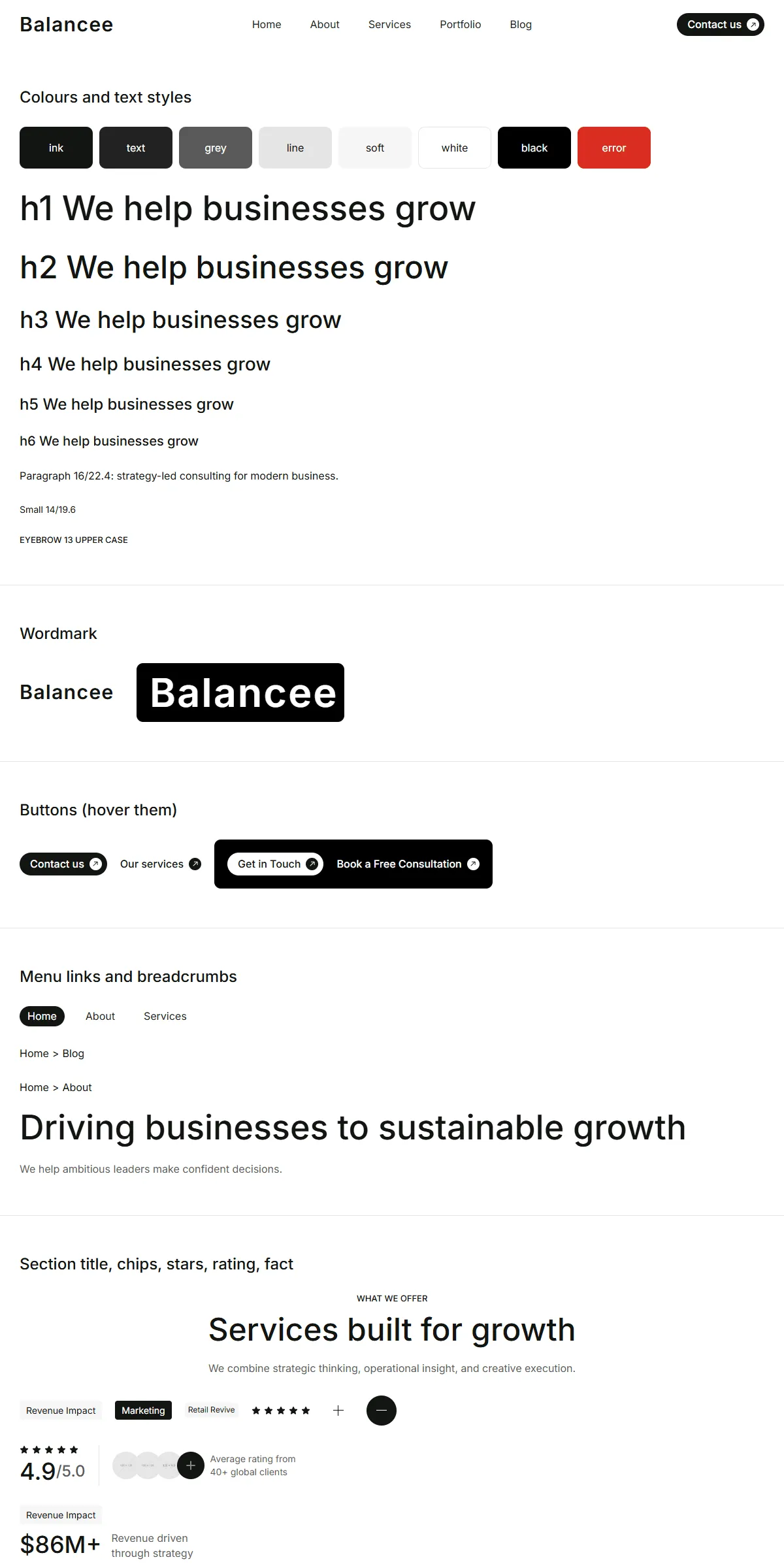
Colours
Section titled “Colours”src/design-system/theme.css:
@theme { --color-ink: #121512; /* headings, the dark buttons, the active menu pill, the dark sections */ --color-text: #222222; /* the menu's links */ --color-grey: #5a5a5a; /* secondary text, meta */ --color-line: #e5e5e5; /* dividers, light fills */ --color-soft: #f5f5f5; /* the client section, the blog cards, form fields */ --color-white: #ffffff; /* the page, text over dark */ --color-black: #000000; --color-error: #d92d20; /* a form field that failed its check */ --color-danger: #ff2244; /* the Submit button when sending failed */ --color-field-line: rgb(136 136 136 / 0.1); /* the hairline of a form field */ --color-focus: #0099ff; /* the hairline of a focused text field */ --color-placeholder: rgb(47 47 47 / 0.5); /* a field's placeholder */ --color-dim: rgb(47 47 47 / 0.5); /* the year pills of the About timeline on black */}Each name becomes a Tailwind class: bg-ink, text-grey, border-line. Swap the hex values for your own palette and
the site changes. Keep text on its background at a contrast of 4.5 : 1 or more, or the site becomes hard to read; the
tokens above are close to black and mid grey on white for that reason.
The wordmark is text, not a drawing: Wordmark in src/design-system/components/brand/Logo.tsx writes “Balancee” in
Inter semibold with a little extra letter spacing, in the current text colour (ink in the header and footer, white over
the Home video). A table of sizes (default 139 × 25, phone 111 × 20, footer 166 × 30, hero and large) keeps the
box the size of the original logo. To use your own:
- Change the name: write yours in
Wordmark(the word is theBalanceetext inside it) and check that it fits the boxes; a longer name needs wider ones insizes. - Use a logo file: replace the
<span>ofWordmarkwith an<Image>of your SVG or PNG. A file has one colour, so the white version over the Home video needs a second file, or a logo that reads on both.
The link’s name for screen readers is logo.alt in src/content/site.ts. public/images/logo.svg and logo-white.svg
are the same wordmark as files for use elsewhere (they use the Inter font, so open them where Inter is installed, or
convert the text to outlines); the site itself draws the wordmark from Logo.tsx.
Browser icons: the “B”
Section titled “Browser icons: the “B””The “B” mark is three files: public/icon-light.svg (a dark tile with a white B, for light browser themes),
public/icon-dark.svg (a white tile with a dark B, for dark themes) and src/app/apple-icon.png (the home-screen icon). They are named in
src/app/layout.tsx. Replace the three with your own mark: SVGs for the first two, a PNG for the third
(Editing the content).
The template loads Inter once, through next/font in src/app/layout.tsx:
const inter = Inter({ variable: "--font-inter", subsets: ["latin"] });Inter is one variable font here, every weight in one file. theme.css makes --font-inter the site font
(--font-sans). Headings and buttons use weight 500, the wordmark 600 and text 400.
To use another Google font, import it by name from next/font/google and keep the variable name:
import { DM_Sans } from "next/font/google";const inter = DM_Sans({ variable: "--font-inter", subsets: ["latin"] });A font that isn’t variable needs its weights listed (weight: ["400", "500", "600"]). For a font you have licensed
yourself, use next/font/local and point it at the files in src/app/fonts/. Next.js serves the font from your own
domain either way, so there is no request to Google at runtime. If you change the font, check the wordmark’s boxes in
Logo.tsx: they are sized for Inter.
Text styles
Section titled “Text styles”src/design-system/tokens/text.ts holds the sizes and line heights:
| Style | Phone | Tablet (md:) |
Desktop (lg:) |
Used for |
|---|---|---|---|---|
h1 |
32 | 48 | 52 | The page titles |
h2 |
30 | 36 | 48 | Section titles |
h3 |
28 | 32 | 36 | The figures |
h4 |
24 | 26 | 28 | Card titles |
h5 |
20 | 22 | 24 | Row titles |
h6 |
18 | 19 | 20 | Service names |
paragraph |
16 | 16 | 16 | Leads, descriptions, rich text |
small |
14 | 14 | 14 | Labels, meta |
tiny |
12 | 12 | 12 | The case study tags, the legal links |
eyebrow |
13 | 13 | 13 | The upper-case label above a section’s title (“WHAT WE OFFER”) |
button |
16 | 16 | 16 | Button labels (weight 500) |
The headings are weight 500 with a line height of 1.2, the paragraph styles 400 at 1.4. Change the numbers in text.ts
rather than in the components, and text stays consistent across the site. Use a style as className={text.h2} or
combine: className={cn(text.h6, "text-white")}.
Breakpoints and spacing
Section titled “Breakpoints and spacing”Three sizes, set in theme.css:
| Width | Tailwind prefix | |
|---|---|---|
| Phone | below 810 px | (none) |
| Tablet | 810–1199 px | md: |
| Desktop | 1200 px and up | lg: |
The content is centred and at most 1440 px wide; the side padding is 15 px on phones, 20 px on tablets and 30 px on
desktops, and most sections have 60 / 80 / 100 px above and below (sectionGutters and sectionPadding in
src/design-system/components/layout/Section.tsx; the gap between a section’s blocks is set per section). The header is
fixed to the top; <main> starts below a spacer of its height, 60 px on phones, 71 on tablets and 75 on desktops
(src/app/layout.tsx, Pages and sections).
Motion
Section titled “Motion”Almost every hover is CSS: the buttons’ label rolls and blurs and the arrow turns in 200 ms, the cards’ photos grow to the
card’s edge with a spring curve (--ease-spring in theme.css, about 450 ms) and the links change colour. The
Motion library drives the parts that open and close. src/design-system/tokens/motion.ts holds
its transitions:
| Token | Values | Used for |
|---|---|---|
spring |
no bounce, 0.4 s | The rows that open (Collapse: the case study rows, the phone menu), the menu button’s two lines, and every Motion element that sets no transition of its own (MotionProvider) |
springSoft |
bounce 0.2, 0.4 s | Available for your own components |
cardTween |
0.4 s, an ease-in | Available for your own components |
theme.css also holds the loop of the client logos (--animate-marquee, 78 seconds for one pass, paused while the
pointer is over it) and the turning ring of the spinners (--animate-turn). There are no page transitions and no
count-ups. What moves, and where to change it:
| Effect | Where to change it |
|---|---|
| The client logos run in a loop; on phones they are a slideshow with Previous and Next buttons | src/design-system/components/media/LogoTicker.tsx |
| The case study rows on Home open one at a time (the spotlight starts open) | src/design-system/components/patterns/CaseAccordion.tsx |
| The phone menu grows open; the menu button’s lines cross | src/design-system/components/motion/Collapse.tsx, navigation/Hamburger.tsx |
| Portfolio and Blog show four items, then four more as the visitor scrolls | list.pageSize in src/content/pages/portfolio.ts and blog.ts |
| The hero video loops, the About clip plays while on screen, the review video plays on click | mode of <VideoPlayer> in HomeHero.tsx, HomeAbout.tsx, HomeTestimonials.tsx |
| The team cards show the profile when the pointer is over them (desktops only) | src/design-system/components/cards/TeamCard.tsx |
Reduced motion
Section titled “Reduced motion”With “reduce motion” switched on in the visitor’s system, movement is left out: the rows open at once, the logo loop
stands still, the spinners stand still, and the hero and About videos stay on their poster photo. Fades and colour
changes stay. MotionProvider (wrapped around every page in src/app/layout.tsx) makes Motion skip its transform and
layout animations; the CSS animations check the setting with motion-reduce:.
Corners, spacing, shadows
Section titled “Corners, spacing, shadows”Corners are 10 px on cards, rows and photos, 7 px on the photo inside a card, 4 px on the category chip and round on
avatars. There are no drop shadows. Spacing is Tailwind classes on the components (gap-5, p-5, gap-[50px]).
Tailwind’s scale is 4 px per step, so gap-5 is 20 px. Change them where you see them; the style guide shows the result
immediately.
Components
Section titled “Components”src/design-system/components/ holds the buttons and links, the plus mark, the wordmark and the icons, the menu button,
the section layout (Section, SectionTitle, PageTitle, Breadcrumbs), the cards (service, case, post, step, value,
figure, pillar, team, testimonial), the figures and the rating, the patterns (the rows that open, the awards rows, the
list that loads on scroll, rich text), the logo loop and the video player, and the form parts. Its
README lists every component and where it is used. The sections that make up a page
are one level up, in src/components/sections/, and are listed in Pages and sections.
The icons are Phosphor shapes stored as path data in
src/design-system/components/icons/paths.ts: arrow-right, star-fill, arrow-up-right, plus, phone and
envelope. <Icon name="arrow-right" /> draws one in the current text colour. The LinkedIn mark of the team cards is an
image file (public/images/icon-linkedin.svg), not an icon. To add an icon:
-
Open the icon on phosphoricons.com and copy the SVG.
-
Take the
d="…"of its<path>. -
Add a line to
iconPaths:"my-icon": "M128,24A104,104,0,1,0,…",
Then use <Icon name="my-icon" className="size-5" />. Paths use a 256 × 256 grid, which is what Phosphor exports.