Components — Balancee Figma
The pages are built from components, so a change to a component reaches every page that uses it. The main components live on the Components page, on four boards; every page frame holds instances of them. Each component has a short description, shown when you hover it in the Assets panel and repeated on its board.
Using components
Section titled “Using components”- Add one: drag it from the Assets panel (
Alt/Option + I) onto a frame. - Change a variant: select an instance and pick the variant in the right sidebar (for example Header → Breakpoint: Phone, Menu: Open).
- Override content: double-click into an instance and change its text or image. Overrides stay when the main component changes. Many components also have text properties (Label, Title, Description, Case Name, Headline, Summary, Name, Role, Bio…) you can edit straight from the right sidebar.
- Edit for everyone: right-click an instance → Go to main component, and edit it there.
- Break the link: Detach instance (
Ctrl/Cmd + Alt/Option + B) when one place needs something the component can’t do. The copy stops following the main component.
The hover, open, loading, success and error variants document how the interface reacts. Use them to show states in a presentation, or connect them with Prototype → While hovering / On click to click through the design. The pages show every component at rest.
Header & Footer
Section titled “Header & Footer”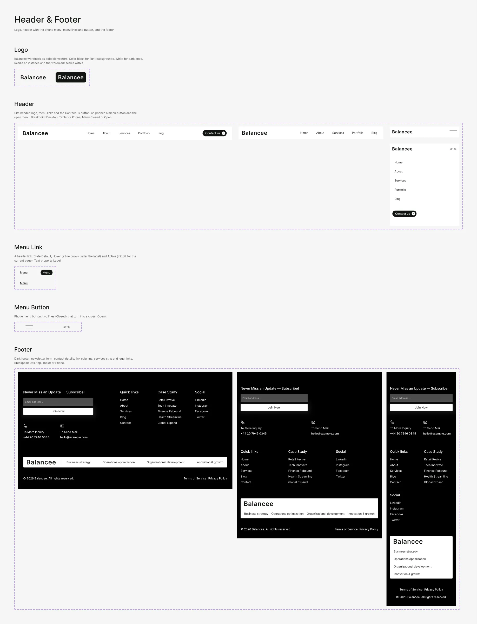
| Component | Variants |
|---|---|
| Logo | Color: Black, White — the Balancee wordmark, as vectors |
| Header | Breakpoint: Desktop, Tablet, Phone × Menu: Closed, Open — the logo, the menu links and the Contact us button; on phones the menu button and the open menu |
| Menu Link | State: Default, Hover, Active — one header link; Active is the ink pill of the current page |
| Menu Button | State: Closed, Open — the phone menu button |
| Footer | Breakpoint: Desktop, Tablet, Phone — the newsletter form, the contact details, quick links, case studies and social links, the services strip and the legal links |
To put your logo everywhere, edit the Logo component once (both variants).
Buttons & Elements
Section titled “Buttons & Elements”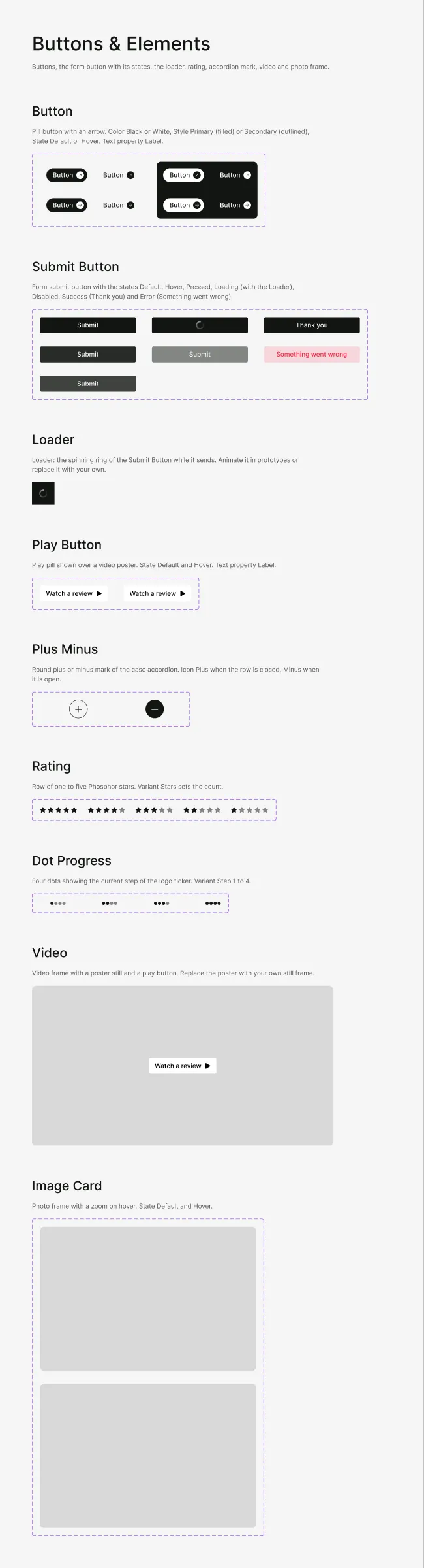
| Component | Variants |
|---|---|
| Button | Color: Black, White × Style: Primary, Secondary × State: Default, Hover — the pill button with its arrow; Secondary is the label alone with an arrow |
| Submit Button | State: Default, Hover, Pressed, Loading, Disabled, Success, Error — the contact form’s send button; Success shows “Thank you”, Error “Something went wrong” |
| Loader | — the ring the Submit button shows while the form sends |
| Play Button | State: Default, Hover — the “Watch a review” pill over a video still |
| Plus Minus | Icon: Plus, Minus — the round mark of the case accordion |
| Rating | Stars: 5, 4, 3, 2, 1 — the stars of the hero rating and the rating testimonial |
| Dot Progress | Step: 1 to 4 — the dots that show the position in a list (the Who We Are cards) |
| Video | — the video still with its play button |
| Image Card | State: Default, Hover — a photo frame with a zoom on hover |
| Component | Variants |
|---|---|
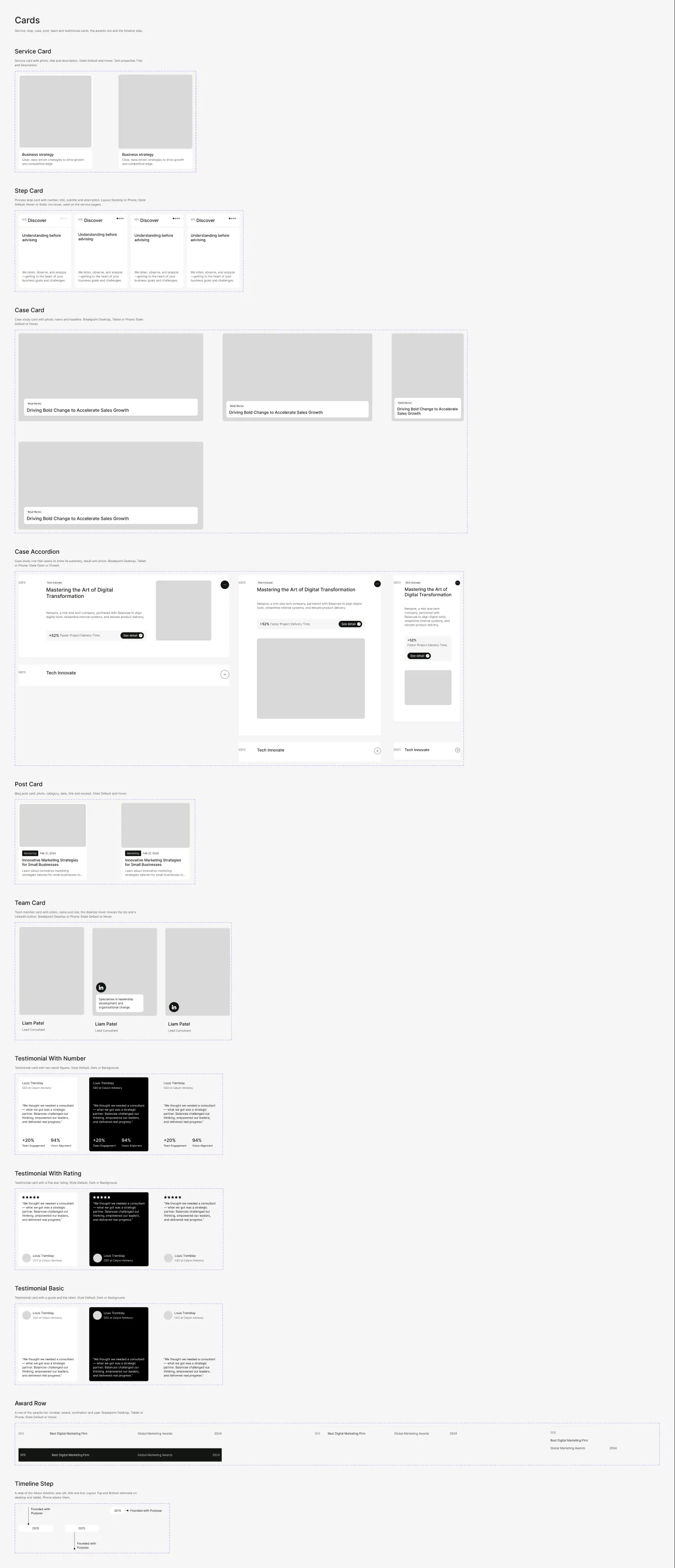
| Service Card | State: Default, Hover — photo, title and description |
| Step Card | Layout: Desktop, Phone × State: Default, Hover, Static — one step of the process: number, title, subtitle and description; Static is used on the Service Detail page |
| Case Card | Breakpoint: Desktop, Tablet, Phone × State: Default, Hover — photo, case name and headline |
| Case Accordion | Breakpoint: Desktop, Tablet, Phone × State: Open, Closed — a case study row that opens to show summary, result and photo |
| Post Card | State: Default, Hover — photo, category, date, title and excerpt |
| Team Card | Breakpoint: Desktop, Phone × State: Default, Hover — photo, name and role; the desktop hover reveals the bio and the LinkedIn button |
| Testimonial With Number | Style: Default, Dark, Background — a quote with two result figures |
| Testimonial With Rating | Style: Default, Dark, Background — a quote with five stars |
| Testimonial Basic | Style: Default, Dark, Background — a quote and the client |
| Award Row | Breakpoint: Desktop, Tablet, Phone × State: Default, Hover — number, award, nomination and year |
| Timeline Step | Layout: Top, Bottom, Phone — a step of the About timeline |
Sections
Section titled “Sections”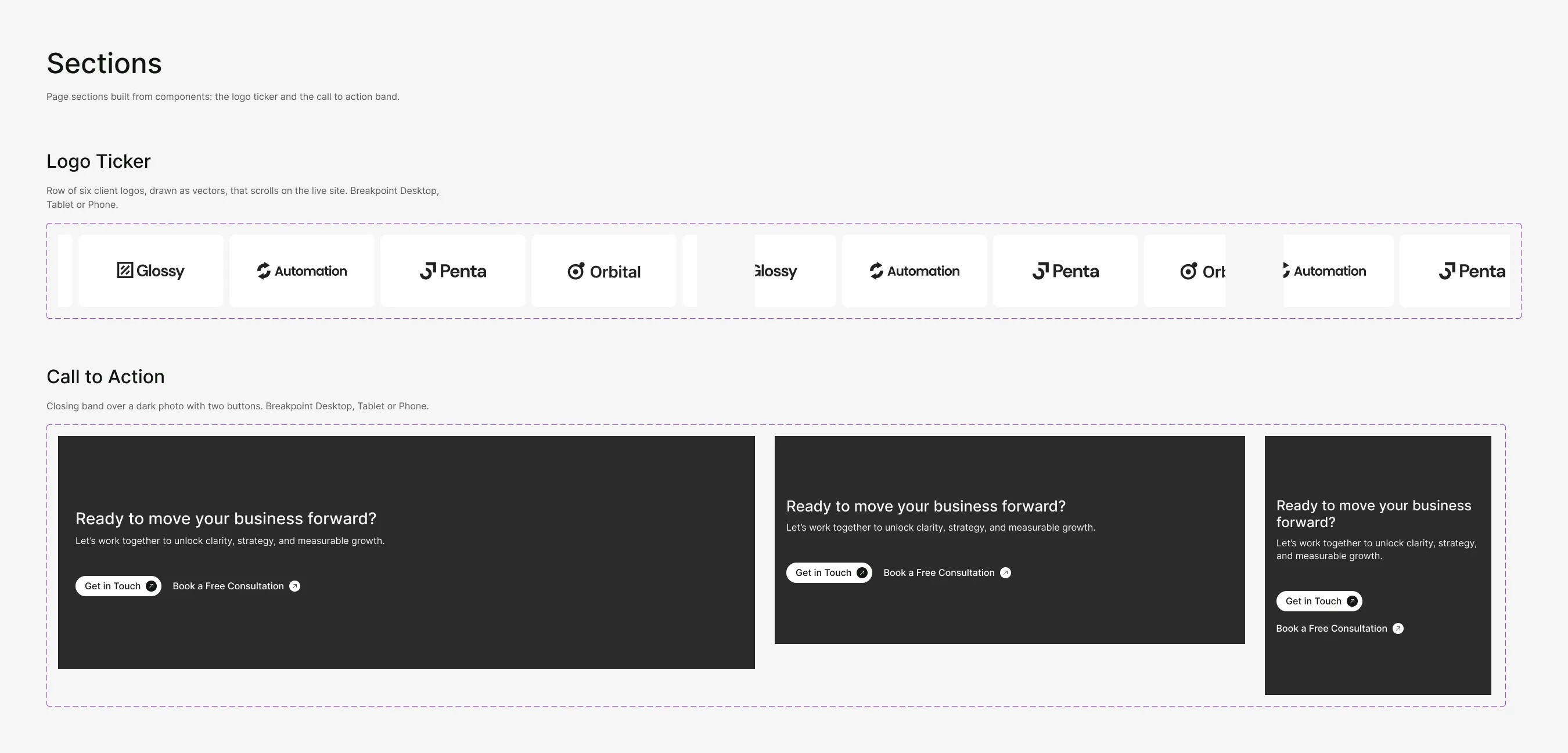
| Component | Variants |
|---|---|
| Logo Ticker | Breakpoint: Desktop, Tablet, Phone — six client logos, drawn as vectors |
| Call to Action | Breakpoint: Desktop, Tablet, Phone — the closing band over a dark photo with two buttons |
The White variants (Logo, Button) sit on a dark backdrop on their board; the backdrop is not part of the component.