Design — Marai Neesu HTML
Marai Neesu is styled with Tailwind CSS classes and a few colour, font and breakpoint tokens. Most changes are HTML edits; a new colour or font needs a CSS rebuild.
How the styling works
Section titled “How the styling works”The pages are styled with Tailwind CSS classes written in the HTML
(class="flex flex-col gap-2.5 text-black/80"). assets/css/style.css contains exactly the classes the pages use,
generated from src/css/style.css.
That means two kinds of change:
| Change | Rebuild the stylesheet? |
|---|---|
| Move, copy or delete elements; use classes that already appear somewhere in the site | No |
Change a colour, the font, a breakpoint; use a class that appears nowhere yet (say mt-7) |
Yes |
Rebuilding the stylesheet
Section titled “Rebuilding the stylesheet”Once, install the tools (needs Node.js 20 or newer):
npm installThen, after a change:
npm run build:css # one buildnpm run watch:css # rebuilds on every save while you workBoth write assets/css/style.css. The build scans the .html files in the root folder and one folder down
(project/, product/, blog/), and assets/js/main.js, so a class you add there is picked up. Upload the new
style.css with your pages.
Colours
Section titled “Colours”In src/css/style.css:
@theme { --color-black: #050505; /* text, the filled buttons and pills, the current menu link */ --color-grey: #9fa0a3; /* the place under the logo, the rolling roles */ --color-accent: #fc5000; /* every hover colour, the e-mail's second copy, the stars */ --color-background: #f6f6f6; /* the page, the header and the footer; labels on black buttons */ --color-white: #ffffff; /* the tick of a checkbox, the sending ring, text over a post's cover */ --color-available: #1fb514; /* the dot of the CV's "Available for work" */ --color-error: #ff2244; /* at 15 %: the Submit button's fill after a failed send */}Each name becomes a class (bg-black, text-grey, hover:text-accent). Change the values, rebuild, and the whole site
follows: the hovers that the script animates read the same colours (var(--color-accent), …), so they follow too. A
few hover colours are written as numbers in the data-motion of the cards and the FAQ (rgba(5,5,5,0.03) is Black at
3 %); they change with a find and replace in files.
Most greys are Black at an opacity, written as a modifier on the colour: black/80 (descriptions, leads, card text),
black/60 (meta lines, placeholders, a focused field’s border), black/30 (the veil over a post’s cover), black/10
(dividers, field borders), black/5 and black/3 (card hairlines and surfaces, field fills). white/50 is the frosted
pill of the header. They follow the palette when you change the colour.
Accent is the colour of hovers. On the Background it reads at about 3.1 : 1, which is fine for a hover, the stars and large text but not for running text; a darker accent reads better. Keep text on its background at 4.5 : 1 or more, so it stays readable: Black on Background reads at about 19 : 1.
A few colours sit outside the tokens:
| Colour | Where |
|---|---|
| The sample client logos, drawn in a mid grey | assets/images/client-*.svg |
| The social logos, in each network’s colours | assets/images/social-*.svg |
| The swatches of the style guide repeat the hex values as text | style-guide.html |
Logo and icons
Section titled “Logo and icons”The logo is not a drawing: it is the avatar (assets/images/avatar.png, shown round, 34 px), the name (“Marai Neesu”)
and the place (“Dubai, UAE”), written in the header of every page. Tablets and phones show it as it is. On desktops it
sits in a frosted pill with a verified seal; under the pointer its lines read “Back to / Homepage” and the seal turns
into an arrow. That second pair of lines is in the logo link too (data-logo-hover): change it with the first
(data-logo-rest), or leave it.
To change the logo, replace avatar.png (180 × 180) and find and replace the name and the place in every page
(Editing the site). To use a picture logo instead, replace the <img> and the
lines inside the logo links of the header.
icon.png (64 × 64) and apple-icon.png (180 × 180) in the root folder are the icons in the browser tab and on a
phone’s home screen: the demo uses the avatar. Replace the files, keeping the names.
The interface icons are inline SVG from Phosphor, drawn on a 256 × 256 grid in the current
text colour. To use another icon, open it on phosphoricons.com, copy its <path d="…"> and paste it in place of the old
one. The arrow of a button turns 45° under the pointer.
Manrope ships in assets/fonts/ as one variable file, manrope-variable.woff2 (weights 200 to 800, upright only),
declared at the top of src/css/style.css:
@font-face{font-family:"Manrope"; src:url("../fonts/manrope-variable.woff2") format("woff2"); font-display:swap; unicode-range:…; font-weight:200 800; font-style:normal; }:root{--font-manrope:Manrope,"Manrope fallback: Arial",sans-serif; }Every page uses it through font-sans on the <body>. The displays, the paragraphs and the text typed into a field are
set in weight 400, the headings, labels, the menu and the buttons in 500, and bold words in a post or a project in 700.
To use another font:
- Put its
.woff2files inassets/fonts/. - Change the
@font-facerule (font-familyandsrc) and the first name in--font-manrope. A font that isn’t variable needs one@font-facerule per weight file (400, 500 and 700). - Rebuild the stylesheet.
The Manrope fallback: Arial rule sizes Arial like Manrope while the font loads; with another font, you can delete it
and its name in --font-manrope. The font file covers Western European languages (the rule’s unicode-range); for
other alphabets, use files that include them and remove the unicode-range. Fonts from
Google Fonts can be downloaded as files with https://gwfh.mranftl.com, so they are served
from your own domain, which is faster and needs no consent banner.
Sizes and spacing
Section titled “Sizes and spacing”Text sizes are classes with a phone value first and the tablet (md:) and desktop (lg:) values after:
text-[22px] md:text-[24px] lg:text-[26px]. The style guide lists all fifteen text styles:
| Style | Phone | Tablet | Desktop | Weight | Used for |
|---|---|---|---|---|---|
| Display 01 | 38 | 52 | 64 | 400 | The Home hero’s title |
| Display 02 | 24 | 36 | 42 | 400 | A post’s title, the 404 title |
| Heading 1 | 24 | 26 | 28 | 500 | Inner page titles, a product’s name, the footer’s call to action |
| Heading 2 | 22 | 24 | 26 | 500 | Section titles, a product’s Overview |
| Heading 3 | 20 | 22 | 24 | 500 | The newsletter’s title, a post’s headings, the course’s block titles |
| Heading 4 | 20 | 21 | 22 | 500 | The footer’s links, the course banner’s title, the CV’s block titles |
| Heading 5 | 18 | 19 | 20 | 500 | Service and product card titles, FAQ questions, experience titles |
| Heading 6 | 16 | 17 | 18 | 500 | Project, post, tool and lesson titles, prices, the footer’s column titles |
| Heading 6 Small | 14 | 14 | 14 | 500 | The name in the logo, the labels on a post’s cover, the CV’s subtitles |
| Big Paragraph | 18 | 18 | 18 | 400 | A post’s text, testimonial names |
| Medium Paragraph | 16 | 16 | 16 | 400 | Leads, descriptions, rich text, form labels, breadcrumbs |
| Small Paragraph | 14 | 14 | 14 | 400 | Card meta, chips, roles |
| Tiny Paragraph | 12 | 12 | 12 | 400 | The place under the name in the logo |
| Menu | 13 | 13 | 13 | 500 | The header’s links (0.03em apart) |
| Button | 12 | 12 | 12 | 500 | Button labels and links with an arrow, in capitals |
The headings have a line height of 1.2; the paragraphs 1.4, apart from Small and Tiny (1.2); the buttons 1.1. The text typed into a field is 16 px, weight 400.
Spacing uses Tailwind’s scale (4 px per step, so gap-5 is 20 px) or exact values in brackets (gap-[50px]). Content
is at most 1200 px wide (max-w-[1200px]), with 20, 30 and 40 px at the sides, and most sections have 40 / 50 / 50 px
above and below and 50 px between their blocks. Corners are 10 px on cards, card photos and the post cover, 8 px on the
testimonial, experience, tool and FAQ cards, 4 px on form fields, checkboxes and product buttons, and 2 px on the social
tiles and the FAQ’s plus box; buttons, pills, the avatar and dots are round. Shadows are kept for hovers: a black button,
a post card and a service card lift under the pointer, and the Go Back pill always floats on one.
| Width | Prefix | |
|---|---|---|
| Phone | below 810 px | (none) |
| Tablet | 810–1199 px | md: |
| Desktop | 1200 px and up | lg: |
max-md: and max-lg: apply below those widths.
Components
Section titled “Components”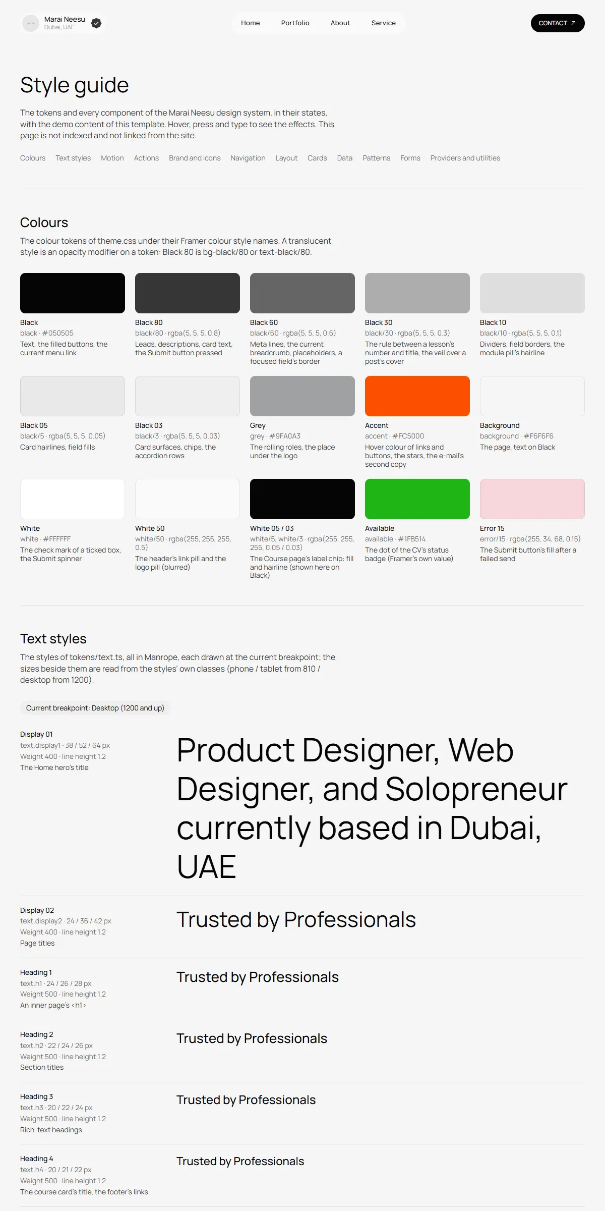
style-guide.html shows the colours, the text styles, the springs of the motion (press a track to try one), the actions
(buttons, links, the e-mail, the product buttons, Go Back), the logo and the icons, the navigation, the layout, the
cards (project, post, service, product, the course banner, module, experience, tool, testimonial), the data rows of the
CV, the patterns (the FAQ, rich text) and the forms with their button’s states, each with its name. To reuse one, copy
its markup from there or from the page that shows it.
Elements with data-… attributes are wired to the site script, so keep those attributes when you copy them:
data-header, data-header-fade, data-header-links, data-menu-toggle, data-phone-menu, data-logo-swap,
data-hover, data-motion, data-transition, data-word-roll, data-social-tiles, data-ticker,
data-ticker-root, data-service-card, data-card-slideshow, data-accordion-button, data-module-button,
data-load-more, data-go-back, data-form, data-local-time, data-current-year, …
Motion
Section titled “Motion”Nothing rises or fades in as the page loads or scrolls, and following a link simply opens the next page, as on the
original design. What moves is in assets/js/main.js, set by a few attributes in the HTML:
| Effect | Where |
|---|---|
| Hovers on buttons, links, the logo and the cards | data-hover on the element, and data-motion on its parts: the rest and hover values the script moves between. data-transition picks the spring: "spring" (S1, the default), "flat" (S2), "roll" (S3) or "instant", or one per state ({"rest":{"width":"instant"},"hover":"spring"}: an underline that grows with a spring and vanishes at once). |
| The roles under the name roll every 4 s | data-word-roll="4" (Editing the site) |
| The testimonials move left at 10 px a second, the client logos at 20, the service photos at 5 | data-ticker="10", "20", "5" on the moving row; the gap is the row’s gap-… class |
| The service photos roll only under the pointer from tablets up, and always on phones | data-ticker-running="false" on the columns of a card; the script starts them on hover |
| The testimonial slideshow on phones steps every 4 s, and with its arrows | The script (initCardSlideshows) |
| The desktop header fades its background, logo and Contact button after 4 px of scrolling down | The script (initHeader), with S2 |
| The Submit button’s colours change in 0.2 s; its spinner turns once a second | ease-form and animate-turn in src/css/style.css |
The springs are at the top of assets/js/main.js, measured on the original design:
| Name | In the script | Values | Used by |
|---|---|---|---|
| S1 | spring |
0.4 s, bounce 0.2 | Nearly every hover: buttons, links, the logo, the social tiles, the post and service cards |
| S2 | springFlat |
0.4 s, no bounce | The header’s scroll look, the phone menu, the project and product cards, the FAQ |
| S3 | springRoll |
0.5 s, no bounce | The e-mail’s roll |
| SL | slideSpring |
stiffness 200, damping 40, mass 1 | The rolling roles and the testimonial slideshow |
Reduced motion
Section titled “Reduced motion”With “reduce motion” switched on in the visitor’s system, movement is left out: the tickers stand still, the rolling roles and the slideshow step without sliding, things that move or grow on hover take their place at once, and the Submit spinner stands still. Colour changes and fades stay.