Design — Kendi HTML
Kendi is styled with Tailwind CSS classes and a few colour, font and breakpoint tokens. Most changes are HTML edits; a new colour or font needs a CSS rebuild.
How the styling works
Section titled “How the styling works”The pages are styled with Tailwind CSS classes written in the HTML
(class="flex flex-col gap-2.5 text-grey"). assets/css/style.css contains exactly the classes the pages use,
generated from src/css/style.css.
That means two kinds of change:
| Change | Rebuild the stylesheet? |
|---|---|
| Move, copy or delete elements; use classes that already appear somewhere in the site | No |
Change a colour, a font, a breakpoint; use a class that appears nowhere yet (say mt-7) |
Yes |
Rebuilding the stylesheet
Section titled “Rebuilding the stylesheet”Once, install the tools (needs Node.js 20 or newer):
npm installThen, after a change:
npm run build:css # one buildnpm run watch:css # rebuilds on every save while you workBoth write assets/css/style.css. The build scans the .html files in the root folder and one folder down (blog/,
category/, author/, legal/), and assets/js/main.js, so a class you add there is picked up. Upload the new
style.css with your pages.
Colours
Section titled “Colours”In src/css/style.css:
@theme { --color-black: #000000; /* headings, links, buttons */ --color-grey: #3d3d3d; /* body copy, meta, labels, the hover colour of titles and menu links */ --color-white: #ffffff; /* cards, the header */ --color-paper: #f5f5f5; /* the page background, the newsletter band */ --color-line: #dedede; /* hairlines: fields, the footer rule, the menu divider, the checkbox */ --color-charcoal: #333333; /* the submit button's hover and pressed fill */ --color-error: #ff2244; /* "Something went wrong" (its fill is the same red at 15 %) */ --color-focus: #5a5a5a; /* the hairline of a focused form field */ --color-spinner: #999999; /* the ring of the loader on Articles */}Each name is used in classes: bg-paper, text-grey, border-line. Change a value and rebuild the stylesheet, and
every page follows. Kendi is black and white by design: a brand colour usually goes into black (buttons, pills,
links) or the page background paper. Faded colours are opacity modifiers on a token: black/50 is the veil on the
category tiles, black/30 and black/80 the veils on photos with text. Keep body text on its background at 4.5 : 1 or
more: Grey on Paper is about 10 : 1 in the demo.
Logo and icons
Section titled “Logo and icons”The logo is an image file, assets/images/logo.svg (340 × 100), shown at 85 × 25 px in the header and the sidebar and
102 × 30 in the footer. Replace the file with yours under the same name (an SVG, or a PNG twice the size shown, then
change the src) and keep its proportions, or change the sizes in its classes (h-[25px] w-[85px]) and rebuild the
stylesheet. It sits on white and on the light grey page, so a dark logo reads everywhere. The logo links carry
aria-label="Kendi": put your magazine’s name there with find and replace in files.
icon.svg and apple-icon.png (180 × 180 px) in the root folder are the icons in the browser tab and on a phone’s home
screen. Replace the files, keeping the names.
The arrows, carets and the calendar are inline SVG from Phosphor, drawn on a 256 × 256 grid
in the current text colour. To use another icon, open it on phosphoricons.com, copy its <path d="…"> and paste it in
place of the old one. The X, Instagram and Facebook marks are the template’s own vectors.
Inter ships in assets/fonts/ as one variable file, inter-variable.woff2, declared at the top of src/css/style.css:
@font-face{font-family:"Inter"; src:url("../fonts/inter-variable.woff2") format("woff2"); font-display:swap; font-weight:100 900; font-style:normal; }:root{--font-inter:Inter,"Inter Fallback",sans-serif; }Every page uses it through font-sans on the <body>. The classes pin Inter’s optical-size axis at 14, its text cut,
for every size ([font-variation-settings:'opsz'_14]), so big headings don’t switch to the display cut. The template
uses the weights 500 (text and buttons) and 600 (headings and the menu).
To use another font:
- Put its
.woff2files inassets/fonts/. - Change the
@font-facerule (font-familyandsrc) and the first name in--font-inter. A font that isn’t variable needs one@font-facerule per weight file (500, 600). - Rebuild the stylesheet.
A font without an optical-size axis simply ignores the font-variation-settings classes. Fonts from
Google Fonts can be downloaded as files with https://gwfh.mranftl.com, so they are served
from your own domain, which is faster and needs no consent banner.
Sizes and spacing
Section titled “Sizes and spacing”Text sizes are classes with a phone value first and the tablet (md:) and desktop (lg:) values after:
text-[30px] md:text-[36px] lg:text-[42px]. The style guide lists every text style:
| Style | Phone | Tablet | Desktop | Used for |
|---|---|---|---|---|
| Heading 1 | 48 | 58 | 72 | The Home hero’s title |
| Heading 2 | 28 | 32 | 34 | Block titles (“Editor’s pick”, “Meet the Team”) |
| Heading 3 | 30 | 36 | 42 | Every page title but Home’s, “Related Post” |
| Rich-text heading | 24 | 26 | 28 | Headings in a post or a legal text |
| Heading 4 | 22 | 22 | 24 | Large card titles, a post’s smaller headings |
| Heading 5 / 6 | 18 / 16 | 18 / 16 | 18 / 16 | Card titles, the sidebar’s titles |
| Menu, Button | 15 | 15 | 15 | The header’s links, buttons |
| Body | 16 | 16 | 16 | Leads, paragraphs, rich text |
| Small | 14 | 14 | 14 | Card text, the meta line, the breadcrumb, labels |
| Tiny | 12 | 12 | 12 | The consent line, the ad’s label |
Breakpoints are 810 px (tablet, md:) and 1200 px (desktop, lg:), in src/css/style.css. Content is at most
1200 px wide; the side padding is 15 px on phones, 20 px on tablets and 30 px on desktops, and most sections have
30 / 40 / 50 px above and below. On desktops, Home and the post pages put a 350 px sidebar 50 px beside the main column;
it stays in view as you scroll, 120 px from the top. Corners are 10 px on cards and photos, 5 px on buttons, pills and
fields.
Components
Section titled “Components”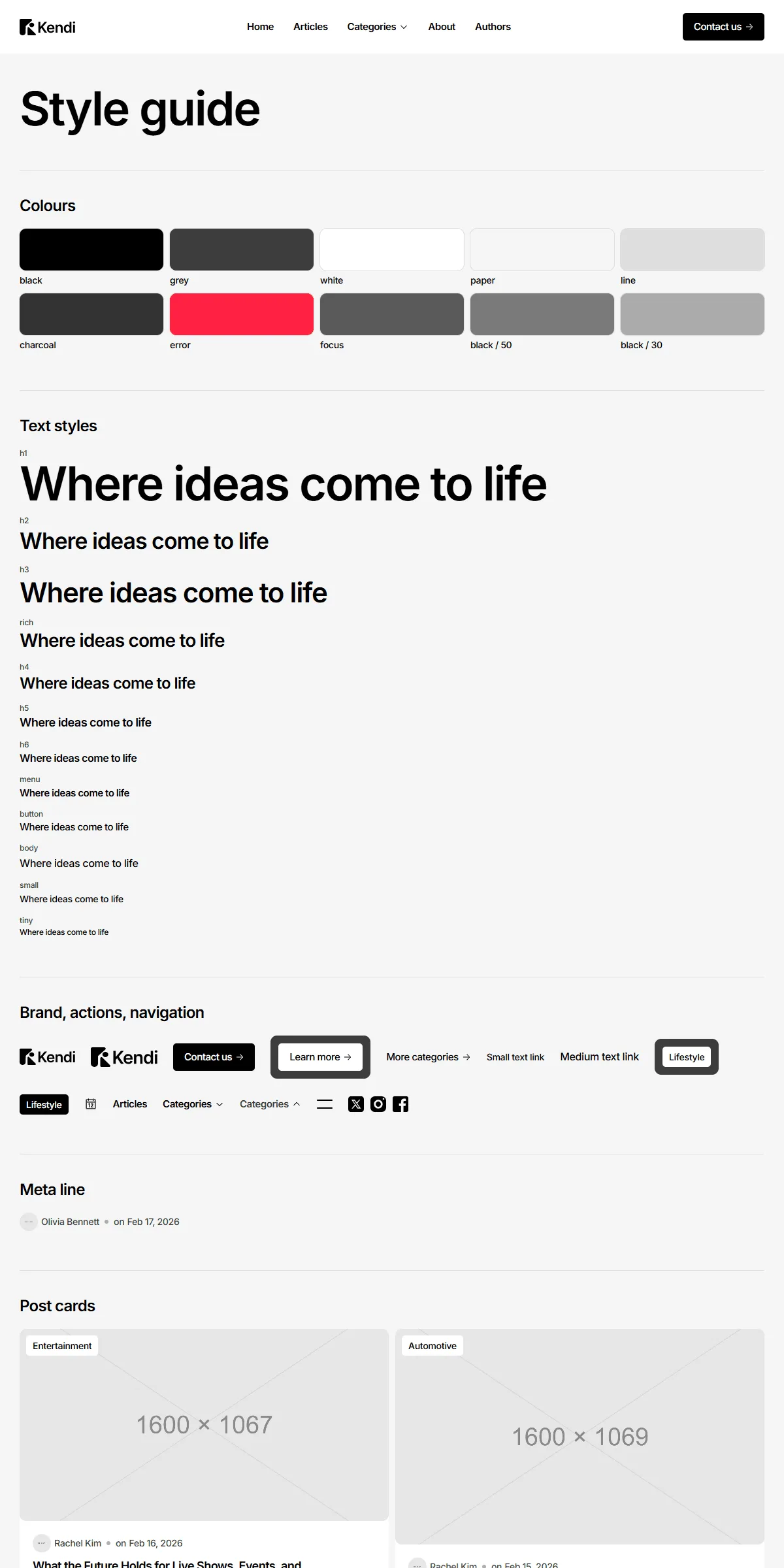
style-guide.html shows the colours, the text styles, the logo, the buttons and links, the menu parts, the meta line,
every post card, the category, team, Instagram and ad cards, the slideshows, the forms with their states and rich text,
each with its name. To reuse one, copy its markup from there or from the page that shows it.
Elements with data-… attributes are wired to the site script, so keep those attributes when you copy them:
data-header, data-hamburger, data-menu-trigger, data-menu-panel, data-categories-menu, data-phone-menu,
data-phone-categories, data-slideshow, data-slides-track, data-slide-step, data-slide-dot,
data-load-on-scroll, data-load-item, data-later, data-form, data-newsletter, data-current-year, … Two-state
looks (the hamburger, the menu trigger, the slideshow dots) carry their classes in data-on and data-off: the script
swaps them.
Motion
Section titled “Motion”The menus, the slideshows and the loader of Articles are in assets/js/main.js; the hovers (photos that grow, labels
that roll up, underlines that grow, arrows that slide) are CSS transitions. A few settings are written in the HTML or
the script:
| Effect | Where |
|---|---|
| The slideshows turn by themselves every 8 seconds | slideInterval in assets/js/main.js |
| How many slides show at once and the gap | data-count and data-gap on the slideshow |
| Articles shows six posts, then six more as the reader scrolls | data-page-size="6" on the list; cards after the first six carry data-later |
| Hovers grow, roll and slide | the classes group-hover/…: with duration-400 ease-spring |
The springs and curves are in src/css/style.css (--ease-spring, --ease-spring-bounce, --ease-spring-slow,
--ease-spring-long, --ease-framer) and in assets/js/main.js.
Reduced motion
Section titled “Reduced motion”With “reduce motion” switched on in the visitor’s system, movement is left out: the slideshows don’t turn by themselves
and the hover movements are switched off (motion-reduce:transition-none). Colour changes stay.