Cerette documentation — AI Prompts
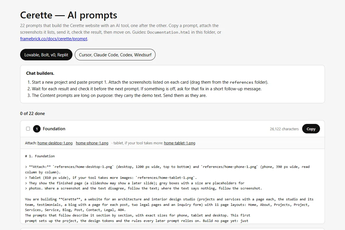
Prompts that build the Cerette website with an AI tool — a chat builder such as Lovable, Bolt, v0 or Replit, or a coding agent such as Cursor, Claude Code, Codex or Windsurf. Read in this order, or jump to what you need.
| Guide | What it covers |
|---|---|
| Getting started | What is in the pack, and building the site prompt by prompt |
| Notes for each tool | Notes for Lovable, Bolt, v0, Replit, Cursor, Claude Code, Codex and Windsurf |
| Making it yours | Your studio’s name and text, projects, services, testimonials, the team, posts and legal pages, photos, the hero video, logo, colours and fonts; adding and removing items and pages |
| The inquiry form | Receiving the project inquiries |
| Publishing | Putting the site online with your own domain |
| Troubleshooting and questions | When the result drifts from the design, and other questions |
In a hurry
Section titled “In a hurry”- Open
Prompts.htmlfrom the download in your browser. - Pick your kind of tool at the top: chat builder or coding agent.
- Chat builder: start a new project and send prompt 1 with the screenshots it lists; wait, check, send the next one.
Coding agent: copy the pack into your project as
cerette/and send the kickoff prompt. - After the last prompt, replace the demo text in
src/content/, add your photos topublic/images/and your own hero video (Making it yours). - Connect the inquiry form (The inquiry form), then publish from your tool and set your domain (Publishing).
What you get
Section titled “What you get”- 22 prompts in order: foundation (stack, design tokens, rules and the icons), components, header and footer, the demo content, the pages — one prompt for each of the 11 page layouts, Home in two parts — and a finishing prompt for titles, sharing images, sitemap and a last check.
- The whole site: Home, About, Projects, a page for every project, Services, a page for every service, Blog, a page for every post, Contact with its inquiry form, the Privacy Policy and Terms of Service, and 404 — with the full-screen hero film, the header that turns solid as you scroll past a dark hero, titles that rise letter by letter or word by word, blocks that rise into view, the services switcher (tabs on larger screens, an accordion on phones), the team picker with its sticky portrait, a project’s sticky photos, the card photos that settle on hover, the rolling button labels and the blog that loads more posts as you scroll.
- The design in numbers: every section’s layout at phone (390), tablet (810) and desktop (1200) width, text styles, colours, spacing and motion — the specification the Cerette Next.js, Astro and HTML templates are built from.
- Reference screenshots of every page layout at desktop (1200 px), tablet (810 px) and phone (390 px) width, to attach to the prompts: 101 images.
- All the demo content as JSON: site details, page copy, the inquiry forms, 6 projects, 6 services, 6 testimonials, 12 team members, 12 posts and 2 legal pages — ready to replace with your own.
- Placeholder images at the size each photo is designed for (103 of them), the grain texture, 10 icons and the browser tab icons.
Getting help
Section titled “Getting help”- Your licence terms: License.
- What changed in each release: Changelog.
- Support and updates: https://framebrick.co/support.
- Want it done for you? Marcframe, the studio behind this template, updates templates to your needs, builds custom templates and designs new sites. It’s also on Contra.