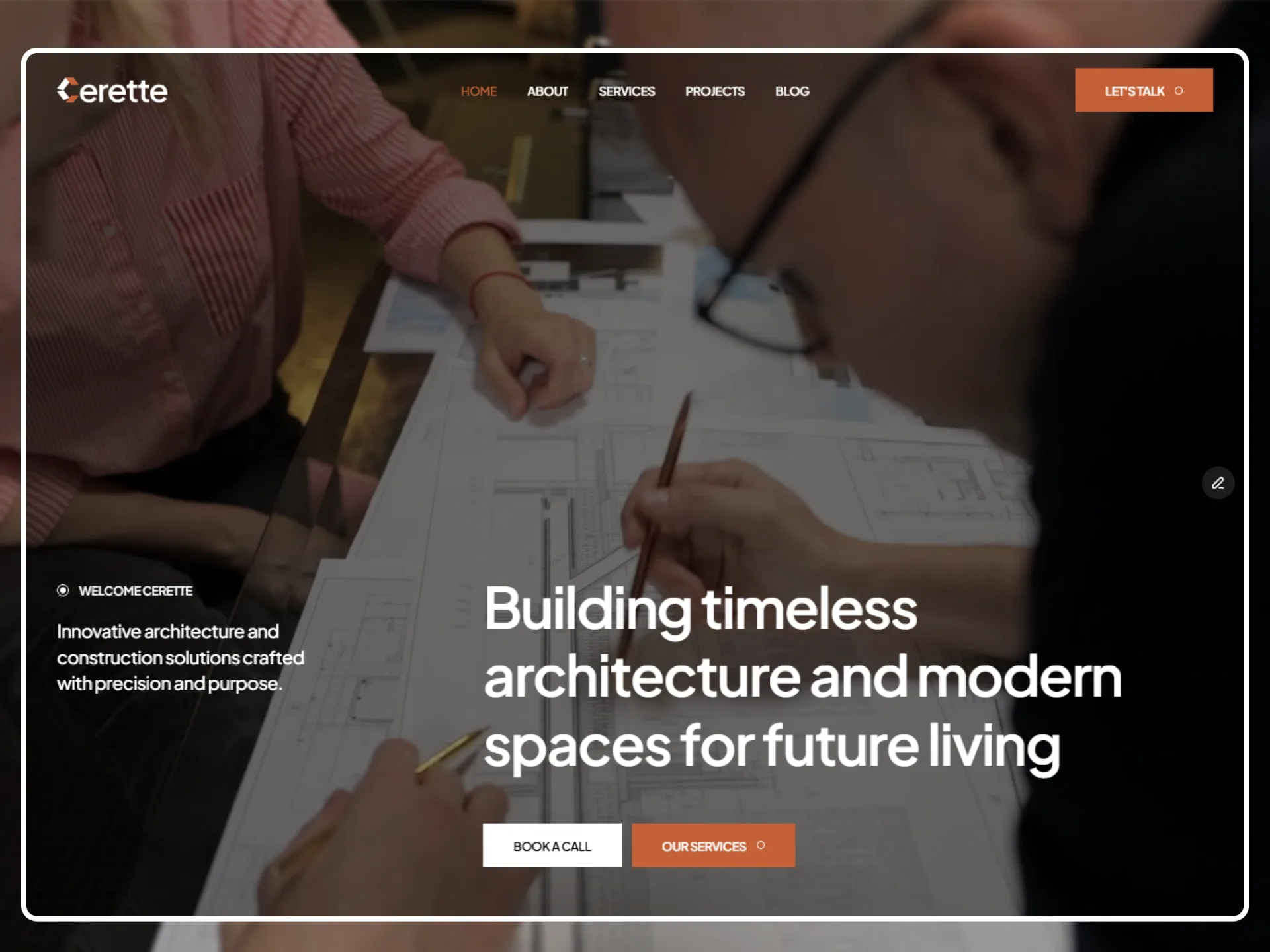
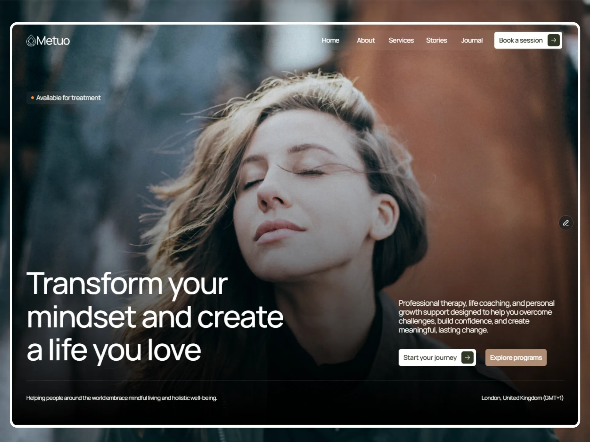
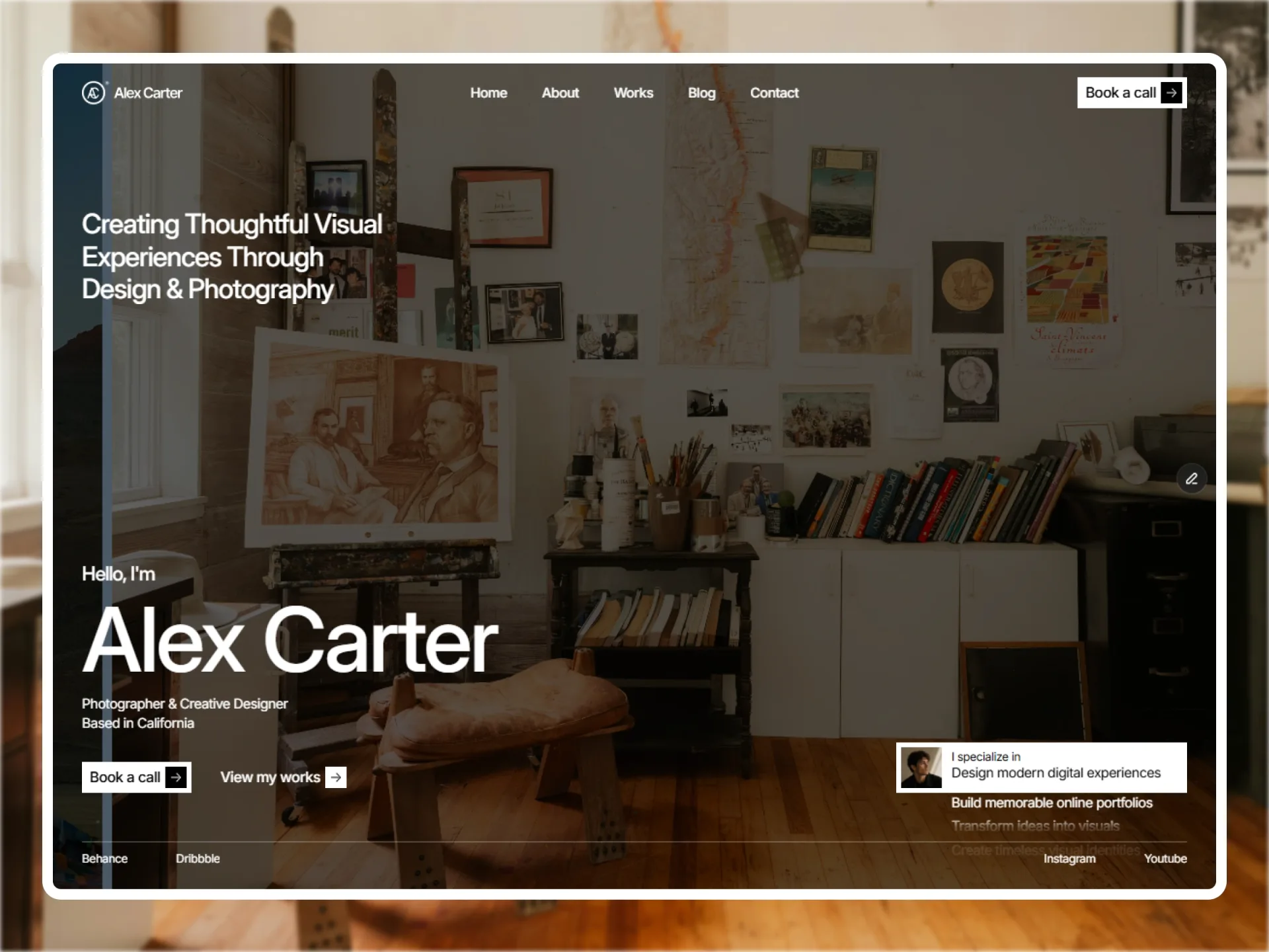
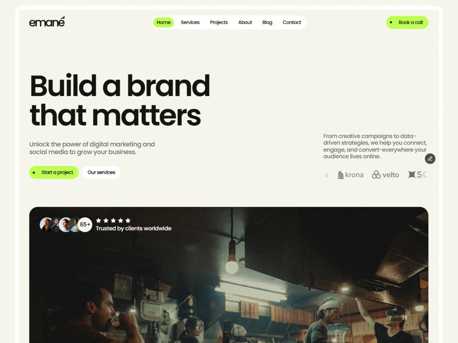
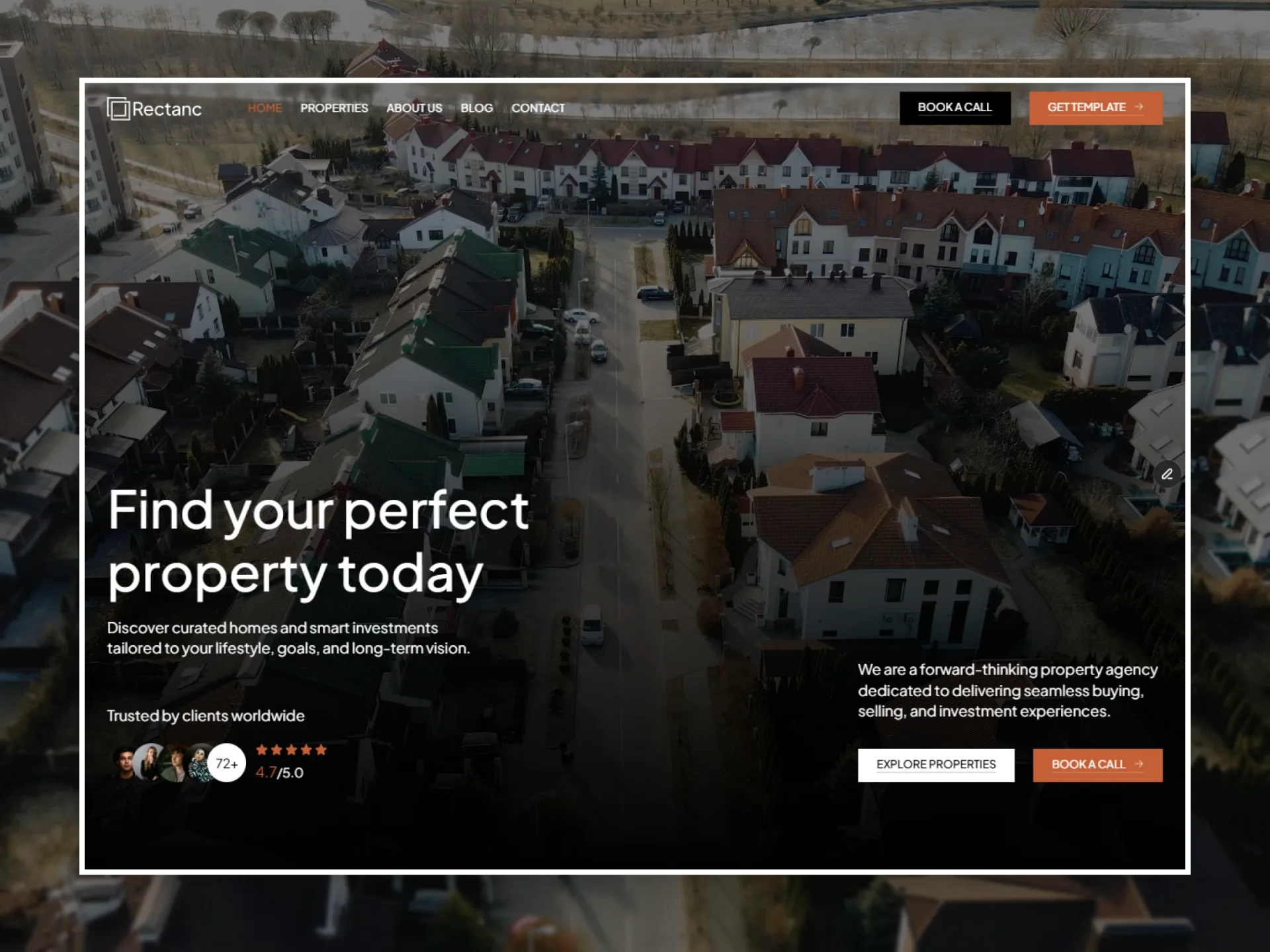
Default, a sample theme of Framebrick Blocks: shadcn/ui neutral, Geist, 0.625rem radius — how every block ships.
The style
Default, a sample theme of Framebrick Blocks: shadcn/ui neutral, Geist, 0.625rem radius — how every block ships.
Every colour, size and corner is a CSS variable in app/globals.css — the shadcn/ui variables (--background, --primary, --muted-foreground…), --radius, and the Framebrick block tokens (--text-display, --text-h1, --text-h2, --text-h3, --text-lead, --section-y, --gutter, --container). Use them through Tailwind's classes (bg-primary, text-muted-foreground, rounded-xl, text-h2, py-(--section-y), px-(--gutter), max-w-(--container)), never as literal values: the theme can then change in one file, and dark mode follows the .dark class.
Colours
background#FFFFFF · dark #0A0A0Abackground · neutralThe page and every section that has no tone of its own.
foreground#0A0A0A · dark #FAFAFAforegroundText on the page: headings, body text, icons.
card#FFFFFF · dark #171717card · surfaceCards that stand apart from a muted band: testimonial and story cards.
card-foreground#0A0A0A · dark #FAFAFAcard-foreground · on-surfaceText on a card.
popover#FFFFFF · dark #171717popoverMenus and dialogs.
popover-foreground#0A0A0A · dark #FAFAFApopover-foregroundText in a menu or dialog.
primary#171717 · dark #E5E5E5primaryThe accent: filled buttons, the chosen tab, a progress bar, the current item, icon squares.
primary-foreground#FAFAFA · dark #171717primary-foreground · on-primaryText and icons on primary.
secondary#F5F5F5 · dark #262626secondarySecondary buttons and quiet fills.
secondary-foreground#171717 · dark #FAFAFAsecondary-foreground · on-secondaryText on secondary.
muted#F5F5F5 · dark #262626mutedCards, chips and panels inside a section (the blocks' most common surface).
muted-foreground#737373 · dark #A1A1A1muted-foreground · on-surface-variantSecondary text on the page and on cards: leads, descriptions, meta, labels.
accent#F5F5F5 · dark #262626accentHover fills of ghost and outline buttons and menu items; a tint of the primary colour.
accent-foreground#171717 · dark #FAFAFAaccent-foregroundText on accent.
destructive#E7000B · dark #FF6467destructive · errorErrors: a failed form send, a required field's mark.
border#E5E5E5 · dark rgba(255, 255, 255, 0.1)border · outlineHairlines between rows, card and field borders, dividers.
input#E5E5E5 · dark rgba(255, 255, 255, 0.15)inputForm field borders.
lead 20px · 400 · 1.6Build a site that feels designed
body 16px · 400 · 1.5Build a site that feels designed
small 14px · 400 · 1.43Build a site that feels designed
label 14px · 500 · 1.43Build a site that feels designed
caption 12px · 400 · 1.33Build a site that feels designed
Corners
sm · 6px
md · 8px
lg · 10px
xl · 14px
full · 9999px
Spacing
section-y · 128px
section-y-phone · 64px
gutter · 40px
gutter-phone · 20px
container · 1280px
Parts
Get startedContact usGet startedGet started
chip
Framebrick Blocks — Default
A card in its own colours and corners.
Framebrick Blocks — Default
A card in its own colours and corners.
Drawn from the file’s component tokens.
Do's and don'ts
use the theme's variables through their classes (bg-primary, text-muted-foreground, rounded-xl, text-h2); never write a colour, a font size or a radius as a literal value.
give a new section py-(--section-y) and a mx-auto max-w-(--container) px-(--gutter) container, and no outer margin.
give each section one h2 (the page has one h1, in its hero), and set headings in font-heading font-semibold tracking-tight.
keep primary for what the visitor should act on: one filled button per group, the second one outlined.
use text-foreground/65 for secondary text on muted, text-muted-foreground on background and card.
check both modes: every colour has a .dark value, and a section can take .dark on its own.
add shadows, gradients or colours of your own; the palette above is the whole palette.
put type-scale classes (text-h2) and a text colour in the same cn() call: tailwind-merge reads both as colours and drops one. Keep the type classes in a plain string.
mix fonts beyond the ones named above.
Use it with the blocks
Default is one of the four sample themes of Framebrick Blocks: whole page sections that read the shadcn tokens, so one theme restyles every block. See them in this theme on any block page, or compose a page in the builder and pick it there.