Design — Lookis HTML
Lookis is styled with Tailwind CSS classes and a few colour, font and breakpoint tokens. Most changes are HTML edits; a new colour or font needs a CSS rebuild.
How the styling works
Section titled “How the styling works”The pages are styled with Tailwind CSS classes written in the HTML
(class="flex flex-col gap-2.5 text-ink/80"). assets/css/style.css contains exactly the classes the pages use,
generated from src/css/style.css.
That means two kinds of change:
| Change | Rebuild the stylesheet? |
|---|---|
| Move, copy or delete elements; use classes that already appear somewhere in the site | No |
Change a colour, a font, a breakpoint; use a class that appears nowhere yet (say mt-7) |
Yes |
Rebuilding the stylesheet
Section titled “Rebuilding the stylesheet”Once, install the tools (needs Node.js 20 or newer):
npm installThen, after a change:
npm run build:css # one buildnpm run watch:css # rebuilds on every save while you workBoth write assets/css/style.css. The build scans the .html files in the root folder and one folder down
(portfolio/, services/), and assets/js/main.js, so a class you add there is picked up. Upload the new
style.css with your pages.
Colours
Section titled “Colours”In src/css/style.css:
@theme { --color-ink: #000000; /* text, the black buttons, label dots */ --color-line: #ececec; /* dividers and borders */ --color-paper: #fafafa; /* the page, the header, the footer card, text on photos */ --color-spinner: #999999; /* the ring of the loading spinner */ --color-error: #ff2244; /* the Submit button's error label */ --color-error-fill: rgb(255 34 68 / 0.15); /* the Submit button's fill after a failed send */}Each name becomes a class (bg-ink, text-paper, border-line). Change the values, rebuild, and the whole site
follows. The palette is black on an off-white page, with the photos carrying the colour: Ink on Paper reads at about
20 : 1. Keep text on its background at 4.5 : 1 or more, so it stays readable.
The greys are opacity modifiers on Ink, so they follow it when you change it:
| Class | Used for |
|---|---|
ink/80 |
Roles, answers, prices, the section labels |
ink/60 |
The footer’s column labels |
ink/50 |
The question numbers, a focused field’s border, the veil over the testimonials photo |
ink/30 |
Outlined circles and pills, the fields’ placeholder text |
ink/20 |
The slideshow’s arrows |
ink/2 |
The fill of the cards: awards, services, the contact form |
A few colours sit outside the tokens:
| Colour | Where |
|---|---|
The logo as a black file (logo.svg) |
assets/images/ (the pages draw the logo inline; this one is for use elsewhere) |
| The browser icons for light and dark browser themes, and the home-screen icon | icon-light.png, icon-dark.png, apple-icon.png |
| The swatches of the style guide repeat the hex values as text | style-guide.html |
Logo and icons
Section titled “Logo and icons”The logo, the “Daniel Mercer” wordmark on two lines, is an <svg viewBox="0 0 330 162"> drawing inside the logo link
of the header in every page. Its shapes are filled with currentColor, so it takes the text colour. To use your own,
replace the <svg>…</svg> with your logo’s, keeping aria-hidden="true" and class="block size-full" on it and
fill="currentColor" on its shapes. VS Code’s Replace in Files does every page at once: turn on regular
expressions (.*), search for
<svg viewBox="0 0 330 162"(.|\n)*?</svg\s*>and replace it with your <svg> on one line. Then replace aria-label="Lookis" on the link with your name.
The logo is 72 × 35 px, and 62 × 30 on phones: the link carries aspect-[330/162] and w-[62px] md:w-[72px]. For a
logo of other proportions, change the aspect ratio to your artwork’s size, and rebuild the stylesheet if the class is
new.
icon-light.png and icon-dark.png (180 × 180 px) are the icons in the browser tab, for light and dark browser themes;
apple-icon.png (180 × 180) is the icon on a phone’s home screen. Replace the files, keeping the names.
The interface icons are inline SVG from Phosphor: the arrow-up-right of the links, the
service rows and cards, and the plus of the questions, drawn on a 256 × 256 grid in the current text colour. To use
another icon, open it on phosphoricons.com, copy its <path d="…"> and paste it in place of the old one. The
slideshow’s arrows are drawn for the template.
Inter ships in assets/fonts/ as one variable file, inter-variable.woff2 (upright only), declared at the top of
src/css/style.css:
@font-face{font-family:"Inter"; src:url("../fonts/inter-variable.woff2") format("woff2"); font-display:swap; unicode-range:…; font-weight:100 900; font-style:normal; }:root{--font-inter:Inter,"Inter fallback: Arial",sans-serif; }Every page uses it through font-sans on the <body>. Text is set in weight 400; the name in the Home hero and the
header’s clock in 500. The classes pin Inter’s optical size to 14 ([font-variation-settings:'opsz'_14]), so large
headings keep the same cut as the text. An italic word is the browser’s slanted version of the regular font.
To use another font:
- Put its
.woff2files inassets/fonts/. - Change the
@font-facerule (font-familyandsrc) and the first name in--font-inter. A font that isn’t variable needs one@font-facerule per weight file (400 and 500). - Rebuild the stylesheet.
A font without an optical-size axis simply ignores the font-variation-settings classes. The Inter fallback: Arial
rule sizes Arial like Inter while the font loads; with another font, you can delete it and its name in
--font-inter. The font file covers Western European languages (the rule’s unicode-range); for other alphabets, use
files that include them and remove the unicode-range. Fonts from Google Fonts can be
downloaded as files with https://gwfh.mranftl.com, so they are served from your own domain, which is faster and needs
no consent banner.
Sizes and spacing
Section titled “Sizes and spacing”Text sizes are classes with a phone value first and the tablet (md:) and desktop (lg:) values after:
text-[28px] md:text-[38px] lg:text-[48px]. The style guide lists every text style:
| Style | Phone | Tablet | Desktop | Used for |
|---|---|---|---|---|
| Display | 60 | 100 | 150 | The name ticker in the Home hero |
| H1 | 30 | 40 | 54 | Page titles |
| H1 (small) | 24 | 26 | 28 | The Home hero’s introduction |
| H2 | 28 | 38 | 48 | Section titles, the big numbers |
| H3 | 26 | 30 | 36 | “Overview”, “Project Gallery”, “Perfect for”, the titles beside the page photo, the form’s title |
| H4 | 22 | 26 | 30 | A service’s price, “404” |
| H5 | 20 | 24 | 28 | Card and row titles, the questions, the footer’s “Let’s Connect” |
| H6 | 20 | 22 | 24 | Quotes, the award titles, the numbered lines of a service |
| Big paragraph | 18 | 18 | 18 | Leads, descriptions, rich text, the footer’s links |
| Paragraph | 16 | 16 | 16 | Card text, small print |
| Menu | 16 | 16 | 16 | The header’s links and clock, button labels |
| Label | 12 | 12 | 12 | The small labels with a dot above section titles (upper case) |
There is no letter spacing. The display line height is 1, H1 to H3 1.1, the other headings and the menu 1.2, the paragraphs 1.4.
Spacing uses Tailwind’s scale (4 px per step, so gap-5 is 20 px) or exact values in brackets (gap-[50px]). Content
is at most 1728 px wide (max-w-[1728px]), with 10, 20 and 30 px at the sides, most sections have 40 / 60 / 80 px
above and below, and a section’s blocks sit 50 px apart. Corners are 10 px on photos and cards, 4 px on the form’s
fields and button, the service rows’ photos and the clients’ photos; buttons, pills and arrow circles are round. There
are no drop shadows: borders are drawn as thin lines.
| Width | Prefix | |
|---|---|---|
| Phone | below 810 px | (none) |
| Tablet | 810–1199 px | md: |
| Desktop | 1200 px and up | lg: |
max-md: and max-lg: apply below those widths.
Components
Section titled “Components”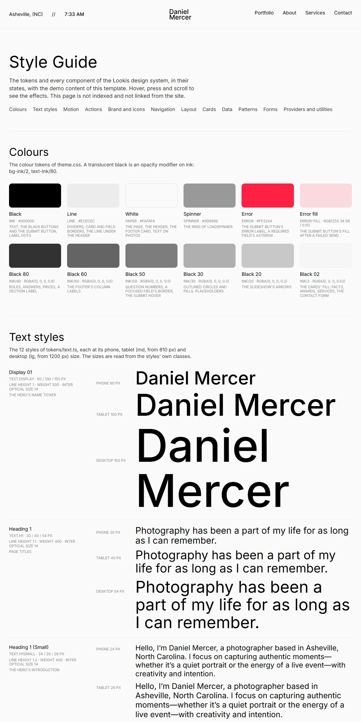
style-guide.html shows the colours, the text styles, the motion, the actions (buttons and links), the logo and the
icons, the navigation, the layout, the cards (project, service row and card, testimonial, award), the numbers, the
patterns (the ticker, the words, the slideshow, the FAQ, the gallery, loading on scroll, rich text) and the form with its
button’s states, each with its name. To reuse one, copy its markup from there or from the page that shows it.
Elements with data-… attributes are wired to the site script, so keep those attributes when you copy them:
data-header, data-hamburger, data-phone-menu, data-clock, data-ticker, data-word-appear, data-word,
data-hover, data-motion, data-stages, data-variants, data-slider, data-portfolio, data-portfolio-tab,
data-portfolio-item, data-load-spinner, data-faq-toggle, data-on, data-off, data-form,
data-current-year, …
Motion
Section titled “Motion”The ticker, the words, the hovers of buttons and links, the phone menu, the slideshow, the filter and the FAQ are in
assets/js/main.js; the hovers of the cards, rows and gallery tiles are CSS. There are no scroll or page-change
animations: the Home introduction is the only one that plays on load. A few settings are written in the HTML:
| Effect | Where |
|---|---|
| The name in the Home hero runs left at 30 px a second, without slowing under the pointer | data-ticker="30" on the ticker row, and data-ticker-steady on the box around it |
| The words of the introduction come out of a blur and rise 10 px, 0.05 s apart, once per page load | data-word-appear (Editing the site) |
| Button labels roll up to a second copy on hover | data-hover on the button, and data-motion on the label: the rest and hover values the script moves between |
| Links: the label rolls up and a faint underline grows; 0.5 s later a solid one follows (and an arrow turns) | data-stages on the link, and data-variants on its parts |
| Project cards (desktops): the photo’s frame shrinks 14 px on every side and the title fades in with four corner marks | lg:group-hover:inset-3.5 and the ease-s0 classes on the card |
| Service rows (desktops): the other rows fade to 50 % and the arrow circle fills black, the arrow turning 45° | The ease-s0 and ease-s2 classes of the row |
| Gallery tiles shrink to 90 % on hover | group-hover:scale-90 on the tile |
| The slideshow moves on every 4 s, while it is on the screen | data-slider (Editing the site) |
| Portfolio loads four projects at a time; after a tab press, the cards slide to their new places | data-page-size on the data-portfolio box (Editing the site) |
| A question opens: its circle fills black and the plus turns into a cross | The data-on and data-off class lists of the circle |
The two springs of the CSS hovers are in src/css/style.css (--ease-s0, no bounce, and --ease-s2, a slight
overshoot, run over 400 ms). The springs, the slideshow’s interval and the filter’s delay of the script are near the
top of the site code in assets/js/main.js (search for tokens/motion.ts).
Reduced motion
Section titled “Reduced motion”With “reduce motion” switched on in the visitor’s system, movement is left out: the words of the introduction fade in without rising, the name ticker stands still, the slideshow doesn’t move by itself and its arrows jump, and the cards, rows, tiles and questions change on hover without a transition. Fades and colour changes stay.