Photo Tabs
Photos that are the tabs: the chosen one takes a fixed share, the others share the rest, and a panel cross-fades beside them.
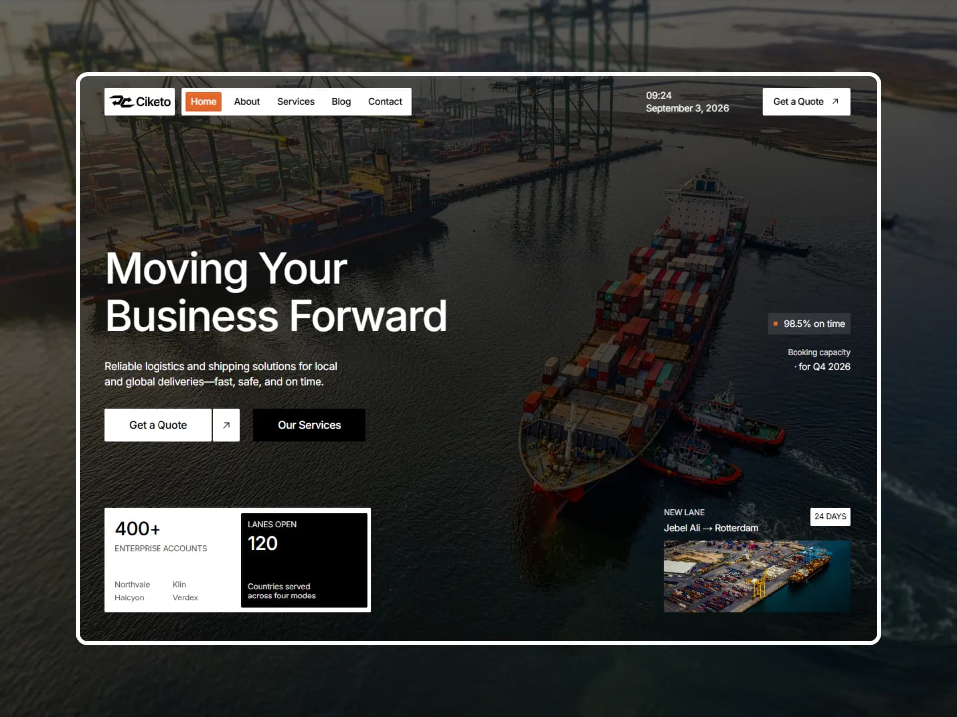
$npx shadcn@latest add https://framebrick.co/r/photo-tabs.jsonFrom the Ciketo template, see it in context.
“They turned a vague idea into a site our whole team could edit on day one. We have not called a developer since.”
import { PhotoTabs } from "@/components/ui/photo-tabs";

// Demo photos from Unsplash (free under the Unsplash License), served by this site so no request leaves it.
const people = [
  {
    value: "amara",
    name: "Amara Okafor",
    role: "Head of Product, Lumen",
    quote: "They turned a vague idea into a site our whole team could edit on day one. We have not called a developer since.",
    photo: "/demo/photo-tabs-amara.webp",
  },
  {
    value: "daniel",
    name: "Daniel Reyes",
    role: "Founder, Kestrel",
    quote: "The launch page loaded faster than anything we had built, and the motion made it feel like a product, not a brochure.",
    photo: "/demo/photo-tabs-daniel.webp",
  },
  {
    value: "lena",
    name: "Lena Hartmann",
    role: "Marketing Lead, Halden",
    quote: "Clear steps, no jargon, and every revision came back the same afternoon. I would hire them again tomorrow.",
    photo: "/demo/photo-tabs-lena.webp",
  },
  {
    value: "mateo",
    name: "Mateo Silva",
    role: "Director, Oakmere",
    quote: "Our enquiries doubled in the first month. The site finally says what we do, in the order people ask about it.",
    photo: "/demo/photo-tabs-mateo.webp",
  },
];

export default function PhotoTabsDemo() {
  return (
    <PhotoTabs
      label="Client testimonials"
      height={400}
      thumbWidth={132}
      className="max-w-2xl"
      items={people.map((person) => ({
        value: person.value,
        label: person.name,
        media: <img src={person.photo} alt="" />,
        panel: (
          <figure className="flex h-full flex-col justify-between gap-6">
            <blockquote className="text-lg leading-snug font-medium text-balance">“{person.quote}”</blockquote>
            <figcaption className="text-sm">
              <span className="font-medium">{person.name}</span>
              <span className="text-muted-foreground"> · {person.role}</span>
            </figcaption>
          </figure>
        ),
      }))}
    />
  );
}
Installation
$ npx shadcn@latest add https://framebrick.co/r/photo-tabs.json1. Install the dependencies.
npm install motion clsx tailwind-merge2. Add
cn()tolib/utils.ts(skip if shadcn already created it).import { clsx, type ClassValue } from "clsx"; import { extendTailwindMerge } from "tailwind-merge"; /* tailwind-merge must know the site's type scale (globals.css) is a font size, not a text color — otherwise cn("text-h6 text-muted-foreground") drops text-h6. */ const twMerge = extendTailwindMerge({ extend: { classGroups: { "font-size": [{ text: ["display", "h1", "h2", "h3", "h4", "h5", "h6"] }] } }, }); export function cn(...inputs: ClassValue[]) { return twMerge(clsx(inputs)); }3. Copy the component into
components/ui/photo-tabs.tsx."use client"; import * as React from "react"; import { motion, useReducedMotion, type Transition } from "motion/react"; import { cn } from "@/lib/utils"; /* * Photo Tabs — the photos are the tabs: the chosen one takes a fixed share of the strip, the others share the rest, and * the panel beside them cross-fades to what the chosen photo stands for (from the Ciketo testimonials). A column from * 768px up, a row below. Click only. Framer's spring: bounce 0, 0.4s, on the sizes and on the fade. * * It is the mirror of `expanding-panels`, where the chosen one is the flexible one and the rest are fixed, and the * other way round from `step-sequence`, where text steps drive a media panel. It fits testimonials, team and products. * * The sizes are flex-basis in percent along the strip's main axis, which is the height in the column and the width in * the row — so one value is right in both, with no breakpoint logic in JavaScript (which would be a hydration trap). * * Improvements over Ciketo: a real tab list (arrow keys, Home and End), panels that are not shown are inert as well as * aria-hidden, and the strip keeps the quote that the port already fixed (Framer switched it on desktops only). * Reduced motion is a zero-duration transition: flex sizes are not a transform, so MotionConfig would not skip them. */ const spring: Transition = { type: "spring", bounce: 0, duration: 0.4 }; export type PhotoTab = { value: string; /** What the tab is called to assistive technology — the person's name, say. The photo itself is decorative. */ label: string; /** The photo. It is stretched and cropped to its tab. */ media: React.ReactNode; /** What shows beside the photos while this tab is chosen. */ panel: React.ReactNode; }; export type PhotoTabsProps = { items: PhotoTab[]; value?: string; /** The tab that starts chosen; the first by default. */ defaultValue?: string; onValueChange?: (value: string) => void; /** Accessible name of the tab list. */ label: string; /** How much of the strip the chosen photo takes, in percent. */ selectedShare?: number; /** Height of the photo column from 768px up, in px. */ height?: number; /** Width of the photo column from 768px up, in px. */ thumbWidth?: number; className?: string; }; export function PhotoTabs({ items, value, defaultValue, onValueChange, label, selectedShare = 55, height = 480, thumbWidth = 168, className, }: PhotoTabsProps) { const [internal, setInternal] = React.useState(defaultValue ?? items[0]?.value); const active = value ?? internal; const index = Math.max(0, items.findIndex((item) => item.value === active)); const reduce = Boolean(useReducedMotion()); const id = React.useId(); const tabs = React.useRef<(HTMLButtonElement | null)[]>([]); const transition = reduce ? { duration: 0 } : spring; function select(next: string) { if (next === active) return; if (value === undefined) setInternal(next); onValueChange?.(next); } function onKeyDown(event: React.KeyboardEvent) { const last = items.length - 1; let next: number | undefined; if (event.key === "ArrowDown" || event.key === "ArrowRight") next = index === last ? 0 : index + 1; else if (event.key === "ArrowUp" || event.key === "ArrowLeft") next = index === 0 ? last : index - 1; else if (event.key === "Home") next = 0; else if (event.key === "End") next = last; if (next === undefined) return; event.preventDefault(); select(items[next].value); tabs.current[next]?.focus(); } return ( <div style={{ ["--tabs-h" as string]: `${height}px`, ["--tabs-w" as string]: `${thumbWidth}px` }} className={cn("flex w-full flex-col gap-6 md:flex-row md:gap-10", className)} > <div role="tablist" aria-label={label} className="flex h-40 gap-2.5 md:h-(--tabs-h) md:w-(--tabs-w) md:shrink-0 md:flex-col" > {items.map((item, i) => { const selected = i === index; return ( <motion.button key={item.value} ref={(element) => { tabs.current[i] = element; }} type="button" role="tab" id={`${id}-tab-${i}`} aria-selected={selected} aria-controls={`${id}-panel`} aria-label={item.label} tabIndex={selected ? 0 : -1} onClick={() => select(item.value)} onKeyDown={onKeyDown} initial={false} animate={{ flexGrow: selected ? 0 : 1, flexBasis: selected ? `${selectedShare}%` : "0%" }} transition={transition} className="relative min-h-0 min-w-0 cursor-pointer overflow-hidden rounded-lg bg-muted outline-none focus-visible:ring-[3px] focus-visible:ring-ring/50 [&>*]:size-full [&>*]:object-cover" > {item.media} </motion.button> ); })} </div> {/* Every panel sits in the same grid cell, so the tallest one sets the height and nothing jumps. */} <div role="tabpanel" id={`${id}-panel`} aria-labelledby={`${id}-tab-${index}`} className="grid min-w-0 flex-1 [&>*]:col-start-1 [&>*]:row-start-1" > {items.map((item, i) => ( <motion.div key={item.value} inert={i !== index} aria-hidden={i !== index} initial={false} animate={{ opacity: i === index ? 1 : 0 }} transition={transition} > {item.panel} </motion.div> ))} </div> </div> ); }
Usage
import { PhotoTabs } from "@/components/ui/photo-tabs";

<PhotoTabs
  label="Client testimonials"
  items={people.map((p) => ({
    value: p.slug,
    label: p.name,
    media: <Image src={p.photo} alt="" fill />,
    panel: <Quote name={p.name} role={p.role}>{p.quote}</Quote>,
  }))}
/>
Props
| Prop | Type | Default | Description |
|---|---|---|---|
| items | { value, label, media, panel }[] | — | The tabs. `media` is the photo, `label` names the tab for assistive technology, `panel` is what shows beside the photos. |
| label | string | — | Accessible name of the tab list. |
| value | string | — | Chosen tab (controlled). |
| defaultValue | string | first tab | Tab that starts chosen (uncontrolled). |
| onValueChange | (value: string) => void | — | Called when another tab is chosen. |
| selectedShare | number | 55 | How much of the strip the chosen photo takes, in percent. |
| height | number | 480 | Height of the photo column from 768 px up, in px. |
| thumbWidth | number | 168 | Width of the photo column from 768 px up, in px. |
- The mirror of `expanding-panels`, where the chosen one is the flexible one and the rest are fixed, and the other way round from `step-sequence`, where text steps drive a media panel. It fits testimonials, team and products.
- A column from 768 px up, a row below. The sizes are flex-basis in percent along the strip's main axis, which is the height in the column and the width in the row, so one value is right in both with no breakpoint logic in JavaScript.
- A real tab list: arrow keys, Home and End move between the tabs. The panels that are not shown are inert as well as aria-hidden. Click only, as in Ciketo; there is no timer.
- Reduced motion is a zero-duration transition, not different markup: flex sizes are not a transform, so MotionConfig would not skip them, and markup that depended on it would fail hydration.
- The portraits in the demo are Unsplash photos shown with invented names and quotes, as placeholders. Use your own clients' photos and words: a stock portrait beside a quote reads as that person's endorsement.
AI prompt
Paste into v0, Lovable, Bolt or Claude to rebuild this component in your own project.
Create a React + Tailwind CSS + Motion (motion/react) component called PhotoTabs.
- A flex container. Below 768px the photo strip is a 160px-tall row above the panel; from 768px up the strip is a column
  on the left (default 168px wide, 480px tall) with the panel on its right, gap-10.
- The strip is role tablist with an aria-label. Each photo is a motion.button role tab (aria-selected, aria-label = the
  person's name, roving tabindex, aria-controls the panel), rounded-lg bg-muted, overflow-hidden, children stretched with
  object-cover.
- Exactly one tab is chosen (the first by default). The chosen tab animates to flex-grow 0 and flex-basis 55%; the others
  to flex-grow 1 and flex-basis 0%, so they share what is left. Percent basis follows the strip's main axis: the height in
  the column, the width in the row, so no breakpoint logic is needed. Spring: bounce 0, duration 0.4s.
- Arrow keys (Up/Left previous, Down/Right next), Home and End move and choose, wrapping around.
- The panel beside is role tabpanel with aria-labelledby the chosen tab. Put every panel in one CSS grid cell (all
  col-start-1 row-start-1) so the tallest sets the height; fade the chosen one to opacity 1 and the rest to 0 with the
  same spring, and mark the rest inert and aria-hidden.
- Reduced motion: use useReducedMotion() only to switch the transition to zero duration — never to change the markup,
  because the server cannot know it and a different render is a hydration mismatch.