Hero Video
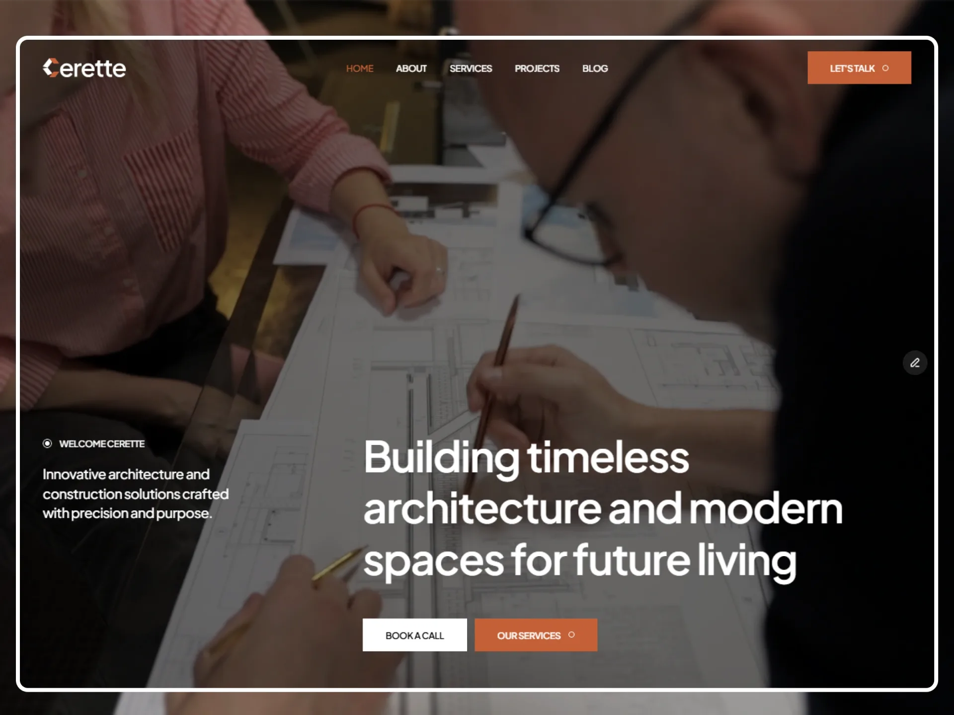
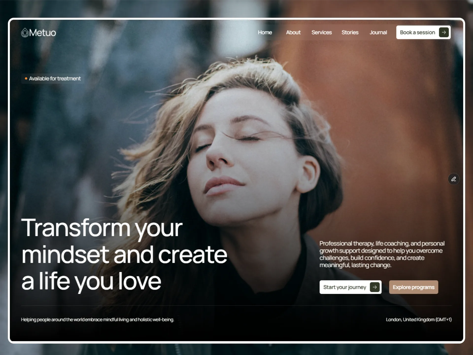
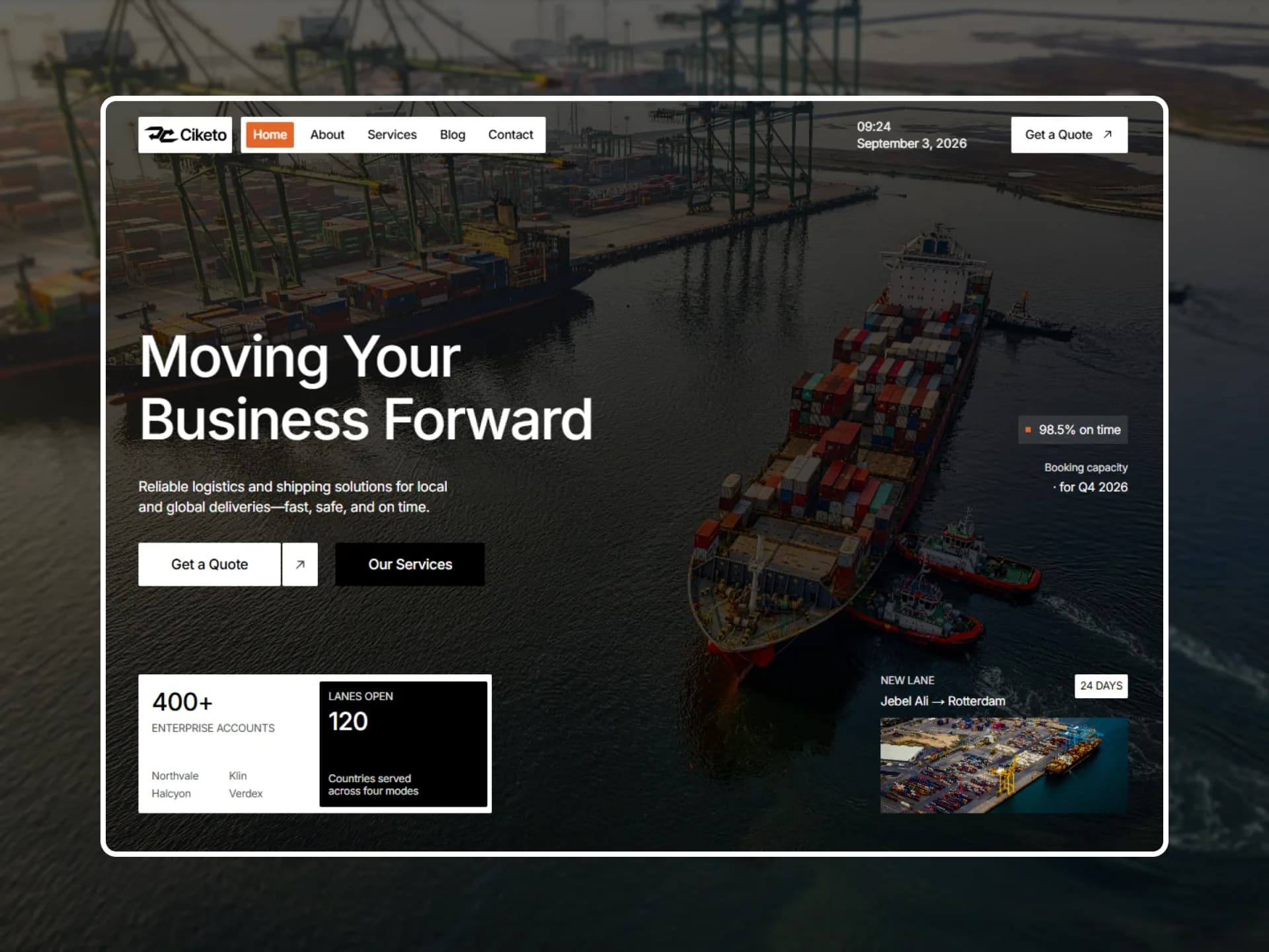
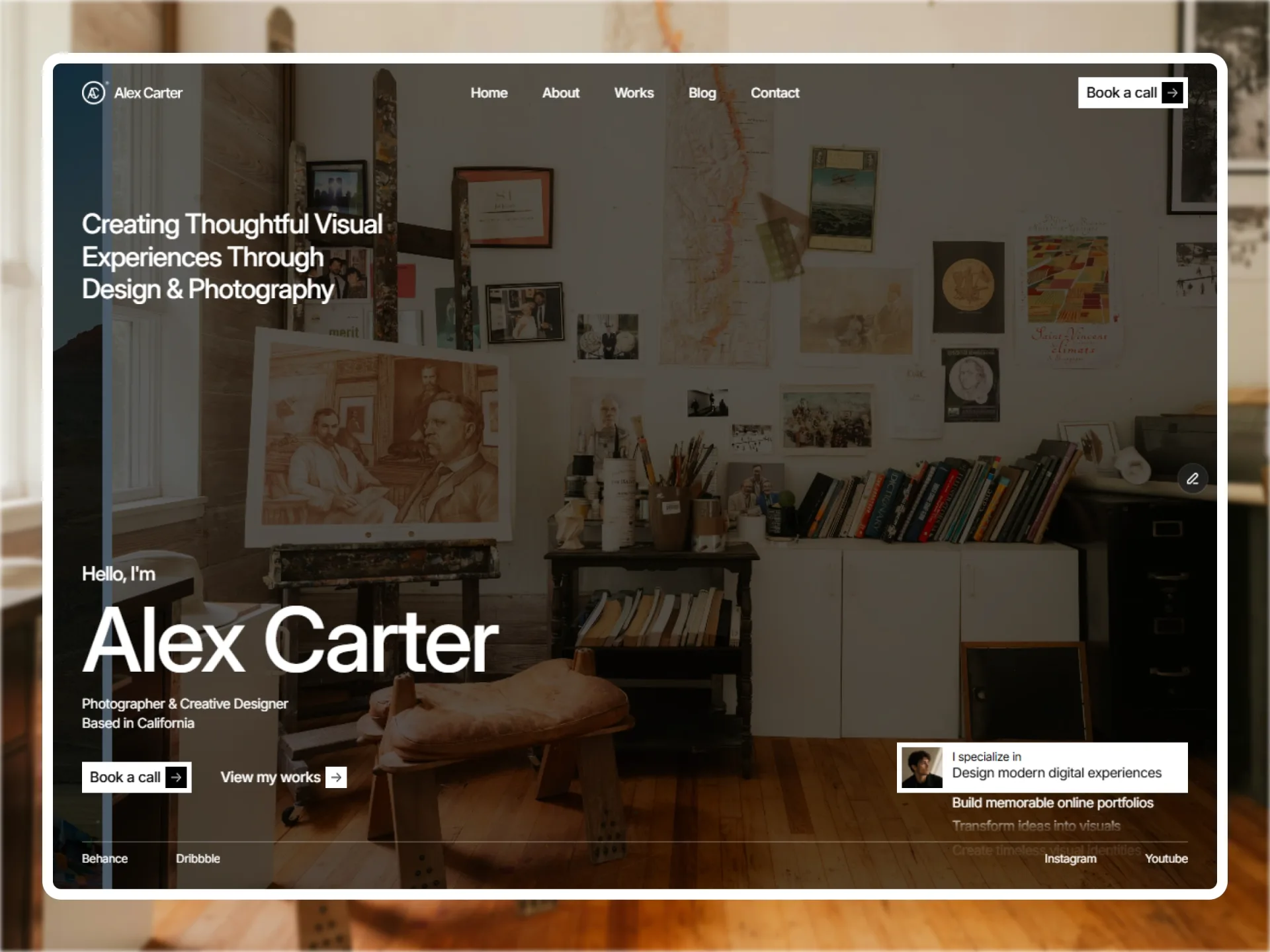
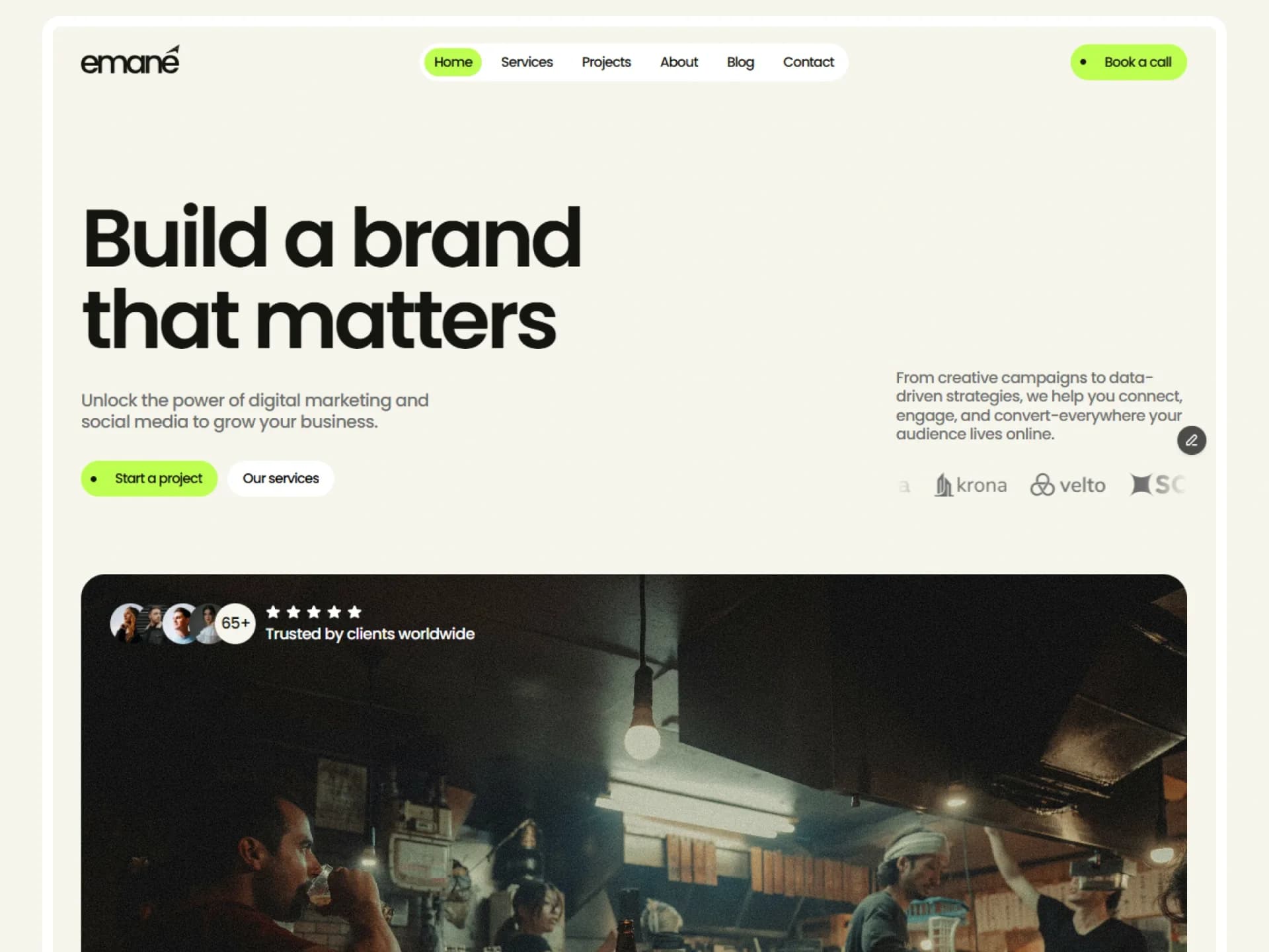
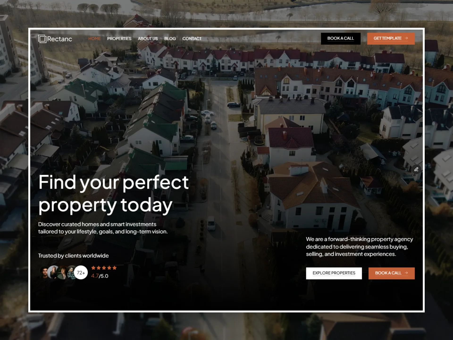
Poster with a round play button over it; the whole frame plays and pauses.
From the Findit template — see it in contextThe file is only fetched when you press play; the poster is all that loads before.
import { HeroVideo } from "@/components/ui/hero-video";

// Clip from Pexels (Pexels License) and still from Unsplash (Unsplash License), both served by this site, so the
// page loads nothing from another host — before the click or after it.
export default function HeroVideoDemo() {
  return (
    <div className="flex w-full max-w-lg flex-col gap-3">
      <HeroVideo src="/video/pexels-10959786.mp4" poster="/demo/hero-video-poster.webp" label="Play the clip" />
      <p className="text-center text-xs text-muted-foreground">
        The file is only fetched when you press play; the poster is all that loads before.
      </p>
    </div>
  );
}
Installation
$ npx shadcn@latest add https://framebrick.co/r/hero-video.json1. Install the dependencies.
npm install motion clsx tailwind-merge2. Add
cn()tolib/utils.ts(skip if shadcn already created it).import { clsx, type ClassValue } from "clsx"; import { extendTailwindMerge } from "tailwind-merge"; /* tailwind-merge must know the site's type scale (globals.css) is a font size, not a text color — otherwise cn("text-h6 text-muted-foreground") drops text-h6. */ const twMerge = extendTailwindMerge({ extend: { classGroups: { "font-size": [{ text: ["display", "h1", "h2", "h3", "h4", "h5", "h6"] }] } }, }); export function cn(...inputs: ClassValue[]) { return twMerge(clsx(inputs)); }3. Copy the component into
components/ui/hero-video.tsx."use client"; import * as React from "react"; import { motion, type Transition } from "motion/react"; import { cn } from "@/lib/utils"; /* * Hero Video — a poster with a round play button over it; the whole frame is the control (from the Findit * "Card/Hero Video"). The button sits at 75% and comes to full on hover, with Framer's soft spring * (bounce 0, 0.4s). Nothing of the video is downloaded until someone presses play (preload="none"). * * Improvement over Framer: the button follows the video rather than the click, so it comes back when the video ends * or is paused from anywhere else, and the frame is a real button — keyboard and screen readers reach it. */ const soft: Transition = { type: "spring", bounce: 0, duration: 0.4 }; export type HeroVideoProps = { src: string; /** Shown before play and while paused. */ poster: string; /** What the button does, e.g. "Play the tour of 14 Almond Street". */ label: string; loop?: boolean; /** Videos start muted so a browser lets them play; turn this off for sound. */ muted?: boolean; className?: string; }; export function HeroVideo({ src, poster, label, loop = true, muted = true, className }: HeroVideoProps) { const video = React.useRef<HTMLVideoElement>(null); const [playing, setPlaying] = React.useState(false); function toggle() { const element = video.current; if (!element) return; if (element.paused) void element.play().catch(() => setPlaying(false)); else element.pause(); } return ( <motion.button type="button" onClick={toggle} aria-label={label} aria-pressed={playing} initial="rest" animate="rest" whileHover="hover" whileFocus="hover" className={cn( "relative block aspect-video w-full cursor-pointer overflow-hidden rounded-lg bg-muted outline-none", "focus-visible:ring-[3px] focus-visible:ring-ring/50", className, )} > <video ref={video} src={src} poster={poster} muted={muted} loop={loop} playsInline preload="none" onPlay={() => setPlaying(true)} onPause={() => setPlaying(false)} onEnded={() => setPlaying(false)} className="absolute inset-0 size-full object-cover" /> {!playing && ( <motion.span aria-hidden variants={{ rest: { opacity: 0.75 }, hover: { opacity: 1 } }} transition={soft} className="absolute top-1/2 left-1/2 flex size-12 -translate-x-1/2 -translate-y-1/2 items-center justify-center rounded-full bg-black/25 text-white backdrop-blur-md" > <svg aria-hidden viewBox="0 0 24 24" fill="currentColor" className="size-6 translate-x-px"> <path d="M8 5.5v13l11-6.5z" /> </svg> </motion.span> )} </motion.button> ); }
Usage
import { HeroVideo } from "@/components/ui/hero-video";

<HeroVideo src="/tour.mp4" poster="/tour.jpg" label="Play the tour of 14 Almond Street" />
Props
| Prop | Type | Default | Description |
|---|---|---|---|
| src | string | — | The video file. |
| poster | string | — | Shown before play and while paused. |
| label | string | — | What the button does, e.g. "Play the tour of 14 Almond Street". |
| loop | boolean | true | Start again when it ends. |
| muted | boolean | true | Videos start muted so a browser lets them play; turn it off for sound. |
- Nothing of the video is downloaded until someone presses play (preload="none") — only the poster.
- The button follows the video, not the click, so it comes back when the video ends or is paused from anywhere else.
- The whole frame is a button with aria-pressed, so a keyboard reaches it and the state is announced.
AI prompt
Paste into v0, Lovable, Bolt or Claude to rebuild this component in your own project.
Create a React + Tailwind CSS + Motion (motion/react) component called HeroVideo.
- The whole frame is a button (aspect-video, rounded-lg, overflow-hidden, bg-muted, visible focus ring) holding a
  <video> with a poster, muted, loop, playsInline and preload="none", filling it with object-cover.
- A click plays or pauses. Keep a "playing" state from the video's own play, pause and ended events, not from the click.
- While paused, a 48px circle sits in the middle: bg-black/25 with backdrop-blur-md and a white play triangle.
  It rests at opacity 0.75 and goes to 1 on hover and on keyboard focus, with a spring (bounce 0, duration 0.4s).
- Accessibility: aria-label describing what plays, aria-pressed for the state.